weekly DK's 52 of 2015 - wk 52 'Christmas' added - FINISHED

Just looked at the Spreadsheet, very funny. :):):);)
 
HI DK, have the very same lens, so therefore it must be elegant, nothing wrong with a little self promotion either (y)
 
Really like your fragile image, very creative and good lighting! Shame about the plate though :)
Thanks Steven :)

You might well cough Dean..

All I can say your lucky its a Canon L lens.
Cheers Darren :D

A very nice lens by the looks. If only I could afford it :crying:
Thanks Mike :)

Believe me they are a LOT of lens for the money, I'd be keeping mine if I could afford the wide angle without the sale :)

HI DK, have the very same lens, so therefore it must be elegant, nothing wrong with a little self promotion either (y)
Cheers Allan... it sure is a cracking zoom lens :)
 
Hmmmm quite like that actually! Nicely composed shot, clean and sharp..... Don't even mind it's a canon! Lol [emoji12][emoji23]
 
As the owner of one of these beauties I have to agree it's Elegant :canon:, although I'm switching full time to the Sony A7, sorry Canon but you are just to heavy for me now :(

If you need a volunteer for the whipping though........
 
It certainly looks elegant.
But you know, I think I'd need to try it out to be absolutely sure.
Yeah, I think that's a good idea ;)
 
Elegant - what a lovely looking lens just not sure I am seeing elegant tho :thinking:. At least it's well shot and I like the surface it's placed on.
Thanks Mandy :)

I agree there is a bit of imagination required, I think it is an elegant lens as in, not small and Dumpy, not Large and cumbersome... Just Elegant in form :)

That's Elegant, nice 'n clean, even lighting, nice surface with reflection. (y)
Thanks David :)

Not sure about elegant, but I like the subtle reflection and back lighting.
Cheers Nick :)

Your wrong, but thanks anyway :whistle:

Hmmmm quite like that actually! Nicely composed shot, clean and sharp..... Don't even mind it's a canon! Lol [emoji12][emoji23]
Ha Haaaaa Thanks Ferg (y)

As the owner of one of these beauties I have to agree it's Elegant :canon:, although I'm switching full time to the Sony A7, sorry Canon but you are just to heavy for me now :(
Thanks a lot Jill, shame you're moving on from Canon :(

If you need a volunteer for the whipping though........
Naughty girl :naughty:

It certainly looks elegant.
But you know, I think I'd need to try it out to be absolutely sure.
:LOL:
Yeah, I think that's a good idea ;)
Thanks Ruth :)
 
Scenic - At a quick glance I thought you’d photoshopped a tree instead of the windmill. LOL. I prefer the windmill (a little more interest) image of the two. The composition and use of a good aspect ratio crop strengthens the image nicely.

Companions - These seagulls :p have been captured well. The use of the of grasses in the foreground hide a possibly distracting fence. Again a good crop used.

Elegant - mmm Canon - Elegant? Not sure about that LOL.:exit:
 
Hi Dean... it's been a while - sorry, my fault!

Scenic - what a great windmill shot. No crit at all - perfect composition and execution!

Companions - again, great capture, don't mind the OOF foreground as it gives context. Having the birds further to the left of the frame would be the icing on the cake, but tiny point!

Elegant - nicely done. Good bit of background lighting - I'm a fan of that look... not sure the surface is helping you, but it's still a good technical shot. Light levels at the front are good.

Looking forward to watery!
 
Scenic - At a quick glance I thought you’d photoshopped a tree instead of the windmill. LOL. I prefer the windmill (a little more interest) image of the two. The composition and use of a good aspect ratio crop strengthens the image nicely.
Thanks Peter :)

Companions - These seagulls :p have been captured well. The use of the of grasses in the foreground hide a possibly distracting fence. Again a good crop used.
Seagulls :O

Elegant - mmm Canon - Elegant? Not sure about that LOL.:exit:
Oooo Peter :bat:

:D

Hi Dean... it's been a while - sorry, my fault!
No worries mate, were all busy :)

Scenic - what a great windmill shot. No crit at all - perfect composition and execution!
Thanks a lot Paul, nice to hear coming from you :)

Companions - again, great capture, don't mind the OOF foreground as it gives context. Having the birds further to the left of the frame would be the icing on the cake, but tiny point!
Thanks again, glad you too like the foreground, there seems to be fewer on this one :)

Elegant - nicely done. Good bit of background lighting - I'm a fan of that look... not sure the surface is helping you, but it's still a good technical shot. Light levels at the front are good.
Thanks :)

Do you think it needs a cleaner surface or a different colour ??

Looking forward to watery!
I wish I was :(
 
Moving on...

Week 6 - WATERY

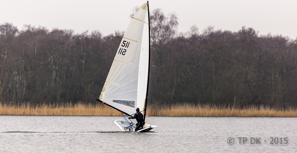
Long story quick... Trying to catch up yesterday plan went wayside due to weather, so today was a must, again not exactly what I was after but will have to do :)

Did what I could with the light, three different shots, liking all for different reasons, I was hoping for much brighter sails but hey, we get what we are given, over to you - Thanks

The main reason I like this one is because of the shape of the hull, looked unusual...

Wk 6 - Watery by TP DK, on Flickr


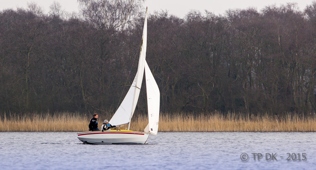
I chose this one because of the angle of the boat and the wind in the sails, the background is still as dull as all the others though

Wk 6 - Watery 2 by TP DK, on Flickr


And this final one I really like because of the OOF gulls, it isn't my first choice as even though I caught the boat in the gap just right, the more I stare at it the more the birds become a distraction :thinking:

Wk 6 - Watery 3 by TP DK, on Flickr
 
Last edited:
Gulls yes, definitley a distraction TBH.
(As I spend more than half of my working life trying shift the buggers, I would say that :D)

A nice watery theme, Dean (y)
But again I think that the main subject is too central in the frame,
you can't see if its coming or going.
certainly in #1 and not quite so much in #2. although the bow and mast are pretty central.
I think also you may have been a little tight with the headroom too
certainly in 1 & 2 ;)

(Its OK i'm feeling brave, by the time I get this theme sorted, you'd have forgotten all about it :D )
 
PLACEHOLDER to get me up to date...

Week 7 - BOLD

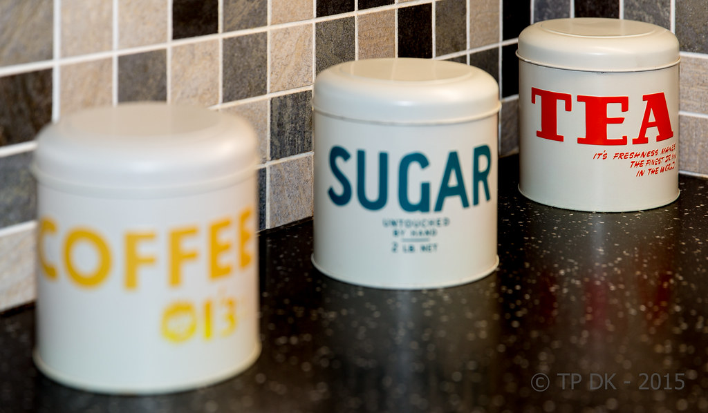
The light was poor today on my trip out for photo's, so I decided to do one shot indoors...

The bolder font on this tea cannister was my thought, I have tried a couple of edits, slightly different crops and one colour one SC, to be honest not very happy with either but they will do, I hope to get another image later in the week, if not this will be up for a re-shot :)

Wk 7 - BOLD by TP DK, on Flickr


Wider crop SC

Week 7 - Bold SC by TP DK, on Flickr
 
I actually like the watery image that has the OOF gulls in. They are not so far out of focus that you cant distinguish what they are and they suit the surroundings of the image.

I'm not a fan the colour pop of the bold image I'm afraid. The full colour version looks much better :)
 
I like watery #2 best out of the three for the very reasons you've put. Shame about the sky but sometimes these things can't be helped.

I also prefer the colour Bold. I think it fits within the theme, which is a really hard one this month. I like the dof you've used to make tea stand out being the bolder text.
 
Head room is a bit better Dean, and I can see why you wanted to leave the wake in.
Personally I'd have reduced the negative space further (about half of what it is now)
to put the sail smack on a vertical 1/3rd. That still leaves quite a bit of wake too.
But maybe its just me?

Place holder, I prefer the second, for the processing and wider crop,
but would have also preferred the coffee to be highlighted, as tea is 'orrible :D
 
Nice shots DK - I like the watery one you chose - like the line of the reeds on the bank. Like the bold one too - either for me - on both the 'bold' stands out. Nice that it's the red one too :)
 
I'm liking the edit of the odd looking boat DK. The added room at the top makes all the difference IMO.

Your shots for BOLD....Well, though I know selective colouring is frowned on these days by the purists, I think it's the one that most fits the theme here. :)
 
Hi DK

Watery ... #2 for me ... better focus, colour, symmetry!

Bold ... not a bad idea! But for me all colour and all in focus.
 
Head room is a bit better Dean, and I can see why you wanted to leave the wake in.
Personally I'd have reduced the negative space further (about half of what it is now)
to put the sail smack on a vertical 1/3rd. That still leaves quite a bit of wake too.
But maybe its just me?

(y) Crop works far better for me, but pretty much agree with Chris on taking a little more from the LHS.

I have to say though, that I'm strangely drawn to the one with the OOF gulls and the boat peeking through the gap.
Lots of reasons why that shouldn't work and why the gulls should be a distraction but <shrug> I just rather like it :D
In fact, I think that one would stand up to a crop from the top to remove the bright patch of sky. I know that you'd lose the tip of the sail and a couple of gulls that way . . . but that whole feel of peeking through the flock of birds to see the boat lends itself to being a bit looser with what you keep in frame.
 
Hi Dean

watery - three good shots for the theme. The gulls are a bit of a distraction though, shame there was so many of them. I do like the first with more sky in though.

Bold - again, fits the theme. Oddly enough, I think the selective colour one works best as it pulls the eye away from the out of focus tins. :)
 
Hi, I like Watery 3, not to some folk's taste but I like the OOF birds in the FG.

Bold, on theme and I like how it's cropped nice and tight. Yeah, SC is frowned upon by some but I like this applicant, especially because the SC is red.

Cheers.
 
Hi DK, like the watery image with the birds they are a bit distracting but in a good way for me

I quite like the B+W of the tins but find the BG distracting maybe as Susie says above tighter together and straight on :thinking:
 
Watery: Yes, strange hull. When I first saw it I thought his boat had broken in half.

Bold: I like the second picture with the red tin and everything else in B&W; definitely makes it stand out boldly.
 
Watery - weather never flipping cooperates does it :( I'm liking the edit more than the original but for me you could still lose a chunk off the LHS and I like the quirkiness of the boat - looks like it's melting in the middle :p

Bold - well, from someone who got her kit off for the challenge you could have been a bit bolder than that :exit:it doesn't say bold to me, but, that's life sometimes. I don't care what the purists think, I like the selective colouring one :clap:
 
Watery for me has to be the strange hull one too, looks like he has seconds to spare!
Bold is definitely the full colour version, I like the dof and wouldn't change a thing!
 
Back
Top