

blakester
Shine On Harvest Moon
- Messages
- 6,679
- Name
- Iain
- Edit My Images
- No
Great start to your 5th year in the 52 Andy ")
Another vote for the abstract image.
Particularly like the vibrancy of it, it's quite hypnotic looking at it
It just goes to show, there are images all around us, they just need discovering.
Good work matey, I shall be looking in again!
Another vote for the abstract image.
Particularly like the vibrancy of it, it's quite hypnotic looking at it
It just goes to show, there are images all around us, they just need discovering.
Good work matey, I shall be looking in again!
 With 68 starters for the year, I don’t think any of us have a chance of commenting on every entry every week, but I hope to keep popping in to each thread at least once in a while. Good luck with the rest of the year.
 Week 1 Bliss 2
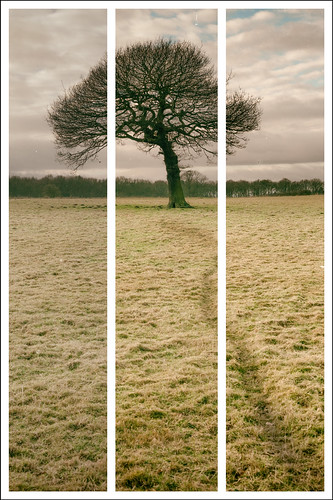
 Week 1 Bliss 4
 , I never even considered the religious connotation of #2 (Christ the Redeemer
 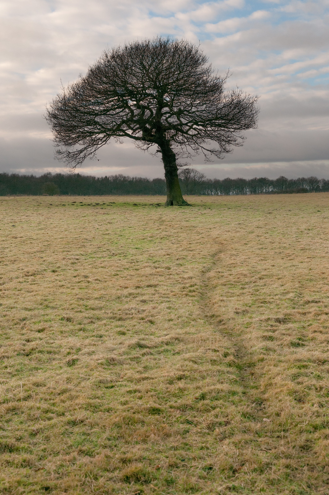 Weel 1 Bliss no split
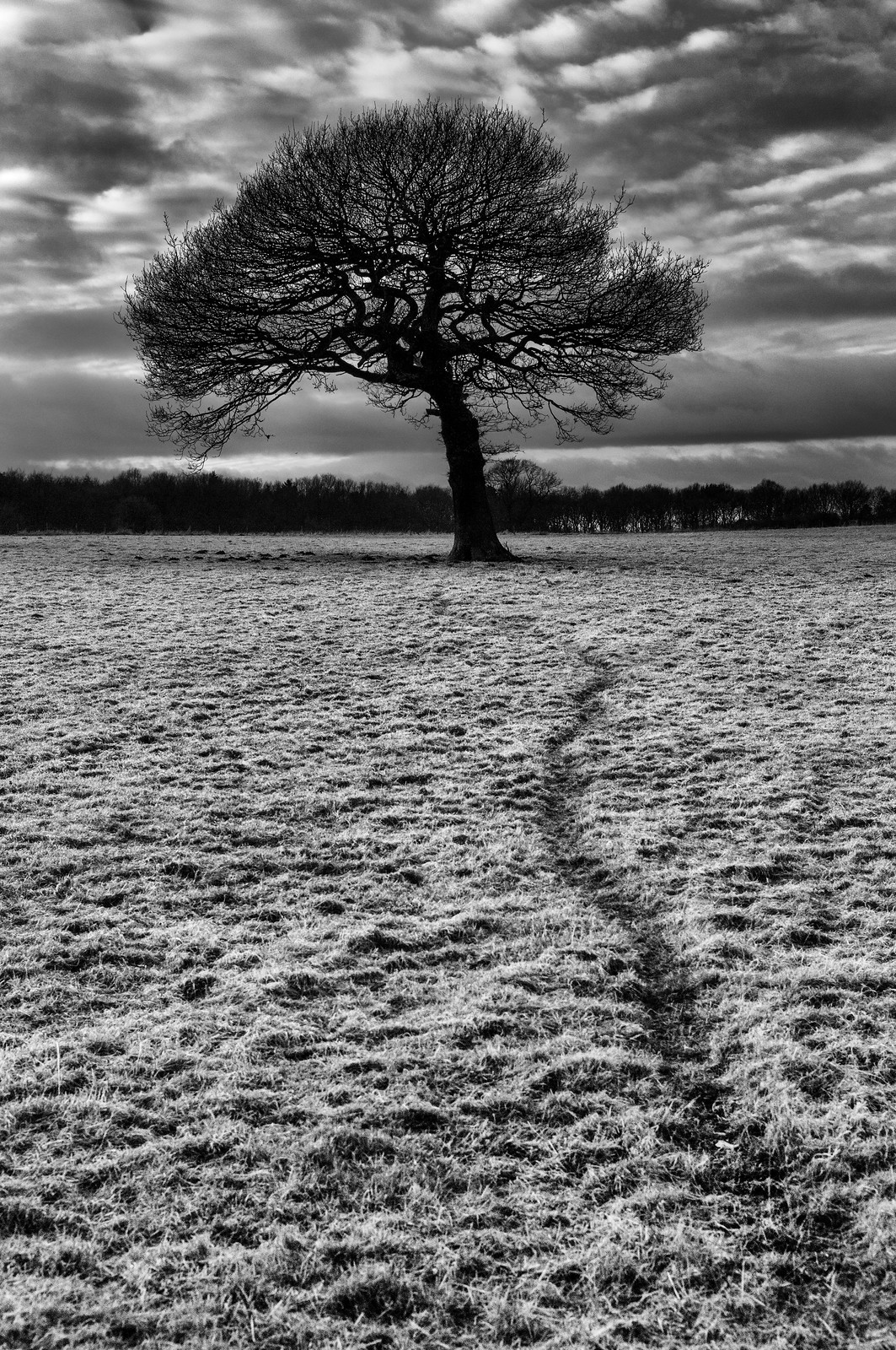 Week1 Bliss no split B&W
 Week 3 Fragile 1