OP
- Messages
- 990
- Name
- Jon
- Edit My Images
- Yes
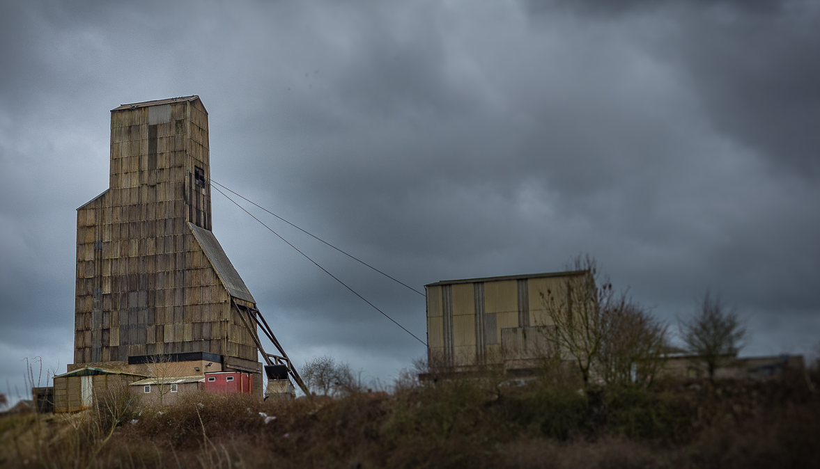
After a bit of a delay I came up with three, the two which didn't make it :
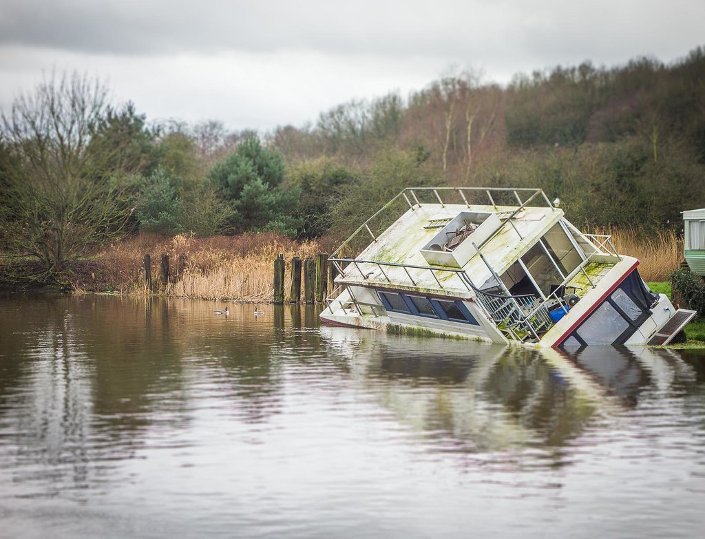 Abandoned (Option 3) by Jon Parry, on Flickr
and
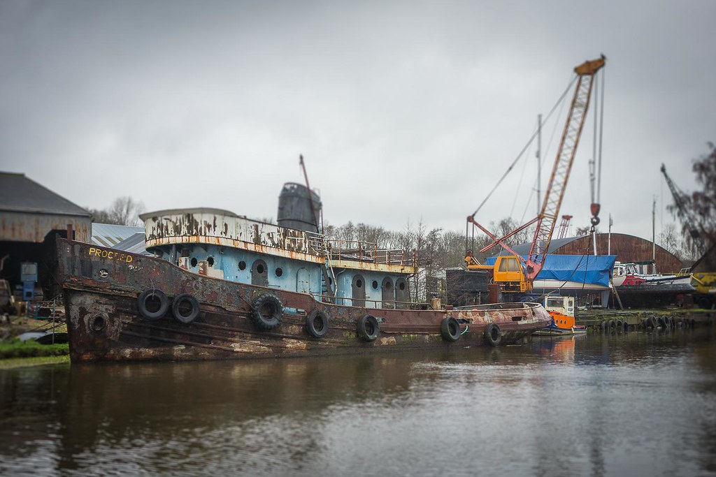 Abandoned (option 2) by Jon Parry, on Flickr
But settled on this
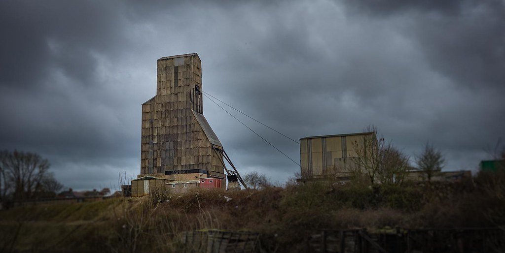 Week # 5 - Subject "Abandoned" by Jon Parry, on Flickr
Camouflage and comments catch up next ! ............
Abandoned (Option 3) by Jon Parry, on Flickrand
Abandoned (option 2) by Jon Parry, on FlickrBut settled on this
Week # 5 - Subject "Abandoned" by Jon Parry, on FlickrCamouflage and comments catch up next ! ............

")
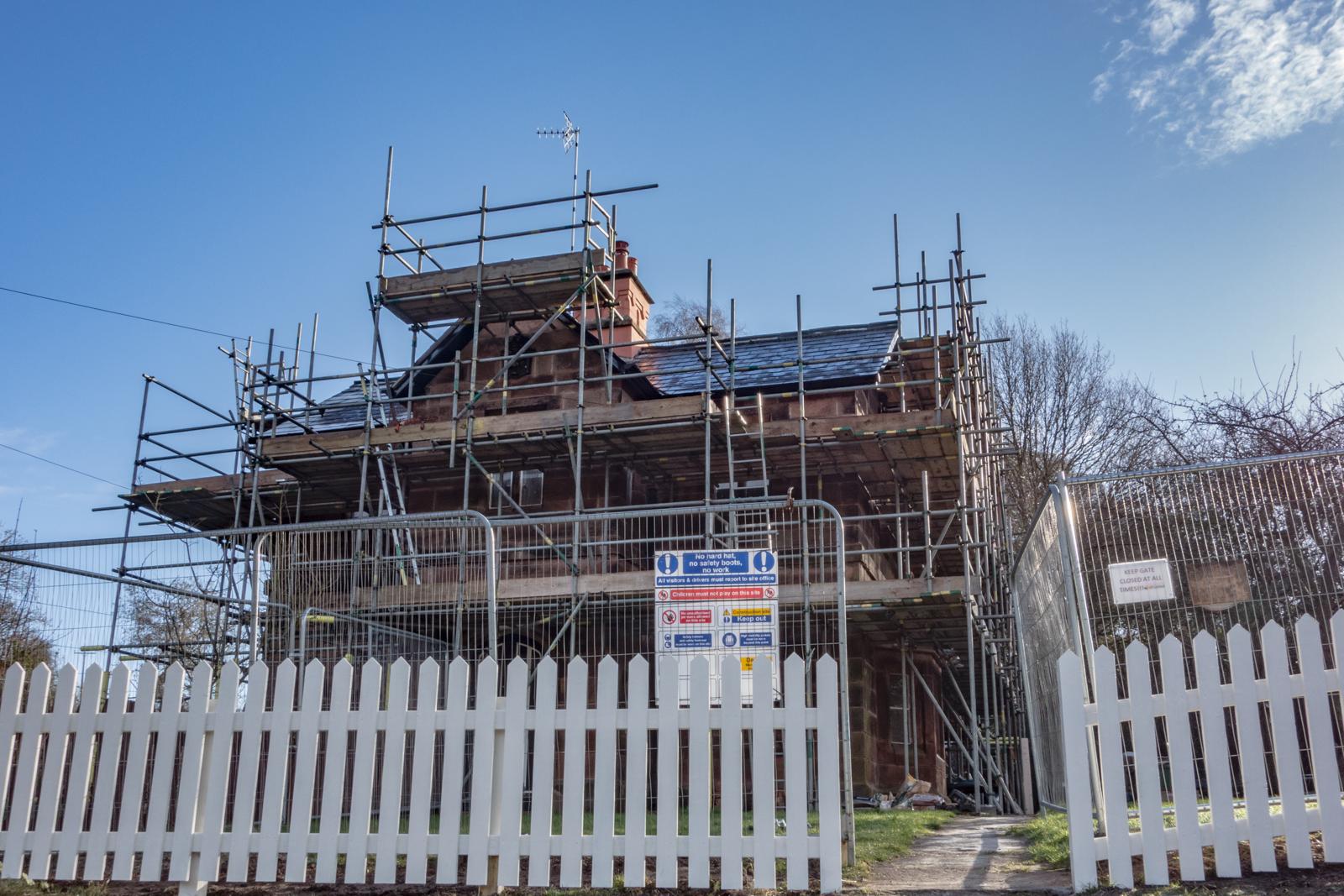
 Week # 6 - Subject "Camouflage"
 With the above comments.
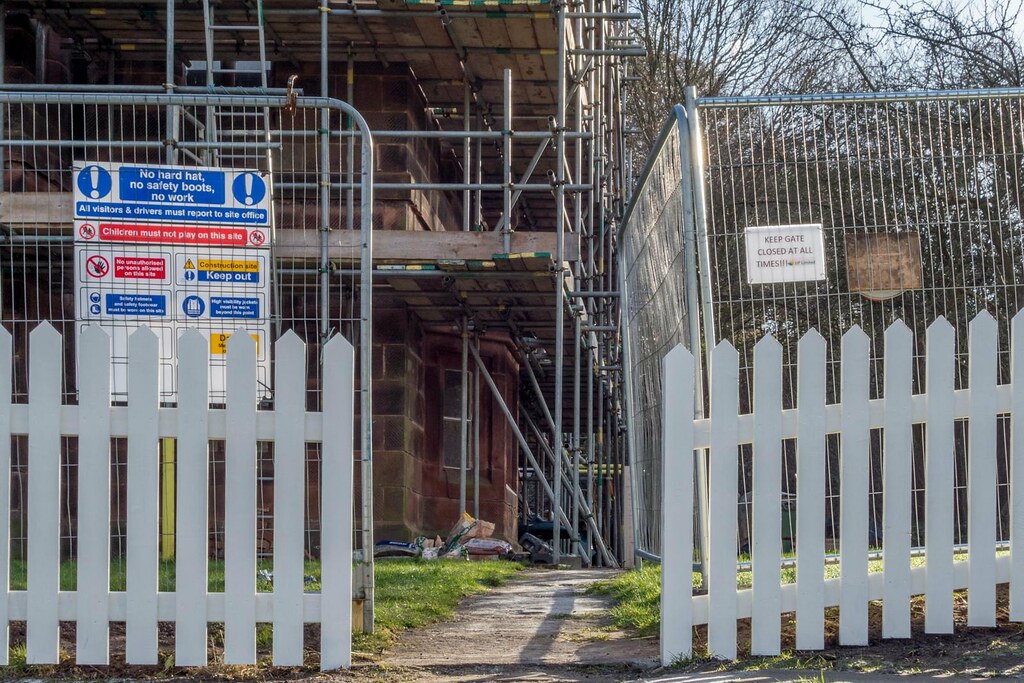 Week # 7 - Subject "Dangerous"