Allan.H TP52 2018 WEEK 52 SHOWCASE ADDED

Heavy - good fun image for the theme, nice crisp shot and a good clean BG.
Wet - another good image for the theme, looks like Holly was fixed on trying to find that pebble you had thrown in.
Juxtaposition - a very well executed image for the theme, I myself was wondering if there was a connection to the theme. I think i see a connection, and its nicely lit another good clean BG and good placement of the props.
Oval - a nice shot, though i think it would work better in mono and if there was a bit more symmetry in the ovals.
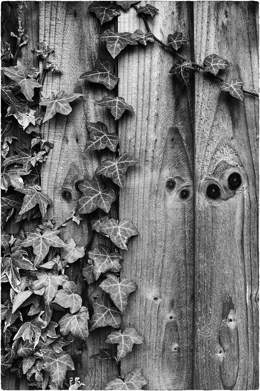
thanks
 
Nice shot for the theme Allan, I think I'd have preferred or in colour but that's just me. It still looks good in b&w
 
Straight
I can't stop staring at the knots, they look like eyes staring at me (owl like).
As for the photo, it works well and the ivy gives a bit more texture.
 
I REALLY like that Allan, and I love the "eyes" in the wood panels too.....
 
Great idea for the theme Allan, very unattractive
 
straight - nice and simple, but I would like to see the colour version!
unattractive - great simple composition and great colours!
 
Unattractive -- I chuckled at this. I'll eat most things but 'unattractive' is too mild a word for these vegetable abominations. Hate the things, they would be my Room 101. Good call on the theme.
 
Unattractive -- I chuckled at this. I'll eat most things but 'unattractive' is too mild a word for these vegetable abominations. Hate the things, they would be my Room 101. Good call on the theme.

^^^ Exactly that lol :)
 
Straight - I really like this Allan great conversion some lovely details and textures.

Unattractive - Works for me a nice fun image some great colours too (I also like sprouts)
 
Unattractive
I like sprouts, but somehow you've made them look Unattractive. I like the simple colours.
 
That's a good find for Oval, Allan. Strong colours in the brickwork and I like the recession of all the repeating ovals with the scene at the end (y)
Straight is excellent; great contrast between the straight lines of the fence and the twisting lines of ivy, and the 'eyes' are a great addition. It seems almost superfluous to say that I would like to see the colour version too, as I think the colour of the Ivy would have contrasted well with the fence, but the B&W processing bring out the textures of an interesting scene and I like it a lot (y)
Unattractive is original and colourful, and it made me smile as well as recoil at the thought of raw sprouts in gravy :D
Thanks for the catch up
 
Back
Top