weekly ChrisHeathcote TP52 Challenge - Back with "Animal" and "Special"

Hey Chris
Definitely number one for me too....stunning![emoji5]️

Picture 1 all day long absolutely bang on theme and top quality I love it. :clap:

I like the simplicity of #1. I'd have removed the leaf from rose, but the reflection is crisp and the water droplets are a nice touch.

Cheers.

Once again thank you all for your feedback, it is much appreciated :) Now something else I'm interested in feedback on. Somebody has requested a copy of the photo but in B/W. Now, B/W is something that I try and keep at arms length (it means using Photoshop type thingies :) ) Anyway I have had a play and would appreciate the feedback of my peers.

Personally I'm not sure, but I'm not a fan of B?W in general, I feel it lacks the warmth and vibrance of the original. One of the things I liked was the deep velvety red, which is lost on the conversion. But like I said, B/W isn't really my thing
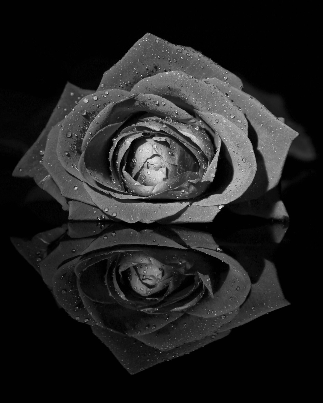
Elegant-055.jpg by Chris Heathcote, on Flickr
 
Last edited:
I like it. It's amazing how removing colour can transform a photograph. It doesn't quite have a sinister feel, but it wouldn't look out of place on a Bram Stoker poster :)

Cheers.
 
Beautiful images Chris.
Got to be number three for me.
The three roses together just look.....right. :)
 
Prefer the original colour version personally. Although the mono conversion definitely brings out the water drops.
 
Personally I'm not a fan of B/W in general, but .... that conversion is nice, works well.
 
I like #1 although I think it could do with a bit more space around it. But I know I like to see lots of space around still life shots...

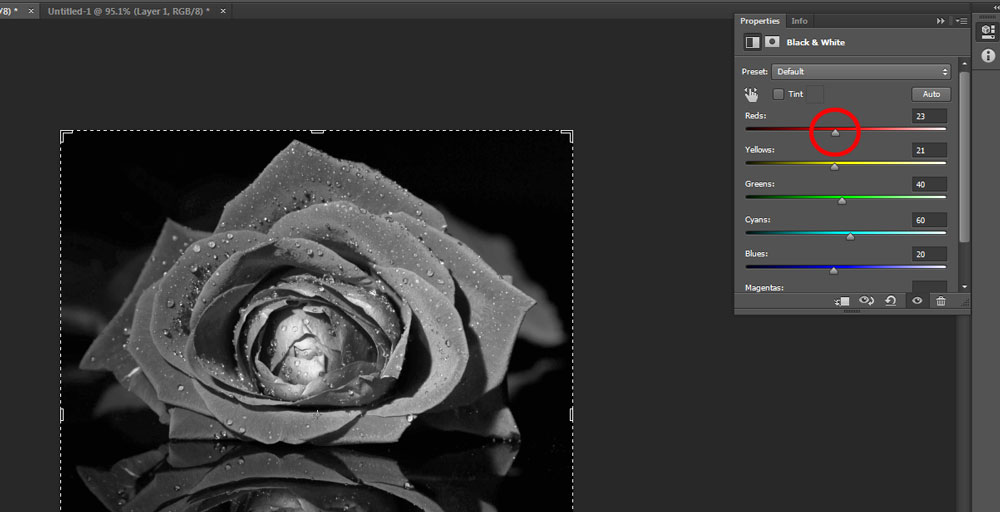
As to the B&W conversion, a shot like this does lend itself well. However, I think the conversion you've done is a bit dark. You have "Edit my images" set to yes, so I've had a play. Let me know if you want me to take these images down.

MDcaT4K.jpg


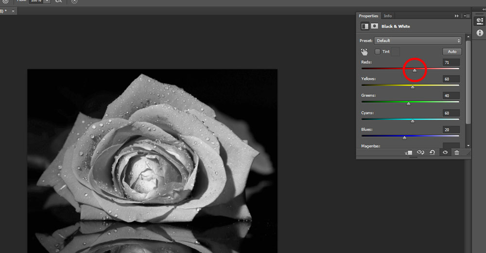
This is a close approximation of your edit. In Photoshop (although most other software has this functionality) you get the sliders for colour channels. Because the rose is predominantly red, you only need to play with the red channel. In B&W shots, I like to see a range of tones from black - white, so pushing the red channel up a bit has this effect.

ptN0OFg.jpg


It's extreme in this case to illustrate the point, but control over these colour channels when doing a B&W conversion is really helpful and in most cases essential. Also, if you're going B&W don't be afraid to push the levels & saturation before you start!
 
I like #1 although I think it could do with a bit more space around it. But I know I like to see lots of space around still life shots...

As to the B&W conversion, a shot like this does lend itself well. However, I think the conversion you've done is a bit dark. You have "Edit my images" set to yes, so I've had a play. Let me know if you want me to take these images down.


This is a close approximation of your edit. In Photoshop (although most other software has this functionality) you get the sliders for colour channels. Because the rose is predominantly red, you only need to play with the red channel. In B&W shots, I like to see a range of tones from black - white, so pushing the red channel up a bit has this effect.


It's extreme in this case to illustrate the point, but control over these colour channels when doing a B&W conversion is really helpful and in most cases essential. Also, if you're going B&W don't be afraid to push the levels & saturation before you start!

Thanks for that Harlequin. As this is the first time I've properly tried to convert to B/W, I was hoping for this kind of feedback, so I don't mind you playing with them at all.

I like it. It's amazing how removing colour can transform a photograph. It doesn't quite have a sinister feel, but it wouldn't look out of place on a Bram Stoker poster :)

Cheers.

Totally agree, it feels completely different to me. I still don't know if I'm a convert to B/W but hey its OK :)

Beautiful images Chris.
Got to be number three for me.
The three roses together just look.....right. :)

And we have a difference of opinion, just when I was starting to wonder why I bothered with the rest :) Thanks Ruth

Prefer the original colour version personally. Although the mono conversion definitely brings out the water drops.

Thanks Mandy, I agree about it lifting the details, but overall I still think the colour is the better shot

Elegant - number 1 for me very simple and elegant.

Thanks Mandy

Love number 1 ( in Colour) it's beautiful!

I'm glad you like it :)

Personally I'm not a fan of B/W in general, but .... that conversion is nice, works well.

Me neither, and normally I wouldn't have bothered however on this occasion it was a specific request, and although I'm not a fan and prefer the original, if I saw it on another thread I would probably click on it and comment :)
 
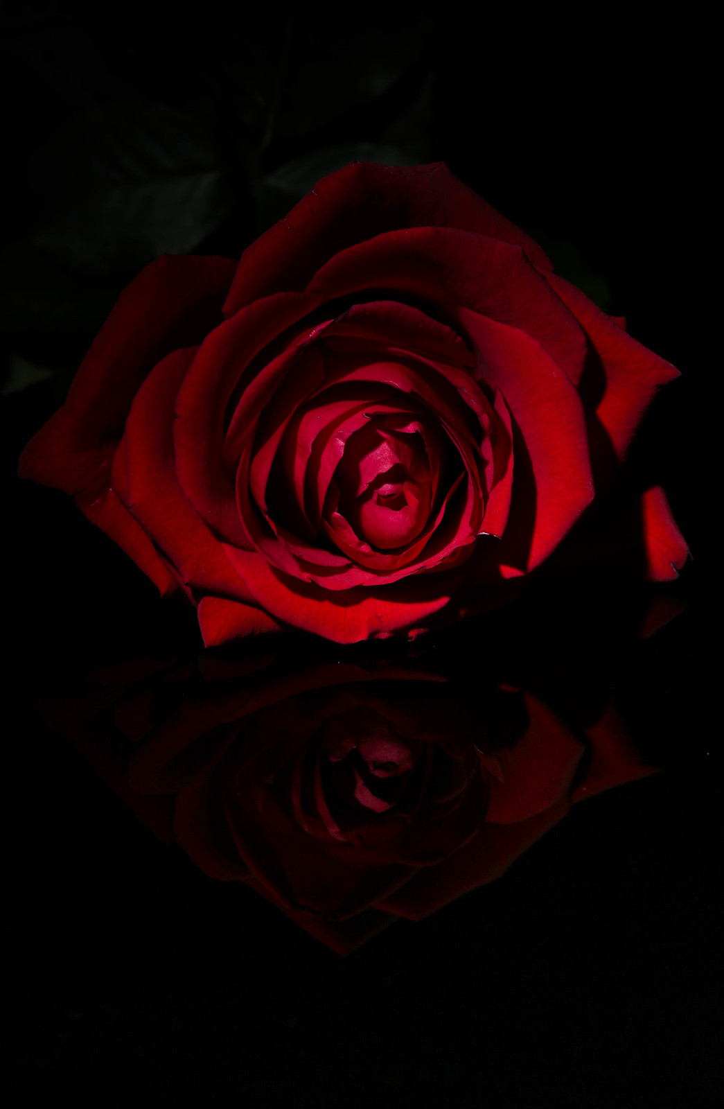
Just to show how this shot evolved I thought I'd post the first shot I took for comparison I have also detailed the how to. (Oooh a magician should never tell ;) )

Elegant-019.jpg by Chris Heathcote, on Flickr

This was taken using a 430exii position at about 7/8 o'clock (camera at 6 o'clock). The flash had a 16 degree grid fitted (25 degree & 45 degree stacked). I removed the 25 degree grid and moved it slightly more towards 8 o'clock. The droplets I added using a 25% mixture of Glycerin and water inside an Ikea spray bottle.

I've often wondered how shots were created and originally wondered if it was in PP etc. So I thought I'd share my "how to" in an effort to help/inspire others, it really is the little details that seem to matter.

And with regards to PP heres the LR trail. (the spot removal was to take off the white line, on one of the petals, however the final "update removal" prior to export was to delete the change as I preferred it and it was also present in the reflection which then looked odd.)

View attachment 30212
 
Last edited:
Thanks
Hi Chris
you have been a busy chap.

they are all great photos.
But love number 1.. Live the B+W conversion.
But just love the colours and reflection in the original

Thanks Darren

As you can tell I've enjoyed this week :) However I think next week I might need to pay a little more attention to the wife, before I have to sell my gear to fund a costly divorce :D
 
Just to show how this shot evolved I thought I'd post the first shot I took for comparison I have also detailed the how to. (Oooh a magician should never tell ;) )

Elegant-019.jpg by Chris Heathcote, on Flickr

This was taken using a 430exii position at about 7/8 o'clock (camera at 6 o'clock). The flash had a 16 degree grid fitted (25 degree & 45 degree stacked). I removed the 25 degree grid and moved it slightly more towards 8 o'clock. The droplets I added using a 25% mixture of Glycerin and water inside an Ikea spray bottle.

I've often wondered how shots were created and originally wondered if it was in PP etc. So I thought I'd share my "how to" in an effort to help/inspire others, it really is the little details that seem to matter.

And with regards to PP heres the LR trail. (the spot removal was to take off the white line, on one of the petals, however the final "update removal" prior to export was to delete the change as I preferred it and it was also present in the reflection which then looked odd.)

View attachment 30212
Thank you for sharing the "How To" very useful information indeed. Hopefully i will put into practice one day.
 
Elegant - No. 1 for me hands down. Fantastic shot. Really fits the theme. I prefer the colour version too. Thanks for letting out your processing secrets (y)
 
Hi Chris :)

Companions - Nice capture, I quite like the branch intruding in on the shot, helps the covert sort of feel, well spotted and for not being spotted (y)

Elegant - Damn that is plenty of edits, too many for my spreadsheet to handle :D

Of them all I prefer you initial first shot, love the colour, superb detail especially the water drops, real nice reflection too - nice one :clap:
 
Thank you for sharing the "How To" very useful information indeed. Hopefully i will put into practice one day.

Elegant - No. 1 for me hands down. Fantastic shot. Really fits the theme. I prefer the colour version too. Thanks for letting out your processing secrets (y)

Glad you both like it and you're welcome for the tips. Quite often when I see a picture I like, I wonder what techniques they used.

#1 for me too, absolutely stunning and well done on the international interest :clap::clap::clap:

Thanks Jill, it's my first magazine request so I'm properly chuffed :D

Hi Chris :)

Companions - Nice capture, I quite like the branch intruding in on the shot, helps the covert sort of feel, well spotted and for not being spotted (y)

Elegant - Damn that is plenty of edits, too many for my spreadsheet to handle :D

Of them all I prefer you initial first shot, love the colour, superb detail especially the water drops, real nice reflection too - nice one :clap:

Thanks Dean, I'm not sure how I wasn't spotted, pointing the 120-300 with 2x at them. as for the edits I make it 4 images with 1 edit. Of the others 1 wasn't my edit and the final wasn't a submission, just to show the journey from initial idea to final image. :D
 
Hi Chris... Nice capture for Companions but the leaves TR are distracting to me... shame!

Elegant - that's a belter of the rose lying on the glossy black surface. Super! Wonderful lighting, lovely detail on the water spray and perfect choice of DOF. Absolutely elegant!

Well done on the magazine interest... well deserved IMO!
 
Hi Chris


like the abstract feel & pastel colrs to #1 BUT

#2...now that is super...perfect crop ,super sharp & great blending of the water to the red color ( was it the other way round ?) , really well it & just..yeah love it :clap: Only minor crit , when viewed large on flickr you can see the dust speckles on the glass......:exit:
 
:clap: you made it.

Watery #1 for me. Nice abstract submission with good detail. I like the square crop,

Cheers.

Thanks, Andy. This was my first time with anything like this, it kind of came out as I wanted. :)

Hi Chris


like the abstract feel & pastel colrs to #1 BUT

#2...now that is super...perfect crop ,super sharp & great blending of the water to the red color ( was it the other way round ?) , really well it & just..yeah love it :clap: Only minor crit , when viewed large on flickr you can see the dust speckles on the glass......:exit:

Thanks Lynne, I thought I'd polished the glass to within an inch of its life :) Yes it was all water, no food colouring or any other additives used at all. The colour was added using gelled lights :)
 
Loving the first Watery shot Chris....rightup my street.
2nd if fab too. Really like the change of water from clear to red. Nice one.
Now...what was all the fuss about? :)
 
Good stuff Chris ...

Watery #2 is an excellent image and very cleverly lit.
Watery #1 oozes watery, an excellent interpretation of the theme, and it's right up my street too!
 
Chris, I think Number 1 is excellent, great colours and take on the theme "Watery"

Phil
 
Hi Chris, really like the 1st one there, superb punchy and bright colours and I like the patterns too.

Thanks Michael, glad you like it :)
Loving the first Watery shot Chris....rightup my street.
2nd if fab too. Really like the change of water from clear to red. Nice one.
Now...what was all the fuss about? :)

Thanks Ruth, what fuss? ;) may have been a few mind games going on :) glad they work for you
Good stuff Chris ...

Watery #2 is an excellent image and very cleverly lit.
Watery #1 oozes watery, an excellent interpretation of the theme, and it's right up my street too!
Thanks, glad it hits the spot. TBH no 1 is my main submission, no 2 was an archive that I thought also fitted the bill.
Chris, I think Number 1 is excellent, great colours and take on the theme "Watery"

Phil
Thanks Phil
 
Watery - really like the 1st one, colourful, abstract and love the square crop :)
2nd one is great too but think the first one is my favourite.
 
What's not to like? its pink :D

nice concept on #2 as well Chris (y)
 
Watery. 2 lovely images, one nice pastel abstract. 2nd love the composition and the red bubbles look awesome when viewed on flickr. How on earth did you blend?????
 
Hi Chris,

Watery - both well on theme. There's nice detail in the first shot, but the second is my favourite - very cleverly done - love it
 
Hi Chris, after all that bleating on about having no time you come up with two cracking shots. Love #1, a fantastic abstract (y), as for #2 not a clue how you did that but a fab interpretation :clap::clap::clap:
 
Wow 2 great watery shots there Chris! Clever lighting on the second one - well done! The first ones my favourite out of these though - love the vivid colours
 
Like how this fills the frame, just a tad tight rhs. Lovely lighting.
 
Back
Top