You are using an out of date browser. It may not display this or other websites correctly.
You should upgrade or use an alternative browser.
You should upgrade or use an alternative browser.
weekly Downton Mini's '52 for 2016 Week 52 Celebration THe FInal Chapter!!!
- Thread starter DowntonMini
- Start date
- Messages
- 3,925
- Name
- Carl
- Edit My Images
- Yes
Dog Mooring by a country mile ... or maybe after a country mile. It has curiosity value plus I do like the bg and colour. Fabulous.
LC2
Negan
- Messages
- 10,459
- Name
- Tim
- Edit My Images
- Yes
Simple - The first shot for me Mark, the deeper DoF helps imo, and the leading lines work better as they are sharper. Good idea to put it at the centre of the cross.
Sign - I like the brightness of the narrow boat's sign, but losing the bottom corner by the side (I'm guessing engine room) doors detracts a bit. Regardless I prefer the simplicity of the first shot and the under-statedness(sic) of the sign.
Metal Reshoot - Oi Oi !!! I prefer the first to the second as the lighting in the second is very flat and I would say the colour balance looks off.
Flora - The flowers are well taken, but actually I prefer the dog mooring sign on the wall of (I presume) a chandlers.
Sign - I like the brightness of the narrow boat's sign, but losing the bottom corner by the side (I'm guessing engine room) doors detracts a bit. Regardless I prefer the simplicity of the first shot and the under-statedness(sic) of the sign.
Metal Reshoot - Oi Oi !!!
Flora - The flowers are well taken, but actually I prefer the dog mooring sign on the wall of (I presume) a chandlers.
- Messages
- 4,182
- Name
- Paul
- Edit My Images
- Yes
Love the dog mooring sign! The tea room one is probably a slightly stronger capture (technically) but I prefer the concept of dog mooring!
The flower shots are just suffering from the background behind them... easily fixed when you reshoot by turn to another angle! Good first attempt
The flower shots are just suffering from the background behind them... easily fixed when you reshoot by turn to another angle! Good first attempt
Minx
Papillon
- Messages
- 2,516
- Edit My Images
- Yes
signs - I really like the barge. the toy emporium needs a brighter day. and the 4th one is spot on theme.
metal reshoot - good choice
old reshoot - shame about the light an interesting old building
flora - I like both the signs especially the humor of the dog mooring.
metal reshoot - good choice
old reshoot - shame about the light an interesting old building
flora - I like both the signs especially the humor of the dog mooring.
- Messages
- 4,562
- Name
- Mark Gameson
- Edit My Images
- Yes
Hmmmm tough choice Mark, love the yellow flowers but the Brick weave background is off-putting, a real nice colour and good detail... so I'm choosing the 'Tea Room' sign, nice and different and a pleasant DoF too
Tea room for me too although Dog Mooring sounds intriguingPerhaps they could also have a Child Mooring sign too

They all lovely shots but the Dog Mooring with the handle (I presumed its for 'mooring' the dog while the owner went for a pint!) makes me smile.
Signs are great Mark, I like the dog mooring tbh but really like the handmade tea room sign with the detail of the brush strokes. Craftsmanship much better than a laser printed vinyl
Dog Mooring by a country mile ... or maybe after a country mile. It has curiosity value plus I do like the bg and colour. Fabulous.
LOL Dog mooring, like everyone else it made grin Nice find Mark
I'm guessing Dog Mooring is by a canal, nice find. The yellow flowers are nice but I'm not sure about the angle, the tea room sign does the job nicely though.
I like the floral signs, is Llangollen the place where there is a big viaduct which carries the barges
Simple - The first shot for me Mark, the deeper DoF helps imo, and the leading lines work better as they are sharper. Good idea to put it at the centre of the cross.
Sign - I like the brightness of the narrow boat's sign, but losing the bottom corner by the side (I'm guessing engine room) doors detracts a bit. Regardless I prefer the simplicity of the first shot and the under-statedness(sic) of the sign.
Metal Reshoot - Oi Oi !!!I prefer the first to the second as the lighting in the second is very flat and I would say the colour balance looks off.
Flora - The flowers are well taken, but actually I prefer the dog mooring sign on the wall of (I presume) a chandlers.
Couple of nice Flora signs there. Nice find and it's always good to see something different for the theme.
Love the dog mooring sign! The tea room one is probably a slightly stronger capture (technically) but I prefer the concept of dog mooring!
The flower shots are just suffering from the background behind them... easily fixed when you reshoot by turn to another angle! Good first attempt
It has to be the Dog Mooring sign Mark ....what a great find and a super sign, I've not seen one like that before. The lily is a beauty but I have to agree on the background, it's sometimes awkward to find the right angle isn't it.
signs - I really like the barge. the toy emporium needs a brighter day. and the 4th one is spot on theme.
metal reshoot - good choice
old reshoot - shame about the light an interesting old building
flora - I like both the signs especially the humor of the dog mooring.
Thank you all for your comments really appreciate them.
The lily's were taken in my front garden well bparder I was hoping the ones n the back garden would have been in flower but they ween't playing ball
The Dog Mooring was out side the Tea Room I really wanted a dog tied to it but I think they were all in hiding
- Messages
- 4,562
- Name
- Mark Gameson
- Edit My Images
- Yes
Week 27 Activity
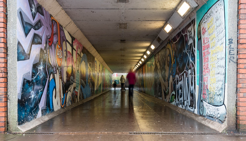
Found this on a but of a struggle managed to get this image but not really happy with it so I've included an Archive shoot too (this shoot came third in the print set subject of Life in Motion in our club competition earlier this year
 ACTIVITY2 by Mark Gameson, on Flickr
 ACTIVITY by Mark Gameson, on Flickr
Found this on a but of a struggle managed to get this image but not really happy with it so I've included an Archive shoot too (this shoot came third in the print set subject of Life in Motion in our club competition earlier this year
 ACTIVITY2 by Mark Gameson, on Flickr
 ACTIVITY by Mark Gameson, on Flickr
- Messages
- 3,925
- Name
- Carl
- Edit My Images
- Yes
Definitely the underpass Mark - it has artistic input in the form of movement blur and several points of interest to hold the viewers attention. Congrats on the third place 

- Messages
- 13,760
- Edit My Images
- Yes
Underpass for me too Mark, I'd have loved to see a bit more of the top of the frame or equally cropped at the bottom... I know, OCD 
- Messages
- 4,562
- Name
- Mark Gameson
- Edit My Images
- Yes
Nice takes, underpass edges it for me, colourful, and i like the bler in the people, nicely framed
Thanks Walter
Underpass for me, the blur on the people gives a good sense of activity
Thanks Chris I had fun taking this set!
Underpass for me too Mark, someone's been busy in there, I like the slightly ghostly blurred figures with their long shadows.
Thanks Susie
Definitely the underpass I would have probably cropped it sides and bottom but it got you third place so what would I know
Thanks Allan never thougtht about cropping it a bit more I will have a look.
Underpass for me too Mark, a little action going on among the colours.
Thanks Chris the Graffiti was an organsised thing a few years ago it looks really cool but other idiots have started painting their names etc over the artwork
Definitely the underpass Mark - it has artistic input in the form of movement blur and several points of interest to hold the viewers attention. Congrats on the third place
Thanks Carl I was just a little cuffed
Ditto. For pretty much the same reasons + I quite enjoy Urban Art.
Thanks TIm
Yes, I agree with everyone who posted above, the underpass!
Thanks Bernd
Underpass for me too Mark, I'd have loved to see a bit more of the top of the frame or equally cropped at the bottom... I know, OCD
Thanks Dean just done a quick crop
 ACTIVITY by Mark Gameson, on Flickr
- Messages
- 13,760
- Edit My Images
- Yes
Yep that works better for me, whats your thoughts ??
- Messages
- 4,562
- Name
- Mark Gameson
- Edit My Images
- Yes
Yep that works better for me, whats your thoughts ??
I think it's improved it I was tempted to crop the brickwork off the sides but I think it help pull you into the image
- Messages
- 4,562
- Name
- Mark Gameson
- Edit My Images
- Yes
That's a nice shot and the cropped version is more balance. The motion blur work well too.
Thanks Stan
Activity - both fit the theme but the underpass is the better of the 2
Thank you Minx
- Messages
- 4,562
- Name
- Mark Gameson
- Edit My Images
- Yes
On to Week 28 and Life a couple from me for this one
Mom and Dad are away at the moment so I've been looking after their fish and feeding the birds (they eat more then me!!!)
So first off a couple of Pond Life images
 PONDLIFE2 by Mark Gameson, on Flickr
 PONDLIFE by Mark Gameson, on Flickr
Not overly happy with these to be honest so as an added bonus how about
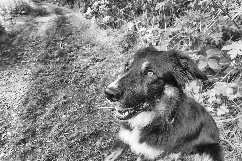
Dogs Life
 DOGS LIFE by Mark Gameson, on Flickr
Mom and Dad are away at the moment so I've been looking after their fish and feeding the birds (they eat more then me!!!)
So first off a couple of Pond Life images
 PONDLIFE2 by Mark Gameson, on Flickr
 PONDLIFE by Mark Gameson, on Flickr
Not overly happy with these to be honest so as an added bonus how about
Dogs Life
 DOGS LIFE by Mark Gameson, on Flickr
- Messages
- 4,562
- Name
- Mark Gameson
- Edit My Images
- Yes
Week 29 Hidden
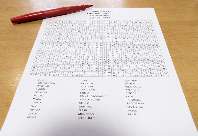
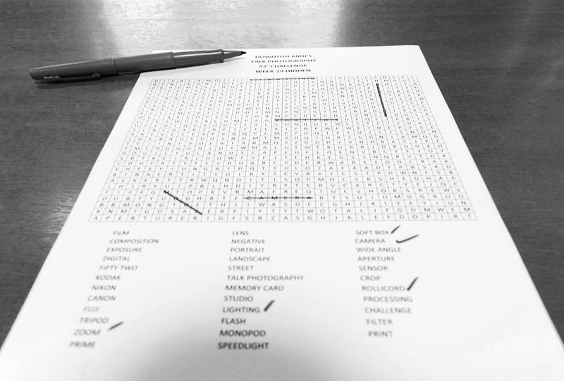
Well this was a challenge and I spent ages looking for hidden items but couldn't find any!! They were obviously very good at hiding so I decided to get creative........
By creating my own photography based word search!
 HIDDEN2 by Mark Gameson, on Flickr
 HIDDEN1 by Mark Gameson, on Flickr
 HIDDEN2 by Mark Gameson, on Flickr
Well this was a challenge and I spent ages looking for hidden items but couldn't find any!! They were obviously very good at hiding so I decided to get creative........
By creating my own photography based word search!
 HIDDEN2 by Mark Gameson, on Flickr
 HIDDEN1 by Mark Gameson, on Flickr
 HIDDEN2 by Mark Gameson, on Flickr
- Messages
- 7,548
- Name
- susie
- Edit My Images
- Yes
Clever you Mark ...this will definitely be the most original one for Hidden, I prefer the first one, I like the bright splashes of red, the only distraction for me is the shadow at the bottom.
I like the open mouthed fish in pond life ...I think he's saying feed me
I like the open mouthed fish in pond life ...I think he's saying feed me
- Messages
- 4,562
- Name
- Mark Gameson
- Edit My Images
- Yes
Clever you Mark ...this will definitely be the most original one for Hidden, I prefer the first one, I like the bright splashes of red, the only distraction for me is the shadow at the bottom.
I like the open mouthed fish in pond life ...I think he's saying feed me
Thanks Susie the shadow is off the camera!! I couldn't move it any further back!
He was saying feed me I had just turned the air bubble pump off ready to feed them the second I walk by the pond they all go mad like they haven't been fed in weeks!

- Messages
- 115,214
- Name
- The real Chris
- Edit My Images
- No
Pond life #1 contains a gob shot, what's not to like? 
Cute looking dog though all the same.
Hidden, clever idea those things drive me nuts TBH.
1st one for me Mark, the red stripes definitely add something to it.
Cute looking dog though all the same.
Hidden, clever idea
1st one for me Mark, the red stripes definitely add something to it.
- Messages
- 3,925
- Name
- Carl
- Edit My Images
- Yes
Well done with Hidden - it is a Susie says, very original. The red stripes add that extra bit of interest and colour so that one for me. As for Life, I like the "gob" shot and the movement you've captured in the fg so #1 for that too. 
