weekly Granddad's 52's - 2017

I agree that I hope to never have to have one used on me or the need to use it on someone else, good to know that they are around if needed though.

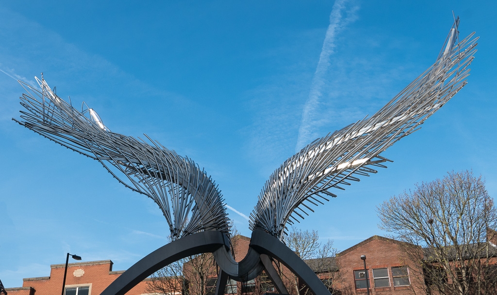
Might have preferred to the shot to have been a bit either more square on or more angled but it's a good clear sharp shot and fits the theme (y)
 
Thanks Steve. Actually I tried a few from different angles, the problem was isolating it from all the junk advertising around it. If anyone did need it the only thing making it stand out from all the cr** is the colour !!
 
I like the numbers with additional stick-on numbers. (y)

... just a thougho_O ... I am wondering what it would look like if, instead of filling the frame with the device, just showed the numbers with handle with some contrasting wood BG RHS.
It wouldn't be clear what it is, but that's not important.
 
That's a really original take on the theme John...something none of us would want to use for sure.
I like the numbers with additional stick-on numbers. (y)

... just a thougho_O ... I am wondering what it would look like if, instead of filling the frame with the device, just showed the numbers with handle with some contrasting wood BG RHS.
It wouldn't be clear what it is, but that's not important.

Thanks Emma, David Yes it's full of numbers. I really got fixated on a church hymn board then a graveyard/war memorial and when I found those used by others it was a bit of a scrabble to find something. I'm not entirely happy with this shot, but it I was just keen to get something in and move on to the next one. Thanks for taking the time to comment.
 
Definitely on theme, and not a subject I think we've seen before. (y)
A couple of suggestions for pp though.
If you could push the whites a bit and perhaps bump the saturation of the green, the image would have more impact
 
all cats are inherently evil, john, many work in government offices on the small print for employment law.....a beautiful cat indeed, and those gooey eyes... got to love cats (y)
 
Very attractive cat, bang on theme, and I like the interesting composition. Maybe it is a tad soft...
 
Aren't almost all cats Evil? I know ours have always been evil masterminds bent on destruction.
There is a touch too shallow a DoF in my opinion, as some of the fur isn't sharp, but indoors, low light? You probably had to shoot wide open to get the exposure without raising the ISO too much.
 
I uploaded this one as an option for last week's attractive theme, but that's perfect timing for darkness falling over Snape Maltings!! Thought I'd get it in before night fell and everybody else rushed out too.


IMG_6694
by granddad john on Talk Photography
 
Last edited:
Very quick off the mark, right on theme, and I like the composition.
 
Lovely shot John, really like the colours, especially the warm amber colours against the greying sky (y)
As much as I don't like cats, i love this photo. Nice one.
Very quick off the mark, right on theme, and I like the composition.
Quick off the mark John, but a lovely warm shot and good composition. Like the lighting in the shot too :)

Thank you all guys. Pure luck that I'd rejected the shot in favour of the cat last week. Also luck that I was down there early for a concert; another 15 minutes and the bg would have gone.
 
Nice compo ... getting the FG steps in focus. Nice job. (y)
 
That works really well John, you've caught the blue hour before the sky goes black well, and the blues really emphasise the warm colours coming through the windows.
(y)

Hi, dark(ness) wonderfully complementing oranges and blues.

Crit, maybe a little darker...

Cheers.

Nice compo ... getting the FG steps in focus. Nice job. (y)

Thank you guys. I'm glad I was there and that I took the camera, even if it wasn't for a darkness shot.

Love the expression on the cats face John, smashing idea also for dark, composition works really well.

Thank you Susuie. Don't let the innocent expression fool you; she hates being handled and lets you know it. But, yes, she is very beautiful ! I think it's a bit soft round the mouth but that may have been movement on her part or the DOF on mine.
The Snape shot came out better than I hoped. I do likethe grey /blue BG and the warmth of the lights.
 
Sizewell A & B at dusk. Tried to get the lines going to a vanishing point but they don't seem to do that. Lots of sizzling standing under these lines; I actually wondered if it would affect the sensor!!


tp 52-9456
by granddad john on Talk Photography
 
Hmm, the wires hurt my eyes. I know they aren't (as I zoomed in) but the pylons look oof (I think it's the power lines that create that effect).
What really intrigues me about the shout though, is the (I assume) golf ball in the background. Some kind of power station I assume.
 
Hmm, the wires hurt my eyes. I know they aren't (as I zoomed in) but the pylons look oof (I think it's the power lines that create that effect).
What really intrigues me about the shout though, is the (I assume) golf ball in the background. Some kind of power station I assume.

Perhaps it's the static Tim;). The golf ball is the reactor for Sizewell B, still working. The grey concrete block is the old decommissioned Sizewell A reactor building. Behind the trees on the left is the site for the new Sizewell C (if it ever gets built!) So no shortage of pylons and sparks in Suffolk then:D
 
Great shot for Power the cables leading to the Power station draw your eyes through the image.
 
Great composition for power, I like how the lines lead the eye directly to the power station.
 
Above: The Angel at Islington this morning. Wanted to get closer but didn't have a wide angel with me. Also surrounded by buildings; the whole structure has a bl***y "Mr Pretzel" kiosk right underneath!! Perhaps it's the Archangel Pretzel, one of the lesser known of the heavenly host

URL=https://www.talkphotography.co.uk/gallery/photos/tp-52-1010708.16002/]
17989-1491231309-712629d7e79b2e6e03c900b41525f343.jpg
[/URL]
tp 52-1010708 by granddad john on Talk Photography
 
Last edited:
Pity about the buildings looks like a fascinating piece of art work
 
Pity about the buildings looks like a fascinating piece of art work

Agree with Allan, it is a shame about the buildings :)

Thanks guys. Yes it was difficult to cut out the surroundings, which is why I wanted to get right underneath, but then the commercial stuff intruded. This was the best of half a dozen different views of the artwork. As you say a shame! Ilike the subject but getting a shot that does it justice was tricky. Next time I'm down there I'll try a night shot.
 
Back
Top