weekly Granddad's 52's - 2017

Very nice composition, a slight nit-pick is that the rock looks a little soft with the focus on the hand-lens, but nicely put together.

I know. That was one of the lighting isues; that bit of rock was quite worn and I couldn't make it sparkle without lighting the plastic. I agree it spoils the impact.

plagioclase feldspar, now there's a word I have not heard for 25 years!

Sorry but these things always come back to haunt you:rolleyes: It could have been worse, I started out with a piece of Lewissian schist but it didn't photo well !!;)
 
some nice props, an old lump of rock for paperweight ...works well.
 
Ya big soppy git ;)

Nah, works well. Nicely composed, and nice colours.

I'd prefer 3 of the same hearts art the top, different sizes.

Cheers.
 
I'd prefer 3 of the same hearts art the top, different sizes

Very colourful :) I think just adding one extra heart the same as the two tone green ones would work well - something about threes :)

Thanks guys, Yes you're right. It would have looked better; it was just a question of grabbing what was available at the moment away from home.

I did learn some stuff about lighting and exposure for white paper however, so not a complete waste !!
 
Spot on John - works really well against that plain white bg - make the colours pop.
 
Hi John

Nice work ... yes there's something about three!

I take it the green is photographed and the pink is shopped ?? Anyway perhaps the green paper/card alone would work?
 
B&W for me, very good composition with the structure leading the eye into the frame. Nice light too, and good B&W conversion.
 
Strangely, I think the colour version works best, specifically the contrast between yellow and blue. The perspective is great with those shapes going off to the vanishing point.
 
Prefer the B&W, nice stark image and like how the repetitive structure disappears in to the distance. (y)
 
Hi Granddad John,
Mineral - Clever idea. I think I prefer the second shot, with the rumpled map due to it being a closer shot. That it's slightly creased only adds to the realness of the image.
Whole(hearted) - Another clever take on the theme. Good use of complimentary colours with the pink & green.
Structure - Whilst I like the second image, for the colours you've captured, I tend to agree that the B&W it the right choice. I think because it helps portray a gritty scene, and also the clouds appear more ominous.
 
Nice find for Structure ... colour for me, gets me looking around the picture some more.
 
all spot on for the routine. structure definitely my favourite (B&W version), love how they seem to endlessly fade away into the background.
routine - prefer a full english :D
 
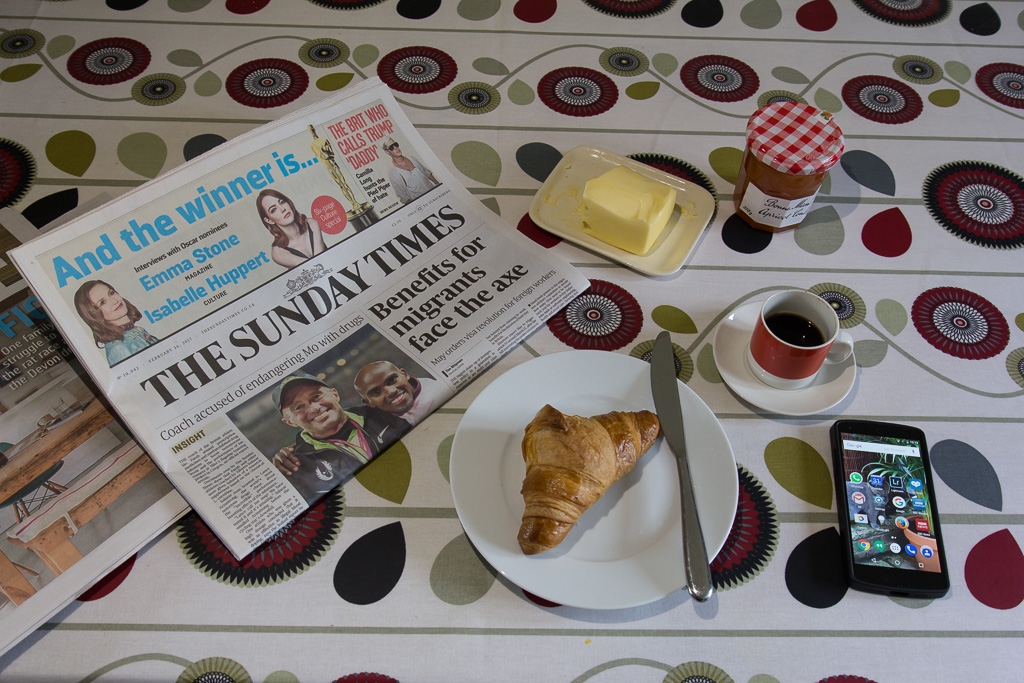
I like this, its simple and effective and spot on theme. Always nice to see a proper butter dish with some proper butter on it too. :) maybe a lower angle would have made it a little bit more adventurous adding some depth to the items on the table?
 
Nice one for the theme John. I think the angle's good, layout is good, not too tight in the frame.

Just a couple of minor points ... it could be rotated CCW, and that yellow speck FG.

But it's good. (y)
 
A good Routine shot John, nicely laid out, for me though just one newspaper though :)

routine - prefer a full english :D

I like this, its simple and effective and spot on theme. Always nice to see a proper butter dish with some proper butter on it too. :) maybe a lower angle would have made it a little bit more adventurous adding some depth to the items on the table?

Nice one for the theme John. I think the angle's good, layout is good, not too tight in the frame.

Just a couple of minor points ... it could be rotated CCW, and that yellow speck FG.

But it's good. (y)

Hi John ...that's a perfect idea for Routine, it looks a little bit static, but it's all there ready for you to enjoy.

Thanks all; yes, it's a bit tidy but it got messier when I started eating the croissant with crumbs everywhere. I never noticed the yellow mark at the time, a previous curry perhaps!
 
Well done, a nice breakfast and a good read, a good start to the day.:)
 
The old quay at Walberswick

tp 52_7-9419
by granddad john on Talk Photography

...and the coloured version. Liked the lichen colours but thought the shapes were more striking in B&W. If I'd got up earlier I'd have got better sky but can't have everything!


tp 52_7-9423
by granddad john on Talk Photography

Definitely the B&W version, very striking and loving the way it leads you into the picture and across the water. The colour just looks muddy.
Walberswick
 
Hoping never to need these particular numbers, either on the receiving end or needing access for someone else!

All the good ideas were grabbed early on, I should have got out there last week. Desperately trying to get something before tonight.

tp52_9-1010687
by granddad john on Talk Photography
 
Last edited:
Back
Top