Hadrons 52 for 21 Week 52 - Showcase (Done and dusted)

It does look a little over-manipulated but I don't think that harms the inherent attractiveness of the image; I rather like it. The blokey in one of the doorways gives it scale too.
 
Pattern
Ok, so maybe a little tenuous, but only ever so little. The fact it was not taken at the best time of day, I reckon you managed pretty well. I like the vignette and sky.
 
Week 22 - Up close. This is probably a bit of a shoehorn but what the hell, a magnifying glass to aid with getting up close to a book (probably should have tried to find a slightly more aesthetically pleasing magnifier but this was the best I could lay my hands on) :)

Up close by James, on Flickr
 
That works, no shoe horn required (y)
 
I've seen shoehorns galore in this forum, this isn't one of them; seems absolutely fine to me. My only crit is that there is a tranche of in-focus writing and it would be nice if the magnifier was right in the middle of it, other than that it's a very nice image.
 
Patterns. The windows and stonework make the patterns, so it fits the bill for me. I like that you have a person in it too - adds that bit more interest.

Up Close. Fits the theme perfectly I'd say. Very nice composition.
 
Up close
I wouldn't call that a shoehorn, more like lateral thinking. Good lighting and focus.
 
That works, no shoe horn required (y)
I've seen shoehorns galore in this forum, this isn't one of them; seems absolutely fine to me. My only crit is that there is a tranche of in-focus writing and it would be nice if the magnifier was right in the middle of it, other than that it's a very nice image.
Don't think that's a shoehorn at all, it's a cool close up shot and like the dof.
Not a shoehorn for me. A good take on the theme and nicely composed.
Patterns. The windows and stonework make the patterns, so it fits the bill for me. I like that you have a person in it too - adds that bit more interest.

Up Close. Fits the theme perfectly I'd say. Very nice composition.
Up close
I wouldn't call that a shoehorn, more like lateral thinking. Good lighting and focus.
Bang on theme for me too. It has a real classic feel.
Thanks for the vote of confidence folks, it still feels like it was a bit of a stretch for the theme but I'll graciously accept the acceptance :)
 
Week 23 - Personal and Technique.. Negative space.
This is about the best I can come up with for this week, my Personal effects, or at least the ones that pretty much never leave my person :)

Peronal by James, on Flickr
 
I think the "lived in" iPhone adds that sense of personal to it. It's not just a collection of things, but a collection of your things. Very much on theme and the composition works really well. I think my "tidyness" would want the subject central vertically but to be honest, the phone is the subject for me which is perfectly balanced.
 
That's a good idea for the theme and tells the view something about you as a person. The composition adds interest and I like the dark background.
 
A nice little personal collection (y)
 
Personal
Well I'm going to say it's a great idea, because I was going to do the same. The negative space works, although it could be cropped a little bit in the left.
 
Up close
Not a shoehorn, if anything you have two elements meeting the tbeme, maybe raising the magnifying glass could have been considered to have shown a specific area, even better if the words were related to the theme

Personal
A nice composition that maybe has just a bit too much empty space, the background works well with the object spacing, did you try different permutations or did their dimensions immediately identify the best layout?
 
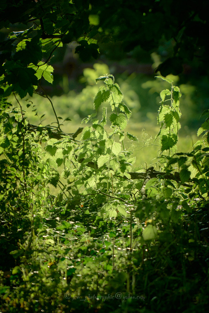
Week 24 - Green.
Apologies (I feel like I'm saying the same thing every week at the moment) for the lack of commenting I will try and catch up at some point but I'm struggling to even fit in finding the time to grab an image for the theme. On that note may I present Green (I'm not sure whether its because I'm knackered but I seem to be having a real issue judging the saturation levels so It'll be interesting to see if I've over done it a bit here).
Thanks for looking. James :)

Green by James, on Flickr
 
Looks good to me!
 
Green
There doesn't seem to be anything wrong with the saturation. A nice bit of natural vignetting.
 
Thanks for the feedback one and all, it's at least allowed me to trust my eyes a little more than I was :)
 
Week 25 - Snappers choice.
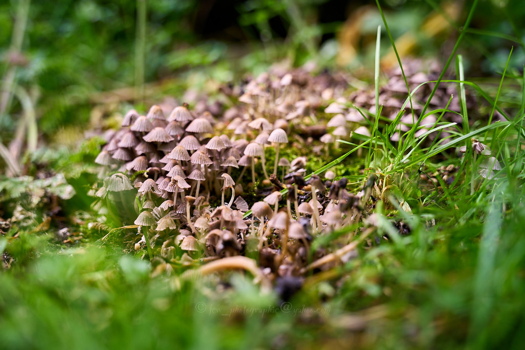
These small toadstools come up in our garden every year with out fail and always fascinate me. When we first moved in here about 16 years ago they grew on an old rotten tree stump which has now long gone but they still return in that spot :)

Snappers choice by James, on Flickr
 
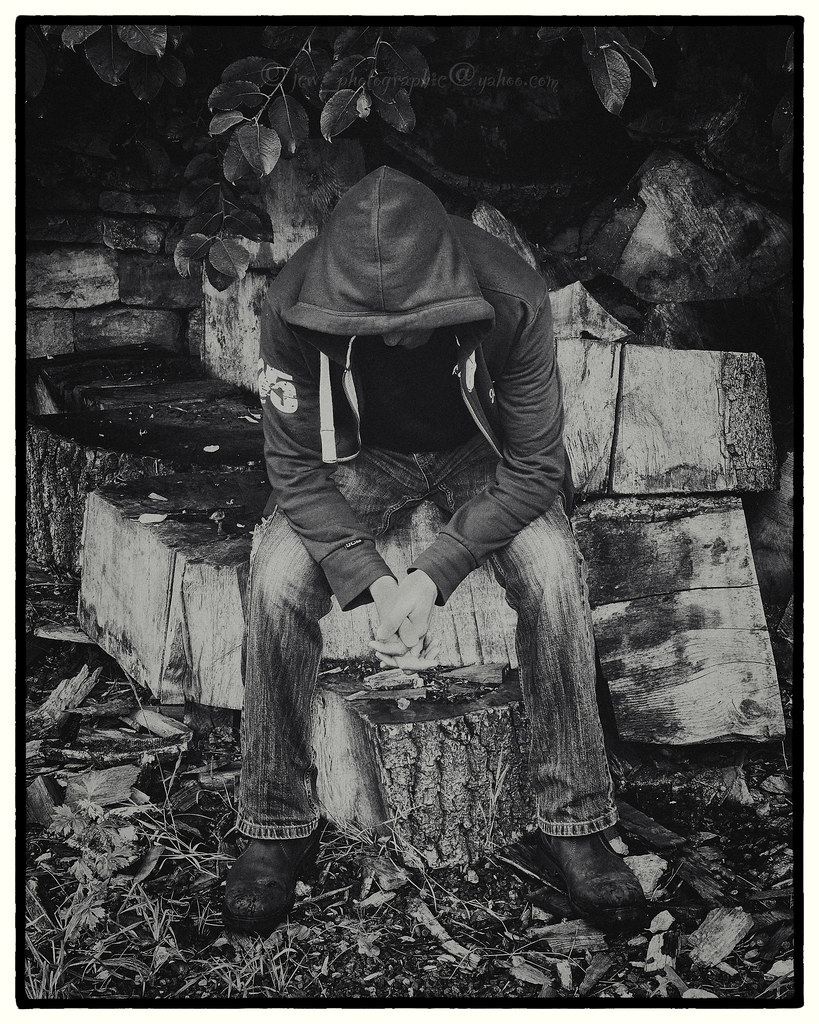
Looking down. This is a bit of a rush job this week taken just to try and get something in before next weeks theme is announced.

Looking down by James, on Flickr
 
Great shot, bang on theme. Love that it's mono. So many interpretations to this......
 
Looking down
It doesn't look particularly rushed.
It's quite a contrasty black & white and I like that, it's a bit grungy.
 
Yes, good in black and white, hands look a bit weird though.
 
Week 27..Indigenous
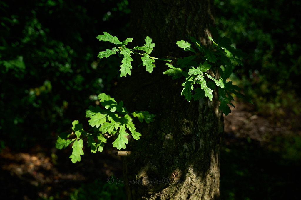
This has certainly been an interesting theme and this is the best I can come up with....an Indigenous tree species, the good old English Oak. This particular example has particular significance to me as I planted it as a small child with my parents and it still grows healthily in the farm yard.

Indigenous by James, on Flickr
 
Now THAT is mildly annoying. I am sitting in my garden this evening thinking 'what do I know that is indigenous to the UK?' I start looking at my oak trees, I think' ah, oak trees', just as your picture crops up on my tablet. Think again, Martin, think again.
 
It looks very healthy - nice back story. The light on the leaves and trunk against the dark background work well.
 
Looking down: tells quite a story I wonder what's going on with him.

Indigenous: the light on the leaves has been caught really well with this.
 
Indigenous
You don't get much more indigenous than an English Oak. A nice bit of light illuminating the leaves.
 
Week 28 - Plant.
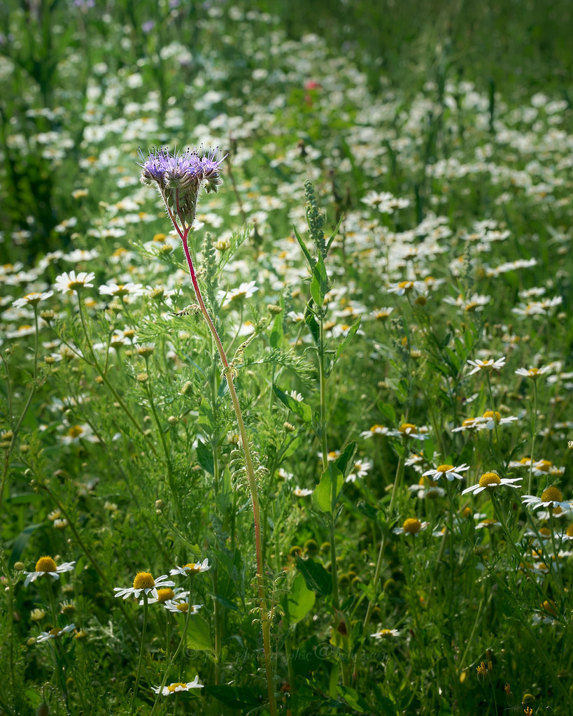
This is just a quick snap taken in one of the environmental plots on our farm that have become a bit of a pet project of mine. The purple(ish) flowering plant is Phacelia and forms the most colourful component of this particular plot that is designed to give insects (bumble bees in particular) a bit of a helping hand :)

Plant by James, on Flickr
 
Plant
I can understand why you've gone wide on this, but the detail in the flower when zoomed in is great, it's a really good looking plant.
 
Back
Top