You are using an out of date browser. It may not display this or other websites correctly.
You should upgrade or use an alternative browser.
You should upgrade or use an alternative browser.
weekly Hertsmans 52 for 2017 Rustic,Festive, weather added-and DONE !
- Thread starter Hertsman
- Start date
- Messages
- 9,077
- Name
- David
- Edit My Images
- Yes
Hard to do white on white but you have done a really good job the teacup is still defined against the BG with some nice shadow, very good indeed
 ... and Allan's our white on white expert. Good work Mark.
 BTW your link on the main thread is not working for me.
- Messages
- 3,413
- Name
- Mark
- Edit My Images
- Yes
Hard to do white on white but you have done a really good job the teacup is still defined against the BG with some nice shadow, very good indeed
Thank you Allan
, very good and very minimal, got to be a serious contender for photo of the week I think.
BTW the link from the main Photos thread isn't working
Cheers Chris, thats praise indeed....
Not to easy to do white on white but you have done a damn good job Mark, like that you over exposed the shot too and like the faint shadow from the cup
Superb shot Mark...can't fault it
I echo others comments. Cracking shot and perfect fit to the theme. Excellent
What other said, that just captured the essence of the theme and still managed the separate the subject from the background.
Great minimalist(ic) photo, very well exposed, and very well composed. A winner.
... and Allan's our white on white expert. Good work Mark.
BTW your link on the main thread is not working for me.
Guys, Im really pleased you liked the shot, and thank you for the input - its always nice to get positive crits.
This shot came together so fast (think 8 frames and ten minutes in LR) Im almost gobsmacked at the amounnt of love its recieved.....
I guess on occasion the idea is strong enough and it all comes togther.
For the record, Ive never done anyhting high key like this before either....
- Messages
- 3,413
- Name
- Mark
- Edit My Images
- Yes
- Messages
- 485
- Name
- Chris
- Edit My Images
- Yes
Been a bit slow on the feedback lately 
Minimalist - A great shot with just the right amount of light and shadow.
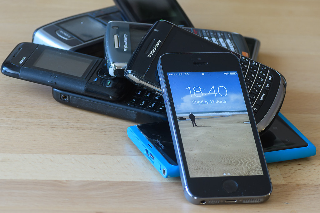
Progress - I think most of us have a pile like that somewhere!
Minimalist - A great shot with just the right amount of light and shadow.
Progress - I think most of us have a pile like that somewhere!
- Messages
- 9,077
- Name
- David
- Edit My Images
- Yes
... like the Evolve theme ... works well. There are different ways of setting this up and/or cropping ... just scrolling down the page, I quite like losing a little off the top, mostly tabletop, just clipping the corner of the two BlackBerrys. Hmmmm ... 
- Messages
- 3,413
- Name
- Mark
- Edit My Images
- Yes
Its a difficult theme, but that works well I like that they are in a heap rather than in any order
Progress of mobile phones in a heap, on theme I think so on to next weeks
Been a bit slow on the feedback lately
Minimalist - A great shot with just the right amount of light and shadow.
Progress - I think most of us have a pile like that somewhere!
Wow, you've kept a lot of your old mobile phones... Works well in a heap, and some interesting models there. Good DoF, but I wonder if you should have cropped it differently to keep all your phones in the frame.
Yeah, on theme. I'd prefer them in a line, maybe a shallow dof focusing on the latest version. Maybe that's a little cliche.
Cheers.
... like the Evolve theme ... works well. There are different ways of setting this up and/or cropping ... just scrolling down the page, I quite like losing a little off the top, mostly tabletop, just clipping the corner of the two BlackBerrys. Hmmmm ...
I like the heap. Like Andy I may have gone for shallow DoF with focus on the newest, but that's just subjective.
I bit of feedback though. The crop right up against the Nokia on the left is a bit too tight, it looks accidental.
Thanks all, been very remiss on the commenting of late, hope to improve !
- Messages
- 3,413
- Name
- Mark
- Edit My Images
- Yes
So, we move on to Pleasure and Tiny....
Ive been watching Drag racing since I was 18, which means Ive been going for best part of 35 odd years (!)
One thing that I really admire, and get great pleasure from, is watching the Superstreet bike class.
Current bikes are north of 600 horsepower now, all running very technical turbo and clutch set ups. The best have run down to just under 6 seconds at 220 mph over the quarter mile - on a treaded street legal tyre -no slicks or wheelie bars.
Tuning skills, riding skills and much bravery make the class one of the most interesting in UK drag racing for me.
Heres on of the top UK riders showing what happens when you get the clutch slip vs turbo boost mapping out of sync....
 Summer Nats-3 by Mark P, on Flickr
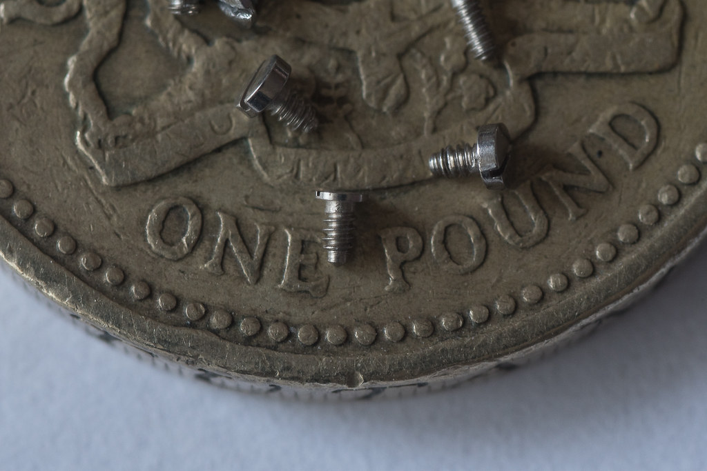
....And I think these little screws certainly class as TINY. They are sitting on a pound coin to try and give some scale....
My other half is a jeweller, so I said I need the smallest screws she had......Could barley see them !
 Tiny by Mark P, on Flickr
Ive been watching Drag racing since I was 18, which means Ive been going for best part of 35 odd years (!)
One thing that I really admire, and get great pleasure from, is watching the Superstreet bike class.
Current bikes are north of 600 horsepower now, all running very technical turbo and clutch set ups. The best have run down to just under 6 seconds at 220 mph over the quarter mile - on a treaded street legal tyre -no slicks or wheelie bars.
Tuning skills, riding skills and much bravery make the class one of the most interesting in UK drag racing for me.
Heres on of the top UK riders showing what happens when you get the clutch slip vs turbo boost mapping out of sync....
 Summer Nats-3 by Mark P, on Flickr
....And I think these little screws certainly class as TINY. They are sitting on a pound coin to try and give some scale....
My other half is a jeweller, so I said I need the smallest screws she had......Could barley see them !
 Tiny by Mark P, on Flickr
Fuji Dave
I'm in Clover
- Messages
- 22,088
- Name
- Dave
- Edit My Images
- No
Loving your pleasure shot Mark, that is some cool bike and pulling a wheelie too, my only grip would be maybe do a letterbox crop to get rid of the walkers feet. Tiny, another nice shot showing how tiny the little screws are while on a pound 
- Messages
- 671
- Name
- Nigel
- Edit My Images
- Yes
Minimalist - Great shot, can t add to what everyone else has said.
Pleasure - Good capture but wonders if it could do with brightening or exposure lifting a tad
Pleasure - Good capture but wonders if it could do with brightening or exposure lifting a tad

- Messages
- 3,413
- Name
- Mark
- Edit My Images
- Yes
Loving your pleasure shot Mark, that is some cool bike and pulling a wheelie too, my only grip would be maybe do a letterbox crop to get rid of the walkers feet. Tiny, another nice shot showing how tiny the little screws are while on a pound
I don't mind the severed feet so much as they are OOF, but composition wise a letterbox crop would work better in my opinion. But very nice panning and cool bike!
Tiny is bang on theme, I like the pound coin you put in for scale.
.... awesome bike shot but may as well crop the top.
Plus great detail in the £ coin to give scale. They do say 3 is the magic number ... so would be nice if the other 3 cropped screws were removed.
Love the Pleasure shot being a biker myself. I would crop out the feet at the top and the guy standing far left. Do you part-take?
That captures the essence of the theme and still manage to achieve spot-on focus nd sharpness.
Just got back after a week away in "Sunny" Devon (not)...
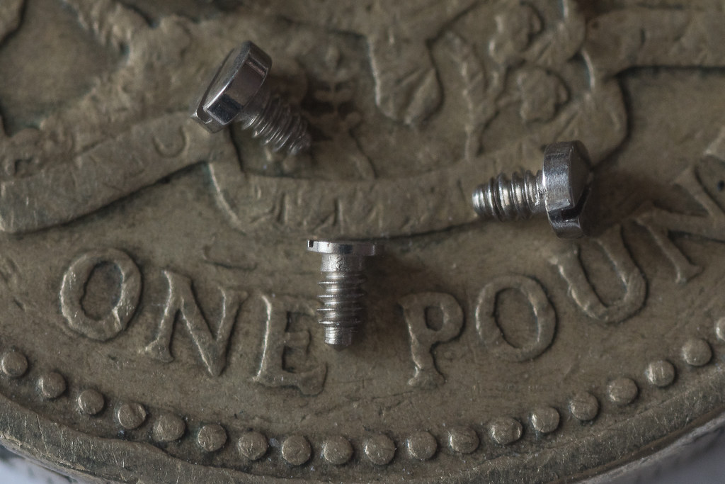
Anyways, as I rushed the two previous themes, have an edit of each....
 tweek by Mark P, on Flickr
 tweek-2 by Mark P, on Flickr
LC2
Negan
- Messages
- 10,458
- Name
- Tim
- Edit My Images
- Yes
Hi Mark,
Pleasure - Sub 6 second quarters! That's 7 seconds faster than I got my ypvs down the strip.
You've caught the motion very well, it must have been shifting to produce any motion blur at 1/500th
Tiny - Well, they are that. Nicely captured macro, that is some serioud magnification.
Face - I agree with Dave, regarding the DoF and you choice of focus point.
- Messages
- 13,760
- Edit My Images
- Yes
Hey Mark 
Progress - now I actually like them in the pile, good to see a few ole Nokia's in your collection, I like that as an image for the theme
Pleasure - Bikes, not my cup of tea at all, but I can appreciate the difficulty in a capture like that so well done :thumbs
Tiny - DAMN they are small screws, and a good idea to show them off on a coin giving a great sense of scale indeed !!!
Face - Now this is my fav shot of yours love the angle colours and depth of field, focus is spot on the name and logo too so cant ask for more, a great catalogue image indeed

- Messages
- 3,413
- Name
- Mark
- Edit My Images
- Yes
Thanks DaveLike the face shot of this very nice Longines Watch Mark, very nice dof with the main focus on the name plus a good BG
I did toy with the idea, but wanted the image to about the name above all esle, so didnt bother in the end.Well light and nice and sharp. You have emphasised the name on the dial but I might have tried to get the hands in focus, may be at a different time, ten-to-two perhaps?
Hi Mark,
Pleasure - Sub 6 second quarters! That's 7 seconds faster than I got my ypvs down the strip.
You've caught the motion very well, it must have been shifting to produce any motion blur at 1/500th
Tiny - Well, they are that. Nicely captured macro, that is some serioud magnification.
Face - I agree with Dave, regarding the DoF and you choice of focus point.
Thanks Tim
Hey Mark
Progress - now I actually like them in the pile, good to see a few ole Nokia's in your collection, I like that as an image for the theme
Pleasure - Bikes, not my cup of tea at all, but I can appreciate the difficulty in a capture like that so well done :thumbs
Tiny - DAMN they are small screws, and a good idea to show them off on a coin giving a great sense of scale indeed !!!
Face - Now this is my fav shot of yours love the angle colours and depth of field, focus is spot on the name and logo too so cant ask for more, a great catalogue image indeed
Cheers Dean, it is one of my favourites too.
ThanksFace
Good choice, as others have said, nice and sharp and a nice dof.
Pleasure & Tiny ... both much improved with the crops.
Nice watch Face, nice focus job.
Glad you like D....
- Messages
- 3,413
- Name
- Mark
- Edit My Images
- Yes
So, a small catch up after some delays....
Agriculture didnt look as good as it did in my head, but times pressing, so I think both these are a bit more PABD than I would prefer.
Gracefulls a shoehorn really, but I couldnt come up with anything that I liked.....
Agriculture
 Agriculture by Mark P, on Flickr
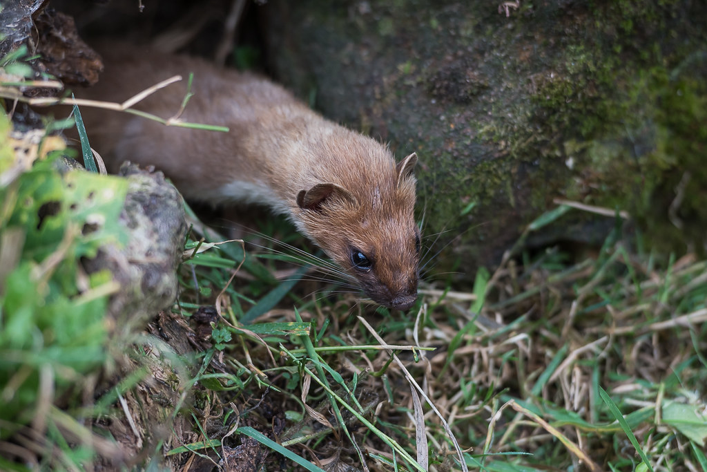
Gracefull little hunter....
 Gracefull by Mark P, on Flickr
Agriculture didnt look as good as it did in my head, but times pressing, so I think both these are a bit more PABD than I would prefer.
Gracefulls a shoehorn really, but I couldnt come up with anything that I liked.....
Agriculture
 Agriculture by Mark P, on Flickr
Gracefull little hunter....
 Gracefull by Mark P, on Flickr
- Messages
- 662
- Name
- John
- Edit My Images
- Yes
Agriculture bang on theme Mark; colours all seem a bit muted or a lack of contrast though.
Great capture of the weasel. Beautiful creature and graceful in a deadly sort of way.
Great capture of the weasel. Beautiful creature and graceful in a deadly sort of way.


 Progress
 face
face