weekly rpn's 2018 Project 52 - Week 52 SHOWCASE Added (Complete)

I'm having a major problem with my Flickr account so I decided to host this week's photos with Postimage instead until I get my Flickr account sorted out.

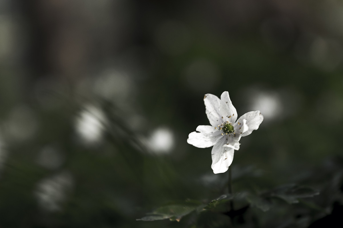
For this wildflower shot, I have to get down low on my knees with my XT-2 LED backscreen turned at 90 degrees. The focus is a tad off.


Week 18 - Low

 
^^^ That, Daffs it is!
 
Hi Stan I like both of your low shots but the Daffs just edge it for me
 
Hi Stan,

Beautiful - The wider version for me. The road makes for a strong leading line with a strong subject as the target.
Nicely processed, the verticals look right (but then I guess you're at a distance so perspective wouldn't be far out?)
Nice colours.
Do you find the 16-55 much of an improvement on the 18-55?

Low - Ah yes, I guess it is a little off, but does that matter with the lovely background and the contrast of the white against the green? IMO no.
The second shot is nice too, but I feel #1 pips it.
 
I think the daffs are really good for the theme, great sense of being down low.
 
Hi Stan,

Beautiful - The wider version for me. The road makes for a strong leading line with a strong subject as the target.
Nicely processed, the verticals look right (but then I guess you're at a distance so perspective wouldn't be far out?)
Nice colours.
Do you find the 16-55 much of an improvement on the 18-55?

Low - Ah yes, I guess it is a little off, but does that matter with the lovely background and the contrast of the white against the green? IMO no.
The second shot is nice too, but I feel #1 pips it.

Thanks, Tim. I found the 16-55mm is sharper and faster focusing but the downside is it's a lot bigger.
 
Hi Stan, I agree with Tim on these two images. The focus in the first is a tad off but the contrast is so striking between the white flower and the dark BG that I don't think it matters. The second one also successfully conveys the 'low' theme and has some lovely colour contrasts, but I do prefer #1.
 
Beautiful - great architecture shot, I prefer the version with tarmac (and surroundings), I think that puts it better into perspective (y)
Low - the daffs! Great PoV!
 
Beautiful - what a lovely piece of architecture and steeped in plenty of history, the closer crop works much better.
Low - both fit the theme but i much prefer the composition of the second image, I feel the first image would work better if the focus was spot on and if there was a couple more wild flowers in the image.
 
A bit later for me this week. Been away for a long weekend in Northern Ireland and when I get home there was no internet for two days. Apparently, a car crashed into the exchange and took BT couple of day to replace.

Anyway, spotted this two nearly Matching canoes while visiting Carrick-a-rede rope bridge and thought they may fit this week's theme.


Week 19 - Match

Match by Stan, on Flickr
 
I like the seascape great colour although they both work in very different ways
 
Hmm, I think I would prefer to see the sharp focus on the keys rather than the controls. Colour is better than mono, I think mono would have been the better option if it were a piano rather than a keyboard.
 
Hmm, I think I would prefer to see the sharp focus on the keys rather than the controls. Colour is better than mono, I think mono would have been the better option if it were a piano rather than a keyboard.

Yes that ^^^^
 
Beautiful - Like a fairy tale castle I like the closer in image best
Low - The Daffodils for me very low PoV
Match - great seascape I think this is the better photo, but the match striker is an interesting subject.
Music - I find the controls distracting more focus on the keys would be better, maybe a letterbox crop to cut out some of the buttons.
 
match - the first one for me, great idea, great execution! Nice colours of the sea with the two spots of yellow (y)
music - again the first one, but I agree with Tim that the focus would be better one the keys...
 
Two little yellow boats out in the big blue sea, I like it.

Music ... a bit shallow with focus on the "accompaniment" word o_O
 
I like the colour photo as it is TBH, something a bit different and colourful. Looks complicated.
 
Match

The first one for me, the two little canoes look lost in the great expanse of sea.

Music

The first is my pick, I'm going to go against the flow and say, I don't mind the focus not being on the keys, but I think the shot could be a bit wider and looking along the keys more (so a lower pov is what I'm trying to say).
 
Stan

Low, both Images are very good, the first one, I like the contrasting colours, The focus on the flower is close enought as everything else is well out of focus. Second one is at an interesting angle and the colours are great.

Match, clearly on theme and the colours of the sea is wonderful. I think you could even crop the sky out.

Match, a very lucky find. Nice details, but cropped soo tight that the perspective is showing.


Music, it is a quick shot, focus is not helping, but on theme. Converting to B&W does not help the focus, but the lack of colours does improve the image a bit.

Pete
 
Nice chucky egg shot!
 
Back
Top