weekly Viv1969's Try at 52....The Sequel....2016 Week 50, 51 & 52.... And finished

Brilliant take on Danger Ruth. The red credit card gives it a lovely pop of colour and it doesn't look 'set up' :clap:

#2 is very scary, my only crit is, as a right-handed person it feels the wrong way around.....
 
Great photography and unusual take on the 'dangerous' theme - brilliant!
 
Danger - Great shots both of them. The first in particular, sharp and well lit. My only grip and it is a minor one goes against the general consensus and that is the reflections. Whilst I like the sharpness and detail. The separation on the card and lines makes my eyes think I'm seeing double. I am being picky though :)
 
Cracking shot for dangerous, theme, like both but prefer the second, the lighting is really good and the drops of blood are perfect too.
 
Brilliant take on Danger Ruth. The red credit card gives it a lovely pop of colour and it doesn't look 'set up' :clap:

#2 is very scary, my only crit is, as a right-handed person it feels the wrong way around.....

Thanks Jull.
I'm right handed too, and I never even gave it a thought!

Great photography and unusual take on the 'dangerous' theme - brilliant!

Many thanks Liz :)

Much prefer #2, well composed, nice blood :) and nice clean, but not uber white, surface.

Cheers.

Thanks Andy. I'd have preferred white BG for the second shot but I found I was losing the top edge of the knife blade if I pushed it.

Dangerous - two very good images for the theme, I like both of them very well executed.

Thanks Many...Much appreciated.

Danger - Great shots both of them. The first in particular, sharp and well lit. My only grip and it is a minor one goes against the general consensus and that is the reflections. Whilst I like the sharpness and detail. The separation on the card and lines makes my eyes think I'm seeing double. I am being picky though :)

I know what you mean about the seeing double bit Chris, I was going cross-eyed looking at them on the back of the camera. :LOL:

Cracking shot for dangerous, theme, like both but prefer the second, the lighting is really good and the drops of blood are perfect too.

Thanks very much Lee! :)
 
That gave me a laugh Ruth ... currant affairs indeed - the EU issue is certainly raisin a few questions in my mind. Excellent concept and I do like the composition ... (and the glass jars match some we have - are they M&S dessert containers by any chance?) :)
 
Very amusing its nice to see a bit of humour though even the currants are 50/50 about in or out, awful theme indeed, a very good take on it regardless
 
LOL, love the back story, very clever.
You're quite good at these bright white backgrounds aren't you. Fits the minimalist composition well. (y)

Thanks Tim....Brightly lit shots are about all a conservatory is good for :LOL:

That gave me a laugh Ruth ... currant affairs indeed - the EU issue is certainly raisin a few questions in my mind. Excellent concept and I do like the composition ... (and the glass jars match some we have - are they M&S dessert containers by any chance?) :)

Thank you Tim.....The pots are from Gü deserts. I knew they'd come in handy one day! :)
 
:LOL: very good Ruth, it raisin'd a smile (y)
( :coat: )
 
Hi Ruth, that's funny :) A very creative shot and as you say, it's not an easy week...

Personally, I find the lighting to be a bit too "on axis", i.e. from just above the camera? If you'd been able to get it at more of an angle I think it could have created a bit more texture in the subjects? Otherwise, it's well composed and well taken - a good job.
 
Ha Ha love the thinking behind this one Ruth, I do find the BG a bit too bright but over I really like it
 
Hi Ruth, loving you idea for the Topical theme, super lighting and perfect aperture.
 
A shoe horn at best.

The Living World........Will always triumph eventually.....

 
Is that because you lovingly c'ress your keyboard?

:D
 
Dangerous - What a fantastic shot, the lines on the glass are brilliant, I guess you couldn't find a razor blade then :) Very creative idea well taken and exposed great reflections too.
Topical - Current affairs :) clever take well done.
Living world - Another very creative shot, I see a pattern in your 52 :)
 
Nice concept & composition Ruth - nature v man and all that. (Hope you enjoyed the plain egg sandwich). :)
 
Last edited:
HA! Excellent .... You are good at this. :D
 
Last edited:
Like that Ruth, the cress is an ideal size for the keyboard
 
Hi Ruth, a quick catch-up from me as this is my first visit to your thread. I'm still catching up with my themes but thanks for dropping into my thread and I'll try to keep up to date with yours in future!

Old - a great subject choice for this theme, and the skin textures and choice of B&W really fit well. I like your placement of the eye and the square crop, too.
Metal - another good subject choice! Lots of lovely shiny metal surfaces in close quarters, and you've made good use of the macro tubes for this one. Another that really suits B&W to bring out all the different tones.
Captive - great props, and I like the deep blacks and narrow DOF. I see others have commented about the point of focus and room at the edges, but the fact that there are so many choices about how we make our images is what makes the final image so personal. This is a striking image that leaps off the screen.
Miniature - clever idea (y) Lovely bright colours, well lit, and I like the way the yellow of the flower centres is echoed in the cotton.
Happy - I'm struggling with one at the moment so I know how it can feel. However.... this is really good! Love the happy face and the simplicity of the image, yet the way the egg's colour contrasts with the others and your use of DOF makes this far from ordinary.
Abandoned - a clean image that conveys the theme very well, and it's another where your composition and choice of B&W is spot on.
Camouflage - excellent idea and nice humour too. Although the colour version is the most striking and funniest, the B&W obviously works best for this theme. Good lighting, too.
Danger - both immediately striking with the use of bright red, both great ideas and well lit again :clap:
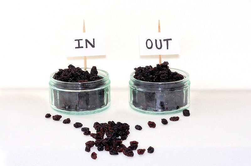
Topical - another clever and funny idea; I do like your thinking, both for the image and "Currant affairs" :)
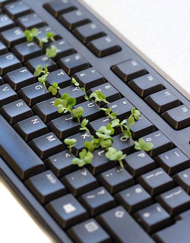
The Living World - well set up and captured. The green stands out very clearly against the black.

I've enjoyed catching up with this, not least because my first instinct is to head outside for images for themes whereas you're clearly comfortable setting up inside, which is something I need to work on. I will definitely be following you and looking forward to more (y)
 
Last edited:
Back
Top