You are using an out of date browser. It may not display this or other websites correctly.
You should upgrade or use an alternative browser.
You should upgrade or use an alternative browser.
weekly Go on then, 5th go at the 52, finished!
- Thread starter michael23
- Start date
- Messages
- 14,766
- Name
- Michael
- Edit My Images
- No
Hey Michael, I like the fragile set..... Especially the way the 3 go up in frame as you go along them. I'm wondering if it wouldn't look stronger as a piece if you toned down the blue slightly on the first photo, then applied to to the others so they were all on a cool tone? Either way, fits the theme well I think!
Thanks for the thoughts, it would work that way, I left it like that as I thought it lended a bit more drama to it.
Like it. Quite a dramatic take on the theme. Not sure about the blue on the left, first thing I thought was your were dead
I did a high contrast B&w conversation and quite liked it.
Cheers.
Cheers Andy, Will probably have a try at a high contrast b+w. I'm pleased it's come across as dramatic, which is what I was hoping for.
I like it, its a slightly different take on the fragile, nice triptych
Thanks Chris for taking a look.
- Messages
- 4,344
- Name
- Martin
- Edit My Images
- Yes
I think the leftmost image would do the job on it's own too. Powerful stuff. 
- Messages
- 6,502
- Name
- Peter
- Edit My Images
- Yes
Good idea for the triptych. I agree with the comments about the blueness of the left hand image and I'm with Andy on trying a real gritty mono conversion
- Messages
- 13,760
- Edit My Images
- Yes
Liking that a lot Michael, that is very different from you compared to your most recent ones, as well as the height change in each shot I think the colour change works very well too, also I feel it doesn't look staged at all - NICE ONE :Thumbs:
- Messages
- 14,766
- Name
- Michael
- Edit My Images
- No
I think the leftmost image would do the job on it's own too. Powerful stuff.
Thanks Martin much appreciated
Good idea for the triptych. I agree with the comments about the blueness of the left hand image and I'm with Andy on trying a real gritty mono conversion
Thanks Peter, tried a few mono conversions, but not found one I am totally happy with yet,
Liking that a lot Michael, that is very different from you compared to your most recent ones, as well as the height change in each shot I think the colour change works very well too, also I feel it doesn't look staged at all - NICE ONE :Thumbs:
Thanks Dean, thanks for the great comments
Wow Michael - that's a very gritty triptych. I really like the three images which work well together as a trio. Very powerful, perfectly on theme and - for me - one of your strongest images yet (including last year's 52!)
Super stuff
Thanks Paul, I am certainly inclined to agree with you there, it certainly is one I am quite pleased with myself
The goblin
<span class="poty">POTY Winner 2015</span></br>
- Messages
- 4,407
- Name
- Marsha
- Edit My Images
- Yes
Hi Michael,
I'm loving little Peekaboo, if it's anything like mu sons Blankie I can see the link to the theme. Although the shadow across the front is a little harsh, maybe some softer lighting/ editing would work better for the theme?
Fragile, I like the idea and the triptych works well. The blue tone to the first image is a tad strong for me. Also have you considered adding a little drop shadow to the three images? I find that helps bring a further depth to a triptych.
- Messages
- 9,095
- Name
- Mandy
- Edit My Images
- Yes
Fragile - a very good dramatic take for the theme, great work well done.
- Messages
- 14,766
- Name
- Michael
- Edit My Images
- No
Beethoven was deaf.
Michael you're a talented image maker.
Thanks David.
Very powerful. For me the far right embodies the theme perfectly.
Cheers Alex, much appreciated.
Hi Michael,
I'm loving little Peekaboo, if it's anything like mu sons Blankie I can see the link to the theme. Although the shadow across the front is a little harsh, maybe some softer lighting/ editing would work better for the theme?
Fragile, I like the idea and the triptych works well. The blue tone to the first image is a tad strong for me. Also have you considered adding a little drop shadow to the three images? I find that helps bring a further depth to a triptych.
Hi Marsha, thanks for the feed back, had not thought about the dropped shadow in the triptych, will have a look at a tutorial at some point.
Fragile - a very good dramatic take for the theme, great work well done.
Thanks Mandy.
Now scenic, attended the whipsnade meet on saturday and managed to bag some scenic shots
My fave
 Week 3, scenic by scilly puffin, on Flickr
Or this one
 whipsnade view #2 by scilly puffin, on Flickr
- Messages
- 115,214
- Name
- The real Chris
- Edit My Images
- No
I know the area well 
The tree maybe a little central in the frame, but I quite like the starkness of that one
I also like the way the snow dusted tracks lead your eyes all the way to the "Beacon" and beyond.
Nice pair Michael
The tree maybe a little central in the frame, but I quite like the starkness of that one
I also like the way the snow dusted tracks lead your eyes all the way to the "Beacon" and beyond.
Nice pair Michael
The goblin
<span class="poty">POTY Winner 2015</span></br>
- Messages
- 4,407
- Name
- Marsha
- Edit My Images
- Yes
Hi Michael, it has to be the second one for me. Have you cloned out something on the horizon on the tree shot? There are areas that look like they've been missed and you can see where you cloned in a straight line as there's lines in triplicate on the RHS. Also small chunks missing out of the tree trunk.
On the second one I like the lead on line from the snowy tracks. Maybe crop a little of the sky off to give a panoramic feel?
On the second one I like the lead on line from the snowy tracks. Maybe crop a little of the sky off to give a panoramic feel?
- Messages
- 14,766
- Name
- Michael
- Edit My Images
- No
I know the area well
The tree maybe a little central in the frame, but I quite like the starkness of that one
I also like the way the snow dusted tracks lead your eyes all the way to the "Beacon" and beyond.
Nice pair Michael
wooo ... love the silhouettiness of #1
Hi Michael, it has to be the second one for me. Have you cloned out something on the horizon on the tree shot? There are areas that look like they've been missed and you can see where you cloned in a straight line as there's lines in triplicate on the RHS. Also small chunks missing out of the tree trunk.
On the second one I like the lead on line from the snowy tracks. Maybe crop a little of the sky off to give a panoramic feel?
Hi, Michael, both need a little crop off the bottom for me and as pointed out above the cloning in the first is a little odd
Hi Michael ....love the starkness of first one, great choice in the B&W.
Thanks all, yes I did a bit of cloning, I shall have to practice more I think with the clone tool, sometimes I get it spot on and others I don't. Thanks for pointing it out.
- Messages
- 9,095
- Name
- Mandy
- Edit My Images
- Yes
Scenic - two very good images, the first image I find the tree a little to Central in the frame, also did you do any cloning on the sky as the cloud at the bottom of the grass line look a bit messy which is distracting me slightly.
The second image works better for me, nice view I like it.
The second image works better for me, nice view I like it.
Bruja
Los Cojones del Perro
- Messages
- 3,883
- Name
- Just call me Mad Madam Mim
- Edit My Images
- Yes
Both good pictures for the theme. Love the starkness of #1 but the position of the tree and the cloning let it down. Like the lead in lines of #2 but feel it would benefit from a letter box crop. Well done for getting 2 pics in 
- Messages
- 14,766
- Name
- Michael
- Edit My Images
- No
Thanks all, have done a re edit on both of them, not sure if the cloning is any better this time round, but I have cropped the tree shot from the left a little and taken some of the sky out on the 2nd
 scenic re-edit # by scilly puffin, on Flickr
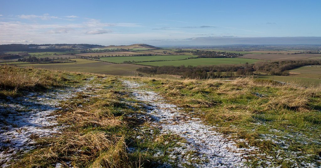 scenic re-edit # 2 by scilly puffin, on Flickr
 scenic re-edit # by scilly puffin, on Flickr
 scenic re-edit # 2 by scilly puffin, on Flickr
- Messages
- 9,095
- Name
- Mandy
- Edit My Images
- Yes
The cloning on the edit of the first image is still a little off and patchy at the bottom, The second image looks ok to me .
- Messages
- 14,766
- Name
- Michael
- Edit My Images
- No
The cloning on the edit of the first image is still a little off and patchy at the bottom, The second image looks ok to me .
Thanks Mandy, I shall re visit the tree when we go back later in the year I think, see if I can eliminate the fence and things that I cloned out.
The goblin
<span class="poty">POTY Winner 2015</span></br>
- Messages
- 4,407
- Name
- Marsha
- Edit My Images
- Yes
Hi Micheal, what software are you using? I think the issue is your brush sides is too solid, maybe feather it and take samples from slightly different places to break up the cloning. If you're using photoshop (CS 5 or higher) zoom in to pixel level, circle a little bit iof what you want removing with the lasso tool, hit shift F5 and fill with content aware, then CTRL to deselect and go round another area.
- Messages
- 14,766
- Name
- Michael
- Edit My Images
- No
Hi Micheal, what software are you using? I think the issue is your brush sides is too solid, maybe feather it and take samples from slightly different places to break up the cloning. If you're using photoshop (CS 5 or higher) zoom in to pixel level, circle a little bit iof what you want removing with the lasso tool, hit shift F5 and fill with content aware, then CTRL to deselect and go round another area.
I'm using elements 12, thanks for the tips, will have a look to see if it works.
- Messages
- 8,398
- Name
- Lynne
- Edit My Images
- Yes
Hi Michael
mono works well in the 1st with the edited version being slightly better as the odd bits along the horizon ( chequer board effect) gone. I get the feeling you may be using a hard edged brush for cloning which gives the "spot" effect ? A soft edge brush I find works better but it's still trial & error sometimes I wonder about cropping a little from the bottom ?
The 2nd , apart from the snowy tracks doesn't really work for me , not enough going on....but then ,I' still learning about landscapes
mono works well in the 1st with the edited version being slightly better as the odd bits along the horizon ( chequer board effect) gone. I get the feeling you may be using a hard edged brush for cloning which gives the "spot" effect ? A soft edge brush I find works better but it's still trial & error sometimes
The 2nd , apart from the snowy tracks doesn't really work for me , not enough going on....but then ,I' still learning about landscapes
- Messages
- 14,766
- Name
- Michael
- Edit My Images
- No
Hi Michael
mono works well in the 1st with the edited version being slightly better as the odd bits along the horizon ( chequer board effect) gone. I get the feeling you may be using a hard edged brush for cloning which gives the "spot" effect ? A soft edge brush I find works better but it's still trial & error sometimesI wonder about cropping a little from the bottom ?
The 2nd , apart from the snowy tracks doesn't really work for me , not enough going on....but then ,I' still learning about landscapes
I wonder if am? Didn't know there were 2 sorts of brushes tbh! Looking at it a crop off the bottom would work. Landscapes, I'm certainly still getting to grips with them too, one day....
D
Deleted member 59779
Guest
Mono shot for me.
- Messages
- 13,760
- Edit My Images
- Yes
The mono lone tree/benches is a great one Michael 
No idea at all how I did not spot that when we were there

No idea at all how I did not spot that when we were there
- Messages
- 14,766
- Name
- Michael
- Edit My Images
- No
Mono shot for me.
Thank you.
The mono lone tree/benches is a great one Michael
No idea at all how I did not spot that when we were there
Thanks Dean, we stopped by the first cafe and toilet block and admired the view across the valley turned round and thought ooh thats a nice tree.
- Messages
- 4,182
- Name
- Paul
- Edit My Images
- Yes
Hi Michael, I too like the first image. The only thing for me is that the tree branches and the bench are a bit too tight / close together... at least that's how it feels to me. I like the processing/tonal range. I wonder if being up the bank a bit more and shooting flat land at a slightly different angle might help? Not sure...
Nice take though and a very effective image!
Nice take though and a very effective image!
- Messages
- 14,766
- Name
- Michael
- Edit My Images
- No
Hi Michael, I too like the first image. The only thing for me is that the tree branches and the bench are a bit too tight / close together... at least that's how it feels to me. I like the processing/tonal range. I wonder if being up the bank a bit more and shooting flat land at a slightly different angle might help? Not sure...
Nice take though and a very effective image!
Thanks Paul, there were more fences and things the other side plus the road through the zoo was there as well which would have encroached a lot. Still might be an idea though, if it wasn;t much further up.
- Messages
- 14,766
- Name
- Michael
- Edit My Images
- No
And now, trying to eradicate a dry spell including the last 3 themes! I have some pictures for companions and a pic for elegant,
Companions
One Monkey and his dog...
 companions idea 3 by scilly puffin, on Flickr
Or
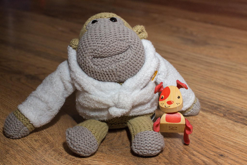 companions idea 2 by scilly puffin, on Flickr
Or
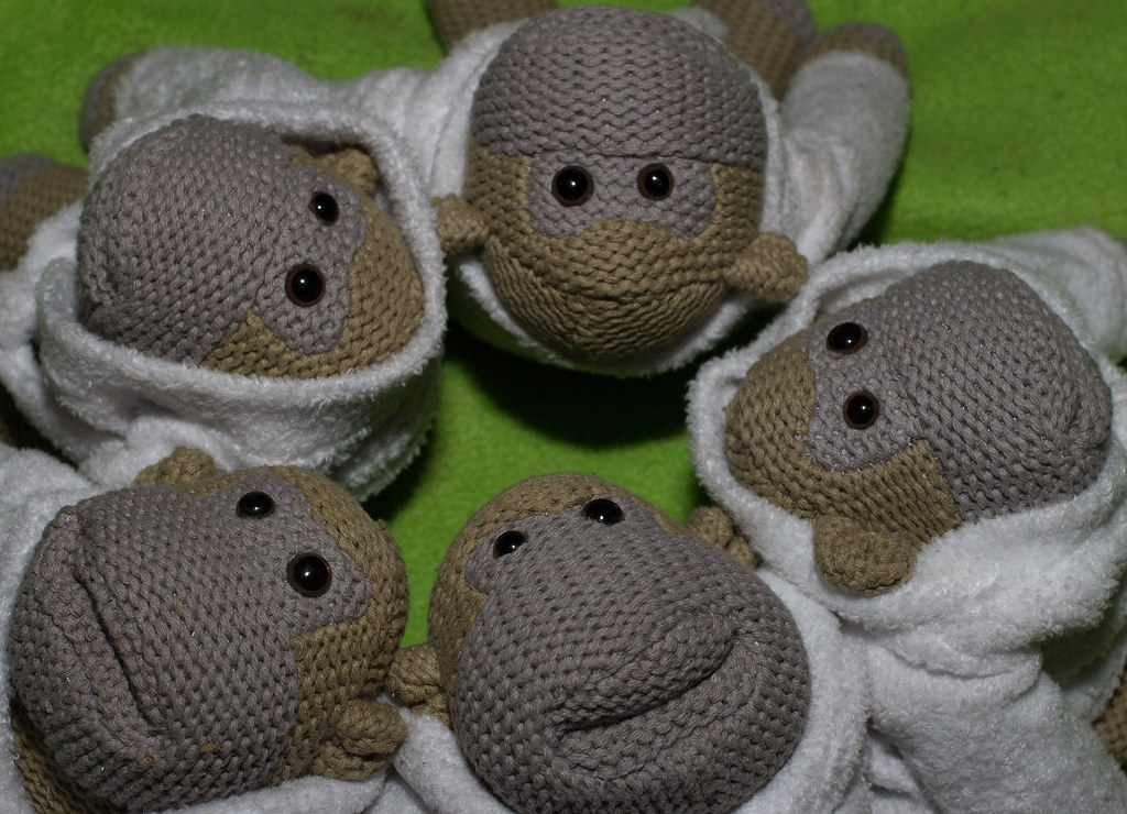 companions idea 1 by scilly puffin, on Flickr
Elegant, I feel this one kind of fits the theme,
 Week 5 theme of elegant. by scilly puffin, on Flickr
Companions
One Monkey and his dog...
 companions idea 3 by scilly puffin, on Flickr
Or
 companions idea 2 by scilly puffin, on Flickr
Or
 companions idea 1 by scilly puffin, on Flickr
Elegant, I feel this one kind of fits the theme,
 Week 5 theme of elegant. by scilly puffin, on Flickr
- Messages
- 29,465
- Name
- Bat-Frog
- Edit My Images
- No
Michael....
Companions - My first thought was: Munkeh!!! I so want one Then I just got incredibly jealous that you have MORE than one
  They do fit the theme well.
Elegant - I can see where you're thinking comes from, but I have to agree with Chris (although I guess if you're a train buff, it might be a VERY elegant carriage!)
Companions - My first thought was: Munkeh!!! I so want one
 Then I just got incredibly jealous that you have MORE than one
  They do fit the theme well.
Elegant - I can see where you're thinking comes from, but I have to agree with Chris (although I guess if you're a train buff, it might be a VERY elegant carriage!)
- Messages
- 14,766
- Name
- Michael
- Edit My Images
- No
Companions, I wondered if Monkeh would make an appearance
Elegant, not totally sure this fits the theme Michael but its certainly topical(ish)
Michael....
Companions - My first thought was: Munkeh!!! I so want oneThen I just got incredibly jealous that you have MORE than one
They do fit the theme well.
Elegant - I can see where you're thinking comes from, but I have to agree with Chris (although I guess if you're a train buff, it might be a VERY elegant carriage!)
Hi Michael
Companions ... I like #3 ... the five of them.
Elegant ... Hmmm ... not Churchill, but what's that olde first class train carriage? Yes.
Thanks for the thoughts all, elegant has been playing on my mind since I took the picture. I was trying to honour his funeral, his coffin was transferred by train, in the back ground is the luggage van which he was carried in, this was repainted in pullman colours for his funeral. Being pulled by a steam train to his final resting place to me takes on the elegant theme. Perhaps I should have put a bit of an explanation.
Being in the national railway museum it was awkward to photograph, I then saw the picture above and went with it, to try something different.
The alternative shot, showing the engine itself
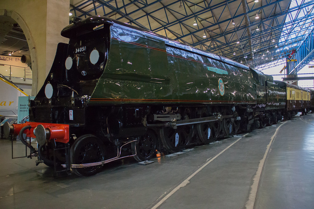 sir winston churchill by scilly puffin, on Flickr

