You are using an out of date browser. It may not display this or other websites correctly.
You should upgrade or use an alternative browser.
You should upgrade or use an alternative browser.
weekly brownin's prjct52: 52,FINISHED!
- Thread starter brownin
- Start date
- Messages
- 8,398
- Name
- Lynne
- Edit My Images
- Yes
Hi Nathan
original idea for Alphabet , great use DOF adds interest
original idea for Alphabet , great use DOF adds interest
- Messages
- 908
- Name
- nathan
- Edit My Images
- Yes
Sorry guys been a very busy few weeks, certification exams to do and revise for meant ive slipped a little way behind, managed to get sound done last night though. Which to choose from though?
Week15 -
'Sound' Desk
 week15 by NathanBrowning, on Flickr
My seat makes a lot of 'sound'
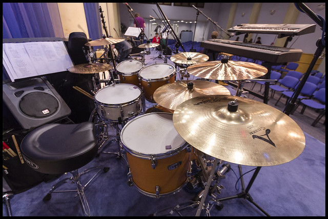 week15a by NathanBrowning, on Flickr
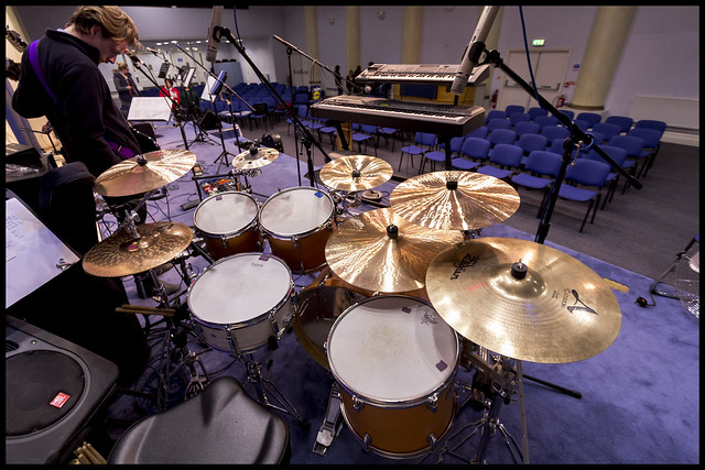 week15b by NathanBrowning, on Flickr
Week15 -
'Sound' Desk
 week15 by NathanBrowning, on Flickr
My seat makes a lot of 'sound'
 week15a by NathanBrowning, on Flickr
 week15b by NathanBrowning, on Flickr
- Messages
- 908
- Name
- nathan
- Edit My Images
- Yes
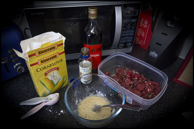
Tried experimenting with food preparation last night as previously found my beef stir fry's very chewy. bit of research led me to a technique called velvetting, so my experiment show isn't up to much but certainly experimentation for me.
Week16 - Experiment
 week16 by NathanBrowning, on Flickr
Week16 - Experiment
 week16 by NathanBrowning, on Flickr
- Messages
- 1,158
- Name
- Lorraine
- Edit My Images
- Yes
Hi Nathan,
Sound - I prefer the first shot of the three, I think the b&w works well and I like the focus. It's probably just me, but I think the other two would've been a bit better if the drummer was in the shot (or are you the drummer?)
Experiment - well, you were experimenting with a new way of cooking, so it fits the bill, and it's a nice clean shot
Bruja
Los Cojones del Perro
- Messages
- 3,883
- Name
- Just call me Mad Madam Mim
- Edit My Images
- Yes
Hi Nathan, I too prefer the first Sound shot as the other two are just a bit cluttered. Really like the DOF field you've got going there and the b&w processing is spot on 
Experiment, any man who can cook gets the from me as husband #1 disn't even think about it (it was the 70's), husband #2 could only cook chips
  and husband #3 won't!
Experiment, any man who can cook gets the
- Messages
- 6,502
- Name
- Peter
- Edit My Images
- Yes
Machine - Loving this although I too thought it was a speaker cone. The toning really suits with the composition and crop working nicely. Good one
Alphabet - Not as strong as the previous one although I feel the blacks and reds work well together
Sound - Some good studio shots with my vote going for the mixing desk. Our eldest spends quite a bit of time that side of the fence and it always fascinates me just how someone can control so many buttons, knobs and sliders.
Experiment - Maybe the vignetting is a bit too strong but I’m feeling this is a little dark. It does remind me of the cooking style of our youngest who often just experiments with whatever is in the kitchen
- Messages
- 2,480
- Name
- Steve
- Edit My Images
- Yes
Hi Nathan!
Sorry I have been remiss in getting to your post mate! seems to be a constant battle of catch up, this TP52!
So I'm gonna start at Watery....
Watery.... Nice abstract shot, No1 for me because of the positioning of the water droplets.... in this shot they look like they are flying out towards you, or exploding out from behind the central droplet. Incidentally looking into that droplet looks like grass and table and chairs in a garden??? like the gradients of steely blue grey. No2 I find the colour change of the background and the sharp DOF isn't working for me, I prefer more of the droplets in focus. Nice work
Bold.... No1 doesn't float my boat as they say... although you have gone to the effort to create the reflection The actual text looks too artificial (best word I could find) I think the floaty look probably adds to that feeling.
No2 is a bit busy, with all the branches and twigs overwhelming the shot. and although the tree on the left frames the shot and the wall leads you in, its all a bit congested. I think what I would be inclined to do would be to convert it to B&W apart from the cottages and colour pop them, that would do away with a lot of the distractions and highlight your focal point IMHO.
Relax.... Out of the 3, No1 but I'd straighten the candle (with Distort in PS) maybe see what the lens distortion correction does first. Then I'd give a bit more DOF to pull in the cup and cut it off behind the cup to throw out the background as you have.
No 2, just pushes the squiffy candle more in your face which doesn't work for me. No 3 the un-cropped version of No1 has that reflected light in the top RH corner which I imagine is why you cropped it in the first place .
.
Vertical... Love No1 (but with a straight mast this is invariably lens distortion from your lens I guess. Great pastel colours and gradients in the sky. Nice texture in the wall, I think I'd cool off the exposure on that a little (so that the exposure matched the top RH corner of the wall). and I think if you drop the luminance of the Yellow and or Orange channels toy should get rid of some of that light pollution over the town bottom left. Like this shot not the sexyest of towers but a good shot none the less
B&W not for me all those lovely colours gone BUT like the POV better
Mouth.... Nice shot! I don't think its as sharp as it could be but at f1.8 on a moving target I'm not surprised . I guess trying to wind open the aperture and bump up the ISO due to know flash is the resultant
 Having said that I still think its a good shot, especially in incandescent lighting
 White balance is good, a tad noisy so you could probably give that a tweak in PP. Overall I think a good shot in adverse conditions.
Sorry cant help on the equipment side.... All Nikon here
Lovely dog BTW
Crowd.... Minimalist the one on the right looks grumpy
 think I'd crop some of the overhead and not sure what that liquid is on the surface between the group and grumpy? Fits the theme done and dusted!
Close Up.... Like this but your EXIF data seems to be lying f14? Like the DOF here, great lead in to the frets, nice lighting, works well for me.
Machine .... That's a great picture Great lighting there, and really nice POV. no crit from me spot on! Nice Work....
Alphabet.... Great Idea... Love the sharp DOF and really pin sharp. Love the use of Black and Red works very well together, no crit good shot
Sound.... Has to be the Desk! Great POV although I think I would have moved the focal point to the first slider (DVD L&R) still like the shot No2 and 3 (the hot seat
  ) Really like No2 nice POV, looking down from the high hat. like this one a lot too! No3 is lost a little eclipsed by 1 and 2!
Experiment..... Why do people always post food when your starving Think the vignette, centralises the focus on the ingredients but I think I would feather it a bit as its a bit hard. Slightly subdued lighting seems to work well. Other than that would like to know if the experiment worked!!?
I take it your up to your neck in your certification..... MS? Cisco? Good luck with that hope it all goes well
Sorry I have been remiss in getting to your post mate! seems to be a constant battle of catch up, this TP52!
So I'm gonna start at Watery....
Watery.... Nice abstract shot, No1 for me because of the positioning of the water droplets.... in this shot they look like they are flying out towards you, or exploding out from behind the central droplet. Incidentally looking into that droplet looks like grass and table and chairs in a garden??? like the gradients of steely blue grey. No2 I find the colour change of the background and the sharp DOF isn't working for me, I prefer more of the droplets in focus. Nice work
Bold.... No1 doesn't float my boat as they say... although you have gone to the effort to create the reflection
No2 is a bit busy, with all the branches and twigs overwhelming the shot. and although the tree on the left frames the shot and the wall leads you in, its all a bit congested. I think what I would be inclined to do would be to convert it to B&W apart from the cottages and colour pop them, that would do away with a lot of the distractions and highlight your focal point IMHO.
Relax.... Out of the 3, No1 but I'd straighten the candle (with Distort in PS) maybe see what the lens distortion correction does first. Then I'd give a bit more DOF to pull in the cup and cut it off behind the cup to throw out the background as you have.
No 2, just pushes the squiffy candle more in your face which doesn't work for me. No 3 the un-cropped version of No1 has that reflected light in the top RH corner which I imagine is why you cropped it in the first place
Vertical... Love No1 (but with a straight mast this is invariably lens distortion from your lens I guess. Great pastel colours and gradients in the sky. Nice texture in the wall, I think I'd cool off the exposure on that a little (so that the exposure matched the top RH corner of the wall). and I think if you drop the luminance of the Yellow and or Orange channels toy should get rid of some of that light pollution over the town bottom left. Like this shot not the sexyest of towers
B&W not for me all those lovely colours gone BUT like the POV better
Mouth.... Nice shot! I don't think its as sharp as it could be but at f1.8 on a moving target I'm not surprised
Sorry cant help on the equipment side.... All Nikon here
Lovely dog BTW
Crowd.... Minimalist
Close Up.... Like this but your EXIF data seems to be lying f14? Like the DOF here, great lead in to the frets, nice lighting, works well for me.
Machine .... That's a great picture
Alphabet.... Great Idea... Love the sharp DOF and really pin sharp. Love the use of Black and Red works very well together, no crit good shot
Sound.... Has to be the Desk! Great POV although I think I would have moved the focal point to the first slider (DVD L&R) still like the shot
Experiment..... Why do people always post food when your starving
I take it your up to your neck in your certification..... MS? Cisco? Good luck with that hope it all goes well
- Messages
- 1,408
- Name
- Elaine
- Edit My Images
- Yes
Sound - First shot for me, I love the dof and the use of b/w 
Experiment - well it certainly looks very messy and experimental, but did it work???
Experiment - well it certainly looks very messy and experimental, but did it work???
- Messages
- 13,760
- Edit My Images
- Yes
Hi Nathan 
Alphabet - Nice DoF on this and the use of colors and the angle all tie together nicely
Sound - Great angle on this one, liking how you have lit it too - nice one
Experiment - Not so sure on the setting up/angle of this one, a bit too overhead for me... although the experiment side of it sounds spot on, and with the explanation I guess it fits the theme
- Messages
- 908
- Name
- nathan
- Edit My Images
- Yes
Hi Nathan,
Sound - I prefer the first shot of the three, I think the b&w works well and I like the focus. It's probably just me, but I think the other two would've been a bit better if the drummer was in the shot (or are you the drummer?)
Experiment - well, you were experimenting with a new way of cooking, so it fits the bill, and it's a nice clean shot
I am indeed the drummer and a singer in the church band, I preferred the first in the end as well, thank you for your comments.
I really had no brain matter working for experiment from the moment it was announced. Found it incredibly difficult to think of something interesting. Hence the boring shot.
Hi Nathan, I too prefer the first Sound shot as the other two are just a bit cluttered. Really like the DOF field you've got going there and the b&w processing is spot on
Experiment, any man who can cook gets thefrom me as husband #1 disn't even think about it (it was the 70's), husband #2 could only cook chips
and husband #3 won't!
Thanks for you comments Jill. Yer I try my best, saves the wife a little as she pretty much does everything else
Machine - Loving this although I too thought it was a speaker cone. The toning really suits with the composition and crop working nicely. Good one
Alphabet - Not as strong as the previous one although I feel the blacks and reds work well together
Sound - Some good studio shots with my vote going for the mixing desk. Our eldest spends quite a bit of time that side of the fence and it always fascinates me just how someone can control so many buttons, knobs and sliders.
Experiment - Maybe the vignetting is a bit too strong but I’m feeling this is a little dark. It does remind me of the cooking style of our youngest who often just experiments with whatever is in the kitchen
Hi Peter, thanks again for the catch up and detailed response.
Machine was a gamble and thankfully paid off, Alphabet was a quick one taken with the new body and my raynox filter to get up close, Sound - I wish I had got the first slider but as it was in the middle of mixing for the hall I managed to grab it (very quickly) empty whilst engineer was off fiddling with cables. I often 'Experiment' which sometimes works well but others not all part of the fun of it I say, the wife doesn't quite see it like that sometimes lol
Hi Nathan!
Sorry I have been remiss in getting to your post mate! seems to be a constant battle of catch up, this TP52!
So I'm gonna start at Watery....
Watery.... Nice abstract shot, No1 for me because of the positioning of the water droplets.... in this shot they look like they are flying out towards you, or exploding out from behind the central droplet. Incidentally looking into that droplet looks like grass and table and chairs in a garden??? like the gradients of steely blue grey. No2 I find the colour change of the background and the sharp DOF isn't working for me, I prefer more of the droplets in focus. Nice work
Bold.... No1 doesn't float my boat as they say... although you have gone to the effort to create the reflectionThe actual text looks too artificial (best word I could find) I think the floaty look probably adds to that feeling.
No2 is a bit busy, with all the branches and twigs overwhelming the shot. and although the tree on the left frames the shot and the wall leads you in, its all a bit congested. I think what I would be inclined to do would be to convert it to B&W apart from the cottages and colour pop them, that would do away with a lot of the distractions and highlight your focal point IMHO.
Relax.... Out of the 3, No1 but I'd straighten the candle (with Distort in PS) maybe see what the lens distortion correction does first. Then I'd give a bit more DOF to pull in the cup and cut it off behind the cup to throw out the background as you have.
No 2, just pushes the squiffy candle more in your face which doesn't work for me. No 3 the un-cropped version of No1 has that reflected light in the top RH corner which I imagine is why you cropped it in the first place.
Vertical... Love No1 (but with a straight mast this is invariably lens distortion from your lens I guess. Great pastel colours and gradients in the sky. Nice texture in the wall, I think I'd cool off the exposure on that a little (so that the exposure matched the top RH corner of the wall). and I think if you drop the luminance of the Yellow and or Orange channels toy should get rid of some of that light pollution over the town bottom left. Like this shot not the sexyest of towersbut a good shot none the less
B&W not for me all those lovely colours gone BUT like the POV better
Mouth.... Nice shot! I don't think its as sharp as it could be but at f1.8 on a moving target I'm not surprised. I guess trying to wind open the aperture and bump up the ISO due to know flash is the resultant
Having said that I still think its a good shot, especially in incandescent lighting
White balance is good, a tad noisy so you could probably give that a tweak in PP. Overall I think a good shot in adverse conditions.
Sorry cant help on the equipment side.... All Nikon here
Lovely dog BTW
Crowd.... Minimalistthe one on the right looks grumpy
think I'd crop some of the overhead and not sure what that liquid is on the surface between the group and grumpy? Fits the theme done and dusted!
Close Up.... Like this but your EXIF data seems to be lying f14? Like the DOF here, great lead in to the frets, nice lighting, works well for me.
Machine .... That's a great pictureGreat lighting there, and really nice POV. no crit from me spot on! Nice Work....
Alphabet.... Great Idea... Love the sharp DOF and really pin sharp. Love the use of Black and Red works very well together, no crit good shot
Sound.... Has to be the Desk! Great POV although I think I would have moved the focal point to the first slider (DVD L&R) still like the shotNo2 and 3 (the hot seat
) Really like No2 nice POV, looking down from the high hat. like this one a lot too! No3 is lost a little eclipsed by 1 and 2!
Experiment..... Why do people always post food when your starvingThink the vignette, centralises the focus on the ingredients but I think I would feather it a bit as its a bit hard. Slightly subdued lighting seems to work well. Other than that would like to know if the experiment worked!!?
I take it your up to your neck in your certification..... MS? Cisco? Good luck with that hope it all goes well
Wow, Thanks Steve, great critique which I will take away with me for future shots. I am indeed, MS is my poison, Working through the Windows Server 2012 R2 Certs, time consuming but will be worth it in the end. Experiment - made a huge difference to the tenderness of the meat, only let it soak in for around 30 minutes due to timescales but if I were to do it again I would marinade it for a few hours before cooking.
Hi nathan
I agree the mixing desk is good but, as @69Bonni points out, the focal point should be the first slider ... minor point ... it's a good shot of a good subject.
Yup I totally agree, wish I had more time, maybe could have been interesting with the engineer in there too.... hmmm next time...thanks for taking the time to browse and comment
Sound - First shot for me, I love the dof and the use of b/w
Experiment - well it certainly looks very messy and experimental, but did it work???
Thanks for your comments Elaine, it worked yes, bit longer to marinade though and it would be even better
Hi Nathan
Alphabet - Nice DoF on this and the use of colors and the angle all tie together nicely
Sound - Great angle on this one, liking how you have lit it too - nice one
Experiment - Not so sure on the setting up/angle of this one, a bit too overhead for me... although the experiment side of it sounds spot on, and with the explanation I guess it fits the theme
Cheers, Bit of a shoehorn on experiment Dean, was at a loss totally on it, rest of them were a 'bit' more thought out.
- Messages
- 908
- Name
- nathan
- Edit My Images
- Yes
Week17 -
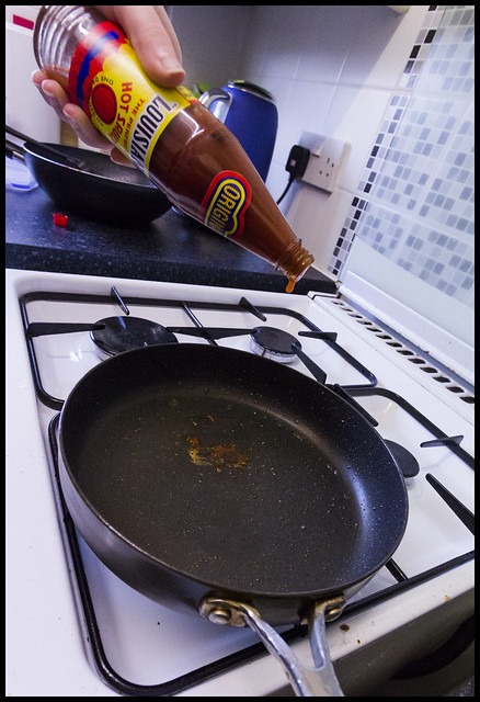
Had an idea for this one but unfortunately the below was my best effort, I blame this particularly on the fact that my wife is a massive woose with hot spitty pans and would not go an inch closer as a result wide angle had to come out and distorted my idea along with not having f-stop to bring in some much needed DOF to hide my cluttered little kitchen, glad its out the way though
"Heat"
 week17 by Nathan Browning, on Flickr
Week18 -
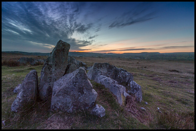
Shoehorn again, been meaning to get up here for some time to find a focal point, especially as its literally two minutes from my home. Anyway I did and I liked the image and the rocks were kinda 'figures' against the sunset, the rocks are also completely natural placement, no man intervention apparently which in my opinion makes them even more cool
"Figures"
 week18 by Nathan Browning, on Flickr
Week19 -
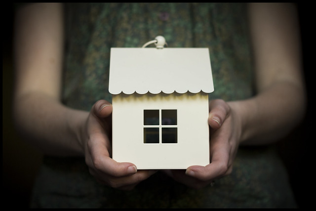
Very literal idea I had this evening, Not much more to say other than I asked the wife to 'hold this house' candle ornament, set it up next to my patio doors and snapped away using the natural light available and my nifty fifty - I do love this lens!
"House-hold"
 week19 by Nathan Browning, on Flickr
Had an idea for this one but unfortunately the below was my best effort, I blame this particularly on the fact that my wife is a massive woose with hot spitty pans and would not go an inch closer as a result wide angle had to come out and distorted my idea along with not having f-stop to bring in some much needed DOF to hide my cluttered little kitchen, glad its out the way though
"Heat"
 week17 by Nathan Browning, on Flickr
Week18 -
Shoehorn again, been meaning to get up here for some time to find a focal point, especially as its literally two minutes from my home. Anyway I did and I liked the image and the rocks were kinda 'figures' against the sunset, the rocks are also completely natural placement, no man intervention apparently which in my opinion makes them even more cool
"Figures"
 week18 by Nathan Browning, on Flickr
Week19 -
Very literal idea I had this evening, Not much more to say other than I asked the wife to 'hold this house' candle ornament, set it up next to my patio doors and snapped away using the natural light available and my nifty fifty - I do love this lens!
"House-hold"
 week19 by Nathan Browning, on Flickr
Last edited:
- Messages
- 4,331
- Name
- Martin
- Edit My Images
- Yes
Household: Excellent picture. Fits the theme and the DoF is just right. It is always said that a photograph needs to draw the eye to the subject and in truth, it's very hard to take ones eye away from the subject in this picture, everything guides you in. Well done.
- Messages
- 9,700
- Name
- Stan
- Edit My Images
- Yes
Heat; I quite like that. The high view point and wide angle view work well. I don't mind the clutter it actually gives context to the image.
Figures; Overall I like the image regardless of theme fitting. The stones are a tack dark for my liking though.
Household; or should that be hold house? Nice DoF and would like to see a candle light too.
Figures; Overall I like the image regardless of theme fitting. The stones are a tack dark for my liking though.
Household; or should that be hold house? Nice DoF and would like to see a candle light too.
- Messages
- 9,071
- Name
- David
- Edit My Images
- Yes
Hi nathan
Heat ... like the distortion and I think there's an interesting blue tinge.
Figures ... fits. A first rate landscape .... I'm guessing you used the same wide angle lens for both this and Heat.
Household ... creative idea ... nice soft colour with great DoF.
Heat ... like the distortion and I think there's an interesting blue tinge.
Figures ... fits. A first rate landscape .... I'm guessing you used the same wide angle lens for both this and Heat.

Household ... creative idea ... nice soft colour with great DoF.
- Messages
- 1,344
- Name
- Philip
- Edit My Images
- No
Great stuff Nathan, good luck with the exams too.
Phil
Phil
- Messages
- 19,461
- Name
- Andy
- Edit My Images
- Yes
Hi, Heat funky angle and the lens distortion work on this one.
Figures, interesting interpretation and nice colours/sunset. I'd like a little more light on the rocks.
Household. Like it, had a very nostalgic feel to it and the shallow dog works really well.
Cheers.
Figures, interesting interpretation and nice colours/sunset. I'd like a little more light on the rocks.
Household. Like it, had a very nostalgic feel to it and the shallow dog works really well.
Cheers.
Bruja
Los Cojones del Perro
- Messages
- 3,883
- Name
- Just call me Mad Madam Mim
- Edit My Images
- Yes
Hi, Heat funky angle and the lens distortion work on this one.
Figures, interesting interpretation and nice colours/sunset. I'd like a little more light on the rocks.
Household. Like it, had a very nostalgic feel to it and the shallow dog works really well.
Cheers.
 except I like the shallow DOF as I can't see your shallow dog anywhere
 - Messages
- 908
- Name
- nathan
- Edit My Images
- Yes
Week20 -
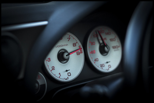
At first I thought this was going to be a difficult one to manufacture, however knowing I was going to a car show this morning meant my imagination kicked in and focused my interest towards the cars. So...
Limit
 week20 by Nathan Browning, on Flickr
At first I thought this was going to be a difficult one to manufacture, however knowing I was going to a car show this morning meant my imagination kicked in and focused my interest towards the cars. So...
Limit
 week20 by Nathan Browning, on Flickr
- Messages
- 7,548
- Name
- susie
- Edit My Images
- Yes
Hi Nathan ....apologies because I don't think I've actually commented on your thread so I'll at least go back to the top of this page.
Sound ...the mixing desk is a great idea and I think the B&W suits it perfectly, with the drums I think I would have tended to zoom in on the cymbals part ....I think that would make a really striking image..
Experiment ....how nice that you not only only cook but you experiment too a man who can cook is definitely on my list for my next life. I like the way it looks like an experiment in action ....not just a posed one ....I hope it worked ....I've never heard of velvetting ....excellent choice for the theme.
Heat ....another good action shot with the drip on the sauce.
Figures ...yes it's a bit of a shoehorn but I like the fact that you've drawn attention to something that would so easily be passed by, the low pov and the stunning sky give it a real sense of atmosphere.
Household ...I think a little glowing candle would have been the icing on the cake on this one, but great DOF and the house is in perfect focus ....it's a very eye catching shot.
Limit ...bang on for the theme, and perfect focus on the vital part of the dial.
A super thread Nathan ....I shall definitely try to hop in more often.
Sound ...the mixing desk is a great idea and I think the B&W suits it perfectly, with the drums I think I would have tended to zoom in on the cymbals part ....I think that would make a really striking image..
Experiment ....how nice that you not only only cook but you experiment too
Heat ....another good action shot with the drip on the sauce.
Figures ...yes it's a bit of a shoehorn but I like the fact that you've drawn attention to something that would so easily be passed by, the low pov and the stunning sky give it a real sense of atmosphere.
Household ...I think a little glowing candle would have been the icing on the cake on this one, but great DOF and the house is in perfect focus ....it's a very eye catching shot.
Limit ...bang on for the theme, and perfect focus on the vital part of the dial.
A super thread Nathan ....I shall definitely try to hop in more often.
- Messages
- 908
- Name
- nathan
- Edit My Images
- Yes
Hi Nathan ....apologies because I don't think I've actually commented on your thread so I'll at least go back to the top of this page.
Sound ...the mixing desk is a great idea and I think the B&W suits it perfectly, with the drums I think I would have tended to zoom in on the cymbals part ....I think that would make a really striking image..
Experiment ....how nice that you not only only cook but you experiment tooa man who can cook is definitely on my list for my next life. I like the way it looks like an experiment in action ....not just a posed one ....I hope it worked ....I've never heard of velvetting ....excellent choice for the theme.
Heat ....another good action shot with the drip on the sauce.
Figures ...yes it's a bit of a shoehorn but I like the fact that you've drawn attention to something that would so easily be passed by, the low pov and the stunning sky give it a real sense of atmosphere.
Household ...I think a little glowing candle would have been the icing on the cake on this one, but great DOF and the house is in perfect focus ....it's a very eye catching shot.
Limit ...bang on for the theme, and perfect focus on the vital part of the dial.
A super thread Nathan ....I shall definitely try to hop in more often.
Thank you susie, appreciate your time and feedback!
Hi, Limit, another one quick off the mark
On theme and nice DOF.
Cheers.
Spot on theme and at maximum limit.
VVVEEEETTTECCCHHH lol!
On theme ... and there are some beautiful textures & colours there.
As above really, fits the theme well the red really shows up
Thank you both for your comments.
- Messages
- 908
- Name
- nathan
- Edit My Images
- Yes
Week20 Reshoot:- Scenic
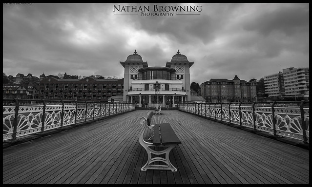
Taken mothers day but not found until I started trying to clear my cards last night, was a dreary Spring day, but made for some dramatic clouds
 Penarth Pier by Nathan Browning, on Flickr
Taken mothers day but not found until I started trying to clear my cards last night, was a dreary Spring day, but made for some dramatic clouds
 Penarth Pier by Nathan Browning, on Flickr
- Messages
- 908
- Name
- nathan
- Edit My Images
- Yes
Hi Nathan,
Figures - that's a smashing landscape shot and I really like the detail in the sky
Household - super shot, everything leads your eye to the house in the centre
limit - well on theme and nicely shot
Thanks Lorraine, appreciate you stopping by to comment
Love your re-shoot Nathan, perfect choice with the b&w and the leading lines. It looks slightly skewed to the right, but I could be wrong.
I dunno about skew i used the ruler tool along the top of the pavillion pillars, the oldies were not known for making particularly straight buildings... maybe... lol
- Messages
- 908
- Name
- nathan
- Edit My Images
- Yes
So I've done bizarre, just....
not at all happy with it, boring subject matter that maybe only I find bizarre so yer.... meh!
found on a grubby old windowsill in my junk spare room, no idea what it is or what its supposed to raise awareness for... Smokebugs? anyone care to enlighten me?
anyway here it is:
Week21 - Bizarre
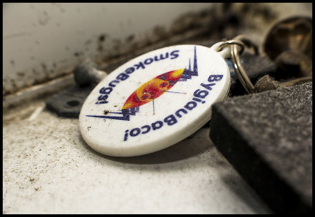 week21 by Nathan Browning, on Flickr
not at all happy with it, boring subject matter that maybe only I find bizarre so yer.... meh!
found on a grubby old windowsill in my junk spare room, no idea what it is or what its supposed to raise awareness for... Smokebugs? anyone care to enlighten me?
anyway here it is:
Week21 - Bizarre
 week21 by Nathan Browning, on Flickr
- Messages
- 1,408
- Name
- Elaine
- Edit My Images
- Yes
Love your reshoot Nathan, the b/w gives it a good vintage feel and the clouds add a bit of drama 

- Messages
- 908
- Name
- nathan
- Edit My Images
- Yes
Whoops! got a little behind with posting but keeping on time shooting lol (honest!)
Week22 - Broken 'mind'
I saw this sculpture whilst away with the wife in Wiltshire, to me it signified a broken mind as all of the head/face was intact and complete but the brain area was sequence of metal rods interlinked with no matter in between, could be a great sculpture for mental health advertisements I think,
 Week22 by Nathan Browning, on Flickr
Week23 - Entertain
What more could you ask for, apart from the real thing of course, a Queen tribute in my local park on the weekend of the announcement of entertainment meant i could easily fulfill this one!
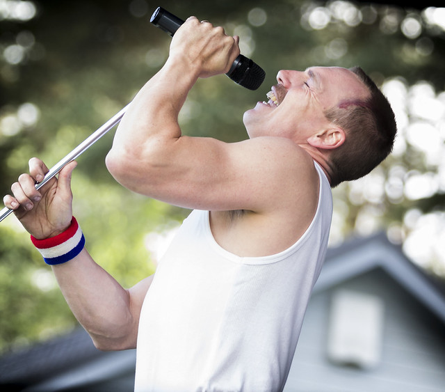 Week23 by Nathan Browning, on Flickr
As always C&C welcomed!
Week22 - Broken 'mind'
I saw this sculpture whilst away with the wife in Wiltshire, to me it signified a broken mind as all of the head/face was intact and complete but the brain area was sequence of metal rods interlinked with no matter in between, could be a great sculpture for mental health advertisements I think,
 Week22 by Nathan Browning, on Flickr
Week23 - Entertain
What more could you ask for, apart from the real thing of course, a Queen tribute in my local park on the weekend of the announcement of entertainment meant i could easily fulfill this one!
 Week23 by Nathan Browning, on Flickr
As always C&C welcomed!


