weekly Choppie's 2015 Photo52 Challenge. - Week 37 Special added

Faster than Bolt out of the blocks !!!! Where/how/when did you get to know? Nicely themed, good composition and nice lighting. (Enjoy your trip)
 
The mention of a suspenders panties and a bra in the challenge thread scared me!
 
That's an excellent idea for Support Ian, a very interesting-looking tripod too.

Minor crit ... Zooming in, the top looks gorgeous, and I think that top bit only would make a better sharper image. It may not be immediately apparent that it's tripod but ....
 
I think that top bit only would make a better sharper image. It may not be immediately apparent that it's tripod but ....

Thanks David. Do you me just crop to the tripod head?
 
I need to see all that glorious detail .... something a bit like THIS

>
>
>

08/08/15 - EDIT - Perhaps it's not really the done thing on TP52s to edit someone's image and post the result on the thread, so it's now in the link above.

Hope you don't mind my interfering Ian.
 
Last edited:
Medical - On theme, nice grouping and the bold colours are nice, I'd have been tempted to go for a slightly tighter crop, but it's nice as it is. I owe my remaining sanity to those 2 products!
Proverb - I'm fine with either, as there's insufficient colour in the untreated shot to make much difference. The central composition works well, and I like the detail around the strawberry.
Pale - I like the edited version moves from just being a picture of a pebble, to being an image. I like the simplicity of it.
Tear - The monkey was a nice idea, they can't all work. Except for the fact that the tear is hard to make out, there's a darkness towards the bottom of the frame which doesn't look quite right. Good choice of paper colour in the other shots.
Words - Shot #1 works best for me, I just like the washed out tones, and the composition with the dead space to the left of the frame helps.
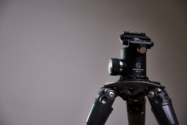
Support - #1 works nicely. Sharp, nicely lit, nicely composed. The crop in #2 doesn't work at all for me.
 
First one for me too (y)
 
Hi Ian, you sneaked in whilst I was away on holiday and you've done a really good job so far!
Favourites for me are the sc version of Proverb - works really well; Tear - just makes me go aaaw! I can just about see the tear on the shot as it is, but careful use of the dodge tool would help it stand out a bit more. The shot for words is a great image - I love the look on his face - and it would have worked just as well for the Support theme!
 
Hi, definitely the first one for me otherwise its a little un obvious what it is
 
Support, decent bit of street photography there, I think I'd prefer a more eye level composition; as Brian said, he looks very happy :)

Support, I rather like #2, I don't need to see all of it to know it's a tripod.

Cheers.
 
Week 33 : Religion
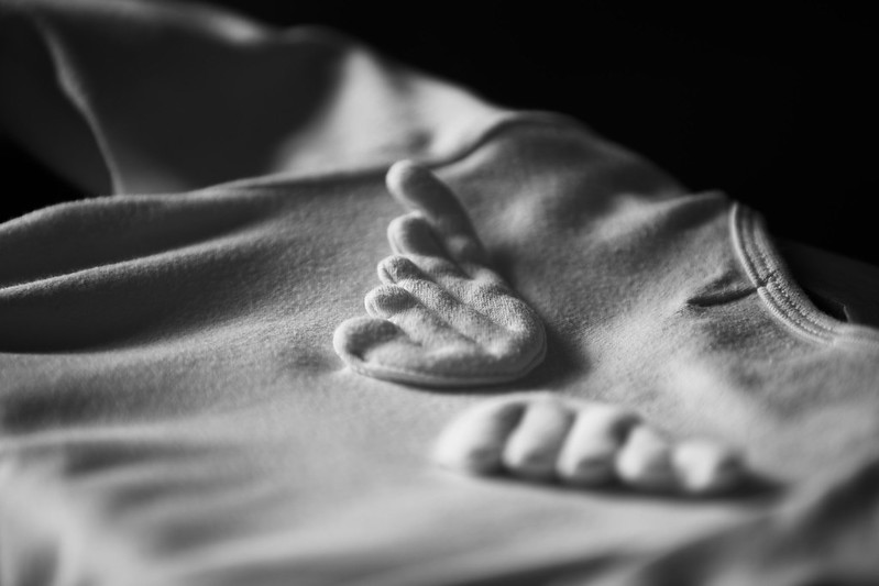
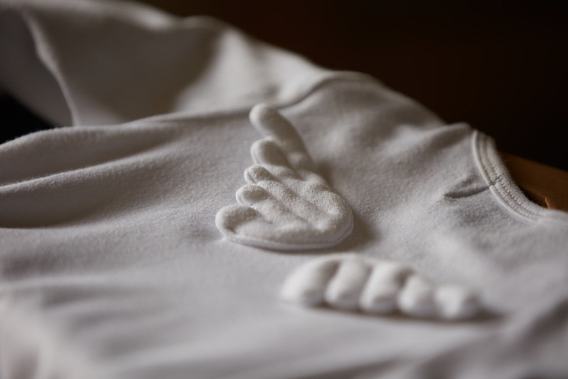
Two versions, I like the B&W but not sure if it's too somber. If you haven't guessed it's one of my daughters rompers. She's too big for it now and ironically I haven't got any pictures of her in it!


TP 52 w33: religion B&W
by choppie01, on Flickr


TP 52 w33: religion
by choppie01, on Flickr

Got a few other ideas but first attempt at them yesterday failed miserably! Will see if I get time later
 
Last edited:
Hi think you are perfectly right the black and white shot is better, nice subtle meaning too (y)
 
Hi Ian. Never even thought of that link with religion - very novel take. I too go for the b&w for preference. Nice focus and DoF.
 
Yes, very novel take and yes another one with a preference for the B&W ... on this occasion. (y)
 
Hi think you are perfectly right the black and white shot is better, nice subtle meaning too (y)

Love this, especially in black and white!

Hi Ian. Never even thought of that link with religion - very novel take. I too go for the b&w for preference. Nice focus and DoF.

Yes, very novel take and yes another one with a preference for the B&W ... on this occasion. (y)

Thanks folks, it was the perfect excuse to try out the new lens :)
 
Ah now I threatened that I'd post on your thread didn't I, Ian:D

Medical .... Really nice bright bold colours, sharp focus. Didn't know they did Nurofen in shots like Calpol! Anyhow well lit, nice composition, just needs a tweak clockwise.

Proverb .... Like this shot a lot, nice composition. I think the selective colour really works well, I guess its a marmite thing though:). I like it here. Think the DOF is working well for you, but think those specular highlights on the foot of the glass are a little distracting, if I had my really picky with my OCD hat on I'd say the glass is off centre on the table in those little circles:eek: that's just Tooooooooooo Picky:runaway: (OCD hat off).

Stoned .... ooppsss! I mean Pale:D. Got to be No2 for me. Minimalist, some light texture in the stone, maybe a small pile of 3 little stone might have anchored it and made it less floaty not sure... Nice clean shot fits the theme well.

Tear .... I can see the tracks of his tears (that was a song wasn't it!). Anyhow what I would try is this .... Get your camera all set up with the remote release, because it might be good to be quick. Then I'd use some glycerine in an eye dropper as its much thicker than water and less likely to soak in so quickly. Just a thought.
Think you needed a little more light on the LH side to pick it up a tad.
Tear ..... As in paper, I like v2 but for me the DOF is much too sharp, the thing that hits me is the top of the curl and as you follow the curl around is OOF IMHO. So all that detail of the tear in the curls has been lost. The point of focus is halfway along the tube which puts the tear OOF and most of the texture of the paper OOF too.:(

Words ... I really like this, with Carl on this one. Like the story, really nice sharp focus in the right place, door has some nice character, if I was going to say anything just a smidge less aperture, or point of focus a tad to the left pick up the "Mr". But a cracking shot(y)
Words 2 ... a very happy chappy he would have my donation any day, am sure it makes a big difference if you have a nice chatty person making collections. Spot on DOF here. Very nice shot, nice and colourful too(y)

Support .... Bugger another idea gone:rolleyes:. I'm with the first image as it stands, but then David's version of the image is really nice as Susie says lots of oommhhh!
I really quite like the background and the lighting on this. I think this stand on its own 3 feet:D:ROFLMAO:. Nice shot, I'm afraid No2 doesn't do it for me, too much of the subject material missing.

Religion ....Great take on the theme! Yes No 1 for me to great contrast, and shadow, like the muted lighting on the point of focus.

See it wasn't too bad was it.... I'm taking the medication today:D Hope you find some of this inane babble useful.
 
Really really like this, this type of image is right up my street and so have a huge appreciation for this. Ive just followed you on flickr too, I was being nosey and checked out the information and so see you have a really nice camera. Can I ask does a very good camera make these images easier to capture or is it purely based on the artist behind the lens?

Apologies to Ian for a minor hijack. I see no one really came along and answered your question " Can I ask does a very good camera make these images easier to capture or is it purely based on the artist behind the lens?"

Well most definitely the person standing behind the camera and there are many reasons for this. If you consider most camera's today are more than capable of producing excellent images, how they are used are what makes the difference. First of all the camera is so often fooled by light, so if the person behind it doesn't know how to compensate then the images will not be good. The camera cannot compose your image for you, the photographer does that and it cant pick the right light to shoot in and so on...

However, obviously using the right equipment for the job in hand makes a difference, and better cameras do have attributes that can help you like for example better low light handling etc etc. (if you need it).
Also the Lens has a great deal to do with it, for example, I bought excellent lenses over changing my camera for a fair few years. (there's ALWAYS a new model of camera out). People do go under the misapprehension of thinking if they buy a £1500 camera its going to make them a great photographer..... It wont;).
Hope that helps Laura

Sorry for the mild Hijack Ian
 
Last edited:
Proverb .... Like this shot a lot, nice composition. I think the selective colour really works well, I guess its a marmite thing though:). I like it here. Think the DOF is working well for you, but think those specular highlights on the foot of the glass are a little distracting, if I had my really picky with my OCD hat on I'd say the glass is off centre on the table in those little circles:eek: that's just Tooooooooooo Picky:runaway: (OCD hat off).

Hi Steve, all constructive comments are welcome - thank you. I did mess about with the alignments of the glass I suspect you are right

Stoned .... ooppsss! I mean Pale:D. Got to be No2 for me. Minimalist, some light texture in the stone, maybe a small pile of 3 little stone might have anchored it and made it less floaty not sure... Nice clean shot fits the theme well.
:D Good idea I should have tried that, the backgound is actually some black leather on my desk which I darkened in post as I thought it might distract, but maybe I should have left it in.

Tear .... I can see the tracks of his tears (that was a song wasn't it!). Anyhow what I would try is this .... Get your camera all set up with the remote release, because it might be good to be quick. Then I'd use some glycerine in an eye dropper as its much thicker than water and less likely to soak in so quickly. Just a thought.
Think you needed a little more light on the LH side to pick it up a tad.
Tear ..... As in paper, I like v2 but for me the DOF is much too sharp, the thing that hits me is the top of the curl and as you follow the curl around is OOF IMHO. So all that detail of the tear in the curls has been lost. The point of focus is halfway along the tube which puts the tear OOF and most of the texture of the paper OOF too.:(
.
For the tear in the monkey I actually ended up using some makeup stuff (god knows what it was), so it didn't move all that fast. Getting the tear to show was the problem, but as you and others said maybe some lighting on the LH might have helped that would. - only using one light at the moment as I'm still trying to get my head around it.

Words ... I really like this, with Carl on this one. Like the story, really nice sharp focus in the right place, door has some nice character, if I was going to say anything just a smidge less aperture, or point of focus a tad to the left pick up the "Mr". But a cracking shot(y)
Words 2 ... a very happy chappy he would have my donation any day, am sure it makes a big difference if you have a nice chatty person making collections. Spot on DOF here. Very nice shot, nice and colourful too(y)
.
Agreed, the MR is just out.


Support .... Bugger another idea gone:rolleyes:. I'm with the first image as it stands, but then David's version of the image is really nice as Susie says lots of oommhhh!
I really quite like the background and the lighting on this. I think this stand on its own 3 feet:D:ROFLMAO:. Nice shot, I'm afraid No2 doesn't do it for me, too much of the subject material missing.
.
Again a quick idea as I didn't have much time that week, but glad you like.

Religion ....Great take on the theme! Yes No 1 for me to great contrast, and shadow, like the muted lighting on the point of focus.
.
Have to say I like this too, going to print and put it up in house.

See it wasn't too bad was it.... I'm taking the medication today:D Hope you find some of this inane babble useful.
.

Not at Steve and thank you for taking the time to give plenty of feedback I hope I can try and improve from it and the other comments. So gotta try harder with my feedback, (at least some participation is better than known i guess.)
 
Apologies to Ian for a minor hijack. I see no one really came along and answered your question " Can I ask does a very good camera make these images easier to capture or is it purely based on the artist behind the lens?"

Well most definitely the person standing behind the camera and there are many reasons for this. If you consider most camera's today are more than capable of producing excellent images, how they are used are what makes the difference. First of all the camera is so often fooled by light, so if the person behind it doesn't know how to compensate then the images will not be good. The camera cannot compose your image for you, the photographer does that and it cant pick the right light to shoot in and so on...

However, obviously using the right equipment for the job in hand makes a difference, and better cameras do have attributes that can help you like for example better low light handling etc etc. (if you need it).
Also the Lens has a great deal to do with it, for example, I bought excellent lenses over changing my camera for a fair few years. (there's ALWAYS a new model of camera out). People do go under the misapprehension of thinking if they buy a £1500 camera its going to make them a great photographer..... It wont;).
Hope that helps Laura

Sorry for the mild Hijack Ian
No problem Steve, I did respond myself but if I recall Laura started another thread about it. :)
 
Wow thank you for al the specific comments Ian, but no need(y)
I never stop learning and there are some great people here on TP that are always willing to help.
Keep up the great work Ian(y)
 
Apologies to Ian for a minor hijack. I see no one really came along and answered your question " Can I ask does a very good camera make these images easier to capture or is it purely based on the artist behind the lens?"

Well most definitely the person standing behind the camera and there are many reasons for this. If you consider most camera's today are more than capable of producing excellent images, how they are used are what makes the difference. First of all the camera is so often fooled by light, so if the person behind it doesn't know how to compensate then the images will not be good. The camera cannot compose your image for you, the photographer does that and it cant pick the right light to shoot in and so on...

However, obviously using the right equipment for the job in hand makes a difference, and better cameras do have attributes that can help you like for example better low light handling etc etc. (if you need it).
Also the Lens has a great deal to do with it, for example, I bought excellent lenses over changing my camera for a fair few years. (there's ALWAYS a new model of camera out). People do go under the misapprehension of thinking if they buy a £1500 camera its going to make them a great photographer..... It wont;).
Hope that helps Laura

Sorry for the mild Hijack Ian

Thank you! It helps loads xxx
 
#2 for me. Lovely textures in the baby grow.

I'd prefer both the wings n focus.

Minor point, though; these items of clothing really do bring back the memories.....of when they weren't TEENAGERS :)

Cheers.
 
#2 for me. Lovely textures in the baby grow.

I'd prefer both the wings n focus.

Minor point, though; these items of clothing really do bring back the memories.....of when they weren't TEENAGERS :)

Cheers.
Fair point about the wings. I should have taken a few a different versions (I might have but at different angles) . Cheers
 
Hi Ian
Looks like you're off to a cracking start (y)

Medical: Great colours, sharp and on theme. Cracking stuff :)
Proverb: I'm not a fan of selective colour but your SC one wins for me. My only comment (and I am really nit picking here) is that I would like more of the glass in focus.
Pale: Another good shot. No 2 for me.
Tear (Monkey): I like the concept. Just a thought - how about colouring the tear and trail selectively maybe?
Tear (paper): I prefer v1. Nice choice of colour and good lighting.
Words: I wasn't sure on this when `i first saw it but it has grown on me a lot :) It's a touch tight to the hook at the top but, again, I am being picky.
Words 2: Great natural shot. Looks like a great character.
Support: Nice tripod head. Looks a touch dark towards the top right on my screen? The original works best for me.
Religion: I like the idea but can't help thinking a different perspective is needed or more DoF maybe?
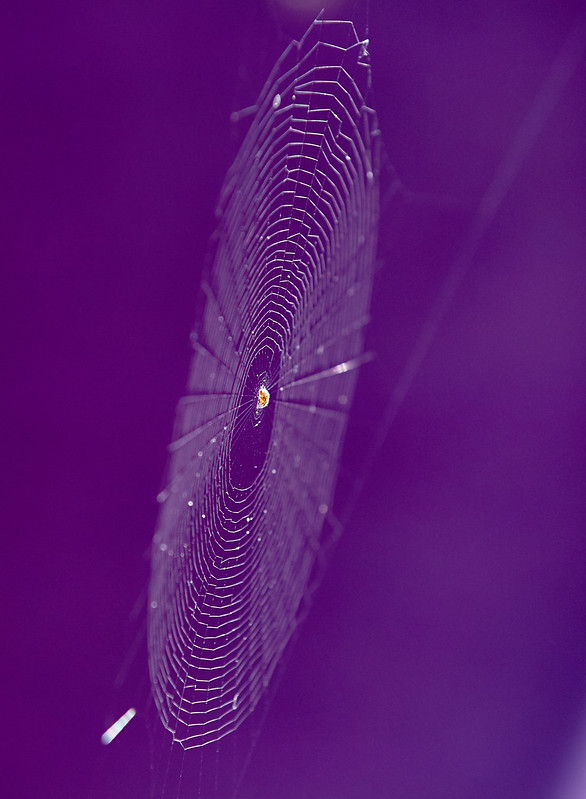
Geometric: Personally, don't look any further:) Stunning shot. Perfect DoF and composition for me. Strong BG colour works perfectly :clap:
 
Back
Top