Critique required Kell's 52 in 22 - week 52. Showcase

A good choice, although I probably would have gone with the B&W door on the back of the building.
I really like the old lock with the cobweb and the coloured graveyard scene. The Old back door works better in B&W.

Pete
Nice set of images, and like your choice. Your B+W conversion looks spot on to me.
A good choice, although I probably would have gone with the B&W door on the back of the building.

Great series Kell. The focus on your chosen image is sharp but I wish I could read the quote under the husband's information (jut for curiosities sake).

For me the image I would have gone with is the doors in the rear. I like how it's framed and the different textures and patinas. I'd be interested in seeing the colour version.

Looks like you had a good day out there, your chosen picture definitely suits the theme.

Hmm, the rear door shot for me, or perhaps the penultimate graveyard one.
Nothing wrong with your selection for the theme, it's just I find the other two have more to look at in them.

All great shots as usual Kell. I like your chosen shot, the mist makes it for me, but the rear doors one a close second for me as well.

Think you put the right on in the main thread, 1828 is old.

My choice would have been the padlock or the back doors. That’s the joy of this,everyone has a different viewpoint.

Nicely done, and on theme, but I really like the lock shot, it's a great image.

You sure are spoiled for choice this week. They all fit the theme. I like the one you've picked and the black and white conversion suit the subject.

Nice set Kell and a hard choice. I would have gone with the next to last churchyard one. I like the angle and the composition.

Great selection of old items, the house is amazing its so old I surprise its still stood up. Lots of interesting photos.


Thanks all. It's amazing when you have a choice how you can flick between different images. I really liked the lock as an image, but wasn't sure it said 'old' as much as some of the others. It's also interesting that lots of people have a different idea on what they prefer.

Slightly frustrating as the light when I went out for a bimble before work this morning was great. Sunny and misty:

Could have added a whole other dimension.

IMG_0995 by Kell Lunam-Cowan, on Flickr
 
I like your chosen shot. The misty background makes the gravestone pop - very nicely processed.
 
Couple of themes for this week.

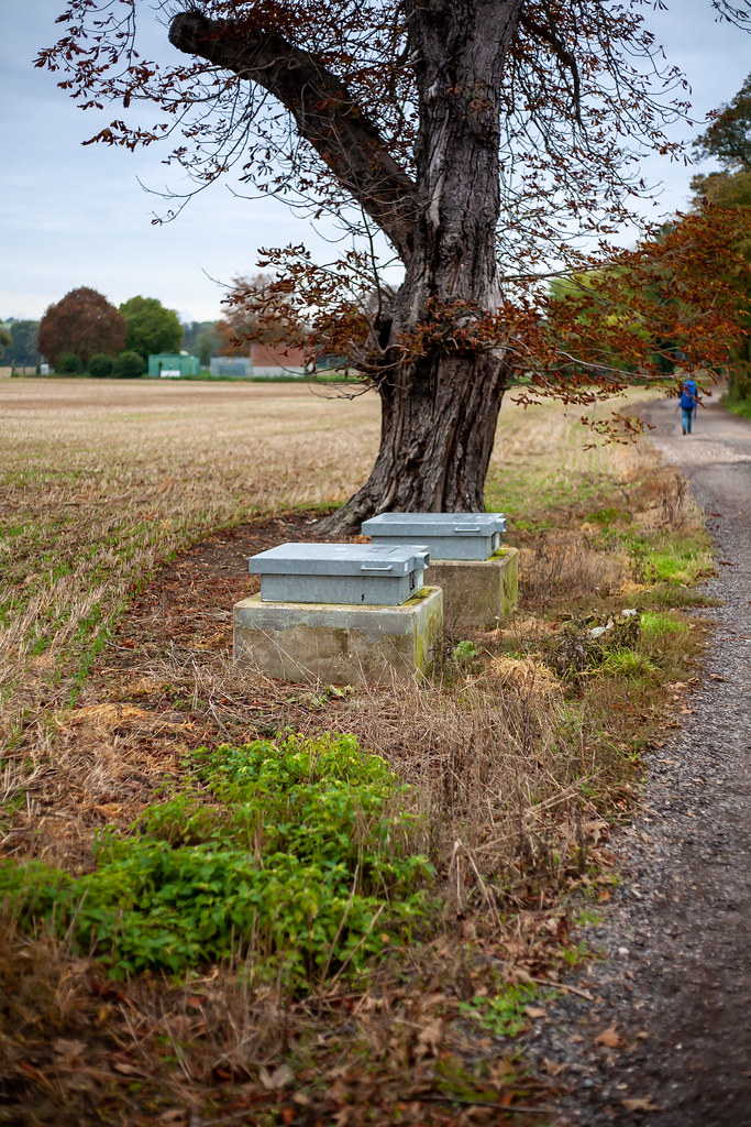
The first is this.

Still not entirely sure what these are (there are two side-by-side) but the stencilled-on sign makes me think that they're RECEPTACLES for people's souls.

Dull, flat light again today, which influenced my choice of desaturated and mono conversions.

5D3_8704 by Kell Lunam-Cowan, on Flickr

5D3_8705 by Kell Lunam-Cowan, on Flickr

5D3_8706 by Kell Lunam-Cowan, on Flickr

However, my first thought when I saw this theme (and don't ask why my mind went there) - was for the bins you deposit dog poo in.

5D3_8612 by Kell Lunam-Cowan, on Flickr

Happened to be lucky while thinking about setting up a shot for this when someone came up and made a deposit. Loved the look in the dog's eyes. Might just be reflections, but he looks totally shocked: "Waht doing wiff ma poo?"

5D3_8611 by Kell Lunam-Cowan, on Flickr
 
Last edited:
Some interesting receptacles Kell. I think I like the third shot the best. Definitely would make me think twice about opening it. What is actually did contain a portal to Hell? There's a story there to be told.

I think that with your chosen shot I might have cropped it in to just the lady, the container and her four-legged companion.
 
Your chosen image has great interplay between the dog and owner.

Like others, I do wonder about the Hell Portal!
 
Some good observations, but I agree the chosen one is a good composition. I had thought about poo bins too, but your shot was way better than what I had considered
 
That portal though... o_O (I like the 3rd one best)

I like your chosen one though. Spot on theme
 
Love the pooch pic. It'd make a good caption comp! :D
 
Your chosen image certainly fits the brief but the Hell Portals are more intriguing to me! I wonder what they really are - not sure they're correctly labelled!
 
Good subject and you’ve chosen the right image.
Fills the brief very well.
 
The first set made me laugh! Someone seeing the funny side of what is probably a very boring receptacle.
Nice to see people making use of those doggy doo receptacles.. too many don't seem to see then :)
 
Your chosen image certainly fits the brief but the Hell Portals are more intriguing to me! I wonder what they really are - not sure they're correctly labelled!

Still not entirely sure - here they are from a different angle (and another day). I think there's some sort of water treatment place in the distance (which would make sense as they're not far from the Thames).

The Hell Portals by Kell Lunam-Cowan, on Flickr

Next time I'm out that way, I'll have a look.
 
  • Like
Reactions: Nod
Someone posted the following on one of my flickr photos:

"ROC post entrance. ROC - Royal Observation Corps. Used in the cold war at times of great internatonal tension."

Not sure that's correct as when I did a search for that, it didn't come back with anything in the area.
 
  • Like
Reactions: Nod
I like the third the best of the original set Kell, though I do rather like the colour one you posted recently.
 
Frosty works well ;)
 
Receptacle - The expression created by the tree bark makes the image with the dog even better

Bottle - Serve chilled, anyone seeing a TP photographer in the wild must wonder what they are up to!! :)
 
Receptacle - The expression created by the tree bark makes the image with the dog even better

Bottle - Serve chilled, anyone seeing a TP photographer in the wild must wonder what they are up to!! :)


I definitely got some funny looks taking pictures of poo-bins.
 
Receptacle - wow what curious items!! Presumably someone is having a laugh with the writing on it? Quite fascinating so thank you for sharing.

Bottle - very sad to see, but well spotted and perfect for the theme, and served chilled as Stuart said :)
 
Nice shot Kell, I like it when a good image is made from some prosaic object that most people wouldn't even notice.
 
Regarding the covers. There’s also the possibility that you were intended to find them for a purpose assigned to you by a higher deity, and, if I were to be turned into one of those covers, I think I’d be a little alarmed as well. ;) Either way, it’s the mono one for me, it just ‘pops’ more than the others!
 
I like the tones in that, the processing really suits the subject.
 
Nicely processed - it picks up all the textures you've incorporated.
 
Week 05 - Snapper's Choice + ICM technique.

I've been at a loss to try and think of a subject that would benefit from the ICM for the previous weeks, so figured I'd dedicate this to just producing the technique.

Just for reference, often when you see these sorts of shots, they're done with a static camera, and moving lights. I thought I'd try it the other way with a static light and move the camera to try and get the letters ICM in camera.

Few things to consider... It's a mind bender. If you start trying to write with the light on the left, you're moving the camera the wrong way - right to left, so that feels unnaturally weird and my tiny brain couldn't cope.

Not only that, but the M has to be written as a W and the C has to be written backwards. Trying to remember all that and move the camera backwards... o_O

5D3_8971 by Kell Lunam-Cowan, on Flickr

So then I tried some starting with the light on the right and trying to write everything backwards (with a view to flipping it in post). But then this time, you should write the C the right way round ... Couldn't get it...

5D3_8973 by Kell Lunam-Cowan, on Flickr

5D3_8974 by Kell Lunam-Cowan, on Flickr

5D3_8978 by Kell Lunam-Cowan, on Flickr

While I think I could have got it, eventually, I thought a triptych might be better... i.e. do each letter on its own.

TP52_05 Snappers Choice ICM2 by Kell Lunam-Cowan, on Flickr

And then I remembered I had a colour-changing torch.

TP52_05 Snappers Choice ICM by Kell Lunam-Cowan, on Flickr
 
Yep the last on does it for me ... nice image
 
I have to agree, the last one does it. Very creative and nicely done.
 
A very original take on the theme.

Being a naturally lazy person, I probably would have just written "I", "C" & "M" in light trails and argued the toss that it clearly was ICM, which was what we were asked to do. So well done for going the extra mile (or several miles).
 
A couple of the single shot tries look like "IOU" more than "ICM". I like the triptych idea.
 
Got there in the end - good work!
 
A couple of the single shot tries look like "IOU" more than "ICM". I like the triptych idea.
I know - honestly I couldn't get my head around the movement I needed to make to get it right.

I think I'd have got there in the end, but it was cold and my dinner was ready...
 
Back
Top