

You are using an out of date browser. It may not display this or other websites correctly.
You should upgrade or use an alternative browser.
You should upgrade or use an alternative browser.
LC2's Many Many Fine Shoehorns in 2017 :Week 52 - Weather ** COMPLETED **
- Thread starter LC2
- Start date
- Messages
- 1,075
- Name
- Georgina
- Edit My Images
- Yes
Hi Tim
Display - Very good display of power. the colours are lovely on this one and particularly like the touch of pink in the sky
Occupation - Lovely portrait, I think they would be very pleased to have a copy of this one
Arch - Just about got the arch in. I think I might have been tempted to crop little off the bottom to lose the red light and maybe a little from the left too but a good shot of the engine coming up to the arch
You - Not sure about this one but I'm sure you must be in there somewhere
- Messages
- 3,413
- Name
- Mark
- Edit My Images
- Yes
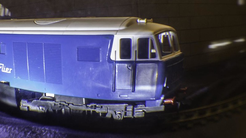
Liking your arch shot Tim, nicely timed to get the driver looking out at you while in this beaut of an engine
100% this, its a nice shot for the theme...
OP
LC2
Negan
- Messages
- 10,451
- Name
- Tim
- Edit My Images
- Yes
Surely that would have to be a sink plungerThe eye of a Dalek is watching You, PABD good enough for me
Cropping closer on the right. Hmm interesting idea, I had little enough of the arch as it is.Hi, Arch, might have been tempted to crop in a bit closer on the right.
You....still searching....but I do like the green.
Cheers.
Are you thinking lose the vertical bit?
I really should be in that shot. I'm only a couple of feet from it. Gawd knows where though, as I can't see me either.
Hahahaa at You, it had me looking closely for a moment or two, didn't realise you didn't see yourself either
Ta Mark, if at all possible I was always going to try to frame a train for Arch.Hi Tim
I kinda knew your arch shot would be th above, but still a nice shot image and on theme....
And yet, it really isn't. I must be in there somewhere.I can see there are some blurry figures or trains or signals but not You! One of the most subtle shoehorns shot yet.
Only heading? I must try harder.Yes I think you're heading for the shoehorn of the year award with that one Tim
Hi Georgina,Hi Tim
Display - Very good display of power. the colours are lovely on this one and particularly like the touch of pink in the sky
Occupation - Lovely portrait, I think they would be very pleased to have a copy of this one
Arch - Just about got the arch in. I think I might have been tempted to crop little off the bottom to lose the red light and maybe a little from the left too but a good shot of the engine coming up to the arch
You - Not sure about this one but I'm sure you must be in there somewhere
I liked the sky in Display too.
Arch, isn't it interesting how people see it differently. Andy thinks lose a bit of the right, you think the left. Perception is a funny thing.
Could be worse, you might be able to see me !100% this, its a nice shot for the theme...
I'm beginning to think if it as enigmatic.You - perhaps the Dalek had already exterminated you? The sort of selfie I like to take, where you can't see me.
OP
LC2
Negan
- Messages
- 10,451
- Name
- Tim
- Edit My Images
- Yes
Week 39 - Bent
Had a very busy few weeks at work, and my one opportunity to try to catch up and nothing comes out the way I want it.
Nothing to see here, please move along
TP 52 for 2017 - Week 39 : Bent by Tim White, on Flickr
Had a very busy few weeks at work, and my one opportunity to try to catch up and nothing comes out the way I want it.
Nothing to see here, please move along
TP 52 for 2017 - Week 39 : Bent by Tim White, on Flickr
OP
LC2
Negan
- Messages
- 10,451
- Name
- Tim
- Edit My Images
- Yes
Week 41 - Wall
I think I've hit the wall too here. New laptop (Windows 10), new versions of editing s/w (LR & PS CC from PSE12 and CS2).
It's a bit of a culture shock.
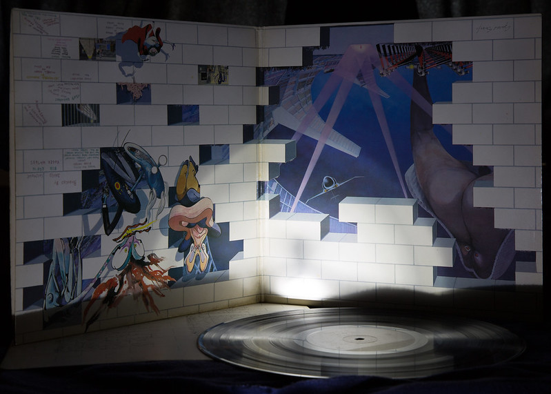
Anyway, this is my submission for "Wall". Yes, it is an original from 1980 (I think I bought it in the Jan with some of my Christmas money).
Lit with my trusty maglite (I wanted to have the light fall off very quickly to obscure the background).
I should give up on arty indoors shots and go back to trains
TP 52 for 2017 - Week 41 : Wall by Tim White, on Flickr
I think I've hit the wall too here. New laptop (Windows 10), new versions of editing s/w (LR & PS CC from PSE12 and CS2).
It's a bit of a culture shock.
Anyway, this is my submission for "Wall". Yes, it is an original from 1980 (I think I bought it in the Jan with some of my Christmas money).
Lit with my trusty maglite (I wanted to have the light fall off very quickly to obscure the background).
I should give up on arty indoors shots and go back to trains
TP 52 for 2017 - Week 41 : Wall by Tim White, on Flickr
- Messages
- 11,087
- Name
- Allan
- Edit My Images
- No
Bent, see where you are going with this, maybe if you would have shot it at a wider angle it would have emphasised the bend and distortion of the train more
Wall, a bit more even light its a bit harsh in the middle bottom, a bit picky maybe but I would like to see the label on the L.P in more detail, its not asking much is it
Wall, a bit more even light its a bit harsh in the middle bottom, a bit picky maybe but I would like to see the label on the L.P in more detail, its not asking much is it
OP
LC2
Negan
- Messages
- 10,451
- Name
- Tim
- Edit My Images
- Yes
Thanks, the idea was to lose all the background, which more or less worked.Wall
I quite like your wall shot, it's different from the norm. That light gives a nice effect too.
Yeah, I would have preferred not to have that shadow, but it was an artifact of the position of the torchThat's a nice shot love the lighting. My only negative comments are the dark shadows at the bottom of the album sleeve. My son got all my Pink Floyd albums and they are all first pressings.
Bent was actually quite difficult. the shot was taken through my crystal ball (canal bridge shot a couple of years ago) and getting anything that even vaguely worked was a real effort. A wider shot would have included all sorts of junk.Bent, see where you are going with this, maybe if you would have shot it at a wider angle it would have emphasised the bend and distortion of the train more
Wall, a bit more even light its a bit harsh in the middle bottom, a bit picky maybe but I would like to see the label on the L.P in more detail, its not asking much is it
I did try a shot where the light picked out the label on the LP, but didn't like it as much.
I do have a flash, stand, umbrella, but it would have given too much overall light. Perhaps I could have made a snood to direct the light.Bent, interesting take on the theme, I like the idea.
Wall - I've got one of those somewhere, will have to go and dig it out now. Don't give up on indoors photos but maybe the maglight isn't the best tool for this job.
I agree, the lighting could have been better, but I don't think I could have done much more with what I have available.Hi Tim ....Bent makes sense, I can just about see the bend in the track.
I really like your idea for wall, lighting not the best, but I love the image .... nice to see something different, not that I don't love the trains
OP
LC2
Negan
- Messages
- 10,451
- Name
- Tim
- Edit My Images
- Yes
Week 42 - Symmetrical
Well, nearly, kinda sorta.
okay, so not really, but close.
TP 52 for 2017 - Week 42 : Symmetrical by Tim White, on Flickr
Well, nearly, kinda sorta.
okay, so not really, but close.
TP 52 for 2017 - Week 42 : Symmetrical by Tim White, on Flickr
- Messages
- 13,760
- Edit My Images
- Yes
Well bent works in a way mate, and box ticked
Wall - A clever idea, set up is okayand the light does help hide the background, you should keep trying these as that is the way to get better
Symmetry - Just about worksin an odd way, but hey some cool textures and colours on that steel
Wall - A clever idea, set up is okayand the light does help hide the background, you should keep trying these as that is the way to get better
Symmetry - Just about worksin an odd way, but hey some cool textures and colours on that steel
OP
LC2
Negan
- Messages
- 10,451
- Name
- Tim
- Edit My Images
- Yes
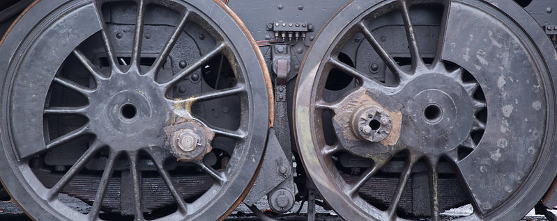
I couldn't convince anyone to put the loco up on jacks and move the wheels around until it was truly symmetricalAlmost symmetrical, nice idea for the theme
Nicely lit... Actually it was a pre-dawn long exposure manually focused using the live view screen.Close enough, Tim. Nicely lit with good details and texture. Even the suspensions details behind the wheels. Would be nice to have the all of the wheels.
It was a creative choice to crop into the wheels. Maybe it didn't work...
Detail was what I was going forWell sort of, I agree all of the wheel would have been good, looks much better on Flickr as you can see the detail a little more
Thanks Dave.Agree with Allan, looking on Flickr you do see more detail and a nice shot too.
The lighting could have been a fair bit better for Wall, though the focused light and drop off was what I wanted, but it *may* be a bit heavy handed.Hi Tim
Wall - brilliant idea and gutted I didnt think of it, very nicely shot as well.
Symmerty- the idea is there but sadly the symmetry isnt - but you now that !
I think bent was the weakest of the lot, the idea was there, the execution wasn't. Still PABD.Well bent works in a way mate, and box ticked
Wall - A clever idea, set up is okayand the light does help hide the background, you should keep trying these as that is the way to get better
Symmetry - Just about worksin an odd way, but hey some cool textures and colours on that steel
Wall - yes, you're right, I shouldn't just give up. I do need better backgrounds / more space though.
Symmetrical wasn't as much of a shoehorn as some of my shots
Thanks Chris. Someone who appreciates the cropSymmetry - really like that, good tones and details and the crop really suits it.
Cheers Susie. 2 votes for my cropHi Tim , I like the crop too, lots of interesting detail in there ...not quite symmetrical, but near enough
Thanks David. Bent - as I said to DK, I tried (but failed).Bent ... HaHa ... nice try.
Wall ... Gerald Scarfe, I like it, not because I like Gerald Scarfe but I think your concept is original and arty.
Symmetrical ... it's not very, but fantastic old heavy engineering detail. Good light & colour.
Glad you like The Wall. It just struck me as what I wanted to try as soon as I read the theme.
Symmetrical. Well it gave me an excuse to do more trains and I went for something less mainstream (mainly because it's not symmetrical) than I could have.
OP
LC2
Negan
- Messages
- 10,451
- Name
- Tim
- Edit My Images
- Yes
Week 40 - Wooden
I'm not completely sure of the significance of a half rotted away rowing boat on the 3rd floor of Portchester Castle other than during the French Revolutionary and Napoleonic wars (1793–1815) Portchester Castle and hulks in Portchester Lake were used to hold prisoners of war.
Anyway, it's made of wood, it was quite interesting to look at and I don't think it's too terrible a picture.

TP 52 for 2017 - Week 40 : Wooden by Tim White, on Flickr
I'm not completely sure of the significance of a half rotted away rowing boat on the 3rd floor of Portchester Castle other than during the French Revolutionary and Napoleonic wars (1793–1815) Portchester Castle and hulks in Portchester Lake were used to hold prisoners of war.
Anyway, it's made of wood, it was quite interesting to look at and I don't think it's too terrible a picture.
TP 52 for 2017 - Week 40 : Wooden by Tim White, on Flickr
OP
LC2
Negan
- Messages
- 10,451
- Name
- Tim
- Edit My Images
- Yes
Cheers Allan. On reflection perhaps I should have edited out the board.3rd floor of a castle , that is very odd, there is an information board on the wall that could do with cloning out but otherwise an interesting piece
OP
LC2
Negan
- Messages
- 10,451
- Name
- Tim
- Edit My Images
- Yes
Week 43 - Worn
Preserved within Portchester Castle is a fairly large and very worn painting of the castle itself.
Low light and I only had the kit 18-135, so no large apertures. I think it came out reasonably well using the lens hood as a makeshift tripod.
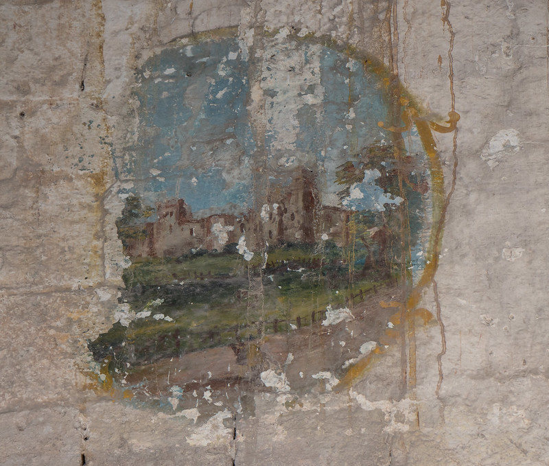
TP 52 for 2017 - Week 43 : Worn by Tim White, on Flickr
Preserved within Portchester Castle is a fairly large and very worn painting of the castle itself.
Low light and I only had the kit 18-135, so no large apertures. I think it came out reasonably well using the lens hood as a makeshift tripod.
TP 52 for 2017 - Week 43 : Worn by Tim White, on Flickr
- Messages
- 104,475
- Name
- The other Chris
- Edit My Images
- Yes
Wood isn't terrible at all, in fact given the situation I think you have done a good jib with lots of detail in the boat and the figures.
Worn is interesting, a painting of the castle inside the castle, good story and certainly worn.
Worn is interesting, a painting of the castle inside the castle, good story and certainly worn.
OP
LC2
Negan
- Messages
- 10,451
- Name
- Tim
- Edit My Images
- Yes
Thanks Dave. It's incredible how these things can last. Presumably aided by being up high and there being no floor.Worn is a great shot and bang on theme Tim, good and fading but still clear enough to make out the castle.
Thanks Andy. I've actually added contrast and clarity. The painting itself was quite hard to view and the lighting wasn't great.Nice back story, works for me. The muted tones suit the painting.
Cheers.
1.3 secs at F5 and iso100 to give myself a chance to pull something out of the image.
F22 was a bit of a risk, but I wanted to get as much detail across the image as possible, and seeing that I was improvising a tripod (with the lens hood), going for a long exposure and small aperture to try to keep it all sharp was worth the gamble.Wood isn't terrible at all, in fact given the situation I think you have done a good jib with lots of detail in the boat and the figures.
Worn is interesting, a painting of the castle inside the castle, good story and certainly worn.
Yes, I believe the girl is supposed to be wading. Not really certain on the story, except it was about slavery.loving that artwork ... the boat, and is that a girl wading through the water?
Worn ... not quite sure what to make of that, how it came to be like that ... certainly interesting .
Photographing 'worn' wasn't the easiest thing in the world, but I think it came out okay.Wood, pic has turned out well, nice composition.
Worn, nice find, looks like you have photographed it well.
I had to wait for people to stop coming up and the deck was very bouncy so any movement would have blurred the shot.
The castle and the exhibits are worth a look if you're ever in the area.Spot on for the theme with Worn Tim, I really like that.
Wood is a fabulous sculpture, how awful for those POW, a real work of art.
There was more space available, but to be honest, the wall wasn't exactly great so I prefer the tight crop.Definitely worn (nearly unrecognisable).
Was there room for a slightly wider shot, i think you could have given it a bit more space.
OP
LC2
Negan
- Messages
- 10,451
- Name
- Tim
- Edit My Images
- Yes
Week 44 - Colourful
Taken at the Salisbury exhibition for Colour of Money author (amongst many other books and the whole discworld series) Terry Prachett who was taken from us in March 2015.
A celebration of some of the artwork on display at the exhibition.
Camera Phone shots only allowed (a bit daft in this day and age, but their exhibition so their rules).
This montage was actually taken during the correct week, but I didn't get a chance to edit and composite them until today.
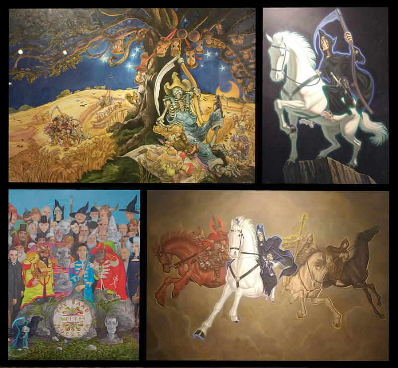
TP 52 for 2017 - Week 44 : Colourful by Tim White, on Flickr
Taken at the Salisbury exhibition for Colour of Money author (amongst many other books and the whole discworld series) Terry Prachett who was taken from us in March 2015.
A celebration of some of the artwork on display at the exhibition.
Camera Phone shots only allowed (a bit daft in this day and age, but their exhibition so their rules).
This montage was actually taken during the correct week, but I didn't get a chance to edit and composite them until today.
TP 52 for 2017 - Week 44 : Colourful by Tim White, on Flickr