weekly Posiview's TP52 2015. Week 52 Christmas added and FINISHED :)

Heat - definitely looks Alien like to me although I wouldn't have immediately tagged it as heat related until I'd had a closer look. Nicely shot (y)

Figures - nowt wrong with a grab shot and we can't be all artyfarty every week :p

Household - can see why you did it like this but it shouts graffic design to me even though you took all the pics sorry :(

Cheers Jill @Bruja, and no worries regarding the crit of Household. I've said elsewhere it'd be a boring place if we all liked the same thing (y)

Bit of a catch up here - sorry!

Heat - This didn't really shout out heat to me on first glance, but I was attracted to the abstract nature of it and now I've read the explanation and looked a bit more carefully, I really like it for composition, colour and the little alien head ;)

Figures - A superb job for what must have been a real rush to capture. I love the dof with the contrasting sharpness of the main subject against the oof bg and am still absolutely intrigued as to how it's done. I can work out that the top man is sitting on a support that's hidden in his cloak, but I still can't work out how the bottom man is holding him up with one hand :confused:

Household - great interpretation of the theme and who knew there was such a thing as green Coke????

Cheers, Elaine, @XenosElaine there is a metal pole in the bamboo - see this photograph :)

Hi Andy,

Figures - that's amazing - how on earth do they do that? bang on theme and very sharp

Household - very well thought out & put together :)

Cheers, Lorraine @Dem55, see link above regarding Figures.

Nice bit of processing there Andy, I like the vibrance.
Spill the beans, how did you process it?

Cheers, processing on Figures, not sure what you mean, the colours or do you think it's Photoshopped???
 
Last edited:
Hi Andy ...well, we got two for the price of one this week :)....the portraits are my favourite...something very startling about the eyes all focusing so directly on the camera and I love the processing :clap:

The first one must have taken ages to do, but it just doesn't work on the white background for me....sorreeee.

Cheers, Susie @susiejb , I might get Household #2 printed.

No worries regarding #1, white BG was the only way to go on this one.

Cheers.

Hi Andy :)

Heat - Love the abstract lit match, took me a while to work it out, that little glow on the head is really well captured mate, really like this :clap:

Figures - It may be a grab shot, but you still have managed to separate the main subjects from the busy background and kept it pretty much uncluttered, works really well for the theme mate, the subjects chosen and their yellow costumes sure help :)

Household 1 - Love this idea, nice and bright, fun to work out each trademark, like the border too :)

Household 2 - Bang on mate, love the processing and similar expressions from you all, no more than that to say :clap:

Cheers, Dean @Dark Knight appreciate the FB. Household #2 is one of my favourites for a long while. It has a rather nostalgic feel to it, which appeals to me.

Loving the tryptich Andy, the eyes really pop! Fab processing :clap::clap::clap:

Cheers Jill, @Bruja, I'm glad you liked Household #2 better than #1 :)

Excellent portrait Andy, spot on theme

Phil

Is that Phil Collins?

Couple of good/different/interesting portrayals of the theme.

Cheers, Phil, @d00d, I've been called Phil Collins and worse, in the past :)

Cheers all.
 
Figures; well caught and good on you for given them some money. I've seen a lot of people just taken photos of them and forget they are actually street artist/performers. I first came across these street statues in Barcelona in 2002.

Household 1; What it said in the tin.
Household 2; Great idea and three very nice portrait shots. Like the triptych and B&W treatment
 
Hi Andy, just a quick catch-up to start with after you were good enough to visit my thread. You're clearly a veteran of 52s while I'm just aiming to actually finish this year!

My favourites so far are
- the vibrant fireguard for Patterns, which got you off to a great start
- the pose, expression and red eyes of Fragile, which needed no caption or explanation!
- your first shot for Scenic where I think you were too harsh on yourself as it's a lovely scene, the composition works well and the light is perfect and conveys the time of day perfectly
- the clever use of the two cranes for Companions and your processing, which was spot on for the conditions
- Vertical for the central composition and processing, which suits the subject very well. We were there a couple of weeks ago and will definitely return as it's a special place
- the wonderful colours in Mouth, which was also a different take on the theme
- Machine for the great idea and excellent PP. Superb work! :clap:
- Sound conveys the theme very well with your daughter looking carried away by the music
- more clever PP for Experiment, something I've always wanted to try and you have carried off brilliantly
and Household, where the direct gazes and identical processing combine for a very compelling result. Good idea, too.

I'll look forward to following your thread :)
 
Hi Andy,
Figures ... was intriguing the first time I saw this in Barcelona, and I still think they must be well practised to be able to get aboard that gizmo without giving the game away even with the shroud they use. My initial thoughts were that the guy up top had had 3 days of eating curry's and was hovering on a layer of gas:D
Right enough cobblers! Yes its a bit of a hot BG on the left hand side, and there's some weirdness going on mid frame on the left, there's a legless torso and an odd leg on its own (maybe a left over from the previous Rolf Harris tribute act) and a strange splodge. But none the less a great grab shot(y)

Household 1 .... Different take on the theme with a pinch of lateral thinking! Obviously a fair bit of work in the shots, then putting it all together. Its amazing what we look at as being household item today isn't it! Only crit from me is looks like someone's been nibbling your frame;).

Household 2 .... Really Like this! I have tried to do something like this before, guess I'm not cut out to take portraits! I loved that you managed to get the expressions all very similar and dead pan, and the eyes.... Fantastic. Its a brilliant series of shots and a great triptych. Next project is to add Daughter 2 then(y). The B&W works exceedingly well here.... Top Work Andy!
 
Figures; well caught and good on you for given them some money. I've seen a lot of people just taken photos of them and forget they are actually street artist/performers. I first came across these street statues in Barcelona in 2002.

Household 1; What it said in the tin.
Household 2; Great idea and three very nice portrait shots. Like the triptych and B&W treatment

Cheers Stan.

Hi Andy, just a quick catch-up to start with after you were good enough to visit my thread. You're clearly a veteran of 52s while I'm just aiming to actually finish this year!

My favourites so far are
- the vibrant fireguard for Patterns, which got you off to a great start
- the pose, expression and red eyes of Fragile, which needed no caption or explanation!
- your first shot for Scenic where I think you were too harsh on yourself as it's a lovely scene, the composition works well and the light is perfect and conveys the time of day perfectly
- the clever use of the two cranes for Companions and your processing, which was spot on for the conditions
- Vertical for the central composition and processing, which suits the subject very well. We were there a couple of weeks ago and will definitely return as it's a special place
- the wonderful colours in Mouth, which was also a different take on the theme
- Machine for the great idea and excellent PP. Superb work! :clap:
- Sound conveys the theme very well with your daughter looking carried away by the music
- more clever PP for Experiment, something I've always wanted to try and you have carried off brilliantly
and Household, where the direct gazes and identical processing combine for a very compelling result. Good idea, too.

I'll look forward to following your thread :)

Cheers Andrea @Manxmaid I'm sure you'll be here at week 52.

I had to revisit some of them as I'd forgotten then :)

Hi Andy,
Figures ... was intriguing the first time I saw this in Barcelona, and I still think they must be well practised to be able to get aboard that gizmo without giving the game away even with the shroud they use. My initial thoughts were that the guy up top had had 3 days of eating curry's and was hovering on a layer of gas:D
Right enough cobblers! Yes its a bit of a hot BG on the left hand side, and there's some weirdness going on mid frame on the left, there's a legless torso and an odd leg on its own (maybe a left over from the previous Rolf Harris tribute act) and a strange splodge. But none the less a great grab shot(y)

Household 1 .... Different take on the theme with a pinch of lateral thinking! Obviously a fair bit of work in the shots, then putting it all together. Its amazing what we look at as being household item today isn't it! Only crit from me is looks like someone's been nibbling your frame;).

Household 2 .... Really Like this! I have tried to do something like this before, guess I'm not cut out to take portraits! I loved that you managed to get the expressions all very similar and dead pan, and the eyes.... Fantastic. Its a brilliant series of shots and a great triptych. Next project is to add Daughter 2 then(y). The B&W works exceedingly well here.... Top Work Andy!

Cheers Steve @69Bonni I almost got away with the shockingly lazy content aware fill processing on Figures :) share eyes you have.

Household #1, one of the things I really like about the 52 is the variation of ideas.

Household #2, enjoyed this one and, as usual, Jackie and isabelle we're helpful models.

Appreciate the feedback (y)

Cheers all.
 
Well Content aware fill is exceptionally clever I think! However you have to keep your eye on it don't you;)
Yep 52 certainly stretched me for sure...:eek: Landscapes being my bag... its a whole new world to me:D
At least you didn't end up throwing Isabelle out into the garden again;) Nice Work!
 
figures - really good shot and fits the theme well, grab shots are always a gamble. It looks like you tried to clone something on the left cos I can see half a man :eek:

household - love the portraits, I don't know much about the technique but I like em lots :clap:
 
Well Content aware fill is exceptionally clever I think! However you have to keep your eye on it don't you;)
Yep 52 certainly stretched me for sure...:eek: Landscapes being my bag... its a whole new world to me:D
At least you didn't end up throwing Isabelle out into the garden again;) Nice Work!

Cheers and Isabelle has become very cautious when I tale my camera out :)

figures - really good shot and fits the theme well, grab shots are always a gamble. It looks like you tried to clone something on the left cos I can see half a man :eek:

household - love the portraits, I don't know much about the technique but I like em lots :clap:

Thanks Summer @sturisoma. Yeah, very lazy content aware on Figures :whistle:

Cheers.
 
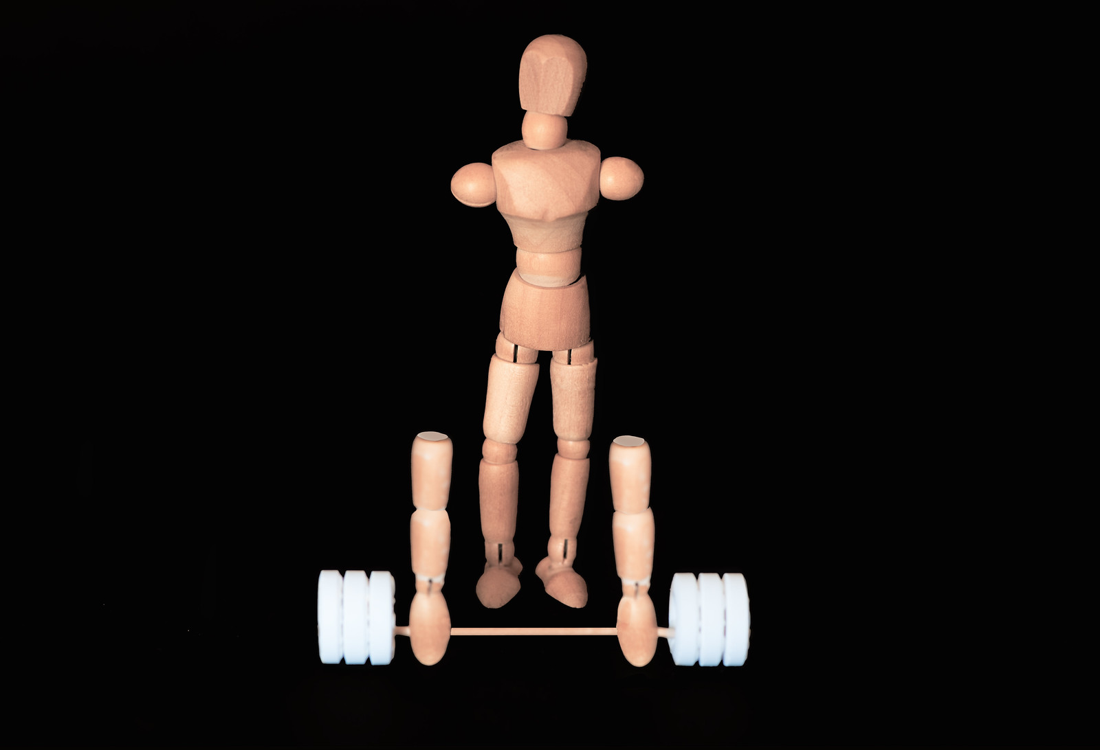
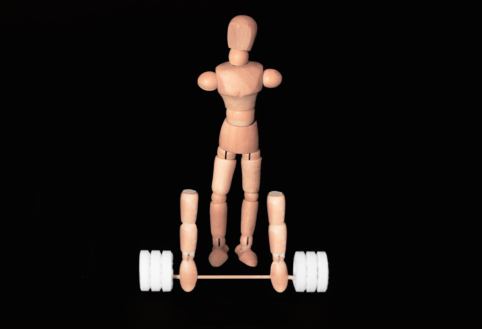
Nice black background, lighting looks good, the whites look a little bright and a little blue? Could be my screen though. I like the idea, wonder how it would work with the head looking down at the weights?

Cheers, Michael @michael23, quick edit below as I didn't see the blue. Yeah, looking down would have been better and I considered it but the head didn't articulate enough.

Cheers.

LOL I sometimes worry about you mate, and this shot proves that point - love it :LOL:

Cheers, Dean @Dark Knight

Limit 2 by aNdy sHeader, on Flickr
 
Oh yes, Limit exceeded. Clever.
 
Oh yes, Limit exceeded. Clever.

Cheers Martin @sunnyside_up

Took me a while to work it out. I like the image, nice separation of subject and background. Good lighting too. Being a tad picky I would like a bit more DoF to have the arms and polo mints :) in focus too.

Cheers, Stan @rpn not being picky all, I got a bit lazy. Should really have closed down a little. Thanks for the crit.

Cheers.
 
Good work Andy, I like the subtle, even lighting on Woody.
Thinking outside the box as ever I see on your interpretation of the weekly theme.
Some good photoshoppery skills in your image. One small crit though, I find the ends of the arms a little distracting. Perhaps it's that they look a little different to the main part of the arm. Beyond my skill set but I think i would have liked to have seen it as wood grain as opposed to colour.
See you in a few weeks time at the Megga Meet Andy.
 
I agree about the focus, as stan @rpn points out ... but lol what a clever interpretation. (y)
 
Hi Andy, can't really add anything to whats been said about "limit" so I wont go on

Have to say the portraits on the previous page are superb, I saw them yesterday very impressed :clap::clap:
 
Good work Andy, I like the subtle, even lighting on Woody.
Thinking outside the box as ever I see on your interpretation of the weekly theme.
Some good photoshoppery skills in your image. One small crit though, I find the ends of the arms a little distracting. Perhaps it's that they look a little different to the main part of the arm. Beyond my skill set but I think i would have liked to have seen it as wood grain as opposed to colour.
See you in a few weeks time at the Megga Meet Andy.

I agree about the focus, as stan @rpn points out ... but lol what a clever interpretation. (y)

Love the idea, Andy, it's a great interpretation of the theme! The lighting works well, there's just that slight niggle with the DOF and the foreground items, but I really like it, well done :)

Hi Andy, can't really add anything to whats been said about "limit" so I wont go on

Have to say the portraits on the previous page are superb, I saw them yesterday very impressed :clap::clap:

Love your take on the theme, and great pic

Cheers, all.

@blakester yeah, bit lazy with the editing on the arms.

@Manxmaid yup, DOF, got tot wrapped up and didn't notice until editing.
 
Nice play on the theme Andy took about a minute before it sank in and that can only be a good thing
 
Hi Andy,

Limit - poor woody! but it's a good shot, as usual, nicley focused and the background works well :)

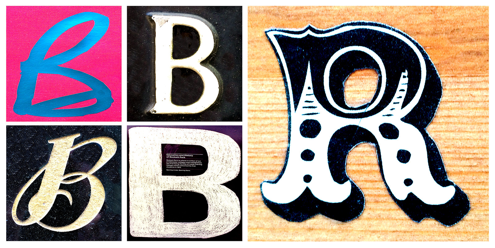
B'sR - excellent pun! It took a few seconds, but when I ssaid it out loud I got it. Great thinking there :clap:
 
Hi Andy,

Limit - poor woody! but it's a good shot, as usual, nicley focused and the background works well :)

B'sR - excellent pun! It took a few seconds, but when I ssaid it out loud I got it. Great thinking there :clap:

Took me longer tan a minute! A few B's and an R! But, yes, interesting take on the theme.

A clever idea for a challenging theme, Andy, and you've come up with a striking and well constructed image (y)

Thanks all, getting harder to come up with something original.

Cheers.
 
certainly original ... and quite cleverly 'shopped. :sneaky:
 
Hi Andy...
Limit... Think Woody has been done to death now and agree with the minor crit, great Idea though, its becoming harder to come up with unique ideas for these themes isn't it! On theme Works well!

Bizarre ... I noticed the slip with the scalpel across the "R" on the right, for me that would have been yet another A&E visit:rolleyes: Only crit from me would be that I would have run round the outside of that same "R" with a brush in PP to take off that jagged edge and generally tidied it up.;)
 
Back
Top