
OP
- Messages
- 10,490
- Name
- Stan
- Edit My Images
- Yes
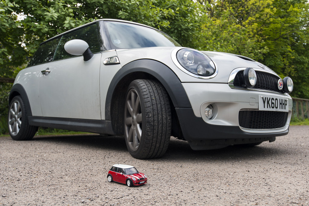
Took this a couple of day ago. An 1/18th scale of my previous R53 Mini Cooper against my current R56 Mini Cooper S.
Week 21 - Size
 Week 20 Size 14514 by Stan, on Flickr
Week 21 - Size
Week 20 Size 14514 by Stan, on Flickr
Last edited:
")
 Thanks for correcting me.
 ")
")


 Week 20 Entry-Entrance 14519


 Week 22 Forgotten

 Week 23 Stone 14547
 Week 23 Stone 14552