weekly TPDK's 52 of 2017 - Wk 49 to 52 Added and COMPLETE

Annnnd here we go, behind a week as usual , but hey that's how the 52 week cookie crumbles at times :)

I decided to get off my arse when I got home from work today and take a couple of shots to get me up to date, I went in my little photography room at around 7:30pm and got a few experiments done and complete by 9:15ish, so a quick edit or two later and here we have first - Smoke...

I have seen loads of splendid smoke images this week so tough to follow, I had a good play about with different ideas trying to get something original and this is my preferred one out of my Smoke images

Week 16 - Smoke

Week 16 - Smoke by TP DK, on Flickr
 
Wow wow wow and wow, that is just totally fantastic Dean. This is the best smoke shot so far imo, love the sharp match and that great smoke coming off it beautifully, very well done too :cool::plus1::plus1::plus1:
And a WOW back !!! - Thank you very much Dave :) :)
 
Interesting image, the smoke is well captured but I am in two minds about the apparently unsupported match
 
Very nice Dean, great detail in the smoke and some wonderful patterns. Almost like someone is riding the matchstick.

Crit, well the LHS of the match seems smudged?? Might be where you held the match up.

Anyway I'm looking to get my Vivid tonight :)

Cheers.
 
Great image. I'm wondering how you managed to 'suspend' the match. Well done.
Thank you Chris... Pure mind power mate, pure mind power :LOL:

Interesting image, the smoke is well captured but I am in two minds about the apparently unsupported match
Thank you Chris 2 too :D - it is a bit marmite I think, I did have the match toned down first but comparing I liked the vivid colours that the light brought out of it :)

Very nice Dean, great detail in the smoke and some wonderful patterns. Almost like someone is riding the matchstick.
Cheers Andy :) :)

Crit, well the LHS of the match seems smudged?? Might be where you held the match up.
Ahhhh well yes, that's poor cloning, but was tired and wanted to move on :D

Anyway I'm looking to get my Vivid tonight :)

Cheers.
Cool !!! - Mines done, edited and now uploading :)

Good shot, well done on getting a different take on smoke. I feel that the match is maybe a touch too bright but otherwise I like it a lot.
Thank you Steve :) I blame your monitor for the colour :naughty: :LOL:

Dean this is great. Would love to know how you did this one.:)
Thank you Kathy :) - Method was > match was held by cable tie, which was attached to a candle by elastic bands :D

Very good indeed lots of smoke and a levitating match, what's not to like :clap:
Cool - Thank you Alan, good to be different hey :) :cool:
 
Last edited:
And for this week - as this is Thursday, which may be the new Friday, but it's not Friday yet so I feel it is still on time :thinking: :) :D

Well this was my plan to shoot straight after my Smoke shot, my initial idea is what I went for too, having seen similar shots before albeit more minimalist, I have always liked the effect although again I have done it differently.. I chose nice bright colour copy paper, curled it up, taped together and set on a paper background

Unlike other shots that have portrayed subtlety I wanted vivid of course, and whilst moving the Speedlight about to see what I could get, I got the best with the light shooting through rather than onto them.

Result - Happy with how it turned out, liking the texture and colour BUT not liking the uneven curves but time was getting on and I didn't want to re-shoot once I noticed, but hey ho, I may do this as a re-shoot week and even them out - but this will do fine for now :)

Best viewed LARGE on Flickr as usual :)

Week 17 - Vivid

Week 17 - Vivid by TP DK, on Flickr
 
Dean, your smoke pic is what I had in my head and just couldnt get it right here - very very good pic.

I like the vivid pic a lot, but I do feel the watermark is heavily distracting.....
 
Smoke ... top job. Really like that bit coming off the flying match head. (y)

origami most vivid ... creative lighting. (y)
 
Smashing choice for smoke DK ..good to see something a bit different for the theme.
I absolutely love Vivid ..in fact I was looking for some fluorescent sticky notes with something similar in mind but I think the grandkids have squirreled them away. Anyway, I'm sure it wouldn't be anywhere near as good ... along with d00ds shed this is my fave of the week.
 
Thats great! Simple and very effective.
Cheers Chris :)

A very effective vivid shot Dean, like the slight shadows and BG and nice and grounded :)
Thank you Dave :)

Dean, your smoke pic is what I had in my head and just couldnt get it right here - very very good pic.
Thank you Mark, I guess it was in the blow :D

I like the vivid pic a lot, but I do feel the watermark is heavily distracting.....
Hmmmmmm you sure have a point there, I didn't notice it that much until you said :)

Smoke ... top job. Really like that bit coming off the flying match head. (y)
Thank you David :)

origami most vivid ... creative lighting. (y)
Thanks again mate :)

Smashing choice for smoke DK ..good to see something a bit different for the theme.
Thank you Susie :)
I absolutely love Vivid ..in fact I was looking for some fluorescent sticky notes with something similar in mind but I think the grandkids have squirreled them away.
Isn't that typical... them pesky kids :D

Anyway, I'm sure it wouldn't be anywhere near as good ... along with d00ds shed this is my fave of the week.
Aweee I'm sure yours would have been just as good with your usual attention to detail !!! - and thank you, very nice of you to say :) :) :)
 
I like the surreal nature of the levitating match and the especially the pattern of smoke coming from the tip of it - great detail on the match head too - very clever! A really strong shot for vivid too - only the slight pinch on the top of the red sheet pulls my eye but really eyecatching and an elegant set up :)
 
Smoke works a treat very clever. Nice colour in vivid.
Thank you Walter :)

I like the surreal nature of the levitating match and the especially the pattern of smoke coming from the tip of it - great detail on the match head too - very clever!
Thank you Em :)

A really strong shot for vivid too - only the slight pinch on the top of the red sheet pulls my eye but really eyecatching and an elegant set up :)
Thank you again... looking back yes I see what you mean, I will have to be careful with that when I do a re-shoot :) :)
 
Hold - That's really just showing off isn't it? Fantastic idea and well taken. From your name I assumed you were Batman, but now I realise you're Ant Man.
Smoke - Again, very clever and vey effective. Love the detail in that match. Ant man didn't have invisible hands so I'm confused about which superhero you are.
Vivid - Very colourful. Whatever your special powers I assume your new show is on NBC?

(edit: just realised Frank made the same NBC observation above!)
 
really nice colours for vivid and a clever idea I like it (y)
Cheers Allan :)

:clap: Love it. The best shot so far this year.
Thank you Stan, it is certainly the brightest I have done this year and guess the most creative, glad you like it :cool:

Can't give much critique other than I love this and what's been already mentioned.
Thank you again :)

Hold - That's really just showing off isn't it? Fantastic idea and well taken. From your name I assumed you were Batman, but now I realise you're Ant Man.
Hahaaa excellent Nick :LOL:
Smoke - Again, very clever and vey effective. Love the detail in that match. Ant man didn't have invisible hands so I'm confused about which superhero you are.
Ahhh thank you again - Now, for this I was the invisible man... I mean Ant :D
Vivid - Very colourful. Whatever your special powers I assume your new show is on NBC?
:D

(edit: just realised Frank made the same NBC observation above!)
Hahaaa seems you are like me and comment with your thoughts too before reading others, thanks for the great feedback :)
 
Vivid is a great idea, simple and well executed!
Cheers Bernd :) (y)

In too late again, nothing more to add so I've just liked them both:D
No worries, thanks for popping by and commenting still, it still helps lift spirits :)

Love the strong colours in your vivid shot and a good setup. I do find the shadows slightly distracting, especially in the red and orange sheet, but not sure how you would avoid them.
Thank you Steve, Mission impossible that I think :D
 
So here is my shot for LARGE... I have been waiting to have a bit of time to get out (not home shots) with the camera, and today was the first good chance in a couple of weeks to get away from the house for some shots, I decided to drive to Gt Yarmouth and take some shots of any wind turbine ships in the outer harbour, as they always amaze be as to the loads they carry out to the offshore sites and anchor themselves with their own legs.

I wanted to get some leading lines from the water as usual and some movement in the sky, yes I know it is another long exposure but for me sea shots like this look better as the subject stands out better :)

Week 18 - LARGE

Week 18 - Large by TP DK, on Flickr
 
That is large, and nice and well composed long exposure shot! (y)
Thank you Bernd :)

Nicely done with a great sense of scale
Cheers Chris :)

Another great long exposure landscape Dean - you are so good at these :)
haaaa thank you Em <blush> I guess to those that do not do many that may appear that way :D
It all looks so futuristic against the timeless sand, sea and sky image.
It does look weird doesn't it... thank you :)

Large, now I like this one Dean. A great shot that looks like it was in a sci fi film, love the silky water that leads the viewer to the large building (y)
Cheers David, glad the water is doing it's job :)
 
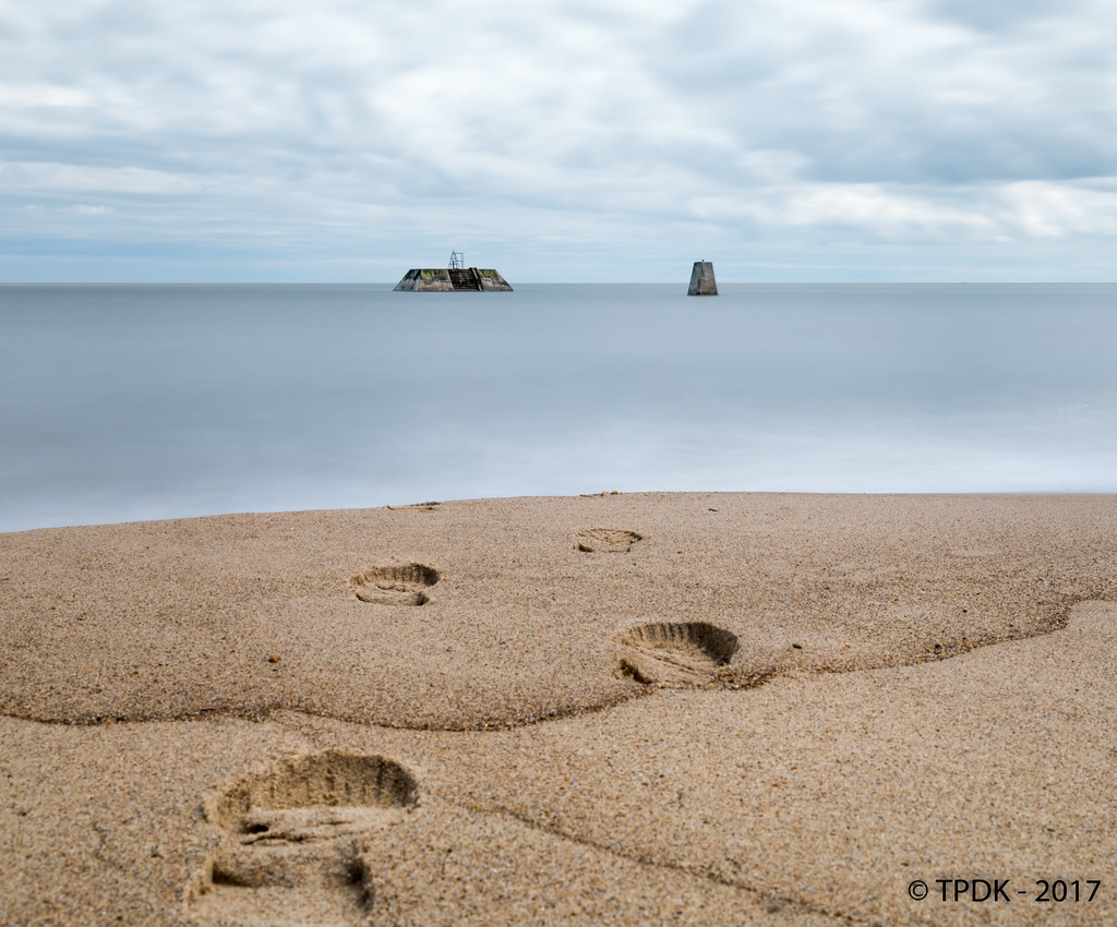
On Sunday when I went out to get my shots I was finally at a location that I wanted for this theme I missed a few weeks ago, I did google this near the time and was keen to get to a suitable location ASAP, but it just didn't happen, odd seems I have a beach 5 minutes walk away :D

Here we have another long exposure, I was hoping to get all the frame in focus but the rear footprint was not playing game, hopefully it doesn't distract too much...

"Beach sand is made up of unconsolidated particles of rock (containing multiple minerals)"
<EDIT> I have changed the Crop to a more 'square' shape, as after editing last night, fresh eyes today see a letterbox crop that I originally envisaged do not work well with the direction of the footsteps.... maybe :thinking:

Week 5 - "Mineral" - Footsteps in the Sand.

Week 5 - Mineral by TP DK, on Flickr
 
Back
Top