
You are using an out of date browser. It may not display this or other websites correctly.
You should upgrade or use an alternative browser.
You should upgrade or use an alternative browser.
weekly viv1969 (Ruth) 52 Challenge - SPIRAL Added
- Thread starter viv1969
- Start date


Brian_of_Bozeat
Jeff
- Messages
- 3,232
- Name
- Brian (not Jeff)
- Edit My Images
- No
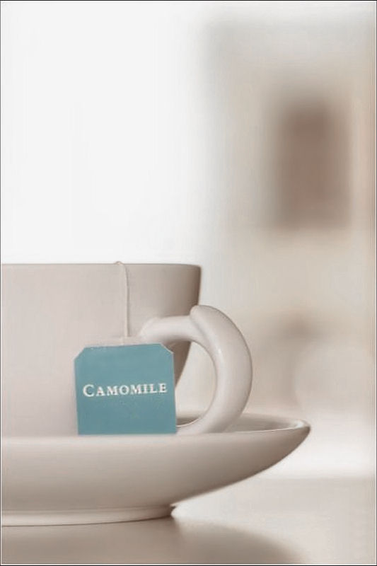
I really like the almost selective colour effect with the cup & BG being all white tones. I could see this on the front of a menu or something. 
OP
- Messages
- 29,452
- Name
- Bat-Frog
- Edit My Images
- No
I really like the almost selective colour effect with the cup & BG being all white tones. I could see this on the front of a menu or something.
Thank you Brian.
No selective colouring, just desaturation.
The teabag tag was actually way brighter than it should be for tea with an alleged calming effect

(I don't know because I don't drink tea
)- Messages
- 3,717
- Name
- Chris
- Edit My Images
- Yes
I don't know what you're mithering for Ruth, A nice simple shot, well lit with excellent composition and as David and Brian have pointed out, works really well with the background. from me
from me
D
Deleted member 30033
Guest
love the composition of this
OP
- Messages
- 29,452
- Name
- Bat-Frog
- Edit My Images
- No
simple. yet very effective, i love simple images and this ticks all the boxes of my appeal. well lit, neutral colours and certainly relaxing to look atgreat shot
I don't know what you're mithering for Ruth, A nice simple shot, well lit with excellent composition and as David and Brian have pointed out, works really well with the background.
love the composition of this
Thanks guys.
Chris I suspect I'm just mithering because it's not the shot I wanted.
(Oh and "mithering"....not heard that for a while....love it
)- Messages
- 3,717
- Name
- Chris
- Edit My Images
- Yes
A much underused word, I think I'll start a campaign to bring back underused words
D
Deleted member 68495
Guest
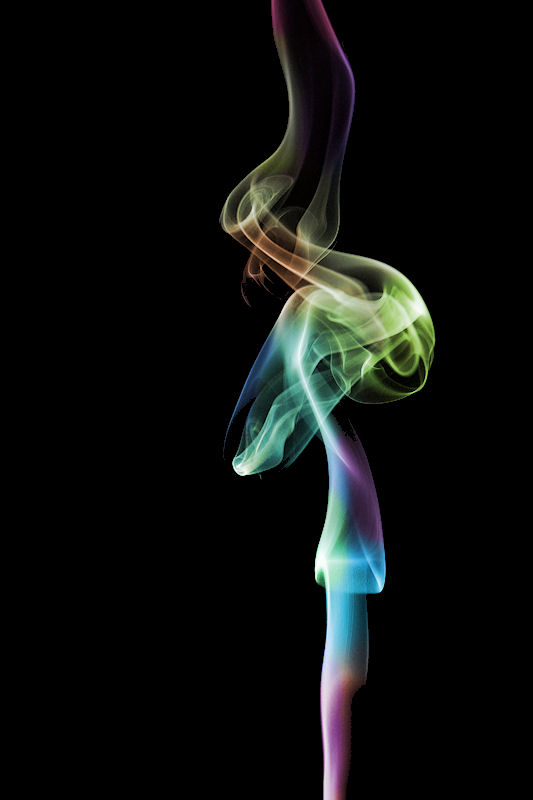
Crepuscular, that's a good word.
Fits the theme, it's a calm picture.
Fits the theme, it's a calm picture.
- Messages
- 170
- Edit My Images
- No
I like your Relax shot and really fits the theme.
- Messages
- 2,480
- Name
- Steve
- Edit My Images
- Yes
Hi Ruth!
Playing catch up and winding back to Watery
Watery.... I really love this shot, and I think its very clever") I love the way the water droplets have taken up the rainbow colours of the backdrop. Was trying to think how you would get that sort of DOF and at the same time keep the water droplets sharp at f1.8
I love the way the water droplets have taken up the rainbow colours of the backdrop. Was trying to think how you would get that sort of DOF and at the same time keep the water droplets sharp at f1.8 . Very colourful and love the way the DOF really pulls up the water droplets. Nice work!
Bold .... I thought you were running an autofocus test card for a minute. Nice DOF again, see your on a bit of a typeface there too. Showed this to SWIMBO to demo DOF as trying to get her into photography too.
Relax ..... Humpff I know this is only your placeholder but its further than I've got! The boss says its because I don't know the meaning of the word.
Anyhow enough drivel, Like the great DOF again here. Its that ghostly image on the RH side and the grainy look that makes it, so think the PP has worked well here.... Did you apply it over the whole image? does look like it .... just pondering if you did it over the whole image apart from the label, might make the label pop a bit? Just thinking out loud. I also think this works nicely with just half the cup in the image rather than the whole thing.
Nice shot I like it.... TBH I would never think of shooting things like this and TP is making me do so, not a bad thing I guess. (Id probably try and integrate the cup into a Landscape).
Nice Work Ruth!
Playing catch up and winding back to Watery
Watery.... I really love this shot, and I think its very clever
I love the way the water droplets have taken up the rainbow colours of the backdrop. Was trying to think how you would get that sort of DOF and at the same time keep the water droplets sharp at f1.8. Very colourful and love the way the DOF really pulls up the water droplets. Nice work!Bold .... I thought you were running an autofocus test card for a minute
. Nice DOF again, see your on a bit of a typeface there too. Showed this to SWIMBO to demo DOF as trying to get her into photography too.Relax ..... Humpff I know this is only your placeholder but its further than I've got! The boss says its because I don't know the meaning of the word
.Anyhow enough drivel, Like the great DOF again here. Its that ghostly image on the RH side and the grainy look that makes it, so think the PP has worked well here.... Did you apply it over the whole image? does look like it .... just pondering if you did it over the whole image apart from the label, might make the label pop a bit? Just thinking out loud. I also think this works nicely with just half the cup in the image rather than the whole thing.
Nice shot I like it.... TBH I would never think of shooting things like this and TP is making me do so, not a bad thing I guess. (Id probably try and integrate the cup into a Landscape
).Nice Work Ruth!
OP
- Messages
- 29,452
- Name
- Bat-Frog
- Edit My Images
- No
I like your Relax shot and really fits the theme.
Thank you...appreciate it!
Hi Ruth!
Playing catch up and winding back to Watery
Watery.... I really love this shot, and I think its very clever
Bold .... I thought you were running an autofocus test card for a minute
Relax ..... Humpff I know this is only your placeholder but its further than I've got! The boss says its because I don't know the meaning of the word
Anyhow enough drivel, Like the great DOF again here. Its that ghostly image on the RH side and the grainy look that makes it, so think the PP has worked well here.... Did you apply it over the whole image? does look like it .... just pondering if you did it over the whole image apart from the label, might make the label pop a bit? Just thinking out loud. I also think this works nicely with just half the cup in the image rather than the whole thing.
Nice shot I like it.... TBH I would never think of shooting things like this and TP is making me do so, not a bad thing I guess. (Id probably try and integrate the cup into a Landscape
Nice Work Ruth!
Wow, Steve thank you very much for the in depth comments!
- Messages
- 908
- Name
- Tracy
- Edit My Images
- No
I like it, it says relax for me and fits the theme perfectly
- Messages
- 1,343
- Name
- Philip
- Edit My Images
- No
Nice image Ruth, but camomile tea....yukk
Phil
Phil
- Messages
- 2,812
- Name
- Mike
- Edit My Images
- Yes
Nice shot for relax Ruth. I love the composition, the light and the dof. If I was going to criticis anything, well I wouldn't be able to 
As for tea, I dont drink it either although I do drink green tea with jasmine in it. That camemile stuff is just wrong!
As for tea, I dont drink it either although I do drink green tea with jasmine in it. That camemile stuff is just wrong!
Last edited:
OP
- Messages
- 29,452
- Name
- Bat-Frog
- Edit My Images
- No
Hi Ruth,
I really like that. If it was a placeholder for me I'd be over the moon, I love the dof and the understated colours
Hi, for a place holder thats really good, one of my favourites of the week the composition is excellent
I like it, it says relax for me and fits the theme perfectly
Hi Ruth
Great shot for the theme... maybe only a placeholder but a very good one.
Nice image Ruth, but camomile tea....yukk
Phil
Minimal, simplicity and very fitting for the theme.
Nice shot for relax Ruth. I love the composition, the light and the dof. If I was going to criticis anything, well I wouldn't be able to
As for tea, I dont drink it either although I do drink green tea with jasmine in it. That camemile stuff is just wrong!
Simple effective nice depth of field sometimes the best pics are the simple ones
Definitely fits the theme Ruth and is much too good to just be a placeholder.........trust yourself!
That image certainly is inviting me to relax and I'm not a huge fan of tea! The DoF makes it very calming indeed. Great work
Wow, everyone thanks so much for your comments and for taking the time.
I've been remiss this week in commenting and am trying to correct that now

OP
- Messages
- 29,452
- Name
- Bat-Frog
- Edit My Images
- No
Hi Ruth, that is a cracking bit of work, lovely colours, great bg and composition is spot on.
Thanks Michael. Years since I tried this. It was good fun
I dug out my incense sticks last week after several years and had great fun.
Interesting take on the theme and the colours work really well.
I had an edit in PS, duplicated and flipped one of them...looked like a praying mantis
Cheers.
Cheers Andy.
One of mine, when mirrored and put back to back resembles the old Michelin man
- Messages
- 8,684
- Name
- Ian
- Edit My Images
- No
Relax - placeholder schmaceholder... That's a lovely photograph. Simple - yes, but simple works really well for this. I like the contrasting OOF blob to the right of the cup which adds some indistinct background interest.
Also I really like vertical with careful composition and use of colour against a black background which shows some real lighting skill. Some lovely photography in this thread.
Also I really like vertical with careful composition and use of colour against a black background which shows some real lighting skill. Some lovely photography in this thread.
- Messages
- 114,434
- Name
- The real Chris
- Edit My Images
- No
I always have to look for something in the smoke / water splash art images, and I finally found a dolphin in yours.
Oh and "casper" wearing a bandanna ( should I seek help? )
Very nice Ruth, nice and colourful too
Oh and "casper" wearing a bandanna ( should I seek help? )
Very nice Ruth, nice and colourful too
D
Deleted member 30033
Guest
Lovely colours and plenty of space around the photo. Really like this. I'm also intrigued - how did you get the colours?
D
Deleted member 59779
Guest
A lovely colourful vertical image and well composed. no crib from me. now where are my incense sticks
- Messages
- 13,393
- Edit My Images
- Yes
Hi Ruth
Bold - A lovely simple idea, very star wars esk in appearance, I really like the narrowing of the text, and the bang on position of the narrow DoF - bang on sharp where it needs to be
Relax - Now for a placeholder this is a lovely shot again, I really like your lighting, and the placement of the tea bag label, the small hint of something in the background works for me too, all in all with the chosen crop it's a good image for the theme for me
Vertical - I do like these smoke images, having not tried one myself when I see brightly coloured ones like this I am dead keen to give it a go, some great colours there and set off really nicely with a good black background - Nice One