Later comer picking up the feed back Dan.
Pattens.... Brickwork for me! sharp focus great texture here, perspective and angles always difficult to get right, but anyhow works for me... 1st frost picture quite selective focus (shallow depth of field) nice sharp detail in the center. 2nd one doesnt do it for me possibly as its not so sharp. Brickwork for me
") Bliss
Bliss.... Bang on, Get the roll closed nothing worse than a cold one mate, great balance here (Male balance SWMBO calls it) Healthy fresh orange juice and a bacon roll
!!!
Jest over! Most have done all the crit already, agree with the narrow crop being a bit too tight, Nice texture in that table top, Very narrow dof picks up the bacon nice and sharp, Not worried about the crumbs can lick the plate clean after
.
Fragile.... Thats a great idea for a HTC phone, my company phone is an HTC and thats the best option for it
.
I think the second shot for me, and although the hand is not pin sharp as it might be, to me it gives more the impression of dropping the phone or letting it go, where as in shot one i think the hand is a little distracting and its implies that the user is trying to catch the phone after an accidental drop. (I would have actually have prefered a shot of flinging it at the wall
) In the second shot i like the movement in the phone, which is as it would be, rather than the frozen look in shot one. Also nice texture in the wall.... Nice work Dan


 Demonstration only, not my submission, or an alternative
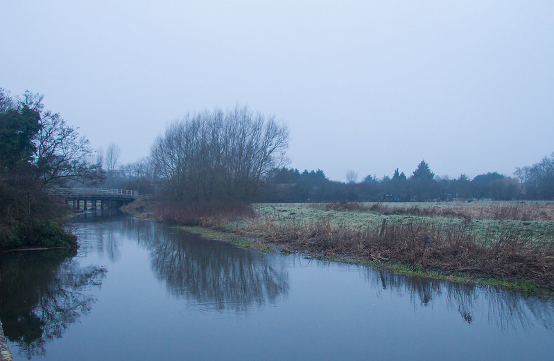
 TP 52 Week 3 - Scenic