weekly brownin's prjct52: 52,FINISHED!

Another two good shots Nathan. Despair is spot on and I quite like the colour tint. Original choice for Noise and a great b&w.
 
Despair ... Nice one, pulling your hair out, blue tint added or boosted in PP presumably, really makes it.

Noise ... great idea for the theme. Real nice composition.

(y)
 
Hi Nathan.
Despair - That is the look of IT support when they realise that they need to call the datacentre team at 4am and ask them to power cycle a non responsive server, contemplating all the incident and problem records that will have to be raised to get it done!!! I like the lighting, it helps tell the story.

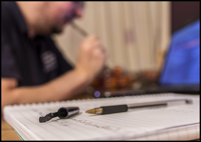
Noise. Interesting shot, not sure what you're pressing. The panel at the back just screams digital noise though, doesn't it.
 
Despair: I like the dark feel, nicely done.

Noise: Reminds me of a film, I can't think which one... Poltegeist? - Anyway, good idea, it has a story and the mono really suits. (y)
 
Finally got something for week 40. Time has been a major issue for me in the last month or so, but I WILL catchup. For Envy I had loads of ideas but just time, light and sheer luck has not been on my side.

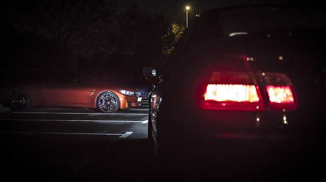
Maybe if there's a re-shoot week coming in the next few weeks I can get on and do the shot I really wanted to do, although my plans did involve another BMW and my old bus similar to this.

I titled the shot as 'Both my car and myself look on in Envy' and amongst the set I took I named another 'My muscley younger brother'

feel free to C&C as always

Week40: Look on in Envy
Both my car and myself Look on in Envy by Nathan Browning, on Flickr

Week40: Envious Brother
My Muscley younger brother by Nathan Browning, on Flickr
 
Hi Nathan. Envy #2 works best in part due to more of the subject being visible as well as the vibrancy of the colour. The bright tail light rh side draws the eye away though from that circle of light on the BMW.
 
Hi Nathan :)

Special - A couple of great shots here, love the humor caught in the second image, special indeed (y)

Despair - Liking this one too, the colour adds a nice touch and nicely staged :)

Noise - I wasn't sure what this was at first, but once worked out I really like it, a great idea with a very unusual PoV, infact I like it the more I look at it (y)

Envy - A good idea, but as said by others I'm afraid, could do with the break light out of the shot, much preferring the more lit car in the second image with more of the cars curves showing :)
 
I think this is one of those images where prior knowledge of what you are supposed to be seeing is required.

I can tell it's a BMW from the grill but I don't know why anyone would be envious of a BMW?

As far as the images are concerned, they look like movie stills to me. I'm waiting for the bad guy to get out of the car in the headlights... I like that. (y)
 
Envy ... just another car but probably not a cheap one. #2 works with better light & detail and nice OOF FG light.
 
Hi Nathan

Great idea for Noise, and yes, it is Poltergeist @Brian_of_Bozeat 'come into the light'

Envy isn't doing it for me I'm afraid, but then I'm not a car person :(

I see the poltergeist reference now, No problem on the car, each to their own as I said I had a much better idea but just no luck with the execution.

Hi Nathan. Envy #2 works best in part due to more of the subject being visible as well as the vibrancy of the colour. The bright tail light rh side draws the eye away though from that circle of light on the BMW.

The first image I thought would be more apt for the theme as it shows my car (an older less prestige/muscly version) next to it, I agree though, I much prefer the second image, but didn't think it met the theme quite as well.

Hi Nathan :)

Special - A couple of great shots here, love the humor caught in the second image, special indeed (y)

Despair - Liking this one too, the colour adds a nice touch and nicely staged :)

Noise - I wasn't sure what this was at first, but once worked out I really like it, a great idea with a very unusual PoV, infact I like it the more I look at it (y)

Envy - A good idea, but as said by others I'm afraid, could do with the break light out of the shot, much preferring the more lit car in the second image with more of the cars curves showing :)

Cheers Dean, Thank you for the catch up. Believe it or not for despair the Blue is toned down a lot in post and its not down to the WB either. The blue comes from a Blue screen of death message I put on the screen of my laptop.

I think this is one of those images where prior knowledge of what you are supposed to be seeing is required.

I can tell it's a BMW from the grill but I don't know why anyone would be envious of a BMW?

As far as the images are concerned, they look like movie stills to me. I'm waiting for the bad guy to get out of the car in the headlights... I like that. (y)

NO Probs its a BMW M4. The movie still was an idea in post I had so I'm glad someone saw it too. BMW stopped the 3 door m3 in the last model bringing this machine as a replacement from then on. Its a monster, powered by a 3litre twin turbo engine running 431BHP. Lots of aggresive body structures make it a real presence on the road. its also Brand spanking new.... I'm envious, particularly as I'm Car Mad!

Envy ... just another car but probably not a cheap one. #2 works with better light & detail and nice OOF FG light.
Not cheap at all lol at a £60k pricemark.


Thanks all for commenting, catching up slowly. 2 more images this evening
 
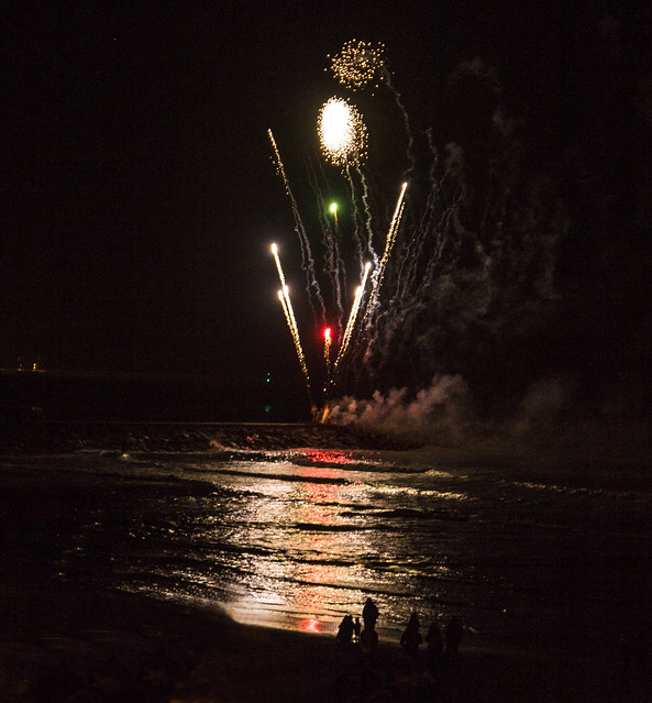
To the point, never really had a good idea for this theme, resorted to good old fashioned literal thinking.
Works for me very well indeed (y)

As does does shimmer, well captured
Nathan :)
 
Fair enough Nathan - Inverse looks OK to me. Got a nice Shimmer too with the fireworks on water.
 
Hi Nathan.
Nothing wrong with a bit of lateral thinking but of the 2 shots, the shot for shimmer is my favourite. The fireworks are nicely captured and the reflections on the water of the red firework really stand out.
 
the literal thinking I like. :)

yes the light shimmers on the water.
 
Works for me very well indeed (y)

As does does shimmer, well captured
Nathan :)

Cheers mate

Fair enough Nathan - Inverse looks OK to me. Got a nice Shimmer too with the fireworks on water.

Photography fallen off a little towards end of this challenge tbh, don't know why. Bought myself a shiny new sigma 17-50 f2.8 for my birthday to play with over the next few weeks and its fantastic so I'm hoping to get more creative again. thanks for the comments Carl.

Hi Nathan.
Nothing wrong with a bit of lateral thinking but of the 2 shots, the shot for shimmer is my favourite. The fireworks are nicely captured and the reflections on the water of the red firework really stand out.

Cheers Tim, I was a bit gutted as the fireworks display wasn't as good as I had hoped and this was the only 'shimmer' worthy image. cheers for stopping by.

the literal thinking I like. :)

yes the light shimmers on the water.

thanks dood, not too interesting this time unfortunately.

Hi Nathan :)

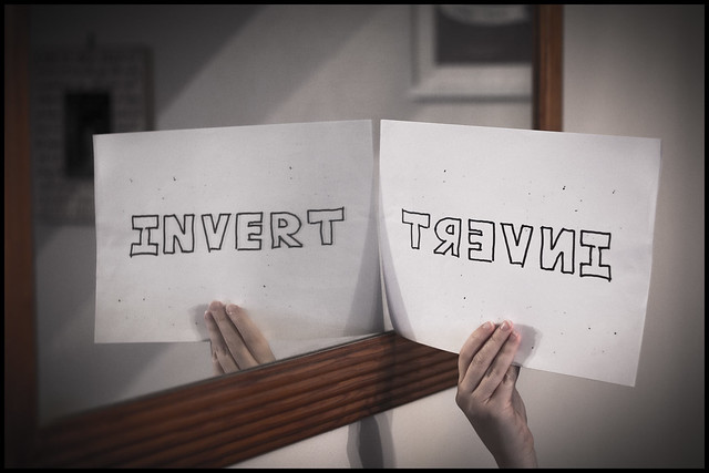
Invert - Not taken with the crop or setting, but loving the idea :)

Shimmer - Good ole fireworks, real nice reflections on the water, fits the theme well (y)

Glad to see you still getting some image in !!!

Will be catching up more this week. I have seasonal, element and habit, and on time but haven't done full, again I have to get on and do it then I should be up to date.

Clever idea for the Invert shot.

Like the Shimmer shot too but just a pity you weren't standing slightly more to the right to get the people (photographers?) by the shore line in full silhouette.
My thoughts exactly, blame the wife for that one, we were late and it was packed out. I would have ideally gone down onto the beach and got right down low to the water but it wasn't to be. Again thanks for sticking with the thread :)
 
Sorry guys, gone a bit array with my exams and lack of enthusiasm to get out in the dark dreary nights. Totally lazy on my part. anyway thanks to all who have stuck with me on this thread and continue to offer really helpful critique and comments.

So.... I finally have a few updates.

here goes...

Week43: Element

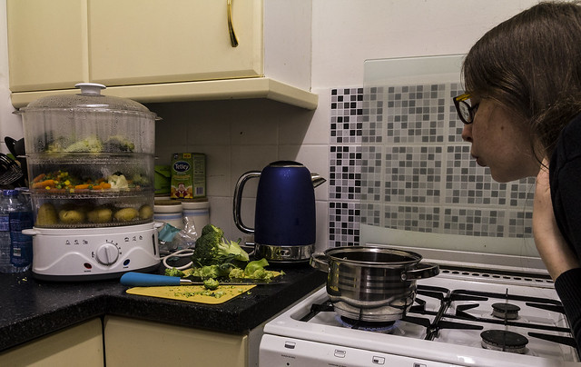
I have 2 entries. The first is one of those 'trying to be clever' shots but its really lacking anything interesting. The idea was to get something cooking on the hob (fire), have earth in the form of vegetables in boiling 'water' with my wife blowing the pan acting as wind. But the ease of using a steamer after a hard day in work for both of us prevailed and so we have this shot, I think you'll agree its really not great.

shot1
week43 by Nathan Browning, on Flickr

then having seen the result of the above I was not happy, so tried out just using a few elements - gas/fire in my dark kitchen (it also gave me an excuse to test out the Optical stabilisation of my new lens)

So heres shot 2, I prefer this by a long way but as usual looks crisp on camera screen but in post can see the focus has shifted away from the flame:
week43a by Nathan Browning, on Flickr

As always feel free to comment and critique
 
And now for Seasonal.

I had 'bog' plans for this one but my subject has been too busy (the wife) so had to resort to another shot.

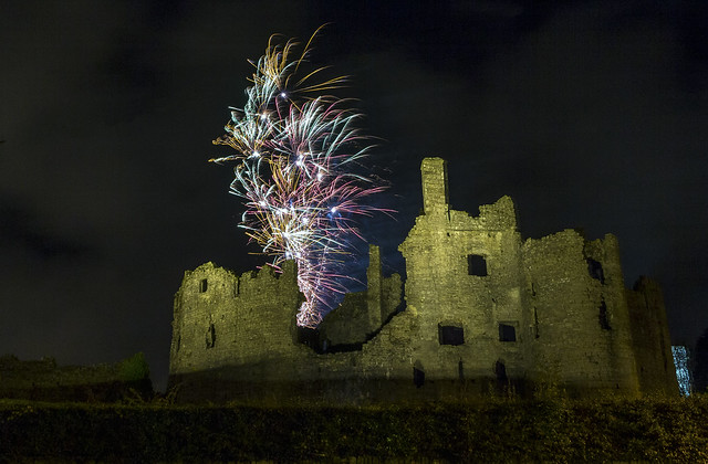
What's more seasonal than autumn leaves in November...The answer.. fireworks:

Welsh Castle, Little village, Fireworks:

Week44: Seasonal

week44 by Nathan Browning, on Flickr

I posted this on my facebook page and for the first time some local newsletter contacted me and requested to use in their next release.
 
I think you'll agree its really not great.
I'm not so sure, Nathan, you have the Mrs as a focal point and there is lots going on, without it being too fussy.
I like it (y)
 
Hi Nathan.

Element: Great idea for earth, wind & fire but probably too many distracting elements competing. Yes, #2 is best with that lovely blue tinge especially picking out that spot of oil/water by the burner.
Seasonal: Spot on theme. Great image - so different seeing the location as well as the firework trails .... a two for the price of one image. Excellent :clap:
 
Hi, Nathan...

Element: The first pic is too busy for me although the idea underlying it is pretty brilliant. I like the simplicity of #2 :D but then again, I am a sucker for everything blue...
Seasonal: Those fireworks win me. Wonderful image! :clap:
 
Hi Nathan, I like the idea behind number 1. The picture doesn't work for me though, a little too busy though. I wonder if having an image of each one and putting them together as a triptych.
I do prefer the gas ring, as Nora I like the blue coming through.
seasonal is nice and composition works well, but bg looks noisy? Could be my screen though.
 
Hi, first shot for elements is a great idea but just a little to cluttered to work properly but still by far the best of the 2

nice firework image for seasonal :clap:
 
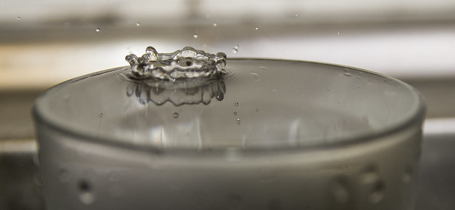
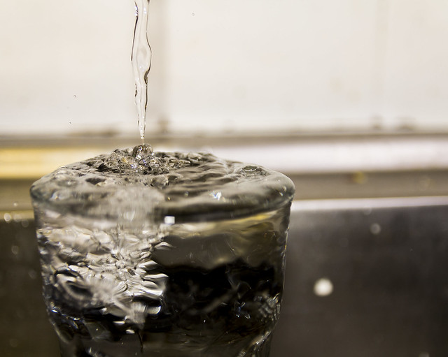
So I did a few experiments last night to get full, as said before I had Habit done just needed to sort out full. Setup in the kitchen with the tap and my softbox, was my first attempt at the typical 'crown' droplet image

so here it is, there are a few I really like but if I did them again i would get hold of a background sheet or something as the background is a little rubbish and distracting:

Week45: Full

1. too full
week45 by Nathan Browning, on Flickr


2. Plop
week45b by Nathan Browning, on Flickr


3. Full
week45c by Nathan Browning, on Flickr


Week46: Habit (bad habit)

This one was fairly straight forward, many bad habits to choose from. Decided on this one... As soon as I have one its chomped, I just can't help it

week46 by Nathan Browning, on Flickr
 
Full - caught at the perfect moment, looks like it should be overflowing (perhaps it is?).

Habbit - good concept, nicely expressed in the photo
 
Last edited:
Hi Nathan.

Full: Good for you. I like experimenting too - only problem with the Kitchen is I get evicted just as I am beginning to get stuck in. All three shots are brilliant. I'd say #1 fits the theme best aw but what a cracker of a shot is #2 with that crown. Maybe I need a night shift in the kitchen to try that one out.
Habit: Excellent idea and nicely composed and executed. :clap:
 
Habit: excellent choice that, a habit I particularly dislike!

Great POV and nice use of DOF here. bravo!

You still have 36 hours to do covered, come on!
 
Hi Nathan ....I think I've missed out on a few of yours, apologies for that.
Starting with Element ...I get the idea of the first one but I think the second one is the more eye catching of the two, really liking the blue flame in the darkness.
Seasonal ...that looks a brilliant location for fireworks, nicely captured against the castle wall.
Love the water shots but I agree a plainer background would show them off better, all well captured, I think #3 is my favourite.
Habit ....reminds me of chewing pencils at school :) I like the composition.
 
Last edited:
Hi, 2 plop for me though the Bg is a little off putting but Habit, is excellent (y) well thought out
 
Hi, quick catchup before work:

Inverted, great idea.

Shimmer, lovely colours on the water. Pity about the folk at the bottom and blown highlights.

Element #2 for me. I'd like better symmetry and there's a drop of liquid on the both. Nice blues, though.

Seasonal, did it get used in the local paper? Well captured, slight crop off the left maybe but nice detail in the fireworks.

Full, decent efforts here. I'd just like cleaned BGs.

Habit, wel composed, nice shallow DOF.

Cheers.
 
Hi Nathan,
Catching up wit comments on your thread, you've been busy :)
Element - Not feeling the love for #1 but I love #2. The way you've captured the blue lighting is reall nice and you have good sharp focus which could have been really difficult with a moving flame.
Seasonal - Excellent firework shot and the ruined castle is also well lit and nicely in focus. Nice one!
Full - I have to agree with you regarding the background (something I also struggle with), of the three I feel the first is the strongest.
Habit - Good use of DoF there and nicely on subject. You even managed to get a little bit of bokeh in the shot :cool:
 
Hi Nathan

Elements #1 ... reading what's going on makes me laugh. #2 is more for me, good colour.
Seasonal ... excellent! and congrats on getting into the paper.
Full ... good stuff, definitely says Full. A cleaner, more contrasting BG would improve it.
Habit ... neat idea. But, I'm not so sure the focus is that perfect. I'd like to get in closer to the teeth marks and put the BG even more out.
 
Last edited:
Full - caught at the perfect moment, looks like it should be overflowing (perhaps it is?).

Habbit - good concept, nicely expressed in the photo

It is indeed overflowing, thanks mate.

Hi Nathan.

Full: Good for you. I like experimenting too - only problem with the Kitchen is I get evicted just as I am beginning to get stuck in. All three shots are brilliant. I'd say #1 fits the theme best aw but what a cracker of a shot is #2 with that crown. Maybe I need a night shift in the kitchen to try that one out.
Habit: Excellent idea and nicely composed and executed. :clap:

Cheers Carl, was great fun, for years i've seen these types of shots on here and all over the web but never attempted myself so was a good experiment. thanks for stopping by.

Habit: excellent choice that, a habit I particularly dislike!

Great POV and nice use of DOF here. bravo!

You still have 36 hours to do covered, come on!

It is an awful habit of mine, so much so I daren't borrow any pens as the first thing I do without noticing is chew. its awful lol

Hi Nathan ....I think I've missed out on a few of yours, apologies for that.
Starting with Element ...I get the idea of the first one but I think the second one is the more eye catching of the two, really liking the blue flame in the darkness.
Seasonal ...that looks a brilliant location for fireworks, nicely captured against the castle wall.
Love the water shots but I agree a plainer background would show them off better, all well captured, I think #3 is my favourite.
Habit ....reminds me of chewing pencils at school :) I like the composition.

Thanks Susie, Don't panic I appreciate you stopping by and leaving the critique.

Hi, 2 plop for me though the Bg is a little off putting but Habit, is excellent (y) well thought out

Cheers mate, yer backgrounds my biggest fault

Hi, quick catchup before work:

Inverted, great idea.

Shimmer, lovely colours on the water. Pity about the folk at the bottom and blown highlights.

Element #2 for me. I'd like better symmetry and there's a drop of liquid on the both. Nice blues, though.

Seasonal, did it get used in the local paper? Well captured, slight crop off the left maybe but nice detail in the fireworks.

Full, decent efforts here. I'd just like cleaned BGs.

Habit, wel composed, nice shallow DOF.

Cheers.

Thanks for popping in, very constructive critique to take on board, as said previously the backgrounds are awful and i need to work on them with my lighting.

Hi Nathan,
Catching up wit comments on your thread, you've been busy :)
Element - Not feeling the love for #1 but I love #2. The way you've captured the blue lighting is reall nice and you have good sharp focus which could have been really difficult with a moving flame.
Seasonal - Excellent firework shot and the ruined castle is also well lit and nicely in focus. Nice one!
Full - I have to agree with you regarding the background (something I also struggle with), of the three I feel the first is the strongest.
Habit - Good use of DoF there and nicely on subject. You even managed to get a little bit of bokeh in the shot :cool:

Thanks for commenting mate, the second element definitely please me more too, seasonal was a wee bit of a shoe horn but in the end did the job.

Hi, Nathan,
Here are my comments for your photos...

Full: I love plop! But I think #1 is the best in representing the theme...
Habit: Spot on. Nice DOF too... ;)

cheers mate

Hi Nathan

Elements #1 ... reading what's going on makes me laugh. #2 is more for me, good colour.
Seasonal ... excellent! and congrats on getting into the paper.
Full ... good stuff, definitely says Full. A cleaner, more contrasting BG would improve it.
Habit ... neat idea. But, I'm not so sure the focus is that perfect. I'd like to get in closer to the teeth marks and put the BG even more out.

I did take a few up close but the chewed bit wasn't so chewed to portray the theme adequately enough. I see what you mean though, had I found a pen less new and more chewed it would have worked (sad that there are different stages of the process in my world. Some become barely 'pen' shaped.

I'm liking full 3 Nathan, and unusual full glass type shot for me seeing the drupes/flow rather than the crown :)

Habit - A real good idea, the DoF works really well, just enough to see somebody chewing on another, like the low point of view too (y)

Cheers Dean, had to go low down to catch my mug doing the deed ;)
 
So I worked out covered eventually. I actually managed to do what i planned which i'm chuffed about instead of shoehorning or forcing an image out of a few snaps to meet the theme.

Week47: Covered
Week47 by Nathan Browning, on Flickr

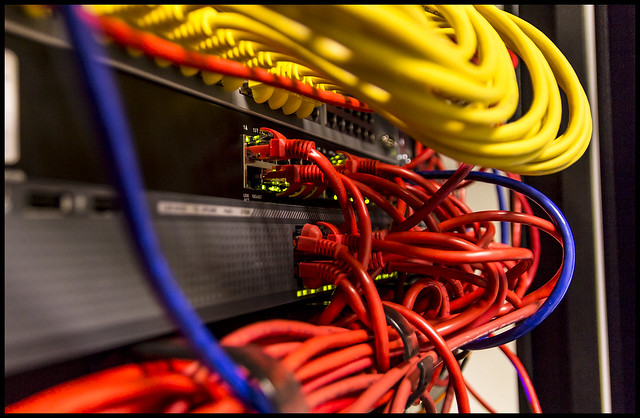
Connected was far more simple for me as my profession allows me access to comms rooms regularly, as a result here is my image for connected. Typical comm's room cables 'connected' everywhere. To some its a spaghetti junction but to others like me it's art and carefully constructed and designed to a companys requirements. so here it is Connected

Week48: Connected
week48 by Nathan Browning, on Flickr
 
Back
Top