
You are using an out of date browser. It may not display this or other websites correctly.
You should upgrade or use an alternative browser.
You should upgrade or use an alternative browser.
weekly Granddad's 52's - 2017
- Thread starter granddad john
- Start date
- Messages
- 5,382
- Name
- Andrea
- Edit My Images
- Yes
Hi John, yet another catch-up from me as I've just got up to date again on my own thread.
Well done for taking and posting pictures from your holiday! I took loads but only posted one for my 52, hence getting behind again. Both Bent and Wood are perfect for the respective themes and illustrate them well")
I like both images for Wall but if pushed I would pick the church wall as I like the leading line, the textures and even the moss on the top.
Symmetrical is an unusual choice for the subject and you struggled with the light, but I sympathise because I find indoor table-top photography quite a challenge.
That tyre is perfect for Worn and the focus point brings your eye straight to the bald surface, and while I don't think the vignette is needed it minimises any distractions around the edges.
Colourful - what a lovely tree, and then an extra splash of colour from the red mini. A lovely scene, and the tree would make a good subject for 'Height', too
Well done for taking and posting pictures from your holiday! I took loads but only posted one for my 52, hence getting behind again. Both Bent and Wood are perfect for the respective themes and illustrate them well
I like both images for Wall but if pushed I would pick the church wall as I like the leading line, the textures and even the moss on the top.
Symmetrical is an unusual choice for the subject and you struggled with the light, but I sympathise because I find indoor table-top photography quite a challenge.
That tyre is perfect for Worn and the focus point brings your eye straight to the bald surface, and while I don't think the vignette is needed it minimises any distractions around the edges.
Colourful - what a lovely tree, and then an extra splash of colour from the red mini. A lovely scene, and the tree would make a good subject for 'Height', too
Last edited:
OP
- Messages
- 644
- Name
- John
- Edit My Images
- Yes
Week 45 Height
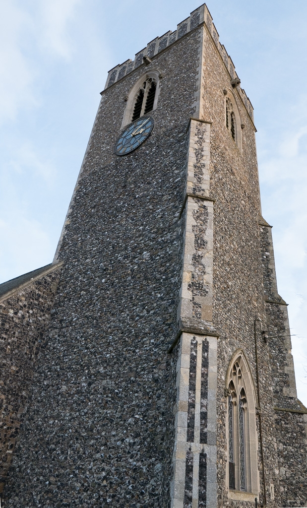
tp45-1020213 by granddad john on Talk Photography
.....then I went round the side and thought there's a really symmetrical window") but then got it back and found it wasn't
but then got it back and found it wasn't  so it's become my reshoot for arch Really must look at the shot before I press the shutter:banghead:
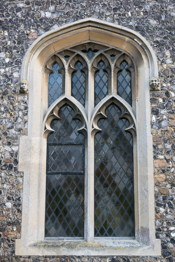
tp45-1020215 by granddad john on Talk Photography Reshoot Arch
tp45-1020213 by granddad john on Talk Photography
.....then I went round the side and thought there's a really symmetrical window
but then got it back and found it wasn't so it's become my reshoot for arch Really must look at the shot before I press the shutter:banghead:tp45-1020215 by granddad john on Talk Photography Reshoot Arch
Last edited:
- Messages
- 13,393
- Edit My Images
- Yes
Hahaaa... well that works for symmetrical too for me John, 95% of the way at least !! - But hey ticks the Arch theme for sure
For Height, the top is a bit tight crop wise but the angle sure does the trick to emphasise it's mighty size so works well
For Height, the top is a bit tight crop wise but the angle sure does the trick to emphasise it's mighty size so works well
- Messages
- 11,218
- Name
- Tim
- Edit My Images
- Yes
Height - Plenty of detail and even the sky was playing ball to some extent
Re-shoot : Arch - Again, plenty of sharp detail, and bang on theme.
A possible target for perspective correction though? It's evident that the shot was taken from below.
(That said, in correcting the perspective, it might end up looking odd and at the moment it gives a natural perspective. It would just be an interesting exercise to see what difference it makes).
OP
- Messages
- 644
- Name
- John
- Edit My Images
- Yes
Like everybody else in trying to avoid the obvious shot I've come up with the same as everybody else Should have stuck with the TV remote idea")
P1000349 by granddad john on Talk Photography
Should have stuck with the TV remote ideaP1000349 by granddad john on Talk Photography
- Messages
- 13,393
- Edit My Images
- Yes
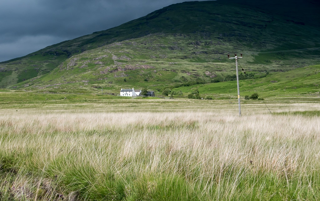
The house is small in the frame and although the top of the mountain is a tad dark, it gives a good sense of remoteness for me
- Messages
- 6,374
- Name
- Dominic
- Edit My Images
- Yes
Remote
I think that there's a bit of a limited amount of different remote ideas, so there's bound to be a bit of repation. Having said that you've managed to capture a remote little cottage at the bottom of a hill with a nice dark cloud to give a bit of drama.
I think that there's a bit of a limited amount of different remote ideas, so there's bound to be a bit of repation. Having said that you've managed to capture a remote little cottage at the bottom of a hill with a nice dark cloud to give a bit of drama.
OP
- Messages
- 644
- Name
- John
- Edit My Images
- Yes
The house is small in the frame and although the top of the mountain is a tad dark, it gives a good sense of remoteness for me
I think that there's a bit of a limited amount of different remote ideas, so there's bound to be a bit of repation. Having said that you've managed to capture a remote little cottage at the bottom of a hill with a nice dark cloud to give a bit of drama.
I think it works well looks very remote that one telegraph pole adding a feeling of isolation
Thank you guys. Yes it's a bit contrasty. When I spotted it and got out to take the shot the mountain top was still in the sun with that black cloud coming up behind. Five minutes later and the heavens opened and it was dive back into the car.
OP
- Messages
- 644
- Name
- John
- Edit My Images
- Yes
Agree with the comments, it's certainly remote.
Did you play with removing the telegraph pole at all? Pondering what difference it may have made to the feel.
Did have a go Tim, but in the end thought it gave some foreground perspective and actually added to the emptiness of the scene and the sense of distance to the house.

OP
- Messages
- 644
- Name
- John
- Edit My Images
- Yes
Given this by my grandkids last hristmas and still haven't started to build it. Still time but not sure my fingers are up to it now. Didn't know Airfix was still going actually
Was going to play with the WB but as it was indoors anyway.....

tp 47-0128 by granddad john on Talk Photography
Was going to play with the WB but as it was indoors anyway.....
tp 47-0128 by granddad john on Talk Photography
Last edited:
- Messages
- 13,393
- Edit My Images
- Yes
Nicely set out John with no items clipped, they look nice and randomly placed too so pretty authentic looking, now, get it built
OP
- Messages
- 644
- Name
- John
- Edit My Images
- Yes
Juicy; Most people beat me to it this week so just a plain shot of a fruit bowl.

tp-48-0139 by granddad john on Talk Photography
cropped this one off centre and tweaked the verticals, though not quite what I hoped it would do, but I'd put it all away and someone has reclaimed the apples and orange for cooking!! No consideration

tp-48-0137 by granddad john on Talk Photography
tp-48-0139 by granddad john on Talk Photography
cropped this one off centre and tweaked the verticals, though not quite what I hoped it would do, but I'd put it all away and someone has reclaimed the apples and orange for cooking!! No consideration
tp-48-0137 by granddad john on Talk Photography
Last edited:
- Messages
- 11,218
- Name
- Tim
- Edit My Images
- Yes
I with @sirch on this, it wants to be punchier.
It's hard to know without being there, but is the bowl itself a true representation of the colour?
I had a quick play making the colour temp cooler (to whiten the bowl) then boosting the blacks, and the contrast it added made the image pop more.
Worth having a play in your editor of choice?
Other than that minor point though, it's a good, well thought out image and spot on for the theme.
OP
- Messages
- 644
- Name
- John
- Edit My Images
- Yes
Seems to lack a bit of punch given the subject, perhaps a bit more dynamic range might lift it a bit?
I with @sirch on this, it wants to be punchier.
It's hard to know without being there, but is the bowl itself a true representation of the colour?
I had a quick play making the colour temp cooler (to whiten the bowl) then boosting the blacks, and the contrast it added made the image pop more.
Worth having a play in your editor of choice?
Other than that minor point though, it's a good, well thought out image and spot on for the theme.
Thanks guys, You're quite right and I'm not sure how that happened. The original was taken under halogen lights indoors so it's a bit warm. Anyway have tweaked the levels etc in PS and I think this looks a bit more like I'd hoped, though still a lot of orange.
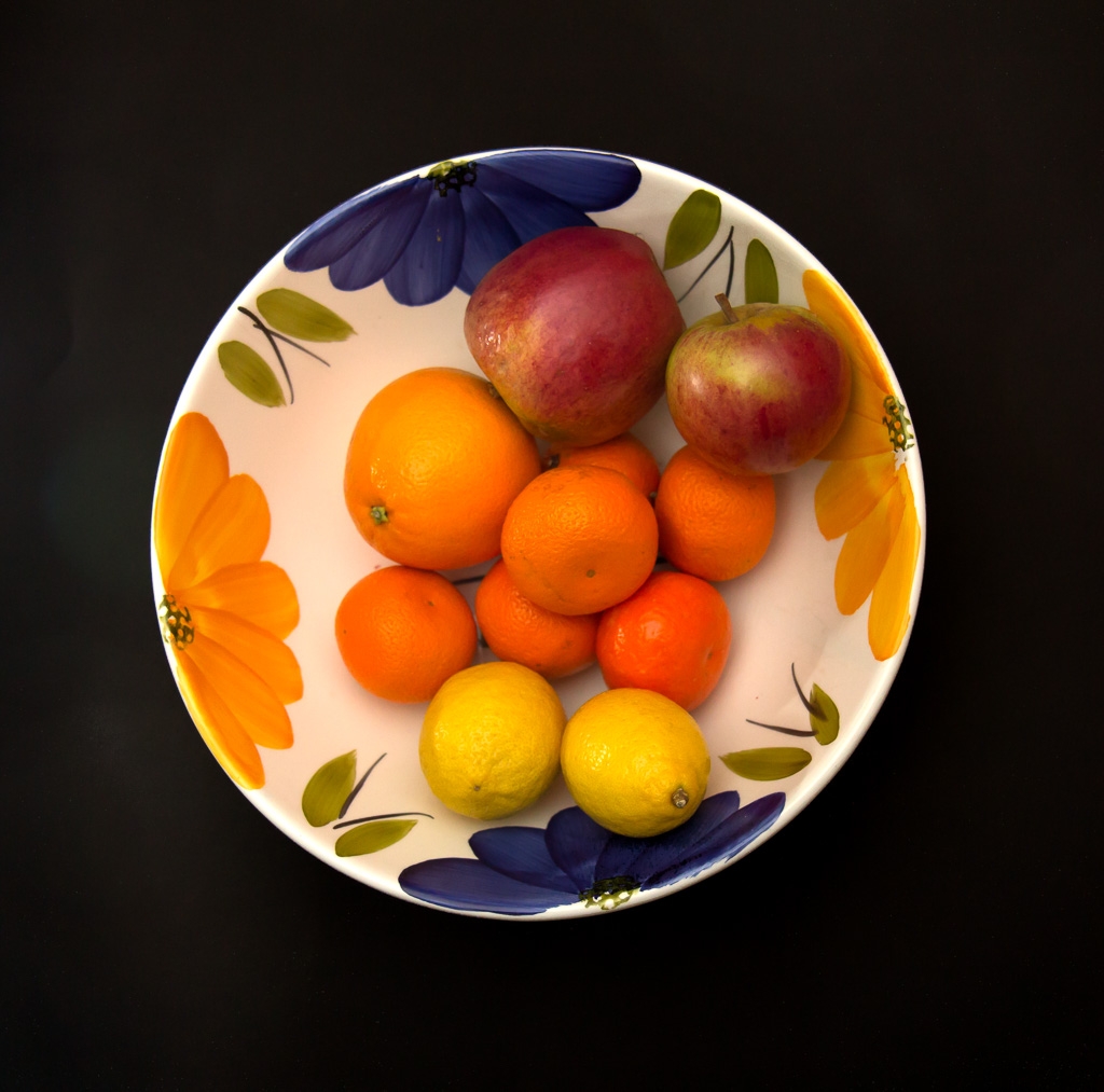
tp-48-0139-3 by granddad john on Talk Photography
Last edited:
OP
- Messages
- 644
- Name
- John
- Edit My Images
- Yes
OP
- Messages
- 644
- Name
- John
- Edit My Images
- Yes
The last posted picture for juicy I quite like, nice crop, tighter could work I think.
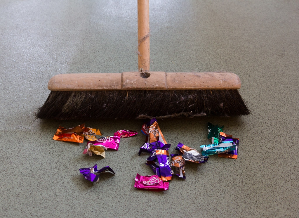
Broad, Spot on for the theme, Sweet wrappers make for a good subject to be sweeping up
Good idea for the theme, the bright sweet wrappers are a good addition
Thanks guys. It was hell emptying those sweet wrappers
OP
- Messages
- 644
- Name
- John
- Edit My Images
- Yes
Nice idea, nicely staged .... but the state of the brush lets it down a bit.
Nowt wrong with triggers broom to my eye, makes it more real. Well set up and taken.
The 3rd edit for Juice for me too
Yes it's a bit tatty isn't it. I found it at the back of the cupboard in the village hall, hence the cobwebs and generally battered appearance. Adds character