LC's 52 Shoehorns for 2016 : Week 52 - Celebration

Hi Tim. Didn't realise they were resorting to building fake chimneys - always imagined the originals being restored - economics at play no doubt. I like the "Pink Floyd" version - fun and reinforces the theme. Like the "fake" processing - how did you manage that? :clap:
 
Yup, the old chimneys have all gone, it was quite odd to look at when 3 of the originals were up, with just the one new one, the difference in colour was quite noticable.

The processing was all done with levels adjustment layers. First I threw away a lot of the data in the blacks, then I played with the input and output levels on each of the 3 colours in seperate layers (I think the blue was also a gradient mask). Lastly I masked the chimney to bring it back.
 
Pink Floyd excellent (y)

Nice processing Tim and yes the chimney really does look artificial (y)
 
:agree: love the Pink Floyd, got that on Vinyl somewhere and the processing really suits.
 
Pink Floyd excellent (y)

Nice processing Tim and yes the chimney really does look artificial (y)
:agree: love the Pink Floyd, got that on Vinyl somewhere and the processing really suits.
Glad you both enjoyed the Floyd reference in the second version. Why I didn't do that first is totally beyond me.
I wish the developers had made more of an effort to keep the chimeys true to the originals, but I do appreciate that they were getting to be unsafe and that they had to do something about them before build the social housing(1) under them.

(1) Social housing if you happen to be a Russian, Chinese or Arabian billionaire... (Grrrrr Don't get me started).
 
Social housing if you happen to be a Russian, Chinese or Arabian billionaire... (Grrrrr Don't get me started).
Now now, no politics :p
( but I know where you are coming from ;) )
 
Nice one Tim

I knew about the old chimneys in need of replacement .. There must be next to nothing left of the original structure, but it's good to see them making an effort. It will always be Battersea Power Station.

Fake chimney, flying pig and not a train in sight.
 
Now now, no politics :p
( but I know where you are coming from ;) )
:oops: :$ I'll behave ;)

Great picture, it should have been the new Stamford Bridge!:)
We'll have to disagree on that. Chelsea should not move from the bridge.

Definitely fits the theme - I love the Pink Floyd reference :)
Cheers Emma. Looking at the construction work going on, I'm not sure that the angle of the cover of Animals is still achievable.

Great shot with the flying Pig Tim ....an excellent addition to your original.
Ta Susie. Not sure why I didn't do it originally.

Nice one Tim

I knew about the old chimneys in need of replacement .. There must be next to nothing left of the original structure, but it's good to see them making an effort. It will always be Battersea Power Station.

Fake chimney, flying pig and not a train in sight.
The outside walls are original (It's not had a roof since the turbines were removed), and I think they are leaving the control room in place.
No trains in sight, but I took the shot from Platform 2 of Battersea Park Station, does that keep my shoehorn count on track?

Nice Moderation.

BTW I've heard that Sting has auctioned everything to buy a pad there.
Wouldn't suprise me...

Love the flying pig, Tim. Can't say I'm a massive fan of that "instagram" style of processing but for the theme it works perfectly so therefore you get a big (y)
Instagram? The very cheek ;)
You should have seen how boring the SooC was before I set to work in CS.
 
Hi, iconic building and album cover, I'm not a fan of the processing, but an interesting subject non the less, pity they didn't restore the original chimneys and the less said about "social housing" the better
 
Hi, iconic building and album cover, I'm not a fan of the processing, but an interesting subject non the less, pity they didn't restore the original chimneys and the less said about "social housing" the better
Ah, but you didn't see quite how bad the SooC was ;)
I agree about the chimneys and I mustn't say anything about the development for fear of the wrath of our dear leader.
 
Hi Tim. I wouldn't mind trying that stacking malarkey - results look good. Good composition - like the mouse in the fg and the light reflections helping define the shape of the laptop. I particularly like the multi-colours of the keyboard ... as well as the fact that you retained detail in the bright screen. :clap:
 
Love the idea Tim, but it almost strikes me as a bit too dark....making the laptop look a little "floaty".
Love the colours on the keyboard.
 
Hi Tim. I wouldn't mind trying that stacking malarkey - results look good. Good composition - like the mouse in the fg and the light reflections helping define the shape of the laptop. I particularly like the multi-colours of the keyboard ... as well as the fact that you retained detail in the bright screen. :clap:
Cheers Carl. I will get CC sometime and do stacking (sometime).
Re the screen, I used selections and the exposure tools in CS to bring that back that far,

Love the idea Tim, but it almost strikes me as a bit too dark....making the laptop look a little "floaty".
Love the colours on the keyboard.
Floaty... You mean like it was sitting at a plane 4 or 5 inches above the mouse?
That could be because it was :) It's supported by a laptop stand sitting on a bean bag tray.
It was deliberately dark to hide all of this (and it's a matt black laptop).

Nice shot Tim. Works really well. I really like the colourful keyboard. I have to agree it is a tad dark for me.
Usually the colours are all set to blue, but for the photo I decided that a rainbow across the keyboard and other random colours would be preferable :)
 
Floaty as in floating in the frame.
No real evidence of surface or background.
Sorry if I offended, non intended.
 
Good idea for the theme, like the colours and lights in the keyboard and mouse.
 
Hi, bit oversaturated for me but maybe thats what you were going for, not keen on the central placement of the laptop and agree about it being floaty
 
Hi Ian, good idea for the Artificial theme, a shame the original chimneys had to be removed. Not overly keen on the processing but I understand why you chose to do it that way.

Cool idea for personal, like that fact its just the mouse and laptop. Perfectly done.
 
Hi Tim, like you I haven't tried focus stacking yet, there's always something new to learn, isn't there? :) You've done well to isolate the subjects in the deep black and although I'd prefer the mouse to be in focus you can still tell what it is and the colours complement the laptop colours well. The multi-coloured keyboard works particularly well for this image to counter all the black and helps to outline the laptop body, and you've shoehorned an engine in there, too! (y)
 
Hi Tim, nice image - and well put together for Personal. I like the colours on the keyboard and the composition/arrangement works really well for me. I'm less certain about the mouse and might prefer a touch more shadow detail on the PC itself, but being black it might be hard to get anything out without lightening the whole background.

Good job :)
 
Hi, bit oversaturated for me but maybe thats what you were going for, not keen on the central placement of the laptop and agree about it being floaty
Hmm, I don't recall particulalrly winding up the saturation. There was a fair bit of highlight recovery on the screen, but not too much work on the laptop itself.
I did experiment with other crops, but the central positioning seemed to work best to my eyes. (I know it shouldn't, but...)

Hi Tim .... I really like it ...there's a reflection underneath so it doesn't look too floaty to me, I'm just not too sure about the mouse, I find it distracting. Maybe clone out those two bright spots, position it nearer the computer I'm not sure!
I suppose the mouse is a bit bright and blurred, but I wanted it in there to add a bit of context.

Eye-catching, a train too! But I have to agree with Allan @alsjazzera
A train? where? surely not :)

Hi Ian, good idea for the Artificial theme, a shame the original chimneys had to be removed. Not overly keen on the processing but I understand why you chose to do it that way.

Cool idea for personal, like that fact its just the mouse and laptop. Perfectly done.
There doesn't seem to have been to much love for the processing :( I thought it was quite artificial ;)
I wanted to keep personal quite minimal, I think I managed it.

Hi Tim, like you I haven't tried focus stacking yet, there's always something new to learn, isn't there? :) You've done well to isolate the subjects in the deep black and although I'd prefer the mouse to be in focus you can still tell what it is and the colours complement the laptop colours well. The multi-coloured keyboard works particularly well for this image to counter all the black and helps to outline the laptop body, and you've shoehorned an engine in there, too! (y)
Thanks Andrea. I would have tried stacking for this one, but after finding that CS2 doesn't seem to support it, I reverted to this.

Hi Tim, nice image - and well put together for Personal. I like the colours on the keyboard and the composition/arrangement works really well for me. I'm less certain about the mouse and might prefer a touch more shadow detail on the PC itself, but being black it might be hard to get anything out without lightening the whole background.

Good job :)
The background was actually a dark red sheet. I think we would have got detail from that before the laptop.
I do like the backlit keyboard and it's fun to change colours. Oddly some games take control of some of the lights too.
 
Week 13 (Tractive) Effort

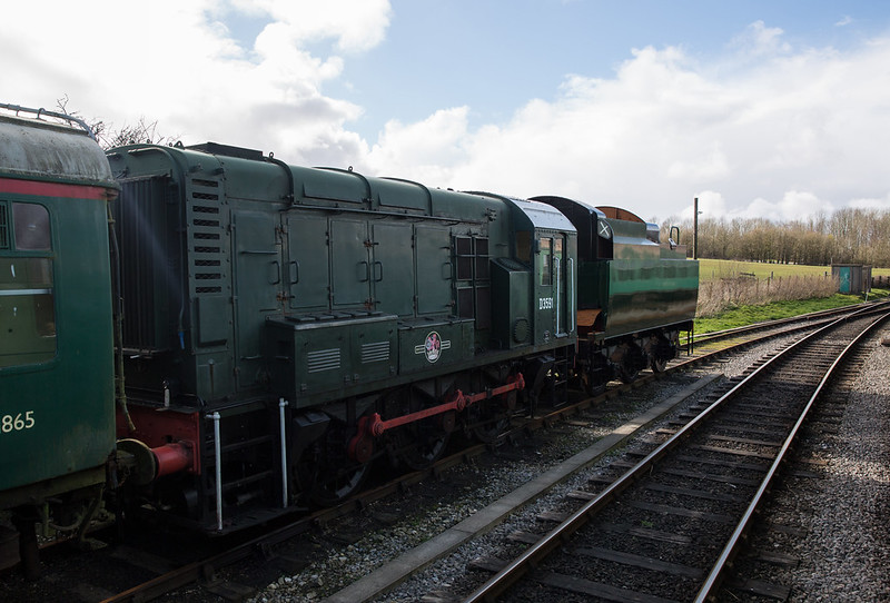
These little shunters were (are) powerful little beasts

Maximum Speed 15 mph (24 km/h) or 20 mph (32 km/h)
Power Output Engine: 350 hp (261 kW)
Tractive Effort Maximum: 35,000 lbf (160 kN)
Loco Brakeforce 19 long tons-force (190 kN)

Here we see one of Swanage Railway's new fangled Steam Powered Diesel Shunters (why else does it have a coal tender?) at rest.
(Sorry about the lens flare, it wasn't obvious on the back of the camera).


Swanage Railway Class 08 D3591
by Tim White, on Flickr

And just in case it's a bit too much of a shoe horn (what me? Never!!!!)
Here we have a couple of Ball Clay Mining trucks which will have been pushed around the clay mining pits by hand.
A fair bit of effort, modelled ably by my youngest...


Ball Clay Mining Trucks
by Tim White, on Flickr
 
Hi Tim. Nothing wrong with the shunter but I like the mining truck best for interest and the more obvious link to the theme. Must have been quite a feat to push one of those fully laden. :clap:
 
Top Trumps? you haven'r given us the tractive effort of your youngest :)

Second for me too, conveys more of a sense of effort
 
Back
Top