LC's 52 Shoehorns for 2016 : Week 52 - Celebration

LC2

Negan
Messages
10,447
Name
Tim
Edit My Images
Yes
Week Zero - OLD

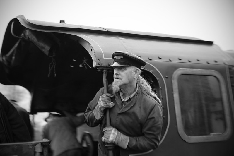
I think that this counts without being a shoehorn. At 89 Years of Age, Nellie is still in fine fettle less than a week before withdrawal at the end of her boiler ticket. (31/12/2105)
It will a good few years before we see her in steam again :(

TP 52 for 2016 - Week 0 - OLD
by Tim White, on Flickr
I *must* try to get more people into this year's 52.

At the Christmas Leave event this Hillman (anyone know what model?) was on show in wartime guise

TP 52 for 2016 - Week 0 - OLD
by Tim White, on Flickr
 
No shoe horns needed there, both good but the second just wins it for me, clean lines and I like the desaturated treatment
 
A couple of good images there. The car stands out though. No1 think I would like to have seen the front of the engine in the shot puffing with steam , but then I suppose you would lose some of the rear of the image :thinking:
 
No shoe horns needed there, both good but the second just wins it for me, clean lines and I like the desaturated treatment
Cheers Chris.

Both nice shots, though number one does it for me. Like the sense of movement (is it moving?) And concentration on the gentleman's face. Solid start
Yes Jason, it was slowly reversing up to the train, so I guess he was concentrating.

A couple of good images there. The car stands out though. No1 think I would like to have seen the front of the engine in the shot puffing with steam , but then I suppose you would lose some of the rear of the image :thinking:
Ta Mandy. I had a few of the whole loco, but nothing jumped out of them as special, whereas I felt the inclusion of the driver & fireman in the shot adds to the image. If you want a decent shot of a loco in motion, take a look at my week 51 in 2015.

Hi Tim... Nice shots, and I'm with you on the 'getting people into the shots' as that first one makes the image for me, liking the old car too, good start (y)
Ta DK. I need to push myself to take shots that I'm not comfortable with in order to grow my skills and confidence. People shots being one of those areas.
 
Number 1 for me as well, I really am a sucker for photographs of steam trains and anything to do with old railways! Nice depth of field, I like the focus on the foreground character, and the fact that the driver/fireman in the background is blurred. Darks are dark where they should be as well, lovely processing.
 
Hi Tim, glad to see you are putting more people in your shots this year. Nice couple of images to start with. My only crit of the first one is it seems a little blown at the top. Love the desaturated car, definitely says old. Great start (y)
 
Hi Tim, glad to see you are putting more people in your shots this year. Nice couple of images to start with. My only crit of the first one is it seems a little blown at the top. Love the desaturated car, definitely says old. Great start (y)
 
Hi Tim, glad to see you are putting more people in your shots this year. Nice couple of images to start with. My only crit of the first one is it seems a little blown at the top. Love the desaturated car, definitely says old. Great start (y)
 
Hi, #1 for me, the guys intense look and his belting goaty work well.

Cheers and welcome back.
Ta Andy. He does somewhat make the photo doesn't he. I may send the shot into the Mid Hants to see if they want to use it.

Number 1 for me as well, I really am a sucker for photographs of steam trains and anything to do with old railways! Nice depth of field, I like the focus on the foreground character, and the fact that the driver/fireman in the background is blurred. Darks are dark where they should be as well, lovely processing.
Cheers David. Stick with my thread and you'll likely see one or two steam locos shoehorned in ;)

Hi Tim ...perfect choices for the theme, I think the train just wins it for me, as you say including a person really brings it to life. Looking forward to lots more next year.
Thanks Susie. It's going to be a challenge adding people in context into my shots, but if we don't challenge ourselves we don't improve. Let's see what the year brings (set myself up for failure there haven't I).

Hi Tim, glad to see you are putting more people in your shots this year. Nice couple of images to start with. My only crit of the first one is it seems a little blown at the top. Love the desaturated car, definitely says old. Great start (y)
Thanks Jill. I see what you mean about looking over exposed. It was a horrible flat grey sky, I added a little vignette to reduce it but I guess it does make it look blown.
 
Glad to see you are off with a shoe horned loco Tim (y)

Although I must admit I prefer the cleaner lines of the car :)
 
Hi, the car for me the train shot unfortunately focuses on the person and while its a good shot of him, i wouldn't say he was that old
 
Glad to see you are off with a shoe horned loco Tim (y)

Although I must admit I prefer the cleaner lines of the car :)
The car was an easier shot though. it wasn't moving and I had time to frame the shot to allow cropping to remove the Range Rover on one side and another 4x4 on the other (hence the tight crop). I'm got to wonder what the disk with 2 on it was supposed to be, in colour you'll see it was a bright yellow plastic disk. Most incongruous.

Hi, the car for me the train shot unfortunately focuses on the person and while its a good shot of him, i wouldn't say he was that old
Good point. I wasn't implying that the driver was old (certainly not the 89 years of the loco). I prefer it to the car as it has life and movement, whereas the car is very static.
 
Hi
Love steam trains but I think the car beats it this time.
Nice choice of subjects for both.
 
Why didn't anybody tell me we'd started 2016? #1 is my fave - lovely DoF and the alert expression on the engineers face is so nicely captured. - (I love b&w). :clap:
 
Hi
Love steam trains but I think the car beats it this time.
Nice choice of subjects for both.
Thanks for looking Anita. Close run thing?

Like them both and I'm definitely a car over train man, but love the first one :)
Thanks Jon. I have to agree, the loco and fireman is the more involving shot imo.

The car for me, I like the hint of colour thats there.
Hi Clive. I think you're teh first person to notice thatI only desaturated it by about 90%-95% :)

#1 would love to have seen more of train, it is a nice pic but should be maybe different title to fit,:)
#2 nice frontal pic, to me this is where you get most detail in a car, ;)
Don't worry @wallyboy, there will be plenty of other chances to view shoehorned trains in this 52 ;) (Although I doubt Nellie will feature much as she gets withdrawn from midnight tonight).

Why didn't anybody tell me we'd started 2016? #1 is my fave - lovely DoF and the alert expression on the engineers face is so nicely captured. - (I love b&w). :clap:
Cheers Carl. I guess they do have to concentrate when reversing up the the coaches, especially when the platform is as crowded as this one was...
 
And he's straight in there but passed up the opportunity to post a track or an engine.
That's what you call restraint :D

Nice sharp image, plenty of texture and detail. Nice start Tim (y)
 
My goodness Tim, that was faster than a speeding ... um ... bullet train. I really like the contrasting textures of wood and metal that have seen better days. Spot on theme. :clap:
 
Last edited:
I like the contrast of the shiny metal against the rust and texture of the wood
 
Nice bit of metal there.

Looks like you didn't photograph straight on as the LHS looks a little OOF. Not too keen on the composition, a little tight at the top and bottom. I might have been tempted to crop a little of the RHS to draw some attention to the shadow.

I am partial to textures and plenty in the wood and rust.

Cheers.
 
Good idea for the theme and well captured details, perhaps a little more space around it?
 
Very sharp and detailed picture! It could also fit for with last week's old theme :)
 
"Old" - I like the picture of the car but for me it's a little too desaturated and I find myself trying to pick out colours rather than enjoying the very crisp lines!

"Metal" - very nice, lots of texture. Would portrait orientation have been a more comfortable fit?
 
Hi, I agree with Andy's comments about you getting straight on, very tight in the frame, portrait might have suited it better.
 
And he's straight in there but passed up the opportunity to post a track or an engine.
That's what you call restraint :D

Nice sharp image, plenty of texture and detail. Nice start Tim (y)
Cheers Mr @Cobra "restraint" ;)

Very nice, you can feel the pits and rust !
Thanks Jon. It's taken many years of neglect to get that patina.

Metal: like the vertical lines in this, and the way the lighting has made the metal disc shine. Nice!
The lighting was a right royal pain.

Like these takes, gives an industrious feel, with the lock and hasp and staple:)
Thanks Walter

My goodness Tim, that was faster than a speeding ... um ... bullet train. I really like the contrasting textures of wood and metal that have seen better days. Spot on theme. :clap:
Cheers Carl. I knew I'd have a hang over today, so it was good to get this in yesterday :)

I like the contrast of the shiny metal against the rust and texture of the wood
Thanks @kr8

You are quick off the mark Tim, I only just found out the theme.
Well Stan, it's not as if I was naging @Cobra or anything ;)

Nice bit of metal there.

Looks like you didn't photograph straight on as the LHS looks a little OOF. Not too keen on the composition, a little tight at the top and bottom. I might have been tempted to crop a little of the RHS to draw some attention to the shadow.

I am partial to textures and plenty in the wood and rust.

Cheers.
Compositionally I was a bit restrained. Slightly above and to the right of the hask & staple there is a Yale Lock at a very peculiar angle. I needed to keep that out of the shot, hence the tight crop. The light was very harsh too, and with the angle it was hitting the lock, I had to be at a slight angle to avoid dazzling reflections and massive blown highlights on the lock(I did try changing the angle of the lock, but no real joy). I quite like the bluring into the distance though :)

Good idea for the theme and well captured details, perhaps a little more space around it?
Hi Chris. Perhaps, I did crop it tightly deliberately, see my reply to Andy for why :)

Very sharp and detailed picture! It could also fit for with last week's old theme :)
Hi Sam, yes I guess it would, but the lock itself if only about 10 years old, the garage doors maybe 5 years more.

"Old" - I like the picture of the car but for me it's a little too desaturated and I find myself trying to pick out colours rather than enjoying the very crisp lines!

"Metal" - very nice, lots of texture. Would portrait orientation have been a more comfortable fit?
Hi Nick. The car was deliberately de-saturated to that level because the disk with "2" on it was actually bright yellow plastic and very out of place. I could have gone the whole hog, but I wanted to try to keep a smidge of colour in there

Hi, I agree with Andy's comments about you getting straight on, very tight in the frame, portrait might have suited it better.
. Hi Allan, I think I got the best I could there due to the rest of the door and lighting (I could post a blown out slightly straighter, uncropped image but nah, it's horrible and I wouldn't want to offend anyone else's eyes ;) ).
 
Hi Tim,

I like both shots for old but the second one works best for me. I like the pp you have done. Crop is a tiny bit tight maybe but I am nit picking really.
Metal: Nice shot that. Nice light which has really brought out the textures.

Cracking start to your 52.
 
Hi Tim, I love locks and doors and this is very nice (y) And not a train in sight :p

Given the restraints you have explained you did good boy ;)
 
Back
Top