

You are using an out of date browser. It may not display this or other websites correctly.
You should upgrade or use an alternative browser.
You should upgrade or use an alternative browser.
weekly Ian's 52 for 2015: Week 16 - Experiment
- Thread starter Harlequin565
- Start date
blakester
Shine On Harvest Moon
- Messages
- 6,679
- Name
- Iain
- Edit My Images
- No
Hi Ian, as the boy @posiview said, that's a bit special.
It's clear to see a lot of thought has gone in to your submission for alphabet and you've been rewarded with a very accomplished image. No matter that it takes a little working out, that's part of its appeal.
It would be a project in itself to shoot the whole alphabet but an interesting one nonetheless. It would certainly train ones eye to look for your subject matter. Good work mister (as Lynne would say") )
)
It's clear to see a lot of thought has gone in to your submission for alphabet and you've been rewarded with a very accomplished image. No matter that it takes a little working out, that's part of its appeal.
It would be a project in itself to shoot the whole alphabet but an interesting one nonetheless. It would certainly train ones eye to look for your subject matter. Good work mister (as Lynne would say
)- Messages
- 6,502
- Name
- Peter
- Edit My Images
- Yes
Machine - A good find out in the country and you’ve taken a good range of shots. I do find this a bit too grey for my liking though. I feel it needs a pop of contrast to help things.
Alphabet - The conversions on this though are spot on. There’s some great creativity to put all this together. I bet it took a while.
Alphabet - The conversions on this though are spot on. There’s some great creativity to put all this together. I bet it took a while.
OP
- Messages
- 8,311
- Name
- Ian
- Edit My Images
- No
Week 16: Experimenting with Infra-red
I gave up with Sound. Too little time and a sensible "accept what you can't do" attitude required. I was determined to get out with my camera yesterday and my shiny new X-T1 pretty much stayed in the bag whilst me newly infra-red converted X-E1 continued to get some use. Thanks again to all the commenters. This week I'll do it...
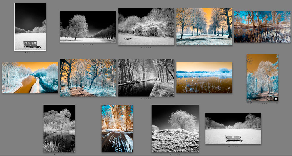
Week 16: Experiment contact sheet. by Harlequin565, on Flickr
I took loads more than this and I've done some processing on the shots I liked and deleted roughly 2/3 of the memory card. This was about experimenting!
Shooting infra-red is a new thing for me, and I learned quite a few things...
Infra-red is invisible to the eye, so what you see through the lens is completely different to what you see with the naked eye.
Grad filters are not required. They just don't work.
A good scene to go infra red with has lots of blue and green in it.
There are a few shots on Flickr, but I liked this one the best. Click through and press L to view on black.
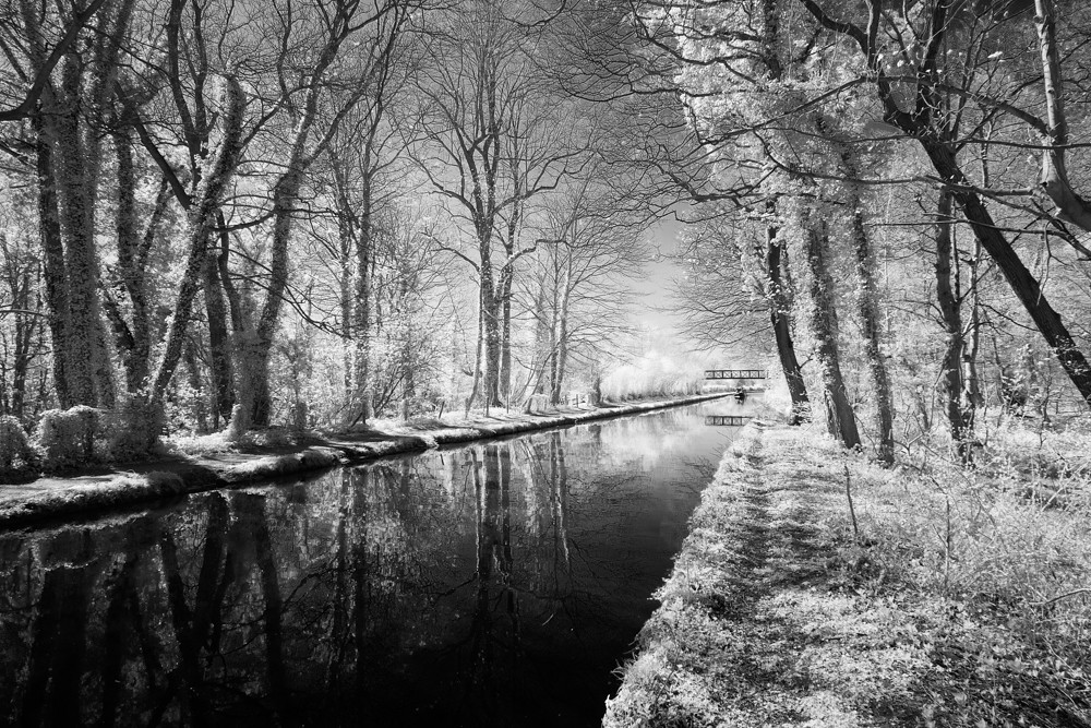
Week 16 - Experiment by Harlequin565, on Flickr
I gave up with Sound. Too little time and a sensible "accept what you can't do" attitude required. I was determined to get out with my camera yesterday and my shiny new X-T1 pretty much stayed in the bag whilst me newly infra-red converted X-E1 continued to get some use. Thanks again to all the commenters. This week I'll do it...
Week 16: Experiment contact sheet. by Harlequin565, on Flickr
I took loads more than this and I've done some processing on the shots I liked and deleted roughly 2/3 of the memory card. This was about experimenting!
Shooting infra-red is a new thing for me, and I learned quite a few things...
Infra-red is invisible to the eye, so what you see through the lens is completely different to what you see with the naked eye.
Grad filters are not required. They just don't work.
A good scene to go infra red with has lots of blue and green in it.
There are a few shots on Flickr, but I liked this one the best. Click through and press L to view on black.
Week 16 - Experiment by Harlequin565, on Flickr
Last edited:
OP
- Messages
- 8,311
- Name
- Ian
- Edit My Images
- No
Hi, I do like that, something about infra-red thats quite appealing, quite like the 4th pic on the contact sheet of the trees, almost alien
It's quite a pain to render the "final image" with IR. First you need to import with a custom camera setting which shifts the WB beyond what native Lightroom can handle. Then you need to export to PS. Then there's a channel swap required along with some delicate sharpening as the IR filter renders colour at the expense of sharpness. After that, a B&W conversion. It can take 10-15 minutes to process one shot which means the ability to "see" IR really helps so that you don;t waste your time on shots that turn out rubbish. 5 & 12 were fully done in colour but I didn't like them at all. The ones with orange skies I haven't even processed yet. 4 & 7 are the next two to look at, so that's reinforced my own thoughts. Thanks!
I agree with Allan, the canal shot is excellent.
It puts me in mind of a still winters morning.
Funny how that ethereal, ghostly feel can only be captured in noonday sunshine when everything is green & blue. Totally get what you mean and I'm glad you see it too. Thanks for the comment.
D
Deleted member 59779
Guest
Well Done for trying something new. I've often thought about IR but never got around to it. For me I rather like the bottom left hand image.
- Messages
- 1,158
- Name
- Lorraine
- Edit My Images
- Yes
Hi Ian,
I really like infra red, it always reminds me of 'magic gardens' that I used to buy my daughter each Christmas (even when she was pretty grown up), you get liquid to go in a little try and crystals form on cardboard shapes - it looks just like the trees in your shots.
I like the second shot on the contact sheet a lot - it does look like heavy frost at night, but the canal shot's very good as well
- Messages
- 8,398
- Name
- Lynne
- Edit My Images
- Yes
Hi Ian
IR is another thing that continues to baffle......That said , on your contact sheet , I'm really drawn to the simplicity of the 1st image & the almost sunset/sunrise feel of the 4th
Your chosen image looks like a winter scene, lovely reflections on the water...my eye is drawn straight to the centre......what is that ...a bridge with a boat under it ?
OP
- Messages
- 8,311
- Name
- Ian
- Edit My Images
- No
Thanks. That was my favourite too but whe I got them all together on the contact sheet, the chosen one stood out more. Interesting to hear your take on it though. Thanks.Well Done for trying something new. I've often thought about IR but never got around to it. For me I rather like the bottom left hand image.
That's what I love about IR. It's invisible light, so it's reality, but it's not what you see with your eyes. Makes it "otherworldy"Beautiful, but almost scary with it.
That "frosty night" effect is quite obvious with the dark skies and blown foliage. It's the shadows that get me. "How can there be shadows at night?" makes my brain go all funny.I like the second shot on the contact sheet a lot - it does look like heavy frost at night, but the canal shot's very good as well
Yep. I toyed with waiting a bit longer to get more boat, but those longboats are so flippin' slow! I liked the vertical bench too. I've got a normal photo of it in colour on the office wall and it is just peaceful to look at.Your chosen image looks like a winter scene, lovely reflections on the water...my eye is drawn straight to the centre......what is that ...a bridge with a boat under it ?
Yep. I wrote a little about it here and more on my website if you're interested.There're few nice shots you've taken there, Ian. I've tried IR once before but using an IR filter instead. Obviously the result wasn't as good as yours. I have a X-E1 too but don't know you can convert it IR?
Thanks everyone!
OP
- Messages
- 8,311
- Name
- Ian
- Edit My Images
- No
There's something about IR shots, and I really like the composition on your final choice. It just pulls you through the frame. The reflections are a nice tough. The colours in 4 & 5 on the contact sheet look a bit special... particularly #5.
Thanks Nick. 4 is straight out of camera. 5 was a 4 shot portrait panorama stitched in PS, so I did the channel swap which is why the colours are reversed (to get a blue sky back). The end result wasn't that good because the lighting in the woods was challenging enough when I could see it. It's tougher when it's invisible. Steep learning curve this...
OP
- Messages
- 8,311
- Name
- Ian
- Edit My Images
- No
it's nice to see everyone experimenting with techniques for this week, I don't understand infra red photography (as in why do it lol) but you did a good job
Thanks for the comment Summer. I'm fascinated by the fact that I'm recording something I can't see with my eyes. It's been a fascination since I read "Visions of Poe" by Simon Marsden. If the admins decide to open up a long term project section I'll be taking it further.
Hi, not sure you've picked the strongest there, IMO. Just too much water, that doesn't emphasis the infra red. I do like #4 and #13.
Thanks Andy. You might be right now that I look at it. Something to bear in mind in future. I really liked 13 too. Simple and straightforward.
- Messages
- 1,344
- Name
- Philip
- Edit My Images
- No
Love the IR images Ian, cracking job.
Phil
Phil
OP
- Messages
- 8,311
- Name
- Ian
- Edit My Images
- No
Thanks Jill. It's really interesting with the contact sheet to show a selection of shots and get a third++ persons idea on them.I love #4 as a surreal landscape and #9 too but I think you've chosen the right one for the main post. I love the leading line of the canal and the detail in the distance keeps me peering at it.
Thanks for your comment Phil.Love the IR images Ian, cracking job.
- Messages
- 7,548
- Name
- susie
- Edit My Images
- Yes
Hi Ian ...your posts are always so interesting. I don't know anything about this type of photography but it certainly yields some stunning shots ....I really like the ones on your Flickr too....there's an amazing 'stillness' about them ...I don't know if that makes sense or not!
- Messages
- 908
- Name
- nathan
- Edit My Images
- Yes
Sorry i have an awful lot of catching up to do, I like your images, the misty scenic image particularly grabs my eye along with your most recent infrared shots (no 4, and the last with the bench ticks all the boxes for me)
I'll try not to leave it so long to comment next time.
I'll try not to leave it so long to comment next time.
- Messages
- 6,502
- Name
- Peter
- Edit My Images
- Yes
I've never tried IR and it seems you've taken some pretty good shots. I like the one you've chosen. The lead in from the left is good as is the range of tones from whites to blacks. Nice one
- Messages
- 13,760
- Edit My Images
- Yes
Hi Ian
Experiment - I have never had a go at this, always been a bit marmite for me these types of shots, just the odd one or two are okay, but like SC, more than one and they become a bit meh... So onto yours, liking the colours on your contact sheet and really like the one you have chosen, the lead in diagonal of the river and the rh pathway are very effective indeed, must say it is hurting my brain though trying to work out what the original is like
Experiment - I have never had a go at this, always been a bit marmite for me these types of shots, just the odd one or two are okay, but like SC, more than one and they become a bit meh... So onto yours, liking the colours on your contact sheet and really like the one you have chosen, the lead in diagonal of the river and the rh pathway are very effective indeed, must say it is hurting my brain though trying to work out what the original is like