You are using an out of date browser. It may not display this or other websites correctly.
You should upgrade or use an alternative browser.
You should upgrade or use an alternative browser.
weekly IanD's 52 Week 2019 Walk Of Shame - Week 26 - Drink
- Thread starter IanD
- Start date
- Messages
- 1,566
- Edit My Images
- Yes
Here we go again - another theme chalked up and hanging on in there 
How about some nice WHOLEmeal Bread
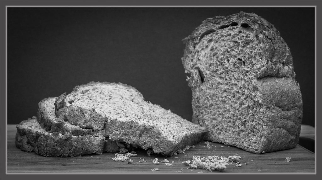 Wholemeal by ***tuttifrutti***, on Flickr
How about some nice WHOLEmeal Bread
 Wholemeal by ***tuttifrutti***, on Flickr
GarethB
Likes to peek
- Messages
- 2,291
- Name
- I don't even know anymore!
- Edit My Images
- Yes
Very nicely processed mono image there Ian!
I like your thinking....Stan's too in fact....when you see my 'whole' image, you'll see why!!
I like the DoF and the black background works very well....nice crumb work there also!
Definitely an 'upper crust' image!

I like your thinking....Stan's too in fact....when you see my 'whole' image, you'll see why!!
I like the DoF and the black background works very well....nice crumb work there also!
Definitely an 'upper crust' image!

- Messages
- 754
- Name
- Daniel
- Edit My Images
- No
Nicely set up shot there Ian, great stuff!
- Messages
- 1,566
- Edit My Images
- Yes
Well, being that i'm in the south of France on my holibobs, I thought there must be something I can throw at this week's theme....
So, it's a very fragile ecosystem that is either helping this rock cling on to the side of the mountain, or it's a very fragile ecosystem that's let the rest collapse over the centuries.....
Nice few hours spent, wandering around Baux de Provence
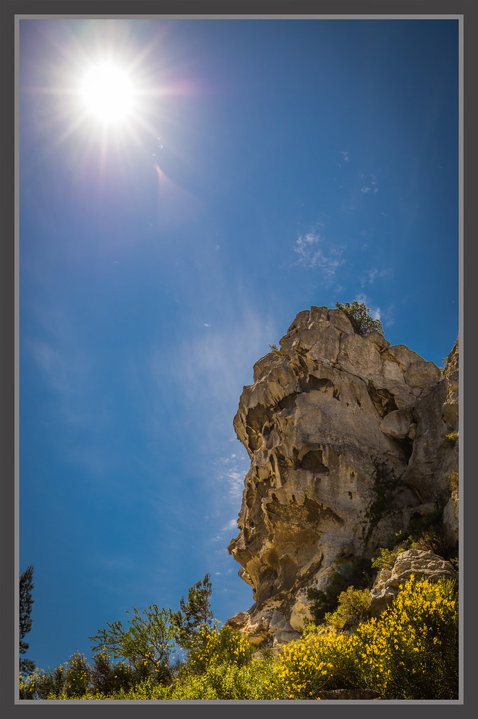 52WK2019 - Fragile by ***tuttifrutti***, on Flickr
So, it's a very fragile ecosystem that is either helping this rock cling on to the side of the mountain, or it's a very fragile ecosystem that's let the rest collapse over the centuries.....
Nice few hours spent, wandering around Baux de Provence
 52WK2019 - Fragile by ***tuttifrutti***, on Flickr
- Messages
- 1,566
- Edit My Images
- Yes
Like Stan`s bread shot for the theme, a very good choice to also have it in mono too and leaving the crumbs in.
Thank you Dave - it's all about the crumbs
Crowd #2. Is my favourite. The bikes and parking attendant has a good story in it, like the aspect ratio of the shot too.
Decay. If it’s marmite I’m on the love it side.
Good clean image with DOF and mono theme
Thank you very much Chenti
Very nicely processed mono image there Ian!
I like your thinking....Stan's too in fact....when you see my 'whole' image, you'll see why!!
I like the DoF and the black background works very well....nice crumb work there also!
Definitely an 'upper crust' image!
All puns intended eh
Nicely set up shot there Ian, great stuff!
Thanks very much Daniel
Very nice shot for Whole Ian. Works very well in mono too. I love the way it brings out the textures.
Cheers Lee. I love mono editing as you can get so much more detail from it without ruining it too much
Like the bread pic good choice for mono too
Thanks very much Allan
Whole
I'm liking the black and white. Only one thing, the top slice is a little bit bright.
Thanks very much Dom. When I put this up, I said to the missus that I guarantee someone will pick up on the over bright slice of bread, and they did
- Messages
- 4,640
- Name
- Pete
- Edit My Images
- Yes
Hi Ian
I can see eco systems as being fragile, but not that lump of rock, how ever it is a great photo, lots of colours in the rock face which stand out against the blue sky. Tree bottom left is awkward but can not be cropped due to the Sun.
Pete
I can see eco systems as being fragile, but not that lump of rock, how ever it is a great photo, lots of colours in the rock face which stand out against the blue sky. Tree bottom left is awkward but can not be cropped due to the Sun.
Pete
GarethB
Likes to peek
- Messages
- 2,291
- Name
- I don't even know anymore!
- Edit My Images
- Yes
Great image for the fragile theme Ian, and I like your interpretation too.
The fantastic colours are equalled by the composition and expert exposure control!
You've picked out some great detail in the rock and yet maintained a really nice exposure elsewhere too.
Very nice work indeed!
The fantastic colours are equalled by the composition and expert exposure control!
You've picked out some great detail in the rock and yet maintained a really nice exposure elsewhere too.
Very nice work indeed!

- Messages
- 1,566
- Edit My Images
- Yes
Well this week's theme could not have come at a better time - our last day in France and a trip out to a Chateau with a vineyard and winery.....
How about a good old fashioned wine press for squashing those grapes
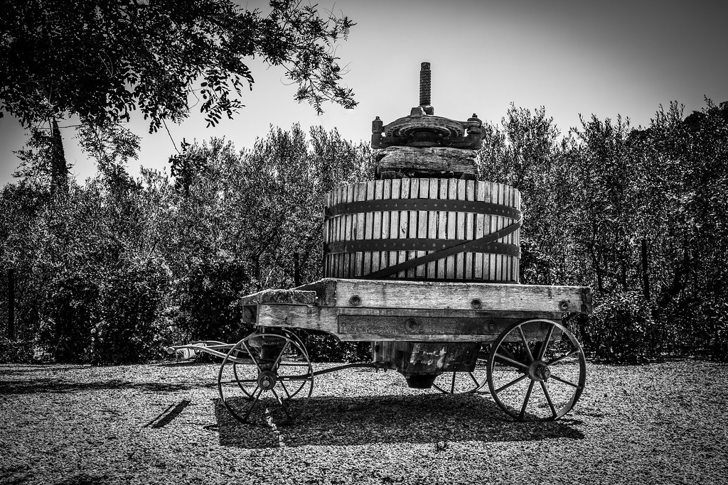 52WK2019 - Squashed by ***tuttifrutti***, on Flickr
How about a good old fashioned wine press for squashing those grapes
 52WK2019 - Squashed by ***tuttifrutti***, on Flickr
- Messages
- 1,566
- Edit My Images
- Yes
Really nice the vignettes a bit heavy but a great find for the theme
I tend to agree with you there Allan. I've had another little edit which I think has improved things slightly
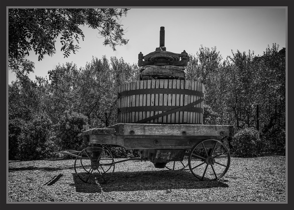 52WK2019 - Squashed New Edit by ***tuttifrutti***, on Flickr
GarethB
Likes to peek
- Messages
- 2,291
- Name
- I don't even know anymore!
- Edit My Images
- Yes
I agree! The subject suits the mono treatment so well....very nice processing!
I think your 'dialling back' of the vignette has improved it further, though it was only the top right that was perhaps a tad heavy on the sky.
A great find and exceedingly well photographed Ian!
I think your 'dialling back' of the vignette has improved it further, though it was only the top right that was perhaps a tad heavy on the sky.
A great find and exceedingly well photographed Ian!

LC2
Negan
- Messages
- 10,451
- Name
- Tim
- Edit My Images
- Yes
Hi Ian,
Blimey, I haven't commented since April!!!!
Above - I initially thought that was something that could go in Pistonhead's Bad Parking thread. But no, from the comments I assume it was moving... They do seem to have issues with their spacial awareness though.
Certainly works well for the theme,
Hot - Great use of complimentary colours there, and the blue background works nicely with it too. The off centre, diagonal placement works well. I think I prefer it over #2.
Light - Well I like it. It works well in B&W, all nicely lined up, no tog shadow
Crowd - #1 should be the one, but I'm just fascinated by #2 which seems to be a traffic warden dishing out parking tickets to a row of push bikes (which would epitomise pointlessness). Both #1 & #2 tell a story, but #2 also asks a question.
Decay - I wish I'd seen this before I posted my Decay image. It's made me realise I could have posted a Harley Quinn shot. Damn... So anyway... B&W suits the shot, especially with the heavy vignette, and the position and perspective also add interest.
Free Week - I think having the complete and expired dandelions in the same shot make it work.
Whole - Like that. The use of the crumbs adds to the image, works well in B&W and the contrast between the board and the background is good.
Fragile - I agree with @-Oy-, it doesn't really sell 'fragile' to me, but that doesn't make it a bad image. The starbursty sun is nice, as are the rich colours.
Squash(ed) - That's a great old thing to find and being old suits B&W (though I'm guessing you've gone B&W to hide a carp sky). Quite a heavy vignette, added in post? Not sure it really needs it. Dunno.
ETA - Just seen the second version, the reduced vignette is better imo.
- Messages
- 754
- Name
- Daniel
- Edit My Images
- No
Squashed - Really like the B&W conversion Ian, I actually prefer the first one. Good idea for the theme too! 
- Messages
- 1,566
- Edit My Images
- Yes
Afternoon all,
Apologies but i've been off the radar for a while and probably will be for the next month, due to damn decorating
So, a little catch up.....
Firstly, a TIME ravaged building in my hometown. It's been empty for as long as I can remember and you'd like to think it could be put to good use instead of being a nightly hot spot for drunks and druggies
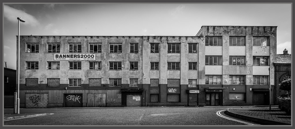 52WK2019 - Time by ***tuttifrutti***, on Flickr
Secondly, due to my current status and depressing decorating i'm involved in.....
How about a FULL tin of paint ready to be splashed all over the carpet and cupboard doors
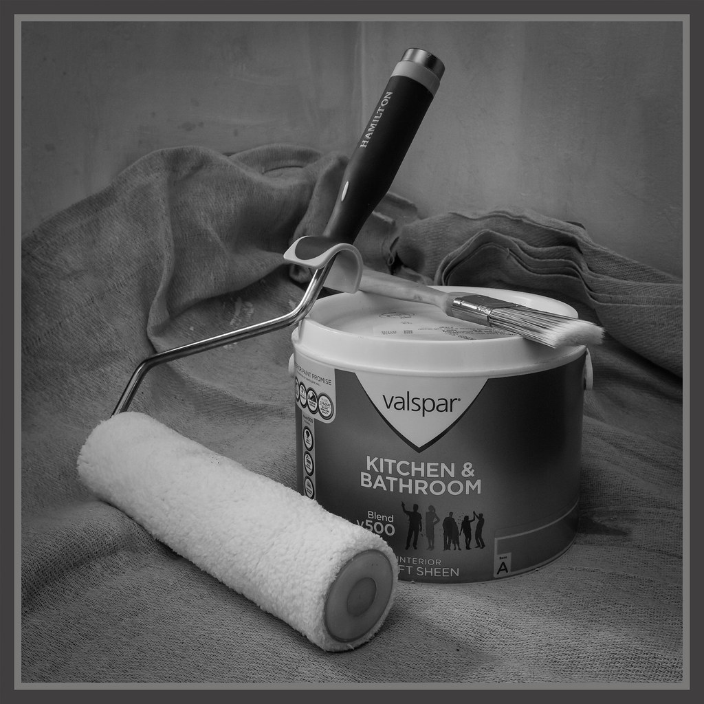 52WK2019 - Full by ***tuttifrutti***, on Flickr
Apologies but i've been off the radar for a while and probably will be for the next month, due to damn decorating
So, a little catch up.....
Firstly, a TIME ravaged building in my hometown. It's been empty for as long as I can remember and you'd like to think it could be put to good use instead of being a nightly hot spot for drunks and druggies
 52WK2019 - Time by ***tuttifrutti***, on Flickr
Secondly, due to my current status and depressing decorating i'm involved in.....
How about a FULL tin of paint ready to be splashed all over the carpet and cupboard doors

 52WK2019 - Full by ***tuttifrutti***, on Flickr
Last edited:
- Messages
- 11,087
- Name
- Allan
- Edit My Images
- No
I like both of them particularly the building, not sure on the fascination you have for frames but each to their own, the paint is a nice composition,
I will say (I do a lot of decorating with my job) only used Valspar paint once and would never use it again.
I will say (I do a lot of decorating with my job) only used Valspar paint once and would never use it again.
- Messages
- 1,566
- Edit My Images
- Yes
I like both of them particularly the building
Thanks very much Allan
not sure on the fascination you have for frames but each to their own
Honestly, don't know myself but I just feel it adds something and finishes off the image for me
the paint is a nice composition,
I will say (I do a lot of decorating with my job) only used Valspar paint once and would never use it again.
Got through a tin already and it seems fine to me, but i'm no expert and B&Q is close by
GarethB
Likes to peek
- Messages
- 2,291
- Name
- I don't even know anymore!
- Edit My Images
- Yes
Great images there Ian!
Time: beautifully crisp mono, simple yet effective composition and a perfect fit for the theme.
The border suits this image well....nice vignette too.
Full: the more I look at this, the more I like it....something I can't quite put my finger on, I just think it's really good - the composition and mono treatment works very well.
On a side note, the silhouettes of the people on the label of the paint tin....what's going on there I wonder? They look like they're having a party!...is decorating that much fun? Did I miss the memo on that?
- Messages
- 1,566
- Edit My Images
- Yes
So, still hanging on in there and managed to get to half way through the year.
Here's my 'Drink' effort for this week.... Oh, and just for @Allan.H I left the frame off
 52WK2019 - Drink by ***tuttifrutti***, on Flickr
Here's my 'Drink' effort for this week.... Oh, and just for @Allan.H I left the frame off
 52WK2019 - Drink by ***tuttifrutti***, on Flickr
