-
Important: the Server Hamster is in need of a bit of TLC so the site will be off line for a while on Friday morning, the 17th
You are using an out of date browser. It may not display this or other websites correctly.
You should upgrade or use an alternative browser.
You should upgrade or use an alternative browser.
Posiview's TP52 2017 I’m done....
- Thread starter posiview
- Start date
- Messages
- 19,461
- Name
- Andy
- Edit My Images
- Yes
Nice take on the bent theme Andy, goes well in mono and nice & sharp front to back
Wood is a nice shot and like the low pov.
Wall is a cracking shot and spot on for the theme, good pov again and like the texture
A couple of crackers there Andy, a very fitting curve and really like your atention to detail on the crop coming in from the corner, nice grain in the timber that leads to the lighthouse
Shame the light wasn't flashing as that would have been splendid
Wood (en) - A great low PoV and symetrical image, now if that red spot was a lady in a coat IU wouldn't find it so distracting, but then again the shadows lead to it very nicely, a warm looking image indeed
Bent
I really like this, it a great scene and conversion.
Wood
I like the low pov and the central position with the shadows on either side.
Wall
Well found wall and it's even got small tower.
Bent and Wood both very good
Good to see a different take on St Mary's lighthouse but the lighthouse is maybe a tad over-sharpened/over-processed?
Wood works really well
Wall does the job, as you say bit of a shame about missing the best light
Agree with DK ...Bent and Wood are absolutely excellent..
Liking the angle on Wall too but I can see how the light would add that extra bit of magic.
Thanks all, 'good' light would have been nice, but it was a great meet nonetheless
Cheers.
- Messages
- 19,461
- Name
- Andy
- Edit My Images
- Yes
Up at 05:00 for a sunrise  trip to Lowton near where I live. Light didn't play ball but @Mardybum recommended the Church of St Marys, so off I went and while there I happened upon Symmetry.
Wonderful, small church with loads of character. I had my tripod fully extended and even the centre column extended to get the POV I needed. The cropped upper right and left plaques couldn't be helped and sacrificed for the resulting photograph.
5 shot (subtle) HDR as the dynamic range was very wide.
Of the 2, it's the B&W for me.
Cheers all and I'll do a catch up on comments tonight
 Symetrical 2 by aNdy sHeader, on Flickr
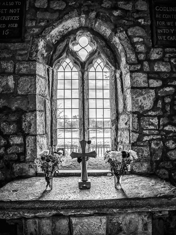 Symetrical by aNdy sHeader, on Flickr
Wonderful, small church with loads of character. I had my tripod fully extended and even the centre column extended to get the POV I needed. The cropped upper right and left plaques couldn't be helped and sacrificed for the resulting photograph.
5 shot (subtle) HDR as the dynamic range was very wide.
Of the 2, it's the B&W for me.
Cheers all and I'll do a catch up on comments tonight
 Symetrical 2 by aNdy sHeader, on Flickr
 Symetrical by aNdy sHeader, on Flickr
- Messages
- 9,733
- Name
- Stan
- Edit My Images
- Yes
Bent; nice pov and black and white treatment works well. Good use of the railing as leading line to the lighthouse.
Wooden; like the low pov and the colours are pleasing. Personally, I would clone out the distance red lifebuoy, the tiny red dot is a bit distracting.
Wall; very apt for the theme. The subject would look much better having been shot with better light.
Symmetrical; prefer the HDR version, very subtle and excellent colour processing.
- Messages
- 13,760
- Edit My Images
- Yes
Hmmmm Its the Colour version for me Andy, the weather sure wasnt playing ball today was it !!! - but still its times like this that you venture into places like this, love the history of old churches and the stone arch you have selected is cool 
- Messages
- 19,461
- Name
- Andy
- Edit My Images
- Yes
Usually I would say B+W but I like the subtlety of the colour in this case, though the B+W is rather good too
You have handled the light and HDR very well, first for me, apart from generally preferring colour the mono feels a bit hard and stark whereas the warm tones of the colour make the photo for me.
Colour for me too Andy, a very shot and like the colours and good texture.
Bent; nice pov and black and white treatment works well. Good use of the railing as leading line to the lighthouse.
Wooden; like the low pov and the colours are pleasing. Personally, I would clone out the distance red lifebuoy, the tiny red dot is a bit distracting.
Wall; very apt for the theme. The subject would look much better having been shot with better light.
Symmetrical; prefer the HDR version, very subtle and excellent colour processing.
Wood is a cracker , I really like that.
The wall has some nice leadinglines intot he Castellet thingy...
I prefer the colour as I think the b/w is to dark in contrast...
Getting results with the new camera Andy.Bent & Wooden both great compos with leading lines to follow. Wall: a different pov but still great compo & detail.
Thanks, all, it's good to be back in the game
Cheers.
- Messages
- 19,461
- Name
- Andy
- Edit My Images
- Yes
Symmetrical ... the colours ... soft textures, with a delightful wonkiness for the theme.
That, David, is the best crit ever and very apt for the wonderful church.
Cheers.
- Messages
- 19,461
- Name
- Andy
- Edit My Images
- Yes
B&W for me I like the gritty harsh look ... it not perfectly symmetrical, but I'll settle for d00d's description
Shush
Yeah, one of them occasions when I couldn't frustrated because the symmetry wasn't 100%. It's a great little church.
Cheers.
LC2
Negan
- Messages
- 10,462
- Name
- Tim
- Edit My Images
- Yes
Hi Andy,
Welcome back and oops, seems it's a bit of a catch-up from me (too much time spent editing or working, but hey)...
Curve - Fantastic find, both very curvy. I can't (currently) get to the flickr versions (private) because 1. the symmetry and 2. The people in it disappear into the background more, I really had to look to find them.. I also like how everything leads to the coat of arms and find that works more in the second image.
Display - Leads eh? I thought it might have been from a circ du soleil display like the one at Kings Cross last year for Christmas.
I'm drawn more to the second shot with the globe for the range of light with the sky still displaying shades of blue.
Bent - Cool example of leading lines that actually has something being led to (quite often you see leading lines leading to nowt). Interesting how the distance means that when the fence turns left before the lighthouse, you don't notice it until you really look.
The mono processing works a treat too, as does the ominous look to the clouds
Wooden - Symmetry again, and a lovely low perspective that emphasis the symmetry well. Great colours, especially the contrast of the straw colour of the wood vs the blue of the sky. Re DK's comment on the red coat. It doesn't bother me (it makes it real) but did you give any thought to selectively desaturating it? (A trick someone on here suggested to me a few years back where one of my loco shots had a distracting colour).
Wall - I contemplated something like this (and in-fact took one yesterday to see what it was like). If you could have gotten the shot in the golden light you mention, it would have taken it to another level.
Symmetrical - Once again showing us how it's done. Great find. I think the mono version for me, given that we're almost at Halloween, the look has a more Gothic, spooky feel. I am going to say that to me it feels as if there is a slight lean to the left. Parts of it are vertical, parts aren't. so choice of the verticals is always going to be difficult. Damn those medieval builders and their wonky ways
- Messages
- 19,461
- Name
- Andy
- Edit My Images
- Yes
Hi Andy,
Welcome back and oops, seems it's a bit of a catch-up from me (too much time spent editing or working, but hey)...
Curve - Fantastic find, both very curvy. I can't (currently) get to the flickr versions (private) because 1. the symmetry and 2. The people in it disappear into the background more, I really had to look to find them.. I also like how everything leads to the coat of arms and find that works more in the second image.
Display - Leads eh? I thought it might have been from a circ du soleil display like the one at Kings Cross last year for Christmas.
I'm drawn more to the second shot with the globe for the range of light with the sky still displaying shades of blue.
Bent - Cool example of leading lines that actually has something being led to (quite often you see leading lines leading to nowt). Interesting how the distance means that when the fence turns left before the lighthouse, you don't notice it until you really look.
The mono processing works a treat too, as does the ominous look to the clouds
Wooden - Symmetry again, and a lovely low perspective that emphasis the symmetry well. Great colours, especially the contrast of the straw colour of the wood vs the blue of the sky. Re DK's comment on the red coat. It doesn't bother me (it makes it real) but did you give any thought to selectively desaturating it? (A trick someone on here suggested to me a few years back where one of my loco shots had a distracting colour).
Wall - I contemplated something like this (and in-fact took one yesterday to see what it was like). If you could have gotten the shot in the golden light you mention, it would have taken it to another level.
Symmetrical - Once again showing us how it's done. Great find. I think the mono version for me, given that we're almost at Halloween, the look has a more Gothic, spooky feel. I am going to say that to me it feels as if there is a slight lean to the left. Parts of it are vertical, parts aren't. so choice of the verticals is always going to be difficult. Damn those medieval builders and their wonky ways
Yikes, feel a little guilty now
Feel I'm back into the game.
I did consider cloning out the buoy but liked the splash of red.
Yeah, I was going to complain that the church wasn't symmetrical
Cheers again
- Messages
- 19,461
- Name
- Andy
- Edit My Images
- Yes
Warn, I've had this knackered old plant in the kitchen for month now waiting for an apt theme. Finally arrived.
Might even post another one.
Cheers, all.
 Week 43 Warn by aNdy sHeader, on Flickr
Might even post another one.
Cheers, all.
 Week 43 Warn by aNdy sHeader, on Flickr
- Messages
- 19,461
- Name
- Andy
- Edit My Images
- Yes
Nice shot Andy, I like the idea and it looks good in black n white
Worn, a very nice shot Andy of the old worn leaf. Goes well in mono and like the curled up bit too plus a good BG to enhance it
nicely lit and a good conversion to B+W
Works well in mono Andy. Another example of how to do it in a really simple but effective fashion.
I'm wondering if worn is the right adjective for the leaf but I'll let you off for a really good mono with a great tonal range.
Thanks, all, valid point @sirch I was going for worn out, but #bitoffashoehorn
Cheers.
- Messages
- 19,461
- Name
- Andy
- Edit My Images
- Yes
Is this a Warning that Autumn is upon us! Not many trees have lost many leaves yet here in London.
A pleasing image, arty processing.
Great to see you back in Andy, the display pictures, really like the one with the moon in view, Loving the leaf for worn, mono works a treat, symmetrical the colour version, just.
Cheers, all the leave are vanishing toooo fast
- Messages
- 19,461
- Name
- Andy
- Edit My Images
- Yes
Colourful, had to be fireworks. Room for improvement, I feel the need for a little shadow detail.
Maybe next year
Cheers.
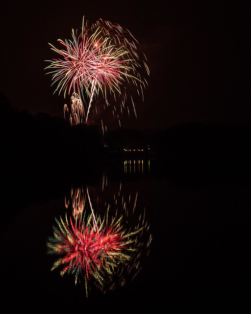 Cracendo by aNdy sHeader, on Flickr
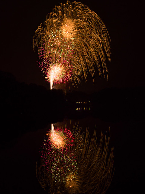 Cracendo 2 by aNdy sHeader, on Flickr
Maybe next year
Cheers.
 Cracendo by aNdy sHeader, on Flickr
 Cracendo 2 by aNdy sHeader, on Flickr
- Messages
- 662
- Name
- John
- Edit My Images
- Yes
Really great shots Andy. Love the reflections; I'm sure there's reason why the reds are more intense in the reflected image Perhaps they're just in the lower part of the burst
 Perhaps they're just in the lower part of the burst
- Messages
- 19,461
- Name
- Andy
- Edit My Images
- Yes
Colourful - Indeed and with reflections too. Nice
Nice shots and on theme Andy, good reflections.
Very colourful and a good reflection too, nice work
Well you seem to have done your own crit, the definition of the buildings could be slightly better but the reflections are a bonus nicely done
Really great shots Andy. Love the reflections; I'm sure there's reason why the reds are more intense in the reflected imagePerhaps they're just in the lower part of the burst

Fabulous leaf Andy, it looks like an artwork, really nicely done, I like that a lot
Well done with the fireworks too, that reflection is a bonus ...it works well.
Guess what I was planning on shooting for colourful? I think the first just edges it because the second is a little cropped at the top but both are good for the theme.
@granddad john Indeed, thought that myself.
Cheers all.
Onto week 45

