You are using an out of date browser. It may not display this or other websites correctly.
You should upgrade or use an alternative browser.
You should upgrade or use an alternative browser.
weekly rpn's 2018 Project 52 - Week 52 SHOWCASE Added (Complete)
- Thread starter rpn
- Start date
- Messages
- 9,699
- Name
- Stan
- Edit My Images
- Yes
Thank you all for your nice words and feedbacks and apologise for lack of commenting and replies. Too busy going between paces down-under and the lack of internet connection doesn't help my causes.
Anyway, trying my best keeping up with my photo weekly 52 challenge. Was in Brisbane the last few days while looking out for Stack theme and came across many potential shots of..........
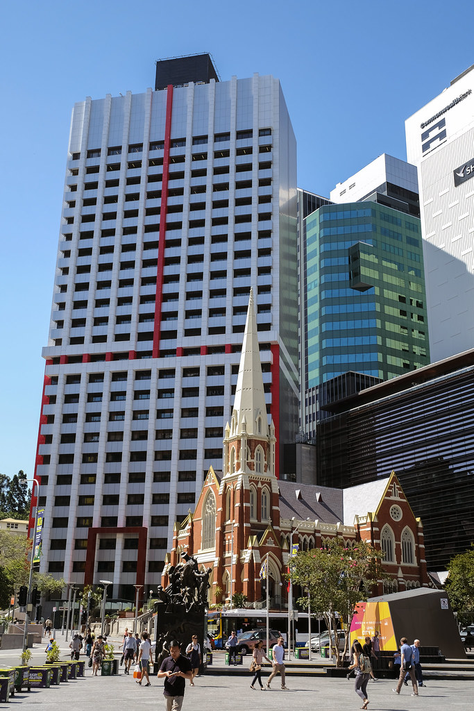
Week 03 - Stack (Contrast of modern and traditional architect)
 Stark 203876S by Stan, on Flickr
Anyway, trying my best keeping up with my photo weekly 52 challenge. Was in Brisbane the last few days while looking out for Stack theme and came across many potential shots of..........
Week 03 - Stack (Contrast of modern and traditional architect)
 Stark 203876S by Stan, on Flickr
Last edited:
- Messages
- 2,625
- Name
- Bernd
- Edit My Images
- Yes
Yep, that works for me. Good light, I love the Australian blue sky. Composition wise, I wonder if it would work even better if you had only the old church and the modern office blocks in the frame, either by moving around or just by choosing a tighter crop. Without the sky.
- Messages
- 9,699
- Name
- Stan
- Edit My Images
- Yes
- Messages
- 616
- Name
- Ross
- Edit My Images
- Yes
Love the second one. Like its been said above, I would have liked maybe a tighter crop on the 1st one. Just having so many modern buildings, especially the ones cut in half on the right, is just a bit distracting for me.
- Messages
- 4,562
- Name
- Mark Gameson
- Edit My Images
- Yes
Hi Stan
I like.......
No No No I don't like it all this keep posting pictures of mlovely blue skies is just not on

Sorry where was I I really like both of them a strak contrast between the old and modern some great colours and refections in both.
I like.......
No No No I don't like it all this keep posting pictures of mlovely blue skies is just not on
Sorry where was I I really like both of them a strak contrast between the old and modern some great colours and refections in both.
- Messages
- 4,635
- Name
- Pete
- Edit My Images
- Yes
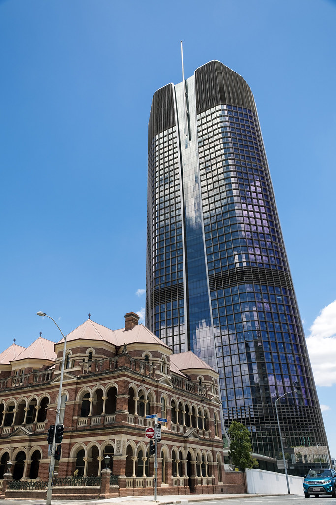
2nd is better than the leaning tower of Brisbane 
- Messages
- 754
- Name
- Daniel
- Edit My Images
- No
Some great shots for all 3 themes Stan nice one, particuarly like the People shots!
- Messages
- 174
- Edit My Images
- Yes
Some lovely photos, really like the start shots. Top job.
- Messages
- 13,760
- Edit My Images
- Yes
Isn't it amazing how them red lines on that first building make it something interesting, love the idea Stan and the architecture contrast is very effective for the theme... Hope you are having a great time 
- Messages
- 1,473
- Name
- Paul
- Edit My Images
- Yes
People theme is brilliant, kept me looking for a while to spot them, the stark theme goes to number one for me, the modern building overlooking the spire, nice capture.... and have a lovely holiday, will expect more pics when you get back 
- Messages
- 9,699
- Name
- Stan
- Edit My Images
- Yes
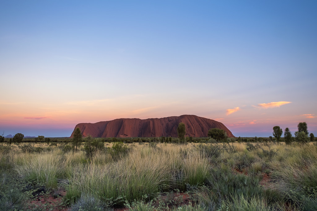
Its boiling hot here in the middle of Australia. Arrived yesterday was a cool 40C and today is 43C but feels like 50C. Up at 4:10 this morning for the sunrise and this is my shot for this week's theme.
Week 04 - (Sunrise) Over (Uluru)
 Over 204242 by Stan, on Flickr
Week 04 - (Sunrise) Over (Uluru)
 Over 204242 by Stan, on Flickr
- Messages
- 4,635
- Name
- Pete
- Edit My Images
- Yes
That's not fair, not much chance of a nice sun rise here in blighty for a while.
Lovely colours over a internationaly known landmark. Make me jealous.
Lovely colours over a internationaly known landmark. Make me jealous.
- Messages
- 4,562
- Name
- Mark Gameson
- Edit My Images
- Yes
Stunning image not a lot else to add !
- Messages
- 3,413
- Name
- Mark
- Edit My Images
- Yes
Stunning image not a lot else to add !
Indeed, a real cracker Stan, one for the wall ?
- Messages
- 9,095
- Name
- Mandy
- Edit My Images
- Yes
People - I was just about to say I couldn't see any people, until I looked top left and seen a blurred group of people at the top. All I can say is wow what a stunning view, and your second image is a cracker.
Stark - I much prefer your second image for the theme, very jealous of that nice bright blue sky, just a shame about the car that snuck in to the frame.
Over - WOW what an incredible image, cant pick fault with this image at all.
Stark - I much prefer your second image for the theme, very jealous of that nice bright blue sky, just a shame about the car that snuck in to the frame.
Over - WOW what an incredible image, cant pick fault with this image at all.


 Week 03 Stark 203916S