Stevesc's 52 for 2017 - week 32, 33 & 34 added

For the best you have its very good indeed
Thanks.

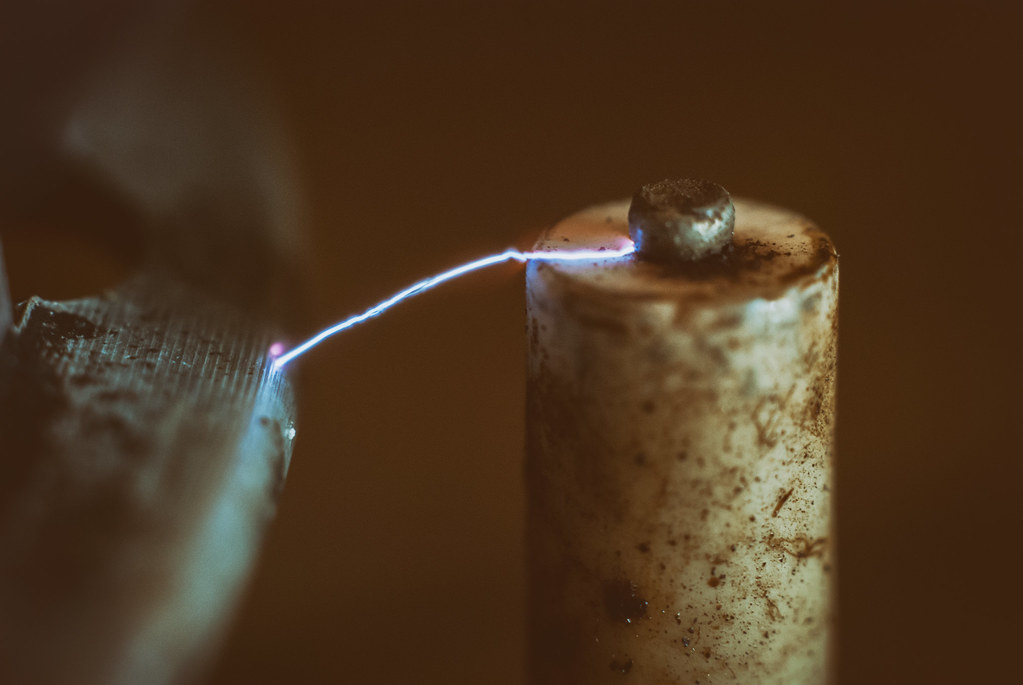
Nicely done Steve, liking the relatively dirty look of the image and the bright spark of electric, works well :)
Thanks, partly what I was hoping for but would have liked more of the image in focus.

I really like that, nice contrast between the muted colours of whatever that is and the spark.
Thanks Bernd, it's the lighter on the cooker hob.
 
I agree with the others a good strong image, there is something Frankensteinian about it
 
Cool idea and nicely done. Another one for my 'rainy day ideas' bag.
Cheers Chris, most of my shots end up being around the house although less because of a rainy day, mostly due to lack of effort to get out!

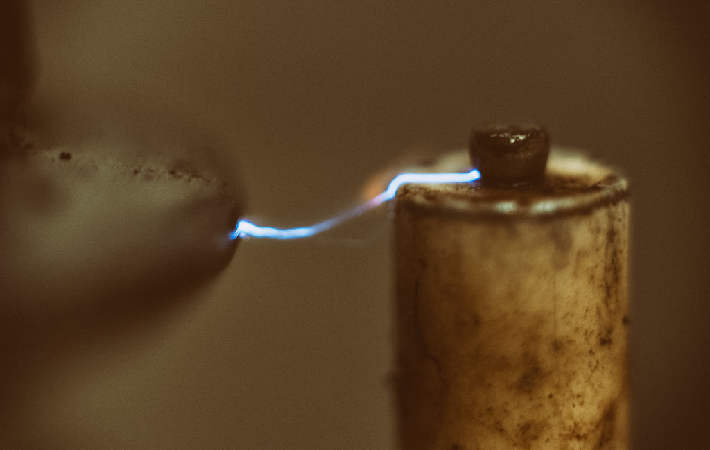
Another who likes it too, like the colours of the electric going from the one side to the other :)
Thanks Dave, I liked the change in colours as well. Most of the other shots just had a blue/white line, I also liked the way it wrapped to the top of the post rather than an arc which I had in most.

I agree with the others a good strong image, there is something Frankensteinian about it
Thanks Chris.

That is a really nice shot. I bet it took ages to get set. The blur rage just adds to it in my opinion. Well done.
Cheers, didn't actually take that long to do this. I only had about an hour on Wednesday evening, which included time to edit and upload. I couldn't easily get a tripod set up so just shot handheld. With extension tubes on meant I was struggling to get enough light to give a reasonable DOF with a shutter speed I could handhold and an ISO I could live with.
 
That looks great - the almost sepia tones give it an aged look that makes it feel like some early experiment - i liked @sirch 's Frankenstein comparison (y)
Thanks Emma.

I love Sirch's Frankenstein comment, spot on.
The enlargement is particularly cruel, but I think you've captured the theme well.

Cheers Tim, yeah the full size image just shows up the flaws but ran out of time to get anything else done. Think it may be another for a reshoot as sometime as I was pleased with how the idea turned out if not the final execution of it.
 
Week 11 "Dark"

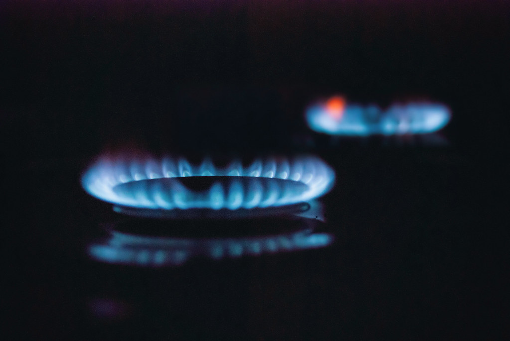
Thought I would have a go at taking a shot that was fairly bright but still fitted into the theme, partly because I have just got some flash triggers and wanted to give them a go :D I'm a bit torn between these two shots, I prefer #1 overall, particularly for the POV and the softer shadows, I do like the deeper DOF in #2 though.
#1
Burnout 1 by Steve, on Flickr

#2
Burnout 2 by Steve, on Flickr
 
I think number one, the DoF just looks right to me emphasises the head of the match
 
Hi Steve

Attractive is a good idea, I agree with all that's been said, nice olde world feel with wonderful electric highlights.

Dark ... nicely done ... preferring #2 with focus on the head. (y)
 
Another vote for #2 for dark, great idea, nicely executed.
 
It's a good idea for the theme and I agree with your analysis regarding which is best, I'm tending towards #2
 
I think number one, the DoF just looks right to me emphasises the head of the match
#1 is my preference but looks like we're in the minority :)

Hi Steve

Attractive is a good idea, I agree with all that's been said, nice olde world feel with wonderful electric highlights.

Dark ... nicely done ... preferring #2 with focus on the head. (y)
Another vote for #2 for dark, great idea, nicely executed.
Dark, has to be #2 for me too as nicely taken on the match head.
2nd pic for me, just prefer the DOF I think. Nice idea well executed.
It's a good idea for the theme and I agree with your analysis regarding which is best, I'm tending towards #2
#2 for me Steve, I think you've captured more detail in the match head, it's definitely a very original take on the theme, good thinking outside the box.
Has to be #2 for me too as I prefer the focus on the head.

Thanks for all the comments, looks like #2 is generally the most popular (y)

Hard to decide. I like #1 for the softer shadows, but #2 has more detail on the match head.
Hmm, no, can't choose.

Thanks Tim, can be tough choosing (which is why I often post more than one).
 
#2 for me, very nicely done.

(Except for the orange flame at the back which I find a tad distracting but that is being very picky)
 
#2 for me as well. Low angle and dof make for a lovely composition. Blame British Gas for the orange bit!! Nice reflections too.
 
#2 for me, very nicely done.

(Except for the orange flame at the back which I find a tad distracting but that is being very picky)

#2 for me as well. Low angle and dof make for a lovely composition. Blame British Gas for the orange bit!! Nice reflections too.

Thanks guys, I was a bit unsure about the orange flame, part of me liked it as a contrast to the blue but will probably have a go at editing it out and see what it looks like, I ran out of editing time last night.
 
Attractive, great capture.

Dark, I prefer the second, I like the composition of the first but would prefer the focus right on the end of the head.

Power, the second for me, I like the second ring in the background and the angle and framing.

(y)
 
Ah, your hob again! #2 for me, great PoV and I like the second flame in the background.
 
Attractive, great capture.

Dark, I prefer the second, I like the composition of the first but would prefer the focus right on the end of the head.

Power, the second for me, I like the second ring in the background and the angle and framing.

(y)

Thanks, my thoughts were the same for Dark. #2 seems the most poplular at the moment. :)


Ah, your hob again! #2 for me, great PoV and I like the second flame in the background.

haha, yes the hob again. A good proportion of my shots have been taken in the kitchen this year. Really need to get out with the longer days.
 
#2 in both for me Steve - most of the interest in texture seems to be on the head of the match, so it seems the most appropriate place to focus. The shot with the two rings just seems more original than the others giving it added interest - great reflection, too (y)
 
I think No2 works because there is another ring in the BG the black and the blue work well together
 
#2 for me too, good low angle and reflection, like the orange bit too :)
Thanks, glad you liked the orange bit.

#2 in both for me Steve - most of the interest in texture seems to be on the head of the match, so it seems the most appropriate place to focus. The shot with the two rings just seems more original than the others giving it added interest - great reflection, too (y)
Thanks Emma, they both seem to have been the most popular.

I must be odd to prefer #3. Cleaner and fewer distractions. A central composition with a complete reflection would really make the image.
Cheers Stan, #3 was my wife's favourite so you must have good taste :). It is a crop so there is a chance of the central composition but unfortunately I did not get the whole reflection which was a real annoyance!

I think No2 works because there is another ring in the BG the black and the blue work well together
Thanks Allan (y) I do agree that the background ring helps with the shot.
 
Re-shoot from attraction, decided to give the same shot a go but set up a tripod and a little LED light this time to allow a smaller apature to give a bit more DOF and allow a slower shutter speed to bring down the ISO a bit.

edited to add original shot for comparison

Attraction reshoot by Steve, on Flickr

The original shot for comparison:
attraction by Steve, on Flickr
 
Last edited:
Yes the reshoot is better than the first try. That's how it should be :)
 
Back
Top