weekly Posiview's 2013 52. Week 52, Water added TTFN.

Messages
19,461
Name
Andy
Edit My Images
Yes
Well, for the 3rd year running I'm in :bonk:

I'll repost some advice I gave last year, FWIW :D

A few pointers from me:

1. look at the theme
2. look again and the theme.
3. spend time ruminating on the theme.
4. make your photograph
5. post your photograph **Mark (Southdowns) suggested posting photographs in a single thread, hopefully, he's explain it to everyone (again :D)
6. sit back and bask in the glory
or
7. reflect on the comments others made and learn - don't get :( or :bat: or :bonk:
8. if you get despondent, fed up, lacklustre or bored, take a moment to think why you're doing the project. Many of those that start will drop out...make sure you are not one of them
9. trust me, no really, trust me it will not be easy, but..
10. when you've finished you will feel FANTASTIC

Finally, support each other and post comments and constructive criticism, and people will respond in kind.

Oh, and don't forget the Mid TP 2013 52 and End of TP 2013 meets....great fun (y)

Week 1, Sin
Week 1, Sin 2
Week 2, Season
Week 3, Gravity
Week 3, Gravity number 2
Week 4, Wild
Week 5, Space
Week 5, Space 2
Week 6, Work
Week 6, Work 2
Week 7, Gluttony
Week 7, another Gluttony
Week 8, Time
Week 9, Juxtapostion
Week 10, Letter
Weel 11, Electric
Week 12, Direction
Week 13, Tacky
Week 14, Value
Week 15, Greed
Week 16, Angle
Week 17, Rustic
Week 18, Kind
Week 19, Reshoot of Value
Week 19, Vertical
Week 20, Pattern
Week 21, Movements
Week 21, More Movements
Week 22, Below
Week 23, Size
Week 24, Process
Week 25, Rock
Week 26, Pair
Week 27, Shape
Week 28, Plenty
Week 29, Speed
Week 30, Steps
Week 30, Another steps
Week 31, Mono
Week 32, Connection
Week 33, Beginning
Week 34, Still
Week 35, Whimsical
Week 36, Curve
Week 37, Power
Week 38, Solitary
Week 39, Sweet
Week 40 to add link
Week 41, Live
week 42, Reflection

Week 44, Left
Week 45, Food
 
Last edited:
TP doesn't have a 'like' button Andy but if they did you would certainly have me click it for the above post.

Well done on completing 2012 52 so successfully and good luck for 2013, I will be joining you.
 
TP doesn't have a 'like' button Andy but if they did you would certainly have me click it for the above post.

Well done on completing 2012 52 so successfully and good luck for 2013, I will be joining you.

Cheers, Iain, I'll keep an eye out for your thread.
 
wayyy hayy...good to see you back in for some more torture matey :clap:
 
Good start, I'm going to get started tomorrow
Can I be daft and ask what the second one is?
 
Cheers.

Second one in Flickr is a bottle top.

D'oh makes sense :LOL:
Good idea to get a flickr set, think I'll do the same
Like the lighting on the signature, think thats my fav of the three, think we all endulged this sin over the holidays ;)
 
D'oh makes sense :LOL:
Good idea to get a flickr set, think I'll do the same
Like the lighting on the signature, think thats my fav of the three, think we all endulged this sin over the holidays ;)

Thats a really good start to the year, it fits the theme well, I really like the JD one aswell ;)

You know, I sat here for what seemed an age wondering which one to post.

Cheers.
 
sworks said:
Is there a TP Flickr account, can I have a link please?
Thanks

Hi, we've had one set up for last year, but people seem to upload to their own Flickr accounts and link from there. Mention was made somewhere about someone setting up another TP Flickr 52account that you can link from if you want.

Cheers.
 
I had read about a TP one but I will just link to my own if that's what most do. Many thanks
 
Now then ...whats this...posting early :thinking:

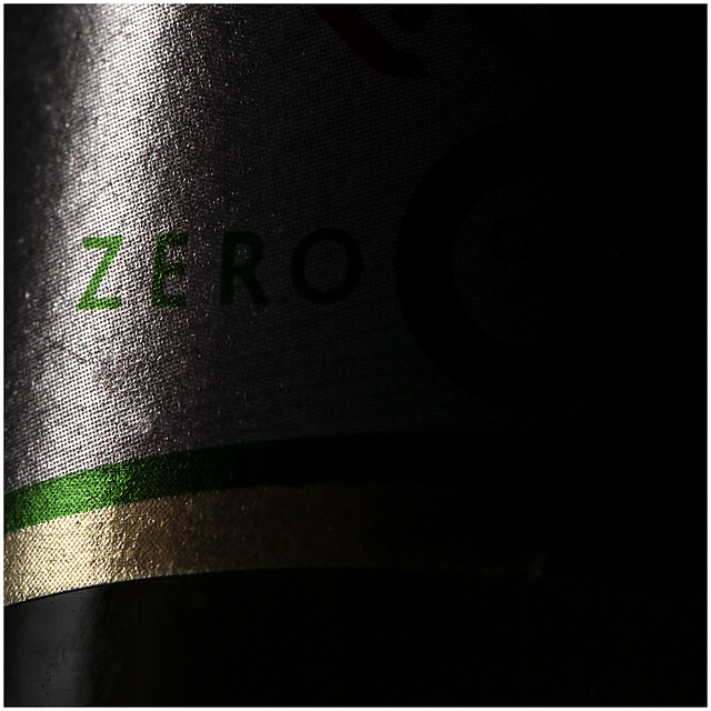
To the shot....like the lighting but maybe just a tad more on th O of zero ?

& figured out where I'm going wrong with this theme.... your shot is good for sure BUT it doesn't say Sin to me :shrug:

off for another ponder.....
 
blondie606 said:
Now then ...whats this...posting early :thinking:

To the shot....like the lighting but maybe just a tad more on th O of zero ?

& figured out where I'm going wrong with this theme.... your shot is good for sure BUT it doesn't say Sin to me :shrug:

off for another ponder.....

Hi, no worried. Maybe a personal thing.

I've just uploaded another to Flickr, but feel posting 2 before the official opening date might be cheeky...then again, I might just do it tonight.

Cheers.
 
Great take on the theme andy and love the use of light and negative space, and I too particularly like the JD shot.

I agree with lynne though, some more of the zero showing would be better :)
 
Hi Andy

First to post eh? (y)

Sin #1 - good comp, nice lighting and limited range of colour make this a good shot. Possibly needs just a touch more light on the 'o' as said by others.

I get the link to the theme, but also zero alcohol (meaning without alcohol) can be translated into Spanish as sin alcohol - so you get a double star. Impressive for the first of the year. :clap:

#2 is a well taken shot but i do not like the image nor the connection to the theme.
 
OI ! slow down & give the rest of us a fighting chance mister :p

Your ability with lighting is pretty darn good matey , like the focus & mono suits (y) Think this maybe says says Sin to more than the 1st as well though irresponsible also springs to mind :LOL:
 
Have to agree with Lynne about the bottle doesn't really say sin, its nicely lit but the black on the left makes it look a bit odd.
The second one I agree with Alan, have you not used that shot or something similar before?
 
DTS said:
Great take on the theme andy and love the use of light and negative space, and I too particularly like the JD shot.

I agree with lynne though, some more of the zero showing would be better :)

Can't seem to multi quote on iPad??

Point taken about the O in zero. Possibly should have submitted the JD shot.

Cheers.
 
superpippo said:
Hi Andy

First to post eh? (y)

Sin #1 - good comp, nice lighting and limited range of colour make this a good shot. Possibly needs just a touch more light on the 'o' as said by others.

I get the link to the theme, but also zero alcohol (meaning without alcohol) can be translated into Spanish as sin alcohol - so you get a double star. Impressive for the first of the year. :clap:

#2 is a well taken shot but i do not like the image nor the connection to the theme.

Cheers, yip, the O was too dark. Double start, lol.

In reference to #2, I'm not sure what you mean?

Thanks for commenting,

Cheers.
 
blondie606 said:
OI ! slow down & give the rest of us a fighting chance mister :p

Your ability with lighting is pretty darn good matey , like the focus & mono suits (y) Think this maybe says says Sin to more than the 1st as well though irresponsible also springs to mind :LOL:

Cheers, no more from me for week 1. I can just take he time to comment on everyone else's.....;)
 
alsjazzera said:
Have to agree with Lynne about the bottle doesn't really say sin, its nicely lit but the black on the left makes it look a bit odd.
The second one I agree with Alan, have you not used that shot or something similar before?

Hi, black on the left, do you mean the shadow on the LH side of the bottle?

Again, I'm not sure what Alan, or you mean in reference to #2? I've used the object in question before, but there the similarity ends.

Cheers.
 
I like the lighting on all your sin shots and like them as pictures but the second one posted here says sin the most to me.
 
Good start to your 52 Andy (y)
I see some things will never change, you and your multiple entries :LOL:
#1 perhaps needs that little explanation to bring it on theme but I think that's ok. It's well lit, with great use of the negative space. You've held the detail in the foil bottle neck, perhaps a little more light to the rhs but other than that, (y)
#2 I like too, technically very good again handling the light on the shiny packaging well but you've got some imagination when it comes to these themes :LOL:
 
:LOL: Wow !!! really quick off the mark with these.

Lighting is absolutely superb in no.1 and photographically I think it's the strongest of your set.
As a standalone image I couldn't care less about the "o" in zero, but in the context of "sin" I agree with the earlier comments about it needing more light.

The second one really took me by surprise.
Not something I was expecting to see . . . you have a wicked, wicked mind !!!
Absolutely bang on theme though and the execution and control over lighting and DoF is spot on.
 
I like the lighting on all your sin shots and like them as pictures but the second one posted here says sin the most to me.

Thanks. Lighting is the area I'm really looking to improve this year.

Good start to your 52 Andy (y)
I see some things will never change, you and your multiple entries :LOL:
#1 perhaps needs that little explanation to bring it on theme but I think that's ok. It's well lit, with great use of the negative space. You've held the detail in the foil bottle neck, perhaps a little more light to the rhs but other than that, (y)
#2 I like too, technically very good again handling the light on the shiny packaging well but you've got some imagination when it comes to these themes :LOL:

Cheers, Iain, I keep feeling that I should really just post a single image...but when I get inspired I can't control myself :D

Lighting with metalic is never easy. I used my polariser (thanks Jackie (y)) an it helped a bit.

Imagination....:geek:

Thanks again.

I like #2. Definitely says sin to me, and the DoF is spot on.

Cheers, bud (y)

:LOL: Wow !!! really quick off the mark with these.

Lighting is absolutely superb in no.1 and photographically I think it's the strongest of your set.
As a standalone image I couldn't care less about the "o" in zero, but in the context of "sin" I agree with the earlier comments about it needing more light.

The second one really took me by surprise.
Not something I was expecting to see . . . you have a wicked, wicked mind !!!
Absolutely bang on theme though and the execution and control over lighting and DoF is spot on.

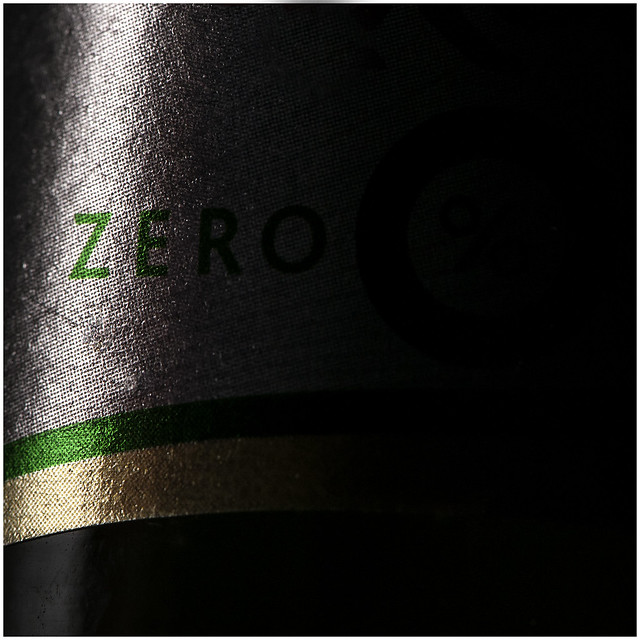
Thanks, Sarah, I did an edit and have to agree what's been said about the O. I guess I wanted an implied O, but the edit below works for me as well.

#2, I do like to throw a curve ball, now an again.

Thanks all.
 
To me the durex photograph is the more striking of the two, 0% alcohol makes me think of good, responsible-driver type people, not sin, although I can see where you're coming from. I personally preferred the original bottle, the 'O' just seems a little forced in the second edit.

The durex one is just pure, pure evil. And the focus on the pin is just amazing.
 
Haha, love the Durex one photo. Not sure it's sin, but maybe that's my sense of humour :nono:

Great photos, something to strive for with my own (y)
 
Definitely better with the more pronounced O.

The Durex one made me chuckle; I won't ask where the idea came from.
 
Excellent Andy, I especially like number 2. Can't really fault it :)
 
Great start, for me Sin 4a is the one. I like the balance of light & shadow, the colours are spot on too, looking forward to seeing more (y)
 
Back
Top