weekly Hertsmans 52 for 2017 Rustic,Festive, weather added-and DONE !

Hi Mark ...tank is looking super clean so spot on for the topic, hope you sold it. Good luck with your marine tank, they look stunning but the fish and corals have become very expensive!

Lovely curves in your racetrack, I think the slight crop works well.
 
Last edited:
Curves
Lots and lots of different curves you've got there, with a good variety of colours.
 
Hi Mark,

Finally getting round to catching up with commenting:(

Fruit - Good alternative to the theme. Nice colours and dof and no you can't beat edible props:D
Vehicle - The edit is good, the white spot did draw the eye other than that I like the colours and good black bg
Piece - Lovely blue against the black bg and well done with the reflections but my OCD would like the chain to be more even and I think it might have worked well in portrait too
Contrast - Nice idea, I do think it has legs but its not really contrasty enough but sometimes you just have to let it go and move on, you might come back to it later and it will work. Might have worked on a reflective surface, just a thought
Curve - I like this there's lots to look at. Nice curves on the track and the grass, it is a bit on the tilt but its tricky to straighten or crop without losing the marshals and I like that detail

:D
Thanks Georgina for coming by and adding to my thread

Does look bit tilted but could be the angle from which it is shot, certainly bang on theme.
Ta

Now that is a cool curve for the theme, to be honest I am not too fused as to the level for some reason, and I musty say the 2 guys walking out of the framer bottom LH is a great touch/inclusion (y)
Yeah, Iiked them for interest too

I feel your pain on the contrast shot Mark - those set ups can be SO frustrating!! I'd probably have tried more directional lighting, perhaps a lower pov/shallower depth of field to generate interest in s different way, but that might not have been at all the shot you were looking for. Huge credit for trying so hard!
I really like the original shot you posted for curves - it is wonky and a bit puzzling, but of all the edits it most emphasises the curves and I think it's really striking with it's bright bold colours (y)
Cheers Em, its was the bold colours and swooping curves that caught my eye.....

Hi Mark ...tank is looking super clean so spot on for the topic, hope you sold it. Good luck with your marine tank, they look stunning but the fish and corals have become very expensive!

Lovely curves in your racetrack, I think the slight crop works well.
Thanks Susie - and yes Reefing is ACTUALLY more expensive than photography!

So many ways to call Dutch angle, but the way I know is. When taking the shot, just tilt your camera so it`s at an angle L/R :)
Ah, gotcha !

Quite interesting to see all the different versions of the shot. But well done to you for capturing the original shot in the first place which I like too. Agree with others that some elements are a bit distracting.
Thanks, I knew it wasnt perfect but had promise, and interestiing to see how others would edit the same pic

Curves
Lots and lots of different curves you've got there, with a good variety of colours.
Cheers
 
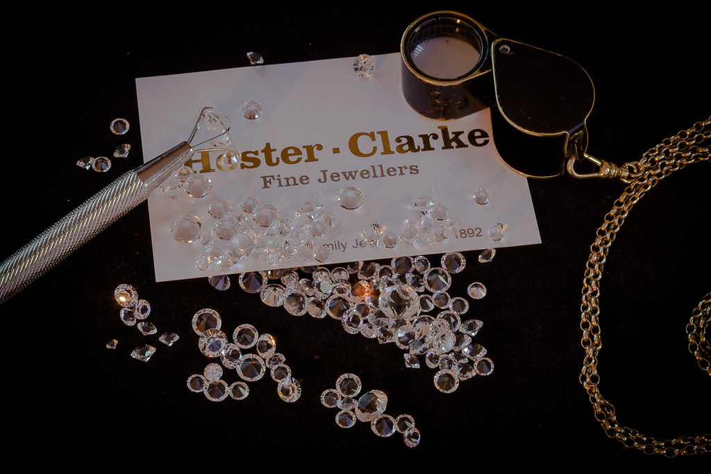
Is that your occupation? Nicely put together and well done controlling the highlights in the stones
 
Is that your occupation? Nicely put together and well done controlling the highlights in the stones

Not me, my better half......Id have taken pics of hammers and things for me - not quite so nice to look at !
 
Very nicely done for occupation Mark, I think you did a great job on keeping the high lights down, good BG and focus :)
Thanks Dave

Yes very nicely set up, a perfect product shot for me, nice background, hint of colour reflecting in the gems and well positioned throughout too (y) - I do hope they use it in the jewellers window ??
Not let them see it tbh, Im not overly happy happy with the lighting.

Nice setup, sharp & nicely lit. (y)
And I think its under lit tbh.....
 
Good job with "you" nice black background shows off the tattoos well.
 
Good composition for occupation. I thinks its a classy image. The arm and the tattoos work well for the theme and the B&W suits the image but I would like to have seen all of your fingers.
 
Good take and on theme Mark, think it goes well in mono :)
Thanks Dave

Two smashing choices for the themes Mark.
Liking Occupation very much ...really nicely composed and perfect against that deep black background.:clap:
Good choice in the b&w for You,that works very well too.

Thanks Susie, no way was I doing a selfie !

Good shot for you and fairly tricky to do too :).
Ta

Good job with "you" nice black background shows off the tattoos well.
Cheers Chris

It is, that's atmospheric. But given the subject, I guess a spot or snoot might add.
Tricky to light, to much light causes multiple highlight issues......

You ... what about a clenched fist!
It was hard enough to get what I did in focus, but yeah, a fist may have improved the image.

Good composition for occupation. I thinks its a classy image. The arm and the tattoos work well for the theme and the B&W suits the image but I would like to have seen all of your fingers.
Thanks Georgina, I think thats the first time me and classy have ever been mentioned in the same sentence..... ;)
 
And then it was time for Arch....I desperately didnt want to post the predictable as thats how Im wired, but time and the 52 wait for no man, so I had to take what I saw....


Arches

Arch (1 of 2) by Mark P, on Flickr
 
Just wonder if you had got slightly further forward and slightly to the right if you would have got a bit more of the middle arch in? Does the job for the theme though.
 
Nice idea, the more I look the more arches I see. I don't think the day has done it any favours, some nice light on the bricks would have been lovely but sometimes you just have to go with it :D
 
Plenty of arches there Mark. As others have said it's a pity you couldn't get a light behind to light the interior a bit more but well done for spotting multiple examples of the theme.
 
Why @Dark Knight ? Its my arm - which makes it "you" from my perspective ? also, the tatts/meaning are also a big part of me/you....
Ahhhhhhh sorry, dim moment there for me :LOL:

Arch - A threesome of arches, cool... nothing wrong with the obvious, well that is what I am now telling myself too as I have taken similar for the theme, guessing some themes and given time we can be more constructive but some weeks this is perfectly suitable :)
 
Hi Mark, just catching up with your additions since my last visit, and I do like Curves. The original works just fine for me as my eye was drawn straight to that strong S curve.

Occupation is interesting and all the items sit well against that dark background, Well lit too, with nicely controlled highlights.

B&W is perfect for You, showing off the details of the tattoos clearly against your skin. I would have left your whole hand in rather than cropping off the fingertips, but that may not have been possible and I think the tattoos are the main subject.

Arch - well spotted and composed. I like the warm tones and different textures in the structures (y)
 
Arch
A good succession of arches there. There's some good detail in the brick and stonework. It's a shame the the light wasn't better.
 
Just wonder if you had got slightly further forward and slightly to the right if you would have got a bit more of the middle arch in? Does the job for the theme though.
Physically limited for compo sadly....

On theme for arch Mark, like the bit of green both sides and the mixture of brick and flint :)
Thanks Dave

Nice idea, the more I look the more arches I see. I don't think the day has done it any favours, some nice light on the bricks would have been lovely but sometimes you just have to go with it :D
Indeed Georgine, a blit of blue sky would have the difference,,,,

An interesting ruin building. Nothing wrong of the obvious interesting to see the different takes and interpretations of the theme.
I agree Stean, I just like to make my own path if poss....

Plenty of arches there Mark. As others have said it's a pity you couldn't get a light behind to light the interior a bit more but well done for spotting multiple examples of the theme.
Another six foot in height and I would have lost the sky completely....

Ahhhhhhh sorry, dim moment there for me :LOL:

Arch - A threesome of arches, cool... nothing wrong with the obvious, well that is what I am now telling myself too as I have taken similar for the theme, guessing some themes and given time we can be more constructive but some weeks this is perfectly suitable :)
Indeed...

Hi Mark, just catching up with your additions since my last visit, and I do like Curves. The original works just fine for me as my eye was drawn straight to that strong S curve.

Occupation is interesting and all the items sit well against that dark background, Well lit too, with nicely controlled highlights.

B&W is perfect for You, showing off the details of the tattoos clearly against your skin. I would have left your whole hand in rather than cropping off the fingertips, but that may not have been possible and I think the tattoos are the main subject.

Arch - well spotted and composed. I like the warm tones and different textures in the structures (y)

Thanks Andrea

Arch
A good succession of arches there. There's some good detail in the brick and stonework. It's a shame the the light wasn't better.
Agreed, I love the textures in the brickwork

Arch - I think I would of converted the B/W but works for the theme, where was that ?

Nah, the warmth was too good to ignore...Colchester Zoo, they have a ruined church in the grounds....
 
Hi Mark,

Occupation - Quite a bit of bling there :) Fels a bit dark to me, could youhave brought the whites up a bit whilst still controlling the reflections off the stones?

You - Live fast / Die Old, that's a different take on it. Have you made it past 27 yet?
Mono suits it.

Arch - Got to have been a difficult one to compose. My gut feel is I would have liked a different sky, but you can only work with what you have on the day.

Hi Tim,thanks for comments.
I struggled as I had a few to many highspots so had to dial it all back a tad too much I think, but Im happy wotht he overall feel of the shot.
You - my life motto, and yes, Ive made to the grand old age of 52 so far.....
Yeah, Arch would have great if I could either have blue sky or get high enough to lose the sky - sadly neither were possible.

That's a good find for Arches Mark, not an easy topic to do quickly, agree with Tim about the sky but we can't have everything.
Thanks Susie, it is indeed a shame about the weather, but we are in September now, so no surprise really.....
 
Back
Top