Kernow Chris' 52 for 2017 - Broken added

Hi Chris.
Not sure that it works for me. Obviously it's on theme, and there is plenty of detail in the subject.
But I think it's the fact that although your verticals are spot on, the horizontals are just off.
That is a result of the slight skew caused by taking the shot from the side and there isn't much you can do about it. Not sure, but I think that accentuating the skew, so that the 'diagonal' horizontals (for want of a better way of explaining it) were much more of an angle would have made it look like a deliberate, artistic choice.

Loving the skies you've captured in the exterior shot :)

Thanks for the comments. A bit more practice on straightening things out needed then, mind you, you should have seen the original! The window horizontals are ok, it's the rear of the pews. Maybe 'lift' the bottom left corner a bit.
 
Last edited:
Ha, good one! Not entirely sure about the composition, but bang on theme.
 
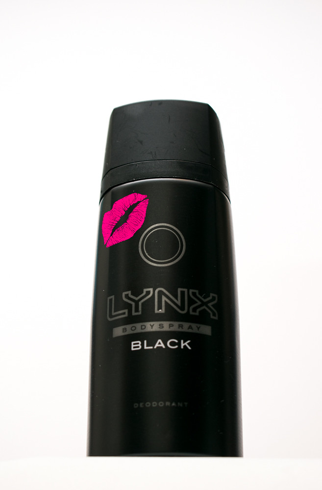
Nice, good choice for the theme and the coloured lipstick looks great. I think I would have had the black go right to the bottom, rather than the strip of white underneath.
 
Lynx is an old one for me, I loved old spice :) I like the shot and think the lipstick kiss helps it :)

Oh my - this brought back memories of have to enter my stepson's room with breathing equipment when he was in his early teens!

Ha, good one! Not entirely sure about the composition, but bang on theme.

Liking the composition of this, and the high key look, not quite dead central alignment, but hey the lips sure add just that splash of colour that sets this off nicely :)
I centered (tried to) the 'circle' graphic, but didn't notice it was skewed.

Nice, good choice for the theme and the coloured lipstick looks great. I think I would have had the black go right to the bottom, rather than the strip of white underneath.
Didn't think of framing it right at the bottom, that could have saved some perspective issues I had.

I'm glad you all liked the lipstick kiss, was a sod to wash off before work this morning ;)
 
Week 11 - Dark

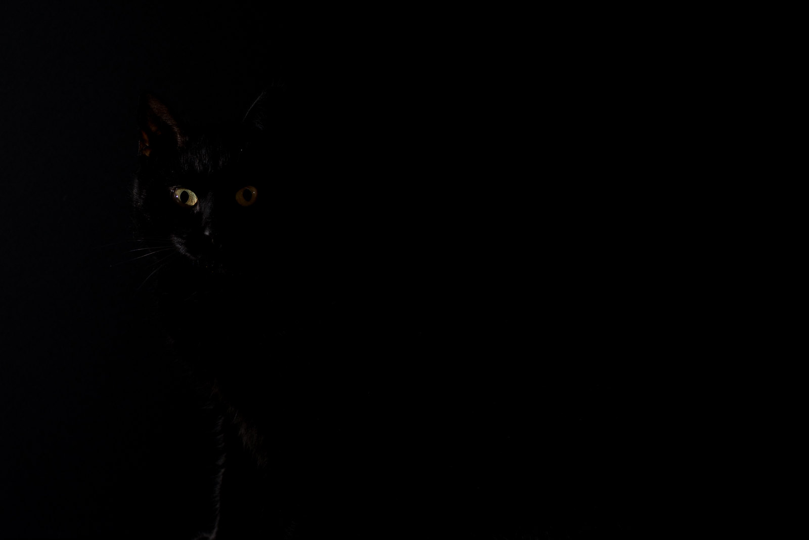
Think I'm going with this one and if you can't see anything then turn your brightness up ;)...


Dark
by Chris Stephens, on Flickr

It's not easy trying to persuade a cat to sit in the right position and look in the right direction. She has the habit of sitting on anything that wouldn't normally be there, so a book on the floor in front of a piece of black foamboard was the plan. It took more than a few shots to get one, not helped by this chap who was feeling left out of the action and kept wandering into shot....


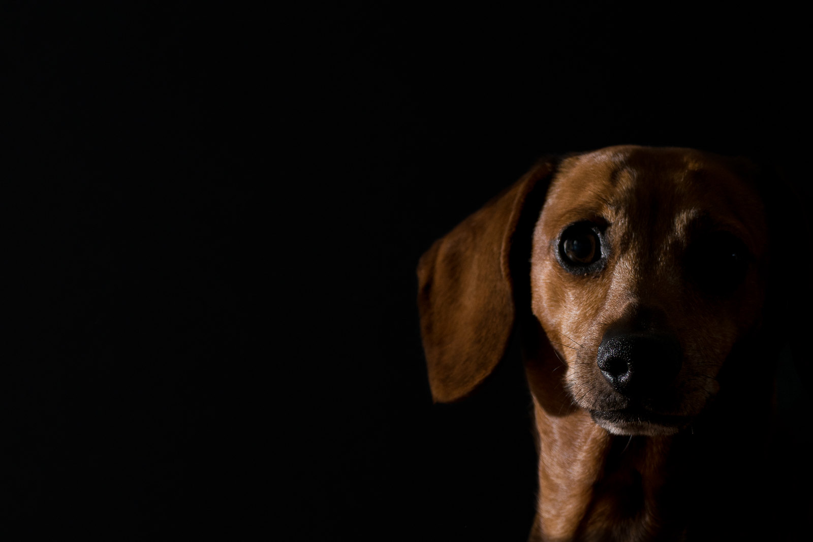
Ollie in the dark
by Chris Stephens, on Flickr

I was tempted to use Ollie, but the camera focused on his nose and the rest of his face was a bit soft. It was completely unplanned and I couldn't get him to do it again.
 
Last edited:
The cat photo for me, just enough light for my monitor and the eyes stand out well against a good black background, good take on the theme
 
As you say, the eyes are just too soft in Ollie's photo - what a gorgeous boy though! They're lovely and sharp on your cat - what a wonderful green as well :) In other circumstances it might have been good to have a hint of light on the body too, but for this theme I think you can definitely get away with it!
 
The cat photo for me, just enough light for my monitor and the eyes stand out well against a good black background, good take on the theme
Cat shot for me too Chris, love it as the eyes are clear so nice one :)
As you say, the eyes are just too soft in Ollie's photo - what a gorgeous boy though! They're lovely and sharp on your cat - what a wonderful green as well :) In other circumstances it might have been good to have a hint of light on the body too, but for this theme I think you can definitely get away with it!

Thanks. Jess the cat was definitely the subject I had in mind for this. It was tricky to know how dark to make it as at this level the brightness and device the viewer is using can easily hide or show the small amount of detail.
 
Its a pity about the dog picture, I do like the cat though, cant make my mind up if there is slightly to much empty space
 
Definitely the cat shot Chris. I think it might be better for me with just a hint of light on the body too, but she probably wouldn't have played ball. Cats !!
 
Hi Chris
Attractive - Personally I prefer Lynx Dry ;) Spot on theme, there is a (to my eyes anyway) interesting effect where 'Black' and the lips are in sharp focus, but the Lynx & Bodyspray text seem slightly soft. Presumably it's the actual printing on the can, exaggerated by the larger than life picture.
Dark - The cat for sure. That is a picture of evil / spooky personified.
Excellent :clap:
 
Love the cat picture a dark predator in your house. Lighting really works for me.
 
Yep, the cat, where you can see the eyes and just guess the outline of the head. Great photo!
 
woo what a lovely looking dog ... but the cat seems somehow better for the theme.
 
Hi Chris
but the Lynx & Bodyspray text seem slightly soft. Presumably it's the actual printing on the can, exaggerated by the larger than life picture.

Yes, it is the printing on the can. I noticed it too and retook the shot a few times before I realised what it was.
 
Cat pic is just the better, but I prefer the dog pic as Im a dog person, not a cat servant.... ;)
Its a pity about the dog picture, I do like the cat though, cant make my mind up if there is slightly to much empty space
Definitely the cat shot Chris. I think it might be better for me with just a hint of light on the body too, but she probably wouldn't have played ball. Cats !!
Jess the cat for me too. Just a pity the eyes weren't the same brightness. I'm sure some PS tricky can sort it out.
Love the cat picture a dark predator in your house. Lighting really works for me.
Yep, the cat, where you can see the eyes and just guess the outline of the head. Great photo!
#1 for me. I wasn't sure about the leg at the bottom but it really grounds the cat.Cheers.
woo what a lovely looking dog ... but the cat seems somehow better for the theme.
That is a very spooky picture for Dark. Very malevolent indeed although I'm sure she's loveliness personified :p
Love the cat for the theme it works really well Chris ...with the dog one the composition isn't quite right, but it's one I'd try again, I think it could be a stunner.

Thanks for the replies, and yes, you wouldn't want to get on the wrong end of her claws or let your foot slip out from under the bed covers in the middle of the night.
 
Jess the cat for me too. Just a pity the eyes weren't the same brightness. I'm sure some PS tricky can sort it out.

Agree with this, on my screen the eyes could do with being just a little brighter especially her left eye (right as we look at it). Love the light on your dog and if the eyes had been in focus I think it would have been a fantastic shot.
 
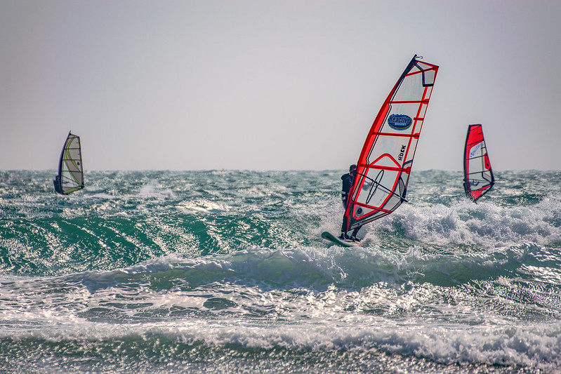
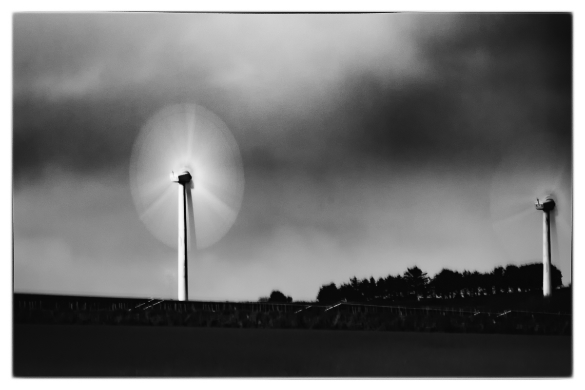
RIght, still debating over 'Power'. I wanted to do something with wind turbines, since there are a lot of them around here and I kind of like them. However, what I had in mind required a sky with broken cloud, a little wind in the right direction and good light. All of which should occur of a lunchtime or just after work. Not asking for much! I did have a 'fall-back' shot from the weekend of some wind surfers, but tbh, I've taken loads of wind surfer shots so wanted to do something different. So far this week we've had blue skies or no wind, so with time running out I was forced to go out this evening in the rain and gloom to see what I could get and it wasn't great.

Working with shots like this....


... after a lot of pp to try and pull something out of them and get three evenly toned images, this is where I'm up to so far....


I might see what the weather is like tomorrow, but I think the wind will be the wrong direction.


The fall-back shot...
 
I like the idea and concept of wind power very much. The problem with the weekly themes is that you have only a week to do them, and if the weather is not appropriate for the shot you're planning you're stuck. But definitely worth a reshoot (y)
 
Well, yesterday was bright, but totally flat grey sky. Today was bright (at least when I left home) but the wind was the wrong direction.....


(I know this is dark, but it was handheld and there was visible camera shake in the solar panel edges at the bottom, but I liked the effect of the blades which wasn't noticeable until after some pp)
 
Great blur on the last one, it suits the dark ground and moody sky.
 
After much deliberation and so as not to get too far behind, going for this for 'Power'....


If I had seen the motion blur on the blades when I first took the shot then I would have recomposed so as not to cut off the right-hand turbine and used a tripod.
 
Last edited:
I like that shot, nicely composed even with the right wind turbine cut off, and I like the mood of the picture.
 
I like that, great idea to get the motion in the wind turbines,
 
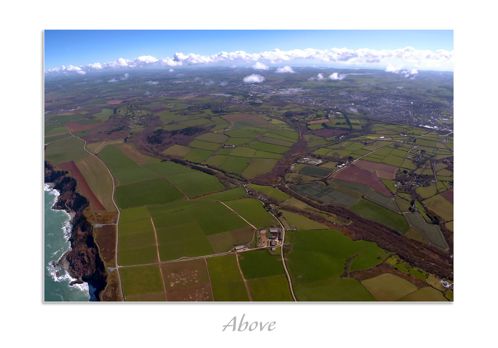
And 'Above'.... Not taken with any kind of decent camera I'm afraid, taken 'blind' and it only shots jpg's, poor auto-exposure control (hence blown clouds) and the fisheye that I have attempted to correct. Hopefully the subject makes up for all my poor excuses :)
On the left side is the north Cornish coast and in the top is the south coast.


Back
Top