You are using an out of date browser. It may not display this or other websites correctly.
You should upgrade or use an alternative browser.
You should upgrade or use an alternative browser.
weekly Minx 52 for 2016 -Finished
- Thread starter Minx
- Start date
Minx
Papillon
- Messages
- 2,516
- Edit My Images
- Yes

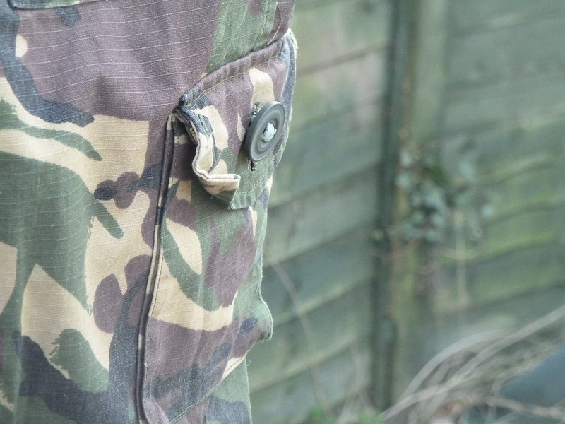
Camoflage by Alison White, on Flickr
- Messages
- 13,760
- Edit My Images
- Yes
Hi Minx 
Happy - I'd like to see it a tad brighter, but nicely set out and perfect for the theme
Camouflaged - Oooo like that, nice sharp detail/focus of the trousers, and the fence does blend in nicely, great idea
Happy - I'd like to see it a tad brighter, but nicely set out and perfect for the theme
Camouflaged - Oooo like that, nice sharp detail/focus of the trousers, and the fence does blend in nicely, great idea
- Messages
- 3,925
- Name
- Carl
- Edit My Images
- Yes
The colours are an almost perfect match - well done on the choice for the theme. 

- Messages
- 1,645
- Name
- Steve
- Edit My Images
- Yes
Happy - Birthdays are always a happy time...I like the composition and the inclusion of both the card and the present. As others have said, it could just do with being a little brighter.
Camouflage - good idea and the colours do match well. I do find the branches/sticks in the bottom right of the picture to be a slight distraction but that is a very minor thing.
Camouflage - good idea and the colours do match well. I do find the branches/sticks in the bottom right of the picture to be a slight distraction but that is a very minor thing.
Minx
Papillon
- Messages
- 2,516
- Edit My Images
- Yes

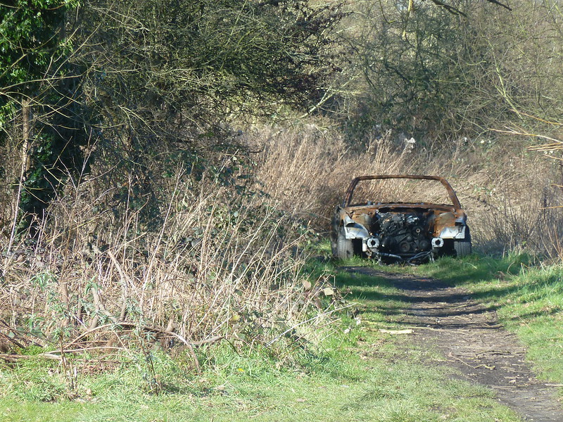
Abandoned by Alison White, on Flickr
Took a stroll in the nearby woods knowing saddley there was a good chance of getting my Abandoned shot at last. Plenty to choose from and I took several this is my favourite of the lot
Last edited:
Minx
Papillon
- Messages
- 2,516
- Edit My Images
- Yes
- Messages
- 9,095
- Name
- Mandy
- Edit My Images
- Yes
Camouflage - fits the theme, just doesn't excite me as an image.
Abandoned - wonderful find for the theme, and the composition works well for the image.
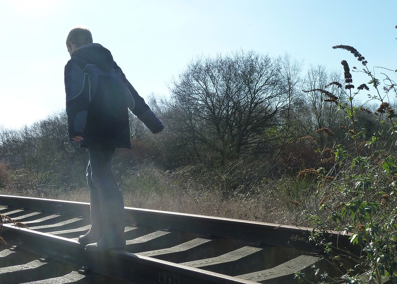
Danger - you can't get much more dangerous than that, I also like the fact the model is walking away from the camera.
Abandoned - wonderful find for the theme, and the composition works well for the image.
Danger - you can't get much more dangerous than that, I also like the fact the model is walking away from the camera.
Minx
Papillon
- Messages
- 2,516
- Edit My Images
- Yes
. Hope there was no real danger!
don't worry he was safe really I did crop the picture slightly as I had the end of the single section of track in the pictureThat is terrifying!I'm guessing the rails are unused?

less dangerous by Alison White, on Flickr
Last edited:
- Messages
- 1,566
- Name
- Lee
- Edit My Images
- Yes
Abandoned - good find for the theme, blends quite well.
Camouflaged - good idea and the colours are spot on, bet it would look good in B&W
Danger(ous) - I work on the railway, and this is stupid idea to let kids roam around, even if its disused, heritage.
Camouflaged - good idea and the colours are spot on, bet it would look good in B&W
Danger(ous) - I work on the railway, and this is stupid idea to let kids roam around, even if its disused, heritage.
- Messages
- 9,078
- Name
- David
- Edit My Images
- Yes
I like the way you've framed the Abandoned car .. in the mid distance off centre.
Super Dangerous shot ... you can see there's something unreal about the tracks, then all is revealed. And your "less dangerous" shot actually looks more dangerous to me.
Super Dangerous shot ... you can see there's something unreal about the tracks, then all is revealed. And your "less dangerous" shot actually looks more dangerous to me.
LC2
Negan
- Messages
- 10,459
- Name
- Tim
- Edit My Images
- Yes
Camouflage - Nicely executed shot contrasting the camo trousers with the green fencing. Good use od a shallow DoF
Abandoned - Nice use of leading lines and the trees framing the subject.
Dangerous - I love the way that you've fooled everyone with the first image There is a little bit of lens flare (probably hard to avoid with a compact) but the composition is spot on.
Abandoned - Nice use of leading lines and the trees framing the subject.
Dangerous - I love the way that you've fooled everyone with the first image
- Messages
- 3,724
- Name
- Chris
- Edit My Images
- Yes
I agree with Tim about the lens flare, however I actually prefer the second image for some reason, the added height and perspective adds to the impression of danger 
- Messages
- 3,925
- Name
- Carl
- Edit My Images
- Yes
I think Dangerous #2 is a terrific shot showing the height he's at as well as the danger associated with falling through the gaps in the line. Well done. 

Minx
Papillon
- Messages
- 2,516
- Edit My Images
- Yes
Danger(ous) - I work on the railway, and this is stupid idea to let kids roam around, even if its disused, heritage.
I appreciate your concerns but these tracks have been abandoned by the railway company in a public area of woodland and he was supervised I would not have put him in real danger.
- Messages
- 13,760
- Edit My Images
- Yes
Hi Minx 
Abandoned - Like how you have the track leading up to the burned out car, it nestles in there nicely and is a sad common occurrence, works well for the theme
Dangerous - A couple of nice images, I prefer the close in shot of him on the track, the lens flare adds a nice feel to it for me
Abandoned - Like how you have the track leading up to the burned out car, it nestles in there nicely and is a sad common occurrence, works well for the theme
Dangerous - A couple of nice images, I prefer the close in shot of him on the track, the lens flare adds a nice feel to it for me
Minx
Papillon
- Messages
- 2,516
- Edit My Images
- Yes
Camouflage - fits the theme, just doesn't excite me as an image.
Have to confess doesn't do a great deal for me either was struggling to think what to do, that is my sons trousers hanging on the washing line.
- Messages
- 4,182
- Name
- Paul
- Edit My Images
- Yes
Dangerous - that first image is lovely (if you can say such a think about a "dangerous" photo!) A few things I really like: (1) the low contrast / light coming into the lens from nearly shooting into the sun - this works really well for me and is a perfect example of when to break "rules" (others may disagree but that's what's great about opinions!) (2) The light that he's apparently walking into - almost creepy given the theme. (3) The tension from having him face away and walk out of frame, rather than through the frame. Quite a few departures in that one shot from the norm and I think your choices work really well.
Bruja
Los Cojones del Perro
- Messages
- 3,883
- Name
- Just call me Mad Madam Mim
- Edit My Images
- Yes
Camouflage is spot on for the theme and you chose a background that really helps the subject to blend in 
Abandoned is a great find. Nice leading lines to the subject which certainly looks like it has been stripped then dumped
Danger, I can see the tension in the first shot with him walking away into the sun, looks extremely dangerous
Abandoned is a great find. Nice leading lines to the subject which certainly looks like it has been stripped then dumped

Danger, I can see the tension in the first shot with him walking away into the sun, looks extremely dangerous
- Messages
- 4,562
- Name
- Mark Gameson
- Edit My Images
- Yes
Hi Minx
Danger - the first one for me a really good take on the theme love the angle the shot was taken at. The bright sun adds to the danger for me
Danger - the first one for me a really good take on the theme love the angle the shot was taken at. The bright sun adds to the danger for me
- Messages
- 5,433
- Name
- Andrea
- Edit My Images
- Yes
Hi Alison, just a quick catch-up from me on my first visit to your thread. I'll try to keep up to date from now on!
Old - the age of your subject and the sepia effect work really well for this theme. Others have commented on the tablet already, but overall it's a good start to your 52.
Metal - very creative and usual, and someone (you?) got to drink the beer first!
Captive - a very pretty cat with some nice catchlights in her eyes, and the paw poking through the bars sums up the theme perfectly.
Miniature - a lovely idea and some colourful little items. I would have preferred to see the whole basket, but it's a perfect subject for the theme.
Happy - good idea. As others have noted, maybe a tweak to the white balance would bring the colours up a bit more, but it's a pretty card and another good take on the theme.
Camouflage - the colours match almost perfectly, and good use of depth of field to throw the background slightly out of focus.
Abandoned - a good find. I like all the rust, and the way you've composed it at the end of the lane makes it seem truly abandoned and left to rot away.
Danger - both images work well to meet the theme. In the first one I like your low angle and the way he's walking into the bright sun, which seems to add to the sense of danger, while the second one looks almost as 'dangerous' from the way he has his arms out to balance.
I'll be keeping an eye out for your new images from now on
Minx
Papillon
- Messages
- 2,516
- Edit My Images
- Yes

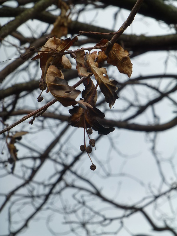
living world by Alison White, on Flickr
Minx
Papillon
- Messages
- 2,516
- Edit My Images
- Yes
- Messages
- 3,925
- Name
- Carl
- Edit My Images
- Yes
I'm with Tim - I prefer the first too for the clarity and singularity of the subject. Nicely lit and detailed too.
- Messages
- 5,433
- Name
- Andrea
- Edit My Images
- Yes
Two nice images for the theme. I would have chosen the first one but it would probably work better if the leaf was more isolated from the background (maybe not possible?) so I'll choose the second one, which is also good for the theme and has some lovely natural colours and and abstract textures 


