You are using an out of date browser. It may not display this or other websites correctly.
You should upgrade or use an alternative browser.
You should upgrade or use an alternative browser.
weekly Nickbee's very late 52: final three photos added - done!
- Thread starter nickbee
- Start date
- Messages
- 9,075
- Name
- David
- Edit My Images
- Yes
Good work Nick
I see what you're aiming for with Minimalist but I think it needs more empty space.
The kids bike shot is a beaut with activity included and I can see why you went B&W.
Pleasurable ... you caught the water beautifully.
Tiny ... I think I like most if just for its pinkness.

I see what you're aiming for with Minimalist but I think it needs more empty space.
The kids bike shot is a beaut with activity included and I can see why you went B&W.
Pleasurable ... you caught the water beautifully.
Tiny ... I think I like most if just for its pinkness.
- Messages
- 667
- Name
- Nick
- Edit My Images
- Yes
Thanks for the comments @Dark Knight @granddad john @Dave70D @d00d
I thought 'Pleasurable' was maybe the weakest of the four but apparently it's most popular! I knew the pink would be divisive and the flare in Progress was pretty much unaviodable given the time of day. Minimalist, I'm still just glad to have taken something!
Anyway, why are we still talking about "minimalist"? So last month. On to weeks 26 and(would you believe it I'm up to date) 27!
- Messages
- 667
- Name
- Nick
- Edit My Images
- Yes
26 Face
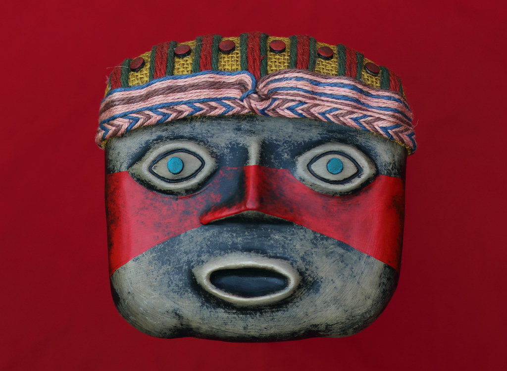
26 Face by nickbrotherston, on Flickr
This is a sort of mask thing from Peru. I can't tell you much more about it. The background is a piece of fabric - I did have to do a bit of photoshop jiggery pokery to make some of the wrinkles less obvious.
27 Agriculture
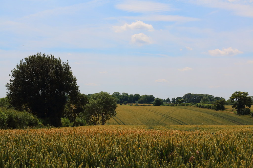
27 Agriculture by nickbrotherston, on Flickr
I've been off work the last couple of days with a chest infection, so I took the chance to sling a bag of lenses on the back seat of the car and head out into the countryside to find something agricultural. What I found was fields. I don't take many landscapes. I thought my wide lens would be the obvious choice but I couldn't compose anything I liked. For the final shot I ended up using my 85mm at F10. I struggled with processing; as it was the wheat looked very dull but I couldn't bring out much colour without the sky going crazy blue. This was the best balance I could strike.

26 Face by nickbrotherston, on Flickr
This is a sort of mask thing from Peru. I can't tell you much more about it. The background is a piece of fabric - I did have to do a bit of photoshop jiggery pokery to make some of the wrinkles less obvious.
27 Agriculture

27 Agriculture by nickbrotherston, on Flickr
I've been off work the last couple of days with a chest infection, so I took the chance to sling a bag of lenses on the back seat of the car and head out into the countryside to find something agricultural. What I found was fields. I don't take many landscapes. I thought my wide lens would be the obvious choice but I couldn't compose anything I liked. For the final shot I ended up using my 85mm at F10. I struggled with processing; as it was the wheat looked very dull but I couldn't bring out much colour without the sky going crazy blue. This was the best balance I could strike.
LC2
Negan
- Messages
- 10,451
- Name
- Tim
- Edit My Images
- Yes
Hi Nick
Quite a catch up there... Don't worry about posting out of order (I think my worst last year was 13 weeks out of date)
Minimalist - Not sure what to make of this...
Progress -Definitely tells the story. I think the motion blur works, freezing the motion would have looked a bit odd without a foot on the ground.
Pleasurable - Not quite the Ice Bucket Challenge, but it looks like they were enjoying themselves. The pink against the green works well and the droplets are nicely frozen in space.
Tiny - Cool bit of colour matching, nicely done.
Face - Nice and sharp, but it feels a bit floaty. A shadow or something would anchor it to the background.
Agriculture - The struggle paid off, the image feel coherent and it is bang on theme.
- Messages
- 667
- Name
- Nick
- Edit My Images
- Yes
Thanks for the comments @Dave70D @Allan.H @posiview @d00d @sirch @LC2
Annoyingly I put effort into making the mask float - even to the point of using a glass to rise it off the ground without causing any shadows. Lesson learned! I have many lessons to learn with landscapes, so thanks for the tips.
And with that, on to the next week...
Annoyingly I put effort into making the mask float - even to the point of using a glass to rise it off the ground without causing any shadows. Lesson learned! I have many lessons to learn with landscapes, so thanks for the tips.
And with that, on to the next week...
- Messages
- 667
- Name
- Nick
- Edit My Images
- Yes
28 Graceful
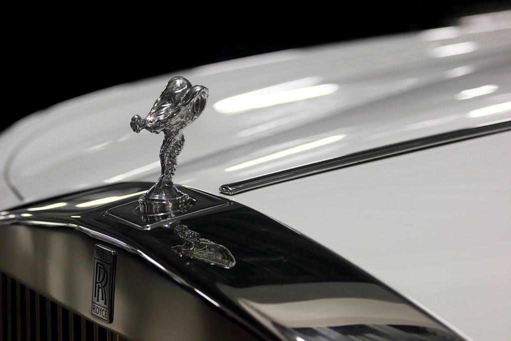
28 Graceful by nickbrotherston, on Flickr
Where's a ballerina when you need one? Usually you're tripping over the damn things and then 'graceful' crops up and there's not one to be seen. I gave up looking after a while and had to come up with a new idea. I went on to Auto Trader to find the nearest Rolls Royce for sale. I went along to Saxton 4x4 with the intention of persuading them that I wasn't a nutter and that it was safe to let me and my camera loose amongst all their lovely cars. Somehow they fell for it and I managed to get the shot I wanted. Obviously just me and a camera with no control over lighting so I'm pretty pleased with the outcome.
- Messages
- 3,250
- Name
- Emma
- Edit My Images
- Yes
That's a beautifully composed shot Nick with the elegant lines of the car and the reflection of the spirit of ecstasy caught so well - I like the way the Rolls Royce symbol is included too. I really like your progress shot too - a very clever take on the theme!
- Messages
- 5,432
- Name
- Andrea
- Edit My Images
- Yes
A good catch-up, Nick - keep plugging away! My favourites are Progress, which is a clever idea and well-executed by you and your daughter, Pleasurable, which is easy to understand once you know how hot the weather has been and you've captured the water well, and Graceful, which is another good idea and spot on with those lovely lines of the mascot and the car itself.
- Messages
- 667
- Name
- Nick
- Edit My Images
- Yes
29 Fruit
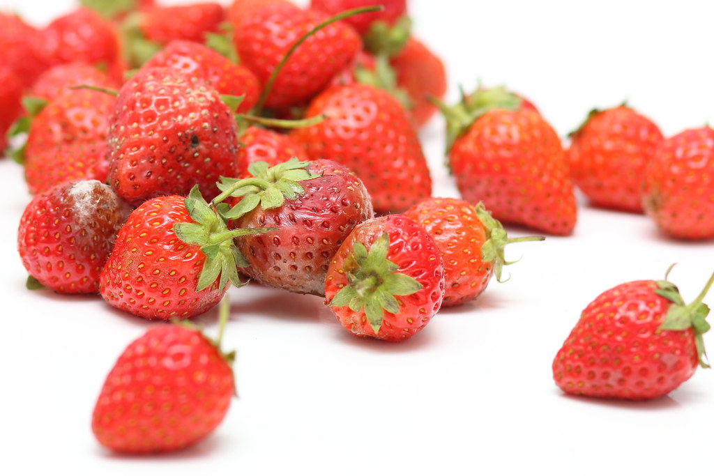
29 Fruit by nickbrotherston, on Flickr
I took several 'fruit' photos over the last couple of weeks and wasn't particularly happy with any of them. Then yesterday I opened the fridge to find an entire punnet of strawberries on the turn. "Brilliant," I thought, which shows exactly what the 52 does to you. Just a simple shot with a flash bounced off the ceiling and a tiny bit of cloning as the white surface didn;t quite stretch to the top-right.
30 Vehicle
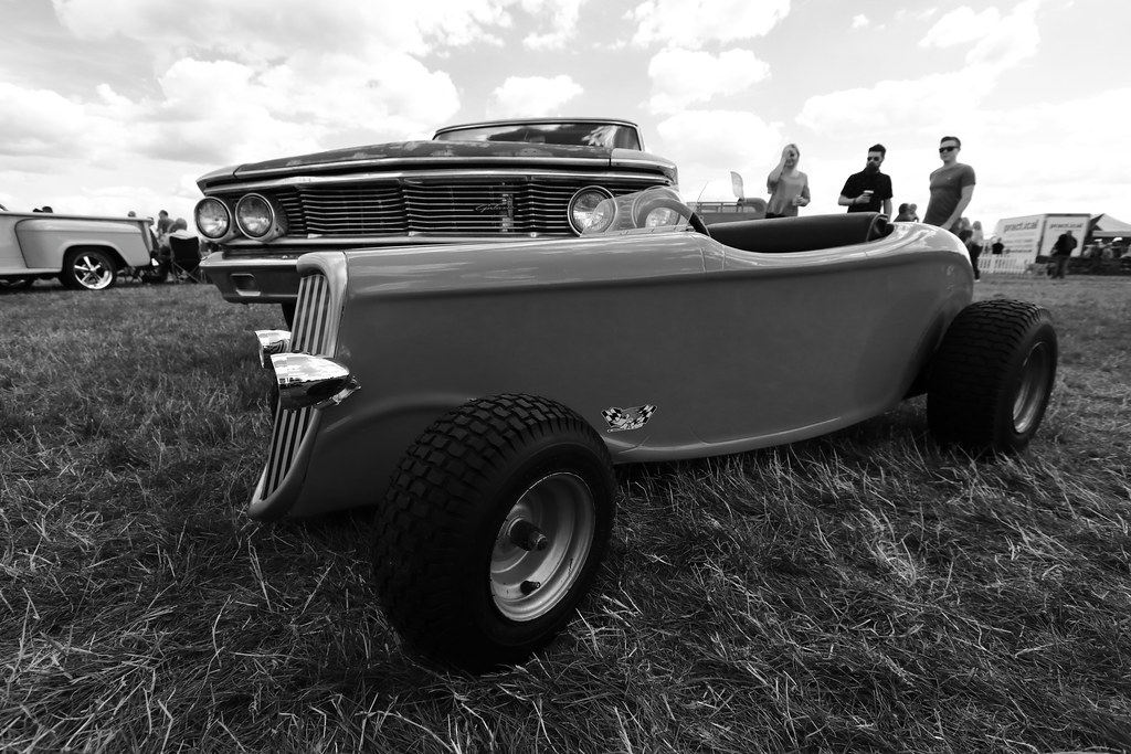
30 Vehicle by nickbrotherston, on Flickr
I was at a car show a couple of weeks back, so plenty of opportunities and for once I was spoilt for choice about which photo to use. There were three, very different candidates and this is the one I picked, but here are the other two:

Monster Truck by nickbrotherston, on Flickr
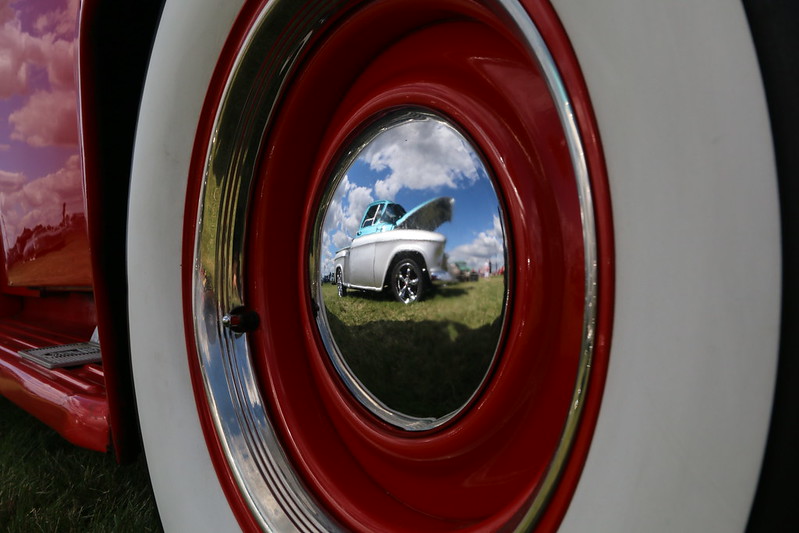
Hubcap by nickbrotherston, on Flickr

29 Fruit by nickbrotherston, on Flickr
I took several 'fruit' photos over the last couple of weeks and wasn't particularly happy with any of them. Then yesterday I opened the fridge to find an entire punnet of strawberries on the turn. "Brilliant," I thought, which shows exactly what the 52 does to you. Just a simple shot with a flash bounced off the ceiling and a tiny bit of cloning as the white surface didn;t quite stretch to the top-right.
30 Vehicle

30 Vehicle by nickbrotherston, on Flickr
I was at a car show a couple of weeks back, so plenty of opportunities and for once I was spoilt for choice about which photo to use. There were three, very different candidates and this is the one I picked, but here are the other two:

Monster Truck by nickbrotherston, on Flickr

Hubcap by nickbrotherston, on Flickr
- Messages
- 1,645
- Name
- Steve
- Edit My Images
- Yes
Fruit - when I first looked I thought it was a shame some of them are going bad but then read your description and realised it was intentional, it does make a change from the very fresh fruit shots we are used to seeing. Nice clean background on it as well.
Vehicle - Interesting vehicle, my favourite of the three shots is the hubcap one as it's something a bit different.
Vehicle - Interesting vehicle, my favourite of the three shots is the hubcap one as it's something a bit different.
LC2
Negan
- Messages
- 10,451
- Name
- Tim
- Edit My Images
- Yes
Hi Nick,
Fruit - Strawberries, what's not to like. I doubt I'd ever find a whole tub turning in the fridge here.
Vehicle - I agree with your choice of the (I assume) Pedal Rod. Interesting shot with the Ford towering over it. B&W suits it well.
Fruit - Strawberries, what's not to like. I doubt I'd ever find a whole tub turning in the fridge here.
Vehicle - I agree with your choice of the (I assume) Pedal Rod. Interesting shot with the Ford towering over it. B&W suits it well.
- Messages
- 5,432
- Name
- Andrea
- Edit My Images
- Yes
Some good shots there, Nick. Fruit works very well with the bold contrast between the bright reds of the fruit and the white background, and all of the images for Vehicle meet the theme but I particularly like the third one with the great reflection in the shiny hubcap and the bright red of the tyre wall and paintwork 
- Messages
- 667
- Name
- Nick
- Edit My Images
- Yes
Thanks @Dave70D @SteveSc @LC2 @susiejb @d00d @Manxmaid Maybe I should have waited until the strawberries were properly mouldy, just so there was no doubt! I think the hubcap photo was the most popular but I'm glad to see there was a decent split of opinion.
Edited to add: I realise I haven't commented on anybody's thread in a long time so I'm extra grateful that you took the time.
Edited to add: I realise I haven't commented on anybody's thread in a long time so I'm extra grateful that you took the time.
Last edited:
- Messages
- 667
- Name
- Nick
- Edit My Images
- Yes
Weeks 31/32/33
I had actually completely given up on the 52 but a pep talk form a colleague who's been followingn my progress spurred me on a bit. I'm not entirely sure I'd do it again but it would be good to get to the end of the year. I have a lot of catching up to do so I'm going to keep it all nice and simple.
Piece
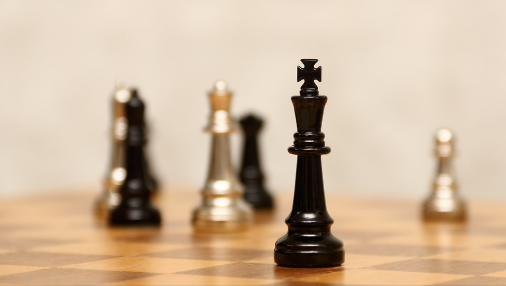
31 Piece by nickbrotherston, on Flickr
Contrast
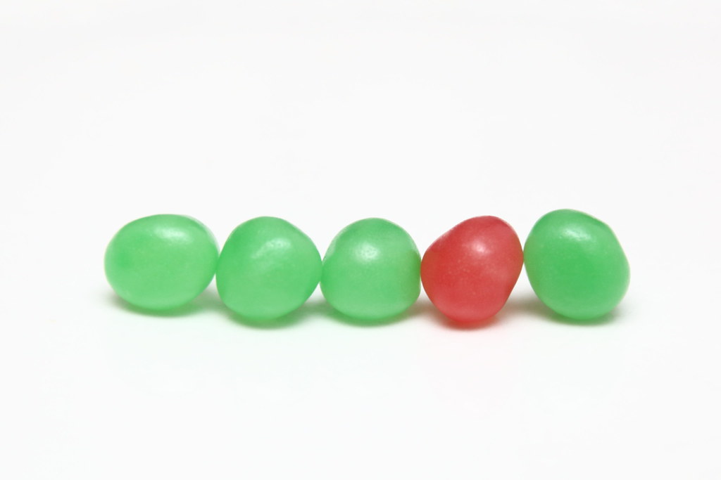
32 Contrast by nickbrotherston, on Flickr
In case you wondered, these are Haribo Dragibus. I hope I never have reason to recreate this shot as the subjects have mysteriously disappeared...
Cleaned
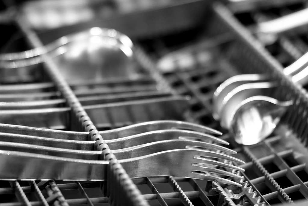
33 Cleaned by nickbrotherston, on Flickr
I had actually completely given up on the 52 but a pep talk form a colleague who's been followingn my progress spurred me on a bit. I'm not entirely sure I'd do it again but it would be good to get to the end of the year. I have a lot of catching up to do so I'm going to keep it all nice and simple.
Piece

31 Piece by nickbrotherston, on Flickr
Contrast

32 Contrast by nickbrotherston, on Flickr
In case you wondered, these are Haribo Dragibus. I hope I never have reason to recreate this shot as the subjects have mysteriously disappeared...
Cleaned

33 Cleaned by nickbrotherston, on Flickr
- Messages
- 13,760
- Edit My Images
- Yes
Some great catch up images Nick, I especially like the Hub-cap image, love the bright colours and the cool reflection 
I also really like your image for Piece, a super DoF and that king stands out a treat !!!
Another great batch for your catch up
I also really like your image for Piece, a super DoF and that king stands out a treat !!!
Another great batch for your catch up
- Messages
- 667
- Name
- Nick
- Edit My Images
- Yes
Thanks @susiejb @Dave70D @Dark Knight @d00d Unexpected amounts of love for the chess piece, thanks  . David, I know what you mean about Cleaned - I think it's that that focal point is too far down the frame and that they're not shiny enough to stand out. Either that or no-one likes pictures of dishwashers, which is equally likely.
Time to post some more pictures! I'm catching up!
Time to post some more pictures! I'm catching up!
- Messages
- 667
- Name
- Nick
- Edit My Images
- Yes
34 Curves
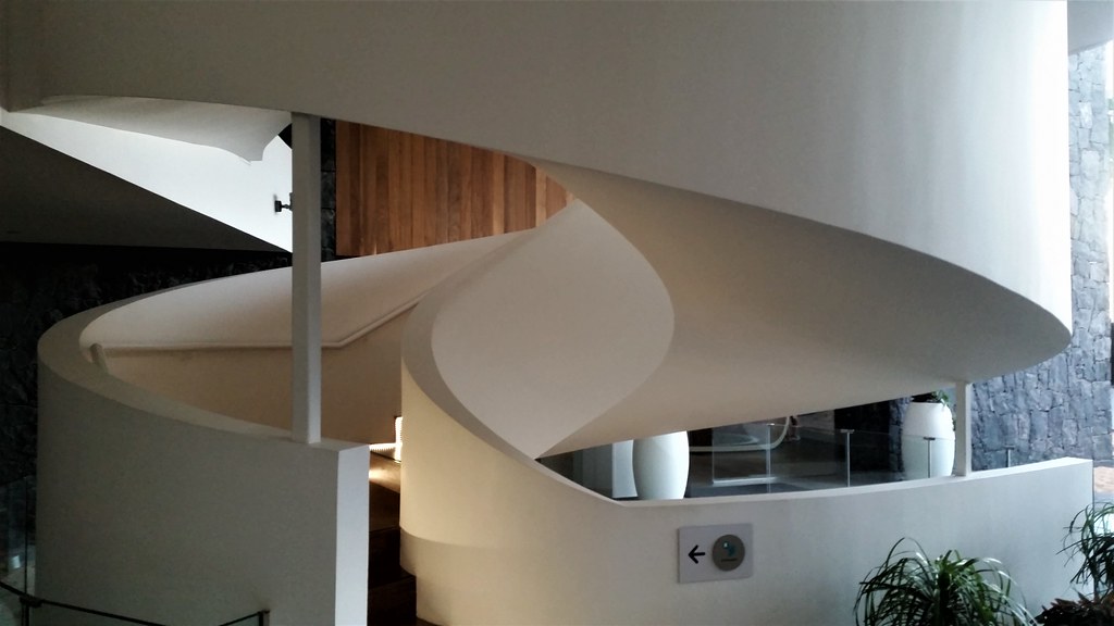
34 Curves by nickbrotherston, on Flickr
No, it's not sharp, because it was taken with my cameraphone. This staircase was in my hotel in Tenerife. I'd looked at the forum the night before checking out and seen the theme, and saw this on the way out the next day. My camera battery was dead so the phone it was. I debated whether to post it because of the quality but I really liked the shapes it formed.
37 Occupational
Watch this space, this is the only one I haven't done! I've never posted out of order before but...
36 You
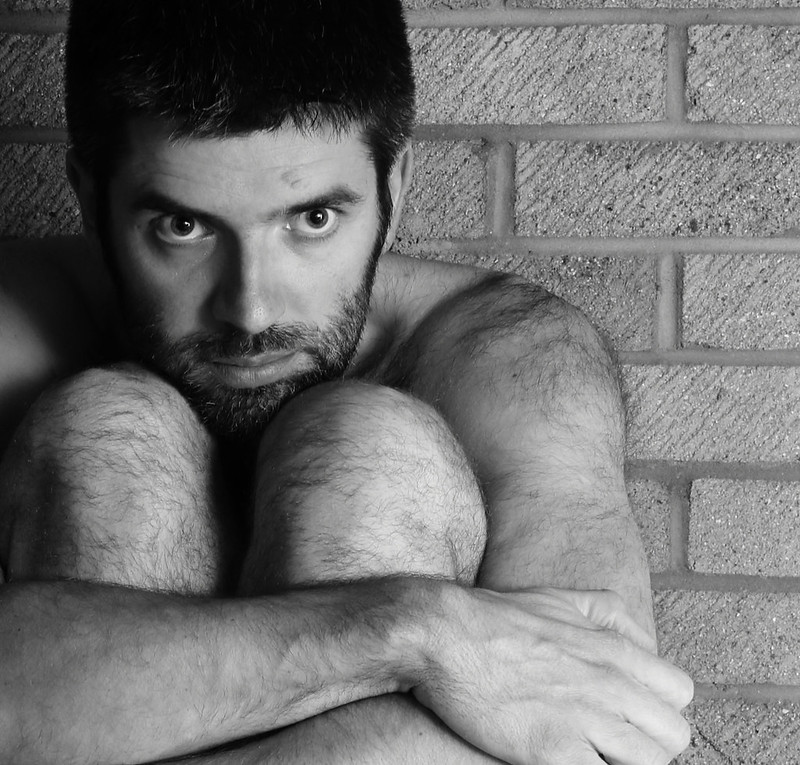
36 You by nickbrotherston, on Flickr
I'd wanted to do something raw and vulnerable for this. The image above is a crop of a shot of me sitting naked o(but tastefully of course) on my garage floor. In all honesty it's quite hard work doing these selfies - setting the timer and then getting into position, and you can;t see anything on the screen in an sort of dark conditions (which it was). It was supposed to be a juxtaposition of a warm, soft body against a very cold, hard background, but I didn't manage to create the atmosphere I wanted to achieve. My wife said it reminded her of a concentration camp, which I guess is a sort of vulnerable. One of the girls at work said it would have been better if it was p***ing down with rain, which is probably true but I was cold enough as it was. Anyway, I was going to post it and ask for advice but then tried cropping it and somehow it makes more sense so I've gone with it.
37 Arch
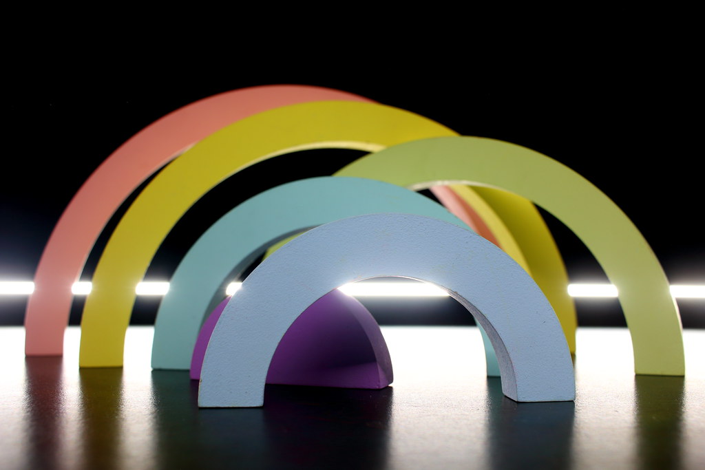
37 Arch by nickbrotherston, on Flickr
My daughter's stacking wooden rainbow blocks, a dark room, a 3 second exposure and the LED torch on my phone. Came out better than I'd hoped, for once!

34 Curves by nickbrotherston, on Flickr
No, it's not sharp, because it was taken with my cameraphone. This staircase was in my hotel in Tenerife. I'd looked at the forum the night before checking out and seen the theme, and saw this on the way out the next day. My camera battery was dead so the phone it was. I debated whether to post it because of the quality but I really liked the shapes it formed.
37 Occupational
Watch this space, this is the only one I haven't done! I've never posted out of order before but...
36 You

36 You by nickbrotherston, on Flickr
I'd wanted to do something raw and vulnerable for this. The image above is a crop of a shot of me sitting naked o(but tastefully of course) on my garage floor. In all honesty it's quite hard work doing these selfies - setting the timer and then getting into position, and you can;t see anything on the screen in an sort of dark conditions (which it was). It was supposed to be a juxtaposition of a warm, soft body against a very cold, hard background, but I didn't manage to create the atmosphere I wanted to achieve. My wife said it reminded her of a concentration camp, which I guess is a sort of vulnerable. One of the girls at work said it would have been better if it was p***ing down with rain, which is probably true but I was cold enough as it was. Anyway, I was going to post it and ask for advice but then tried cropping it and somehow it makes more sense so I've gone with it.
37 Arch

37 Arch by nickbrotherston, on Flickr
My daughter's stacking wooden rainbow blocks, a dark room, a 3 second exposure and the LED torch on my phone. Came out better than I'd hoped, for once!
- Messages
- 14,766
- Name
- Michael
- Edit My Images
- No
Hi Nick,
curves, nice shape, I would prefer a tighter crop on this, b+w would work nice, a shame your camera battery was dead.
you, B+w was a good choice for it, though a grittier conversion would also suit the vulnerable theme, I like the square crop, just wonder if you should have your right side in the frame too.
arch, Nicely lit,not always easy using a phone led. Would prefer the 3rd arch to be in line with the others.
- Messages
- 104,470
- Name
- The other Chris
- Edit My Images
- Yes
Curves - nice light emphasises the curves well.
You - I like the framing and the thoughtful expression with your body against the hard brickwork
Arch, I find the bright line at the back too bright but it is nicely composed and a good job for a phone photo
You - I like the framing and the thoughtful expression with your body against the hard brickwork
Arch, I find the bright line at the back too bright but it is nicely composed and a good job for a phone photo
- Messages
- 662
- Name
- John
- Edit My Images
- Yes
Curves: good work for a spur of the moment shot with a phone Mark. Would B&W have eased the slightly distractng background?
You: striking pose. Not sure I'd call it vulnerable, your gaze is too direct! Great shot nonetheless
Arches are terrific. I like the offset one, though the light is a bit burnt out.
Great set
You: striking pose. Not sure I'd call it vulnerable, your gaze is too direct! Great shot nonetheless
Arches are terrific. I like the offset one, though the light is a bit burnt out.
Great set
- Messages
- 9,715
- Name
- Stan
- Edit My Images
- Yes
Curve; a lovely shape staircase. Agree with Michael about tighter crop and b&w conversion.
You; a thought-provoking shot. The tight crop and b&w treatment work nicely for the scene.
Arch; like the way you've arranged the blocks, the colours are pleasing too. At first, I wasn't too keen on the strip light but on closer look, it actually adds interest and casts nice shadows.
You; a thought-provoking shot. The tight crop and b&w treatment work nicely for the scene.
Arch; like the way you've arranged the blocks, the colours are pleasing too. At first, I wasn't too keen on the strip light but on closer look, it actually adds interest and casts nice shadows.
- Messages
- 13,760
- Edit My Images
- Yes
OOooooo cool curve that Nick !!! cropped to a its best possibilities too imho, may be a phone shot but hey needs must and box ticked 
You - Now that is a cracking portrait, excellent eyes real good detail and liking the brickwork background, for a bit of an afterthought outcome I like it a lot, and can agree having done a few close up ones like this it is very hard to get right in just a couple of shots unless you are in a studio or have a stand in to set focus on
Occupational - "Watch this space, this is the only one I haven't done! I've never posted out of order before but..." Oh you devil
Arch - another cracker, a cool idea and a super prop, nice dark background setting off the colours, also liking the glint/strip of light and cool reflections too

- Messages
- 5,432
- Name
- Andrea
- Edit My Images
- Yes
Hi Nick, well done on your catch-up and I'm glad you've decided to continue.
Those are three strong images - I like the shapes and shadows in Curves and can see why you decided to go with the phone shot rather than go without. You is a brave selfie and does give a sense of vulnerability with your expression and the bare skin set against the brick wall. The crop works well too and gives it an edgy feel Arch is an immediate contrast because of the warm colours and soft shapes, and they sit well against the dark background.
Looking further back I missed Piece, which works really well - the low perspective and narrow DOF isolate the king well against the rest of the pieces
Those are three strong images - I like the shapes and shadows in Curves and can see why you decided to go with the phone shot rather than go without. You is a brave selfie and does give a sense of vulnerability with your expression and the bare skin set against the brick wall. The crop works well too and gives it an edgy feel
 Arch is an immediate contrast because of the warm colours and soft shapes, and they sit well against the dark background.
Looking further back I missed Piece, which works really well - the low perspective and narrow DOF isolate the king well against the rest of the pieces


