
- Messages
- 3,925
- Name
- Carl
- Edit My Images
- Yes
Excellent portraits Andy - I like #1 best with the eyes on full display and relaxed .. maybe a tad red around the ear and a bit on the lips both minor. Work well compositionally too.

Excellent Andy you must be very proud of her, out of the three I like the second one
Excellent portraits Andy - I like #1 best with the eyes on full display and relaxed .. maybe a tad red around the ear and a bit on the lips both minor. Work well compositionally too.
I like #2, that's the one on the main thread. Most creative compo with sideways glance.
Well done Isabelle and I know from experience with dance lessons, football and rugby these things get to be very routine. Second one for me, nicely done.
")
Beautiful portraits, well done. Tack sharp eyes and nice lighting. Congrats to your girl on joining the RAF cadets too
The 3rd shot of Isabelle is one of those portraits where the eyes follow you around the room, she's going to love you for that.
The middle shot (the one you put on the main thread) is my favourite, I think precisely because of the lack of eye contact.
I did the full stretch in the cadets and had to retire at 21 years old. These images brought back some lovely memories, especially of a 'new' beret and the trials of trying to get it to sit properly on my head. The second one is my favourite. nice work both of you.
I like the second one although they are all good, I prefer the lighter skin tones and the unusual angle of her head.
They're all super photos of Isabelle, as usual she looks amazing with those gorgeous eyes of hers ... I like all three poses ...they each show her in a different light ... serious, demure, and fun ... definitely photos to keep and be proud of.
All lovely shots, but the second is really special I think - even though her head is down and she's looking away it seems the most full of pride and excitement to me. A very special memory
Really liking your second shot for Routine, Andy. The lighting, even skin tone and the look away from the camera drawing attention to the uniform / badge more all works. Vignette isn't too sharp either.
Nice one.
Ian
#1 for me Andy. The composition is spot on and she looks fab
Definitely a twenty quid shot that one @Isabelle
 Week 8 Numbers by aNdy sHeader, on Flickr
 Week 8 Numbers 2 by aNdy sHeader, on Flickr
Liking them Andy... well, I'm liking the first one, not sure if it is composite but for me it works better, a tough one to capture I guess, good to still be able to pick out Jackie's figure in the background, like it
first one I don't think it needs the blur, looks very effective indeed, just the right amount of light on the figure too
Got to be the 1st one for me too, great focus which is bang on, great lighting and just enough focus on Jackie
So how much did that cost you in the end?
I think the first is much better. Nice lighting and nicely photoshopped too.
#1 is more erm ... magical, dare I say more unlikely, a cracking image.
I agree, #1 is spot on for the theme and very well captured, I might have gone for a little more light on Jackie but that might have cost you more
First one for me, just brilliant, not much more to say
#1 for me tooas #2 makes my eyes go even funnier than they are already
Only slight OCD crit, the club cards are either too small for their placement or they need more depth.
I like #1 nicely lit and shot
#2 I`m finding the blurred cards a little too distracting for the main subject.
Now Jill's mentioned it I do keep noticing the size of the cards, but it's still a great eye catching photo, the amount of light on Jackie in the background and then on the hand is spot on.
yes pleaseI'll explain later.
...
yes please

Great idea for numbers, not sure which version I prefer...
yes please
hahaaaa nice, a very cheerful looking chap with that on
 Of Etive Mortif by aNdy sHeader, on Flickr
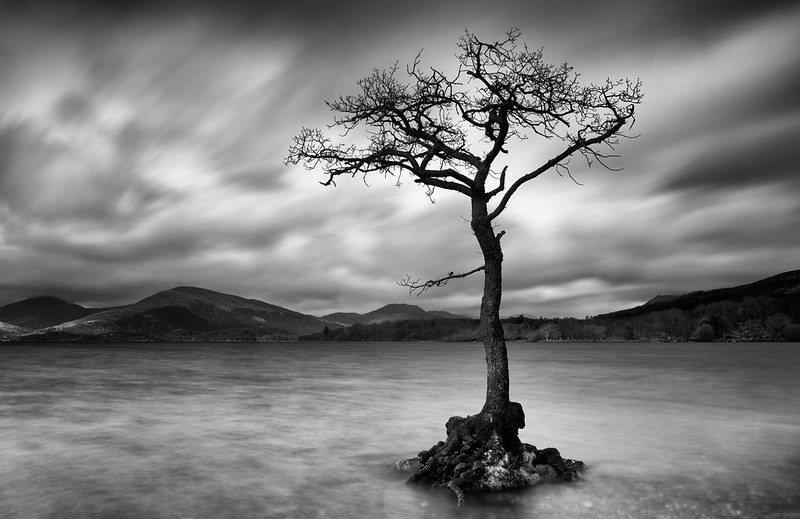 Lone Tree 4 by aNdy sHeader, on Flickr Dark two cracking shots imo Andy, very well taken, I like the 1st one with the rolling mist/fog coming in and it goes well in mono, the 2nd shot is my pick though as I love it, showing the old tree and stunning BG just too finish it off, great photography and PP