
You are using an out of date browser. It may not display this or other websites correctly.
You should upgrade or use an alternative browser.
You should upgrade or use an alternative browser.
Granddad John's 52 in 2018
- Thread starter granddad john
- Start date
OP
- Messages
- 644
- Name
- John
- Edit My Images
- Yes
Really scratching around to find something original this week, but resorted to yet more oval eggs Oh well, on to the next and try and get my brain working
")
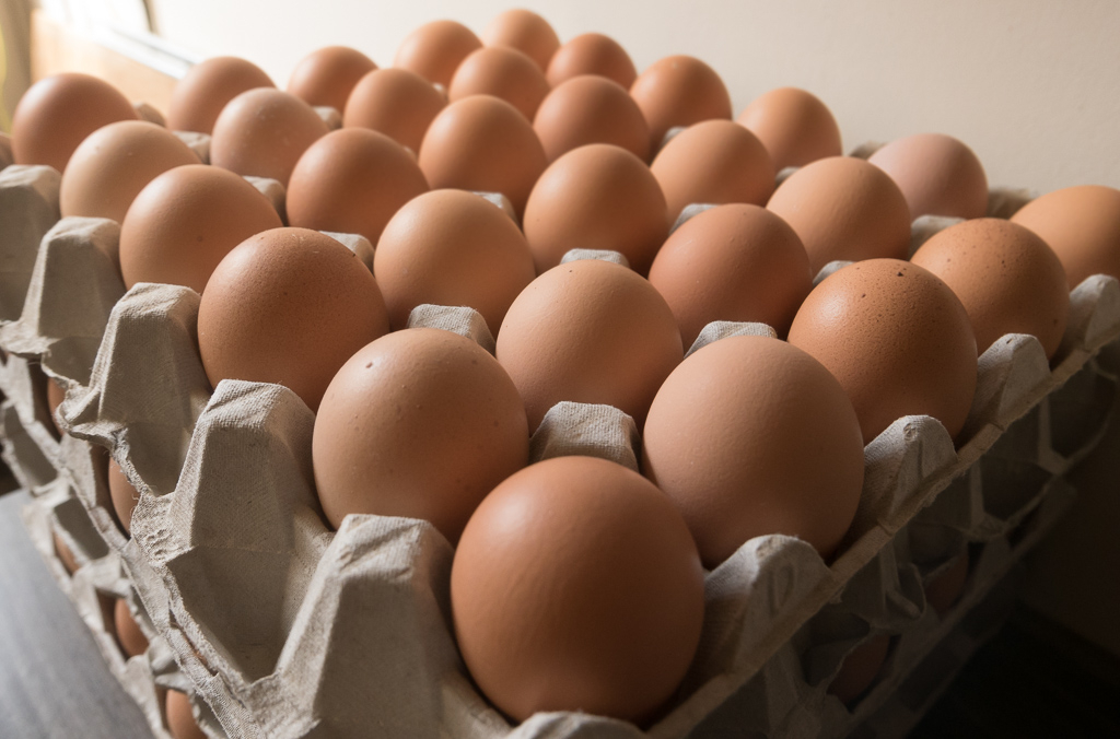
tp_52 13-1020295 by granddad john on Talk Photography
Oh well, on to the next and try and get my brain workingtp_52 13-1020295 by granddad john on Talk Photography
- Messages
- 3,243
- Name
- Mark
- Edit My Images
- Yes
Great photo! Great DoF, great PoV and I like the colour palette with all egg tones in it
I see four (?) crates of eggs there, have you tried unstacking them and taking a photo where eggs fill the entire frame?
I was thinking a frame full of those eggs would work well too.......
OP
- Messages
- 644
- Name
- John
- Edit My Images
- Yes
I see four (?) crates of eggs there, have you tried unstacking them and taking a photo where eggs fill the entire frame?
Thanks all for the kind words.
Not sure how it would have gone down at the local farm shop if I started laying them all out Bernd, I was getting some funny looks already

- Messages
- 9,061
- Name
- Mandy
- Edit My Images
- Yes
Oval - plenty of nicely lit oval eggs, box ticked time to move on.
- Messages
- 4,523
- Name
- Mark Gameson
- Edit My Images
- Yes
Hi John I like the composition of Oval nicely on theme
- Messages
- 5,382
- Name
- Andrea
- Edit My Images
- Yes
Eggs-cellent idea for Juxtaposition, John, with immediate contrasts in the colours and texture as well as the egg/chocolate contrast too. I think the most pleasing image is the second one with the high viewpoint showing the chocolate egg standing out really well against all the others.
Oval is a super shot, well composed from the corner with the focus dropping away nicely and gentle light and tones
Oval is a super shot, well composed from the corner with the focus dropping away nicely and gentle light and tones
OP
- Messages
- 644
- Name
- John
- Edit My Images
- Yes
Some catching up to do Here's straight trees in straight lines. More to follow; unattractive is taking longer than I thought to ripen

tp_14-1020323 by granddad john on Talk Photography
Here's straight trees in straight lines. More to follow; unattractive is taking longer than I thought to ripentp_14-1020323 by granddad john on Talk Photography
OP
- Messages
- 644
- Name
- John
- Edit My Images
- Yes
Week 15 Unattractive. I know it's a lovely bright colour but the complete monoculture of oil seed rape around here is really unattractive to me. From the air it looks like the whole countryside is jaundiced
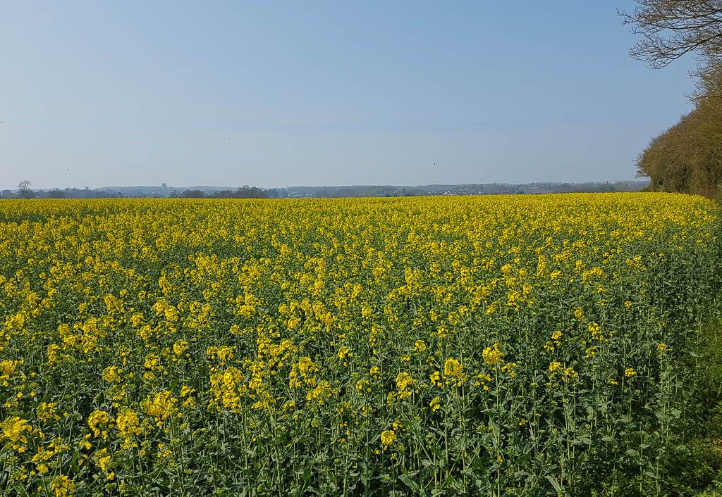
20180420_112842 by granddad john on Talk Photography
20180420_112842 by granddad john on Talk Photography
Last edited:
D
Deleted member 68495
Guest
Somewhat better than fields full of blue photovoltaic panels as is the norm here in Cornwall. Plus, as a beekeeper this stuff is good for a first fillip for my bees.
- Messages
- 3,243
- Name
- Mark
- Edit My Images
- Yes
Somewhat better than fields full of blue photovoltaic panels as is the norm here in Cornwall. Plus, as a beekeeper this stuff is good for a first fillip for my bees.
Indeed, I fully agree.....
- Messages
- 11,218
- Name
- Tim
- Edit My Images
- Yes
Hi John,
Straight - Good find for the theme. Could you have gotten more central possibly? Or was this an artistic decision ?
Unattractive - I can understand how too much of that does indeed look unattractive. I'm fortunate that the landscape I regularly travel through has rape seed, but also has other crops. You've managed to give this a never ending feel, which mirrors your thoughts on fields of yellow.
Minx
Papillon
- Messages
- 2,613
- Edit My Images
- Yes
Straight - a pretty image and fits the theme nicely done.
Unattractive - beauty is in the eye of the beholder, I like others quite like to see a field of flowers especially over one of solar panels. I am sure there are some Hayfever sufferers that also hate the sight of them
Unattractive - beauty is in the eye of the beholder, I like others quite like to see a field of flowers especially over one of solar panels. I am sure there are some Hayfever sufferers that also hate the sight of them
- Messages
- 4,523
- Name
- Mark Gameson
- Edit My Images
- Yes
Straight - Works for me nicely captured.
Unattractive - A different take on the theme but like other I find them to be quite attractive to look at.
Unattractive - A different take on the theme but like other I find them to be quite attractive to look at.
OP
- Messages
- 644
- Name
- John
- Edit My Images
- Yes
The big shoehorn catch-up
Shadow
tp52_16-133736 by granddad john on Talk Photography
more shadow

tp52_16-1020347 by granddad john on Talk Photography
Some more of the beautiful Aubergine restaurant
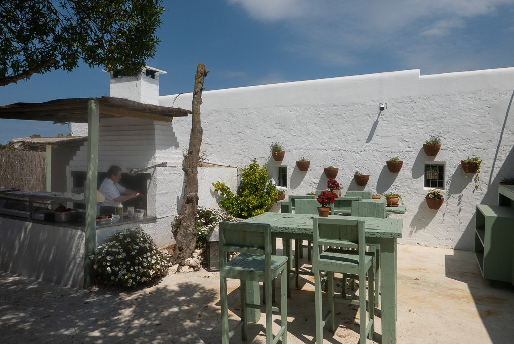
tp52_17-1020379 by granddad john on Talk Photography
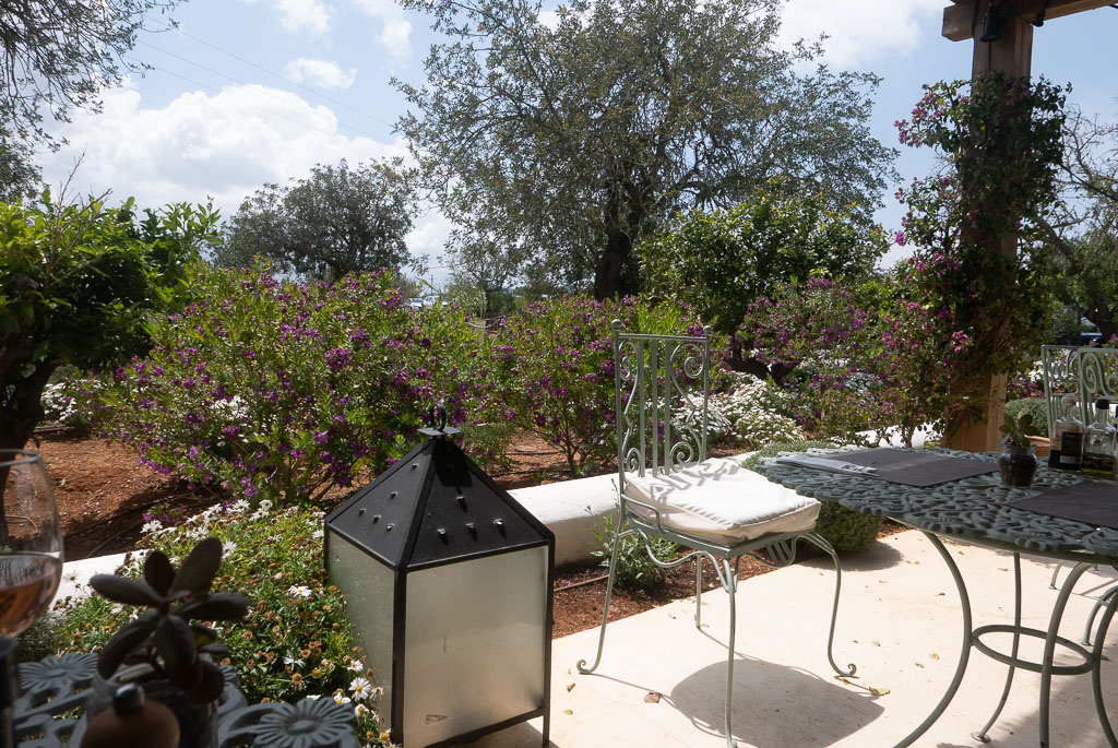
tp52_17-1020377 by granddad john on Talk Photography
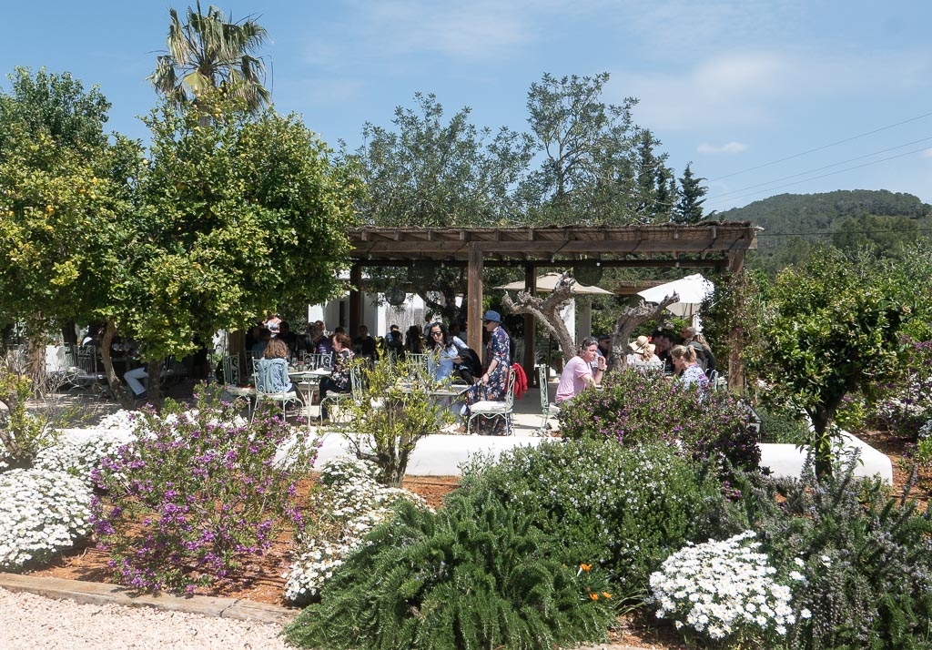
tp52_17-1020381 by granddad john on Talk Photography
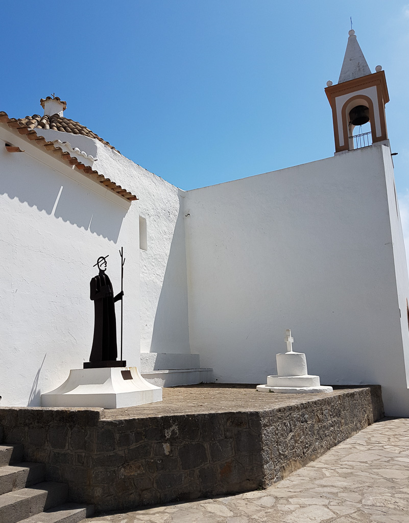
This doesn't really do justice to way these little boats were hauled up under the cliff for shelter, but it definitely had a low roof
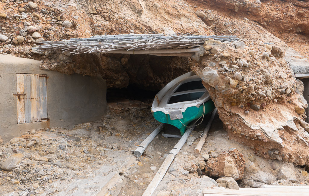
tp52_18-1020391 by granddad john on Talk Photography
Shadow
tp52_16-133736 by granddad john on Talk Photography
more shadow
tp52_16-1020347 by granddad john on Talk Photography
Some more of the beautiful Aubergine restaurant
tp52_17-1020379 by granddad john on Talk Photography
tp52_17-1020377 by granddad john on Talk Photography
tp52_17-1020381 by granddad john on Talk Photography
This doesn't really do justice to way these little boats were hauled up under the cliff for shelter, but it definitely had a low roof
tp52_18-1020391 by granddad john on Talk Photography
Last edited:
- Messages
- 9,061
- Name
- Mandy
- Edit My Images
- Yes
Straight - a lovely simple take on the theme and I like the detail on the trees.
Unattractive - I got to say I am not a fan of rapeseed, it upsets my hayfever. I however dont actually find this image unattractive
Shadow - I prefer the second image with the shadow of the tree, looks like a lovely place.
Beautiful - a couple of nice pleasing images to look at.
Low - works for the theme for me and well done on the catch up, I got some catching up of my own to do.
- Messages
- 11,218
- Name
- Tim
- Edit My Images
- Yes
Hi John,
Shadow - The tree for me, as the image is simpler, the shadow becomes more the focus of the shot, so it fits the theme better for me.
Beautiful - I thought perhaps you were making a focal point of the lovely looking table in #1, but with the legs cut off at the bottom it couldn't be. Nice images, but none really sell the theme for me. I do like the brightness / punchiness of them.
Low - Great for the theme. The colour of the boat contrasts with the rock and concrete which i think helps the image work well.
OP
- Messages
- 644
- Name
- John
- Edit My Images
- Yes
Shadow - I prefer the second image with the shadow of the tree, looks like a lovely place
Great catch up John, good shots and all on theme with low being my pic.
Shadow - The tree for me, as the image is simpler, the shadow becomes more the focus of the shot, so it fits the theme better for me.
Thank you guys. Yes they're all shorhorns! As I couldn't get the themes until I got home I thought I'd use the holiday snaps. the first shadow was the one that struck me at the moment as the figure itself looks like another shadow, but I agree the second one is more clear. the low roof on the boat is indeed the only one truly on theme. thanks for taking the time and I'll be looking for a match soon.
- Messages
- 616
- Name
- Ross
- Edit My Images
- Yes
Nice set of holiday shots there. All fit the themes well with a bit of shoehornery. Hope you had a great time out there.
- Messages
- 3,243
- Name
- Mark
- Edit My Images
- Yes
Great catch up John, good shots and all on theme with low being my pic.
Exactly what I was going to say John, hope you had a good time, weather looked great !