- Messages
- 13,760
- Edit My Images
- Yes
Vernacular - now that is a good word, a nice pleasing image too Chris with the road leading through the shot 
Thanks DeanVernacular - now that is a good word, a nice pleasing image too Chris with the road leading through the shot
Thanks Bernd, I might have a go at re-rendering it.That photo looks a bit bright and HDRy for my taste, but good composition and sharp throughout.
Thanks SusieLooks a real picture postcard setting Chris, nice angle ....some fine looking houses there.
Thanks David, I see what you mean, it does look a bit Cotswold-like but it's up north. Yes, it's HDR but it does seem a bit sensitive to monitor settings, I've viewed it on a few and on some the HDR-iness is my obviousLooks very much like the Cotswolds, where my roots are. HDR? I hadn't noticed.
Thanks Chris, perhaps there is a bit too much greenery now you mention it.Architecture - pretty village, pretty house and no bright yellow cars, but my eyes keep getting dragged to the green shwubbery on the right, strange.
Thanks Mark, it probably could stand a bit more saturation but the local stone is pale grey so it wouldn't gain much more colour even with more saturationArchitechture is a very nice villagey shot, but the colours look a bit washed out on my calibrated screen ?
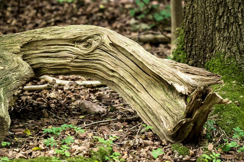
 52-2017-Broken (2) by TheWub, on Flickr
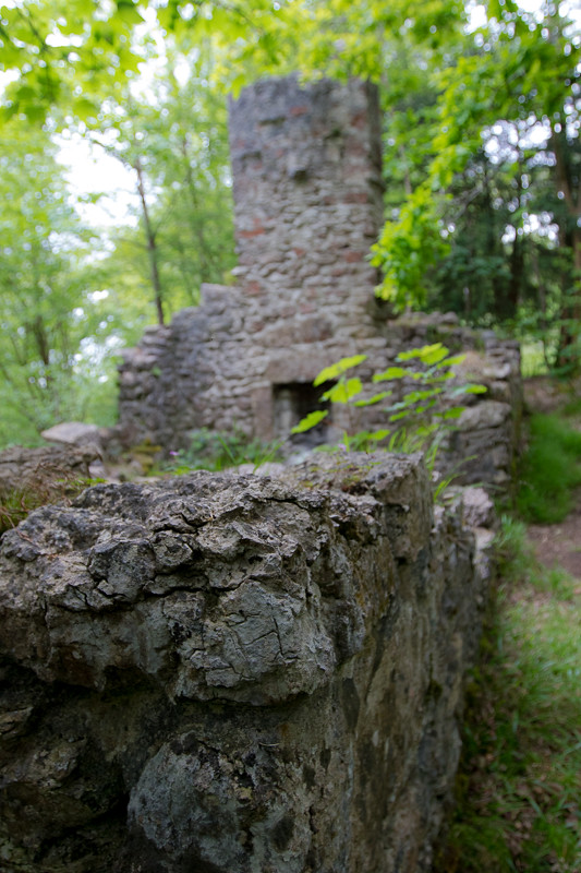
 52-2017-Broken (1) by TheWub, on Flickr
Got to be the broken old ruins #2 shot for me Chris, like how you have only focused on the bit of wall while having the rest nicely oof.
Thanks Emma, I took one with it all in focus but it looked a bit flat, I'm glad you like the shallow DoFThe wall for me too Chris - perfect dof to retain interest but still give the wider picture.
Thanks CliveAs above, really like the wall.
Thanks Susie, good point about the crop I think it would workHi Chris ...I think it's the wall for me too, my eye is really drawn to the OOF part, I'm wondering if it would take a crop to half way down that end wall, it would throw all that lovely detail in the broken wall more into view, but still leave some DOF.
Thanks Bernd, it was fairly un-interesting with it all in focus, I thought this might get the viewer's attention more#2 for me. Unusual choice of focus on the small bit of broken wall rather than on the large bit, but I've got to like that!
Thanks David... the chimney is the more interesting part of the ruin .... amongst the undergrowth ... nice find.
Thanks Tim#2 for me Chris. I like the shallow DoF effect you have with the fireplace and chimney out of focus and the fact that nature is reclaiming it.
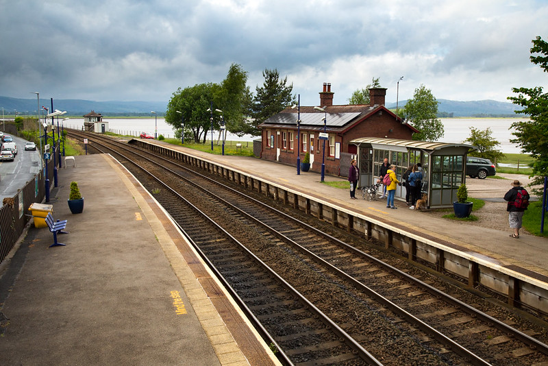
 52-2017-Trasnport by TheWub, on Flickr
Thanks Daniel, I really appreciate you dropping by.•
That's a pretty one, Chris!
… just enough of everything!
Thanks Tim, the station building isn't even used by the railway anymore but at least there is a manned signal box and yes there was a train coming in whcib is what I planned to shoot but I likeed this more.Arnside is a pretty station in a pretty location, shame about the solar panels and bus stop style shelter, but I guess that's the world we live in (enclosed brick shelters tend to attract the wrong sort of visitor).
Nice to see the signal box and semaphore signals in use, and as the signal is on, I assume a train was approaching from behind you.

Thanks DaveTransport, liking this shot Chris as you have the cars in view, but I also like the moody sky and folk on the platform waiting for the train to transport them home or work
Thanks David, as you might have guessed I'm not a "people person" but I thought they made this photo.Quality image, love all the elements, love the human element.
Like your idea for transport, the high viewpoint and the inclusion of passengers waiting for their train. Looks like a quiet little station.
Thanks Dean, I left the car in just because it felt transport related and it's one of those scenes where there is always something at the edges that feels like it could be cropped off.Sorry Chris it looks like I missed Broken... for me the broken wall wins my vote, a very nice DoF and a good leading line
Thanks Stan.
Transport I like the track but wish there were less distractions with the road to the left I would have been tempted to crop it before the plant pot but clone the pot out as that's a real nice sweeping curve on that track mate
Thanks for taking the time Andrea, I did photograph a train in the station for transport but preferred this.A bit of a catch-up by me, Chris, as I haven't been around for a few weeks.
I really like your climbing images for Hold; I agree that the first works best as you can see the hands, but they're both a good choice for that theme and full of drama and interest. Your first image for Vivid is a cracker and is my pick because of the bright sun and its reflection, and Architecture is another lovely image, a real picture postcard. I like both images for Broken, with the natural colours and textures, but my favourite is the second one because of the contrasting man-made textures and narrow DOF.
Finally, Transport is unusual in showing the infrastructure rather than the method itself and is another pretty scene with lots to look at, including the dark clouds. I think the high POV helps to add interest with the clear view of the track running right through the scene
