
I thought I would sign up with the intention of getting out and using my new camera more often (have just moved up from a D40 to a D5300).
CC is welcome.
I fancied going out with the intention of taking a shot to convert to B&W with a high iso today and here you go.
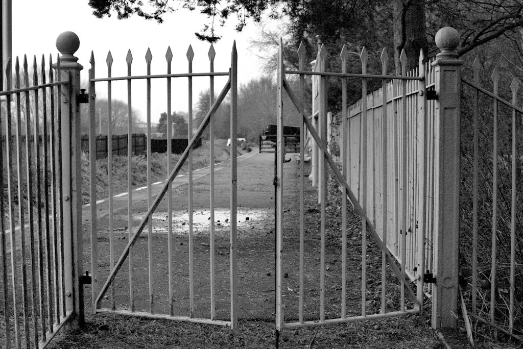
Week 1 gate by Mozthecat on Talk Photography
CC is welcome.
I fancied going out with the intention of taking a shot to convert to B&W with a high iso today and here you go.
Week 1 gate by Mozthecat on Talk Photography
Last edited:
")

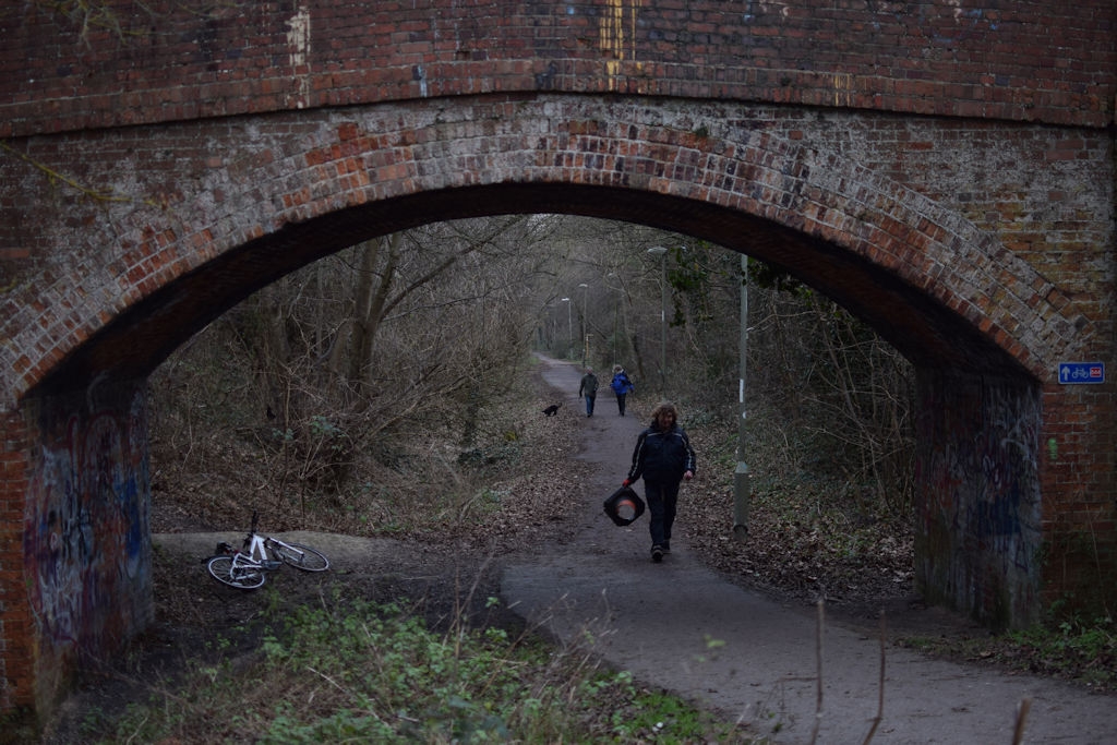
") in the house and you've beaten him to post the first train-related shot this year.
in the house and you've beaten him to post the first train-related shot this year.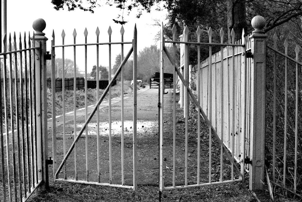

 .
.