
- Messages
- 3,925
- Name
- Carl
- Edit My Images
- Yes
Going for the hat trick The journey begins here.
Last edited:


Thank you Rav. Such a fun theme to kick things off.Great shot Carl, I feel you really captured the theme here [emoji106]
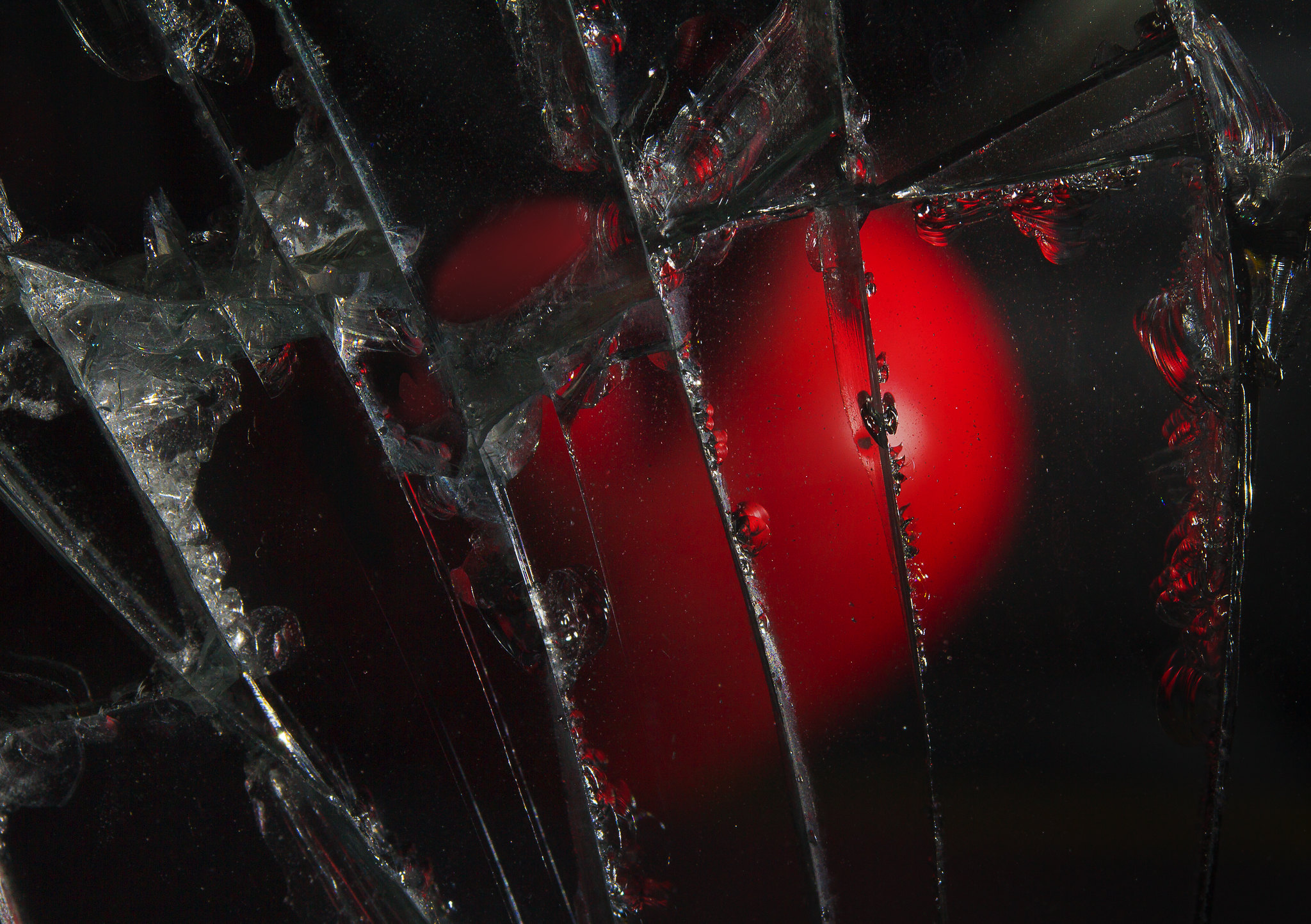
Thanks David. I used a broken wing mirror to reflect a heart held vertically by the camera lens against the table top. A bit Heath Robinson but needs must ha haLove this shot, the heart behind broken glass effect.
Thanks Tim. You're right - a square crop would work and I suppose it would have been more in keeping as an album cover but I quite liked the "grunge" ... helped to emphasise "tainted".I was expecting a Nick Lowe track after first glancing at the image. Interesting shot...Not sure it needs all the space on the right, perhaps a square crop might work too?
Thanks Susie. Really good theme - spoilt for choiceGood thinking there Carl
Hi Chris. Glad to see you back. I started by thinking of Blondie's Heart of Glass but quite liked the grunge of the broken wing mirror and went "tainted love" instead ha ha. Great minds eh!Not been around for a while Carl. The glass and the heart made me think of Blondie and Heart of Glass. Need to start thinking already for my submission. I like the distorted area to the right.
Thanks Paul - now warmed up and ready for Week 1Cracking shot
Thanks Bernd. Struggled a bit getting those cracks lit up and sparkling but then I quite like experimenting so all good fun.The picture works for me, including the crop. Well thought out and nicely executed.
Thanks Scott. I know what you mean ... does the same for me too - maybe the sharpness of the cracks contrasting with the blurry grunge on the rhs ?!?!Nicely done, great choice for the song but my eyes go crackers after looking at it for a few seconds.
It does seem to be the rhs that causes it, glad it's not just me.Thanks Scott. I know what you mean ... does the same for me too - maybe the sharpness of the cracks contrasting with the blurry grunge on the rhs ?!?!
Thanks Alison. I've been having another go and come up with something less harsh on the eyes. Will post separatelyGreat shot for your song choice. I agree you don't want to look at it for too long as it gets to your eyes
 Broken Hearted by Carl Ayling, on Flickr
That's kind of you - thank you. (quite hard getting the light balance right for both the cracks and heart but my trusty led torch seemed to do the trick)Much better for me.
Thank you for your kind comments. I did have a few choices for the title ... one of the faves was What's become of the Broken Hearted.Wow! Love the first shot, and also love the second. I think the second is a bit easier on the eye. I'm so glad you shared how you took it, because I could never have guessed. I thought it was a heart ice cube thingy frozen in ice
Maybe it could also be 'I Love the Sound of Breaking Glass'
Thanks Chris ... like the pun heh heh heh.I think I preferred the first Carl but both are good and reflect* the song title well *pun, sorry
Thank you Emma. Nothing much escapes becoming a camera prop in this house .. even a broken wing mirror has it's uses.I loved the first...and the second possibly more! The crop of the first worked for me. I thought the heart was under ice at first - another very clever idea Carl...and a great song
Thanks MrB - see you in Week 1Love them both although there is something extra to the 1st image, looking forward to more
Thanks Dean.... I've forgotten most of the lyrics so resorting to dum de dum de dumI liked the first one Carl, but now I have seen the second image prefer it much more due to the clearer image, great idea and well thought out
Thanks Andy. I danced to it too ... well dance is a strong word choice, more like foot shuffling.Great song and strong start. Used to dance to this track
Thanks Clive - I loved it too - great song in it's time.On theme and nicely composed, probably my favourite track of all those added so far.
Thanks Mark. Enjoyed the experimentation.Oh wow, the edit is much better Carl...proper album cover stuff, well done!
Thanks Steve. I've become the family's scarp merchant.Both nice shots but I prefer the cleaner second shot. Great idea for the theme and a good use for a broken wing mirror.
Thank you Andrea - looking forward to the challenges to come.A typically strong and eye-catching image from you, Carl. The first one is full of impact and really suits the song title, but your re-shoot improves on it by being just a little clearer and more punchy. You're off to a super start!
That's kind of you thank you Stan.I like both and each has its merit. Very striking and you've captured it well. I really have nothing negative to comment about it.
Thanks Allan. Harsh lighting accentuating the shards of glass grated on the eye a bit methinks.second one nails it for me not so distressing on the eyes and a really good idea, nice start
Thanks Dom - just hope my future submissions can match the theme as much ... I do go a off piste sometimes ha ha.Feels so raw. Image fits the song perfectly. Great start!
Oooops sorry Jill. Thank you though.Number 2 for me Carl, the first one made my eyes go even funnier
 Tainted Love